Data
2017 ~ 2018 Spotify의 Daily streams
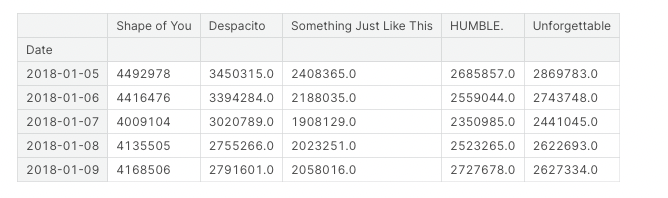
Line Plot
sns.lineplot(data=spotify_data)
인턴십때 Line plot은 일반적으로 x축에 Time Series, y축에 집계량을 표현하는 것이다는 피드백을 받았다. 항상 Plot을 그릴때는 목적에 맞는 것을 명확하게 사용하자!!
Additional information
# Set the width and height of the figure
plt.figure(figsize=(14,6))

# Add title
plt.title("Daily Global Streams of Popular Songs in 2017-2018")

# Line chart showing daily global streams of each song
sns.lineplot(data=spotify_data)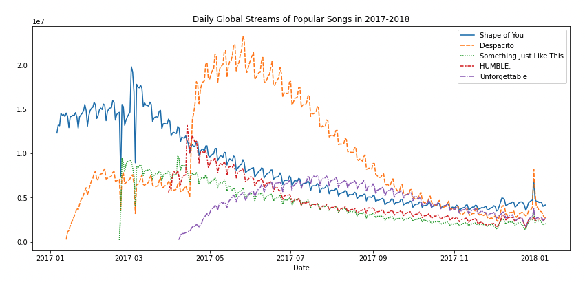
Plot a subset of the data
데이터 일부분만 그리기
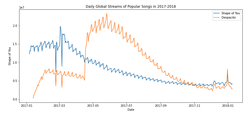
# Set the width and height of the figure
plt.figure(figsize=(14,6))

# Add title
plt.title("Daily Global Streams of Popular Songs in 2017-2018")

# Line chart showing daily global streams of 'Shape of You'
sns.lineplot(data=spotify_data['Shape of You'], label="Shape of You")

# Line chart showing daily global streams of 'Despacito'
sns.lineplot(data=spotify_data['Despacito'], label="Despacito")

# Add label for horizontal axis
plt.xlabel("Date")