transition
transition : property duration timing-function delay ;- CSS 속성값이 변화할때, 속성값의 변화가 일정 시간(duration)에 걸쳐 일어나도록 하는 것이다
- transition은 상태 변화에 동반하여 변경되는 CSS 프로퍼티 값에 의한 변화를 부드럽게 하기 위해 애니메이션 속도를 조절한다.
- transition은 자동으로 발동되지 않는다.
:hover와 같은 가상 클래스 선택자 또는 Javascript의 부수적인 액션에 의해 발동한다.
transition property
| 프로퍼티 | 설명 | 기본값 |
|---|---|---|
| transition-property | 트랜지션의 대상이 되는 CSS 프로퍼티를 지정한다 | all |
| transition-duration | 트랜지션이 일어나는 지속시간(duration)을 초 단위(s) 또는 밀리 초 단위(ms)로 지정한다 | 0s |
| transition-timing-function | 트랜지션 효과를 위한 수치 함수를 지정한다 | ease |
| transition-delay | 프로퍼티가 변화한 시점과 트랜지션이 실제로 시작하는 사이에 대기하는 시간을 초 단위(s) 또는 밀리 초 단위(ms)로 지정한다 | 0s |
| transition | 모든 트랜지션 프로퍼티를 한번에 지정한다 transition : ( property , duration , timing-function , delay ) |
div {
  transition-property: width, opacity;
  transition-duration: 2s, 4s;
}
div {
/* shorthand syntax */
transition: width 2s, opacity 4s;
}transition-timing-function
| 프로퍼티값 | 효과 |
|---|---|
| ease | 기본값. 느리게 시작하여 점점 빨라졌다가 느려지면서 종료한다. |
| linear | 시작부터 종료까지 등속 운동을 한다. |
| ease-in | 느리게 시작한 후 일정한 속도에 다다르면 그 상태로 등속 운동을 한다. |
| ease-out | 일정한 속도의 등속으로 시작해서 점점 느려지면서 종료한다. |
예제
1. 이미지에 hover시 크기가 커지는 효과

<body>
  <div class="con-wrap">
    <div class="img-wrap">
      <img src="https://cdn.pixabay.com/photo/2015/12/09/17/12/popcorn-1085072_960_720.jpg" alt="">
    </div>
    <h3>매점 팝콘 무료쿠폰</h3>
    <p>Lorem ipsum, dolor sit amet consectetur adipisicing elit. Ipsa, amet!</p>
 </div>
</body>
* {
margin: 0;
padding: 0;
}
.con-wrap {
width: 500px;
margin: 100px auto;
}
.con-wrap:hover img {
transform: scale(1.2);
}
.img-wrap {
width: 100%;
height: 350px;
overflow: hidden;
}
.img-wrap img {
width: 100%;
transition: 0.5s;
}
h3 {
margin-top: 10px;
font-weight: 700;
line-height: 1.2;
}
p {
margin-top: 7px;
font-size: 0.8em;
font-weight: 100;
line-height: 1.2;
}어떤 요소,상황에 transition을 적용시키는가
- 자연스럽게 둘다 적용시 직접적인 엘리먼트에
ransition넣기 - 마우스만 올렸을때 적용시 hover 이벤트에
ransition넣기
overflow: 부모 바깥으로 넘치는 자식을 관리해준다. 속성값 중hidden은 넘치는 자식을 잘라주는 역할을 한다. 항상 부모에게 넣어주는 속성이다.
2. hover시 색상이 채워지는 더보기 버튼
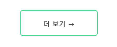

<body>
<div class="btn-wrap">
<div class="gage"></div>
<h3>더 보기 →</h3>
</div>
</body>* {
margin: 0;
padding: 0;
}
.btn-wrap {
width: 300px;
height: 100px;
border: 3px solid #50D994;
border-radius: 10px;
margin: 100px auto;
box-sizing: border-box;
position: relative;
cursor: pointer;
}
.btn-wrap:hover .gage{
width: 100%;
}
.btn-wrap h3 {
color: #494949;
position: relative;
text-align: center;
line-height: 100px;
font-size: 26px;
}
.btn-wrap:hover h3 {
color: #fff;
}
.gage {
width: 0%;
height: 100%;
background-color: #50D994;
position: absolute;
top: 0;
left: 0;
transition: all 0.5s;
}
🐢 💨 💨