video 태그
영상을 출력하기 위해서 사용
src에 주소를 입력하고, 현재: 파일명 입력
controls 속성은 영상의 컨트롤 박스를 출력한다.
autoplay 속성은 영상이 불러와지면 자동으로 바로 재생한다.
loop 속성은 반복으로 영상을 보여준다.
muted 속성은 음소거
ios는 웹페이지에 들어갔을 때 오디오가 재생되는걸 싫어한다.
<video src="/test.mp4" controls autoplay loop muted></video>audio 태그
음악을 재생하는 태그
<audio src="/test2.mp3" controls></audio>iframe 태그
웹페이지 안에 다른 웹페이지를 보여줄 수 있다.
src에 페이지의 주소를 입력, 속성은 width="", height="", frameborder 속성은 표시선을 표시할지(1), 안할지(0) 여부를 정한다.youtube 영상에서 공유 -> 퍼가기, 그대로 복사하면 웹페이지에 유튜브 영상을 넣을 수 있다.
<iframe src="주소" frameborder="0" width="500" height="500"></iframe>form 태그
서버로 데이터를 보내기 위해 사용하는 태그, 이후에 node.js를 배우면서 서버와 같이 작업할 때 데이터를 보내기 위해 사용할 태그
<form action="">
        <!-- form 태그의 action 속성은 보낼 url를 명시 -->
        <label for="">아이디</label>
        <!-- name 속성이 필요한 이유 name 속성이 서버에 데이터를 보낼 때 이름을 정해주는 것
             데이터의 이름을 정해준것. -->
        <input type="text" name="user_id">

        <!-- 하나만 선택가능한 체크박스  -->
        <label for="radio">김밥</label>
        <input type="radio" name="radio">

        <label for="radio">라면</label>
        <input type="radio" name="radio">

        <label for="radio">떡국</label>
        <input type="radio" name="radio">

        <label for="radio">볶음밥</label>
        <input type="radio" name="radio">

        <!-- 하나만 선택하는 여러 체크박스에서 중복 체크할 때 name을 사용한다. -->
background 속성
	background-color: aqua;

    background-image: url();
    /*배경 이미지 추가*/

    background-size: contain;
    /*배경 이미지 크기 지정, 이미지가 다 보일 수 있게 크기를 맞춰준다*/

    background-size: cover;
    /*배경 이미지의 크기 지정, 최대크기로 비율맞춤, 이미지가 짤릴수 있다.*/
background-size: 100px 100px;
/이미지 사이즈 지정 너비,높이/
실행화면
background 속성은 디폴트값으로 반복하는 속성이 있다.
background-position: 10px 10px;
/*배경 이미지의 위치 지정, x축,y축*/

background-position: center;
/*배경 이미지의 위치를 가운데 맞춤*/

background-repeat: no-repeat;
/*배경 이미지 반복 여부, 반복하지 않는다*/

background-repeat: repeat;
/*배경 이미지 반복 여부 기본값*/

background-repeat: repeat-x;
/*배경 이미지를 x축으로만 반복한다*/

background-repeat: repeat-y;
/*배경 이미지를 y축으로만 반복한다*/
position 속성
<body>
    <div class="position1">
        <div class="position2"></div>
    </div>
</body>
.position1{
position:relative;
/*이전 영역의 위치를 기준으로 지정한다. 부모를 지정해주는 포지션 속성이다.*/
width: 500px;
height: 2000px;
border : 1px solid black ;
/* 태그를 해당위치에서 움직여줘야할 때, 위치를 지정하고 싶을 때*/
/* position 속성을 주고 top left */
/* top과 bottom 중 하나, left와 right 중 하나만 적용된다.*/
top: 50px;
left: 50px;
}
.position2{
/* absolute는 부모의 좌측 상단부터 시작된다.
relative를 가지고 있는 부모가 없으면 body를 기준으로 움직인다.자식 포지션을 지정해주는 포지션 속성이다.*/
position:absolute;
width: 100px;
height: 100px;
border : 1px solid;
top : -10px;
left: 100px;
/* 우리가 보고있는 브라우저의 위치로 고정시킨다.
(즉 스크롤해도 따라서 움직인다.),
스크롤을 움직여도 따라오는 장치를 만들때 사용 */
position : fixed;
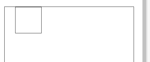
}실행화면
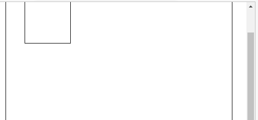
fixed 속성을 넣었기 때문에 스크롤을 움직였을 때 박스가 따라온다.
fixed 속성은 position:relative; 영향을 받지 않는다.
position: sticky;
지정한 위치(부모 범위) 밖으로 나가지 못하게한다.
top : -10px로 설정을 했지만 sticky 속성 때문에 부모 범위 이상으로 벗어날 수 없다.
hover 속성
hover 속성은 마우스를 올려놓았을 때 발생되는 이벤트로,
위 코드는 해당 클래스에 마우스를 올렸을 때 텍스트가 빨강으로 변한다.
.클래스명:hover{
color:red;}
.like:hover .like_tag{
    display: block;
} -> like라는 클래스에 마우스를 올렸을 때 like_tag 클래스를 블록처리 한다는 뜻
.like_tag{

    position: absolute; -> like 클래스의 자식 클래스
    width: 200px;
    height: 30px;
    background-color: rgba(128, 128, 128, 0.918);
    display :none; -> like 클래스에 마우스를 올렸을 때만
    				  나오게 하기 위해 위 명령어로 없애준다
    top: 50px;
    left : -30px;
    -> absoulte; 속성을 사용했기 때문에 부모 클래스 기준으로 위치가 정해진다.
    color : white;
    border-radius: 5px;

}
css 기능
1. 첫번째, 마지막 요소를 지정할 때
/*마지막 요소 선택자 의 오른쪽 여백을 없앤다라는 구문*/
.content1:last-child{
    margin-right:0
}
 content1 클래스에 margin-right 속성을 주었을 때 마지막에 있는 요소는
 오른쪽 여백이 필요가 없다. 그럴 때 위와 같이 사용하면 된다.
/*첫째 요소 선택자 last-child*/ .content1:first-child{ }
2. 이미지 등 사각형 모서리를 없앨 때
border-radius: 40px;
border-radius: 20px 0  0 20px; <-이런식으로 각 모서리를 조절 가능
3. float 왼쪽 오른쪽 붙여서 정렬 시킬 때
float : left;4. ul, li 태그를 사용시, 리스의 점이나 숫자 리스트의 형식을 지정할 때
list-style : none;
5. 클래스 선언할 때 다양한 방법
.content li .item-img{
}

/* <div class="content">
        <li>
            <img class="item-img" src="" alt=""> <- 이 item-img 클래스만 적용된다는 말.
        </li>
        <li></li>
        <li></li>
        <li></li>
</div> */
6. 가상 선택자
<div class="text2">이재영<span></span></div>/* before, after 가상 요소를 추가해줄 수 있다.*/
/* content 속성이 꼭 있어야 한다 */
.text2 span::before{
content: "•"
}
.text2 span::after{
content: "•"
}실행화면
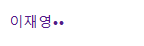
span 속성에 아무것도 입력되지 않았지만
before,after 속성의 content 를 이용해 나타낼 수 있다.
margin : auto; -> 좌우가 같게 가운데 정렬
7. transform 태그
transform: translate 속성: 해당 위치로 이동 시켜준다.
transform: translate(150px, 100px); ->(x축,y축)
transform: translateX(100px); -> x축으로만 이동
transform: translateY(100px); -> y축으로만 이동
transform: scale 속성: 크기 조절
transform: scale(1);
    /*1이 기본 크기고 크기를 조절할 수 있다. 0.5가 50%의 크기*/
    /*두 값을 입력하면 x,y크기를 조절 가능하다.*/
transform: rotate 속성 : 회전 시켜주는 속성
transform: rotate(45deg); -> 오른쪽으로 45도 회전css에서 애니메이션을 작성할 때 사용/ @keyframes 뒤에 애니메이션 이름
@keyframes ani {
    0%{ /*전체 동작중 0~50% 까지의 내용*/
        transform: rotate(0);
    }
    50%{/*전체 동작중에 50%일 때*/
        transform: rotate(360deg);
    }
    100%{ /*전체 동작하면서 50% ~100%까지*/
        transform: rotate(0);
    }
}
transition 속성 :스타일 값이 변화하면서 효과를 줄 수 있다.
transition: transform 3s linear, border 1s ease-in-out, border-radius 1s ease-in-out;transform 속성은 3초 등속, 테두리 속성이 바뀌는데 1초, 둥글게 깎이는데 1초 / ease-in-out :천천-보통-천천
.box6{
    position: relative;
}
.box6 img{
    position: absolute;
    /*상 50% 좌 50% 태그 이동시키고*/
    top  :50%;
    left :50%;

    /*태그의 반지름 만큼 좌로 50% 이동, 위로 50%이동 */
    transform: translate(-50%,-50%);
    /*
     width: 200px;
     height: 200px; */
}
-> box6에 정가운데에 위치하기
8. @media only screen and (조건)
브라우저 환경에 따라 css를 적용
-> 이 화면에서만 조건 수행
@media only screen and (max-width : 1200px) {
    .box{
        width: 300px;
        height: 300px;
        border :5px solid red;
    }
}

@media only screen and (min-width : 1200px){
    .box{
        width: 300px;
        height: 300px;
        border :5px solid green;
    }
}

@media only screen and (max-width : 600px) {
    .box{
        width: 300px;
        height: 300px;
        border :5px solid blue

    }
}

@keyframes ani {
    0%{ /*전체 동작중 0~50% 까지의 내용*/
        transform:translate(-50%,-50%) rotate(0);
    }
    100%{ /*전체 동작하면서 50% ~100%까지*/
        transform:translate(-50%,-50%) rotate(360deg);
    }
}

.box{
    position: relative;
}

.box img{

    position: absolute;
    top  :50%;
    left :50%;

    transform: translate(-50%,-50%);
    width: 200px;
     height: 200px;

    animation: ani 2s infinite normal linear;
}
600px 까지는 blue, 600 ~ 1200px 사이는 red, 1200px 이후 green
으로 테두리 색상이 바뀌고, 박스 정가운데에서 2초에 한바퀴 회전하는 이미지
9. 폰트 적용하는 방법
/* 폰트 파일을 다운받고
    @font-face 작성한다.
    @font-face{
        font-family : 사용할 폰트의 이름을 정해준다.
        src:url('사용할 폰트 파일의 경로를 적어준다.')

    }
*/
@font-face{
    font-family: 'noto';
    src: url('./Noto_Sans_KR/NotoSansKR-Black.otf') format('truetype');
}
body {
    font-family: 'noto';
}
10. input 태그 속성
<div class="tab_menu">
        <!-- checkded input에 체크를 미리 줄 때 -->
        <!-- tab01 id를 가지고 있는 input label for 속성에 tab01 -->
        <!-- for 속성으로 연결된 label을 클릭하면 id로 for에 연결된 체크박스가 클릭이 된다.-->

        <input class="tab01" type="radio" id="tab01" name="tabmenu" checked>
        <label for="tab01">탭1</label>

        <input class="tab02" type="radio" id="tab02" name="tabmenu">
        <label for="tab02">탭2</label>

        <input class="tab03" type="radio" id="tab03" name="tabmenu">
        <label for="tab03">탭3</label>

        <!-- box 클래스도 가지고 있고 각 item1,2,3의 클래스를 가지고 있어 총 2개를 가지고 있다. -->
        <div class="box item1">1번 박스</div>
        <div class="box item2">2번 박스</div>
        <div class="box item3">3번 박스</div>
</div>
.tab_menu input{/*선택 버튼 사라지게함*/
display: none;
}/*tab_menu 클래스에 input 태그에 인접하는 label 태그에 스타일 부여한다는 뜻*/
.tab_menu input + label{
display: inline-block;
padding : 10px;
background-color: gray;
color: white;
font-size: 14px;
/* 마우스를 올렸을 때 보여줄 커서를 설정할 수 있다.*/
cursor: pointer;
}/*tab_menu 클래스에 checked가 있는 input 태그에 인접한 label 태그에 스타일을 적용시키겠다*/
.tab_menu input:checked + label{
background : #222;
color: bisque;
}.box{ display :none;} 속성을 부여해야지 1,2,3번 박스가 전부 표시 되지않고 선택된 1번 박스만 표시된다.
/*input 태그 중 class 이름이 tab01에 체크되었다면 그 아래로 .item1 클래스를 찾아
해당 스타일을 적용시킨다, 같은 div 안에서 찾을 수 있다.*/
input[class="tab01"]:checked ~ .item1{
display: block;
color: white;
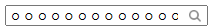
}.textbox::before{
position: absolute;
top : 6px;
left: 184px;
content: "";
background-image: url("돋보기 사진 주소");
width: 12px;
height: 12px;
background-size: 12px; /*사진 넓이, 높이, 크기*/
background-repeat: no-repeat;
display: block;
}
.textbox{
position: relative;
}
.textbox input{
padding-right: 26px; /*input 태그인 textbox 오른쪽 여백을
줘서 돋보기 까지 글자가 침범하지 않게 한다.*/
}실행화면
11. 추가로 알게된 CSS 속성
line-height: 40px; -> 세로 정렬 (px는 높이와 같게)

overflow: hidden;
    text-overflow: ellipsis;
    white-space:nowrap;
    -> 텍스트가 넓이 초과 시 ...로 처리

border-color: blueviolet blueviolet white blueviolet;
-> border 테두리 색상을 위 / 오른 / 아래 / 왼 따로 지정 가능