
🔑key point
최상위에 있는 목록부터 꾸며주고 밑의 세부 내용을 꾸며주기
- align-items 를 사용하여 중간으로 배치
- 양 모서리에 너무 붙어있는 것은 padding 으로 조정 (웹 브라우저의 가장자리로부터의 거리를 조정)
- @media screen and (max-width : 780px)
and 뒤에 괄호로 조건 붙여주기
<!DOCTYPE html>
<html lang="en">
<head>
<meta charset="UTF-8" />
<meta http-equiv="X-UA-Compatible" content="IE=edge" />
<meta name="viewport" content="width=device-width, initial-scale=1.0" />
<title>hyocho coding</title>
<link rel="stylesheet" href="style.css" />
<script src="https://kit.fontawesome.com/39996071eb.js" crossorigin="anonymous"></script>
<link rel="preconnect" href="https://fonts.googleapis.com">
<link rel="preconnect" href="https://fonts.gstatic.com" crossorigin>
<link href="https://fonts.googleapis.com/css2?family=Source+Sans+Pro&display=swap" rel="stylesheet">
</head>
<body>
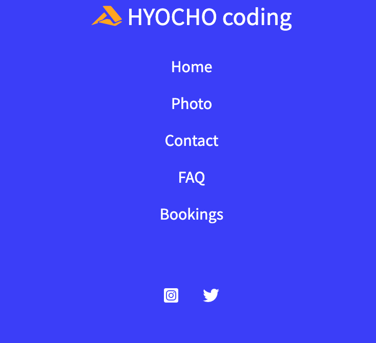
<nav class="navbar">
<div class="navbar_logo">
<i class="fa-brands fa-accusoft"></i>
<a href="#">HYOCHO coding</a>
</div>
<ul class="navbar_menu">
<li><a href="#">Home</a></li>
<li><a href="#">Photo</a></li>
<li><a href="#">Contact</a></li>
<li><a href="#">FAQ</a></li>
<li><a href="#">Bookings</a></li>
</ul>
<ul class="navbar_link">
<li><i class="fa-brands fa-square-instagram"></i></a></li>
<li><i class="fa-brands fa-twitter"></i></a></li>
</ul>
</nav>
</body>
</body>
</html>
body {
  margin: 0;
  font-family: 'Source Sans Pro';
}

a {
  text-decoration: none;
  color: white;
}

.navbar {
  background-color: rgb(61, 61, 253);
  display: flex;
  justify-content: space-between;
  align-items: center;
  font-size: 16px;
  padding: 8px 12px;
}

.navbar_logo {
  font-size: 24px;
}

.navbar_logo i {
  color: orange;
}

.navbar_menu {
  list-style: none;
  display: flex;
  padding-left: 0;
}

.navbar_menu li {
  padding: 8px 12px;
}

.navbar_menu li :hover {
  background-color: orange;
  border-radius: 4px;
}

.navbar_menu li {
  padding: 8px 12px;
}

.navbar_link {
  list-style: none;
  color: white;
  display: flex;
  padding: 12px 12px;
}

.navbar_link li {
  padding: 8px 12px;
}

@media screen and (max-width: 780px) {
  .navbar {
    flex-direction: column;
  }

  .navbar_menu {
    flex-direction: column;
    align-items: center;
  }
}

기록하는 습관을 기르고 있습니다.