
styled-component emotion 과 같은 css-in-js, 정확하게는 runtime css-in-js 는 아래와 같은 이슈들이 대두되고있지만, 개발편의성이나 가독성측면에서 장점이 있어 나도 평소에 많이 사용하고 사람들도 요새 가장 많이 사용하지 않나싶다.
- 런타임 오버헤드 증가
- 번들 크기 증가
- SSR 이슈 (ex: Next13 App Router)
- 성능 이슈
이러한 runtime css-in-js 의 문제점을 해결하기 위해 zero-runtime css-in-js 가 등장하였고, 요새 이러한 문제점을 해결하면서, type-safe 하게 개발할 수 있는 Vanilla Extract 가 핫하다길래 사용해보려한다.
Install
$ yarn add @vanilla-extract/css추가적으로 사용을 위해선 webpack , vite 등의 plugin 설정이 필요하다.
참고링크
++ tsconfig.js 에서도 "target": "ES5" 에서는 에러가 나타났다.
Try
기본적인 사용법은 아래와 같다. 반드시 .css.ts 파일에 작성해줘야한다.
// app.css.ts
import { style, globalStyle } from '@vanilla-extract/css';

export const buttonStyle = style({
  padding: 12,	// px 생략가능
  border: 'none',
  backgroundColor: 'red',
  color: 'white',

  ':hover': {
    opacity: 0.7,
  },
});

globalStyle('body', {
  backgroundColor: 'black',
});
// App.tsx
<button className={buttonStyle}>Button</button>cssVariable
아래와 같은 2가지 방법으로 cssVariable 을 이용할수도있다.
// app.css.ts
import { style, createVar } from '@vanilla-extract/css';

const myVar = createVar();
export const textStyle = style({
  vars: {
    '--my-var': 'blue',
    [myVar]: 'red',
  },
  background: 'var(--my-var)',
  color: myVar,
});
theme
createTheme 을 이용하여 아래와 같이 theme 를 만들 수 있다. 간단하게 darkMode 를 구현해 보았다.
// app.css.ts
import { style, createTheme } from '@vanilla-extract/css';
export const [darkTheme, vars] = createTheme({
color: {
background: 'black',
text: 'white',
},
});
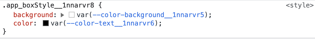
export const whiteTheme = createTheme(vars, {
color: {
background: 'white',
text: 'black',
},
});
export const boxStyle = style({
background: vars.color.background,
color: vars.color.text,
});
// 이런 방식으로도 vars 선언가능
const vars = createThemeContract({
color: {
background: '',
text: '',
},
});// App.tsx
<div className={isDarkTheme ? darkTheme : whiteTheme}>
<div className={boxStyle}>box</div>
</div>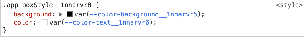
재사용
아래와 같이 재사용 또한 가능하다.
const parent = style({ color: 'red' });

const child = style([parent, { background: 'blue' }]);
styleVariants
styleVariants 를 통해서 아래와 같이 variant에 대한 분기처리도 가능하다.
// index.css.ts
import { style, styleVariants } from '@vanilla-extract/css';

export const base = style({
  padding: '10px 12px',
  fontSize: '16px',
  lineHeight: '20px',
  cursor: 'pointer',
});

export const buttonStyle = styleVariants({
  primary: [base, { background: 'blue', color: 'white' }],
  secondary: [base, { background: 'gray', color: 'black' }],
});

// 아래의 방식도 가능
const variantStyle = {
  primary: style({ background: 'blue', color: 'white' }),
  secondary: style({ background: 'gray', color: 'black' }),
};

export const buttonsStyle = styleVariants(variantStyle, (variant) => [base, variant]);
// app.tsx
<button className={buttonStyle['primary']}>primary button</button>
<button className={buttonStyle['secondary']}>secondary button</button>recipe
npm install @vanilla-extract/recipes 명령어를 통해 @vanilla-extract/recipes 를 설치하면 recipes 를 통해 아래와 같이 손쉽게 분기처리를 할 수 있다.
// app.css.ts
import { recipe } from '@vanilla-extract/recipes';

export const buttonStyle = recipe({
  base: {
    padding: '10px 12px',
    fontSize: '16px',
    lineHeight: '20px',
    cursor: 'pointer',
  },

  variants: {
    variant: {
      primary: { background: 'blue', color: 'white' },
      secondary: { background: 'gray', color: 'black' },
    },
    size: {
      small: { padding: 12 },
      medium: { padding: 16 },
      large: { padding: 24 },
    },
    rounded: {
      true: { borderRadius: 999 },
    },
  },

  defaultVariants: {
    variant: 'primary',
    size: 'medium',
  },
});
// app.tsx
<button className={buttonStyle({ variant, size, rounded })}>Button</button>
개발자 Hoon입니다