
12일차 과제(220413)
grid 정리하기
grid
flex보다 좀 더 복잡한 레이아웃을 위해 사용한다.- grid container
display:grid를 적용하는 grid의 전체 영역이다.- grid item
grid 컨테이너의 자식요소들이다. grid 규칙에 의해 아이템들이 배치된다.- grid track
grid의 행(row), 열(column)- grid cell
grid의 한칸을 가르킨다. grid 아이템 하나가 들어가는 가상의 칸(틀)- grid line
grid 셀을 구분하는 선- grid line
grid의 셀을 구분하는 선- grid 번호
grid 라인의 각 번호- grid gap
grid 셀 사이의 간격- grid area
grid 라인으로 둘러싸인 사각형 영역, grid셀의 집합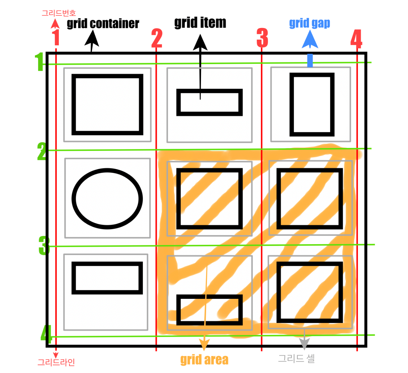
- grid-template-rows : 행의 배치
grid-template-columns : 열의 배치
.container {
	grid-template-columns: 200px 200px 500
    grid-template-columns: 1fr 1fr 1fr
	 grid-template-columns: repeat(3, 1fr)
	 grid-template-columns: 200px 1fr
	 grid-template-columns: 100px 200px auto

	grid-template-rows: 200px 200px 500px;
	 grid-template-rows: 1fr 1fr 1fr
	 grid-template-rows: repeat(3, 1fr)
	 grid-template-rows: 200px 1fr
	 grid-template-rows: 100px 200px auto
}- repeat 함수 : repeat(반복횟수, 반복값)
.container {
	grid-template-columns: repeat(5, 1fr);
	 grid-template-columns: 1fr 1fr 1fr 1fr 1fr
}-
minmax 함수 : 최솟값과 최댓값을 지정
minmax(100px, auto)의 의미는 최소한 100px, 최대는 자동으로(auto) 늘어나게.. 입니다. 즉 아무리 내용의 양이 적더라도 최소한 높이 100px은 확보하고, 내용이 많아 100px이 넘어가면 알아서 늘어나도록 처리해 준 예시이다.
.container {
	grid-template-columns: repeat(3, 1fr);
	grid-template-rows: repeat(3, minmax(100px, auto));
}- row-gap, column-gap, gap: grid셀 간격 설정
.container {
	row-gap: 10px;
	 row의 간격을 10px로
	column-gap: 20px;
	 column의 간격을 20px로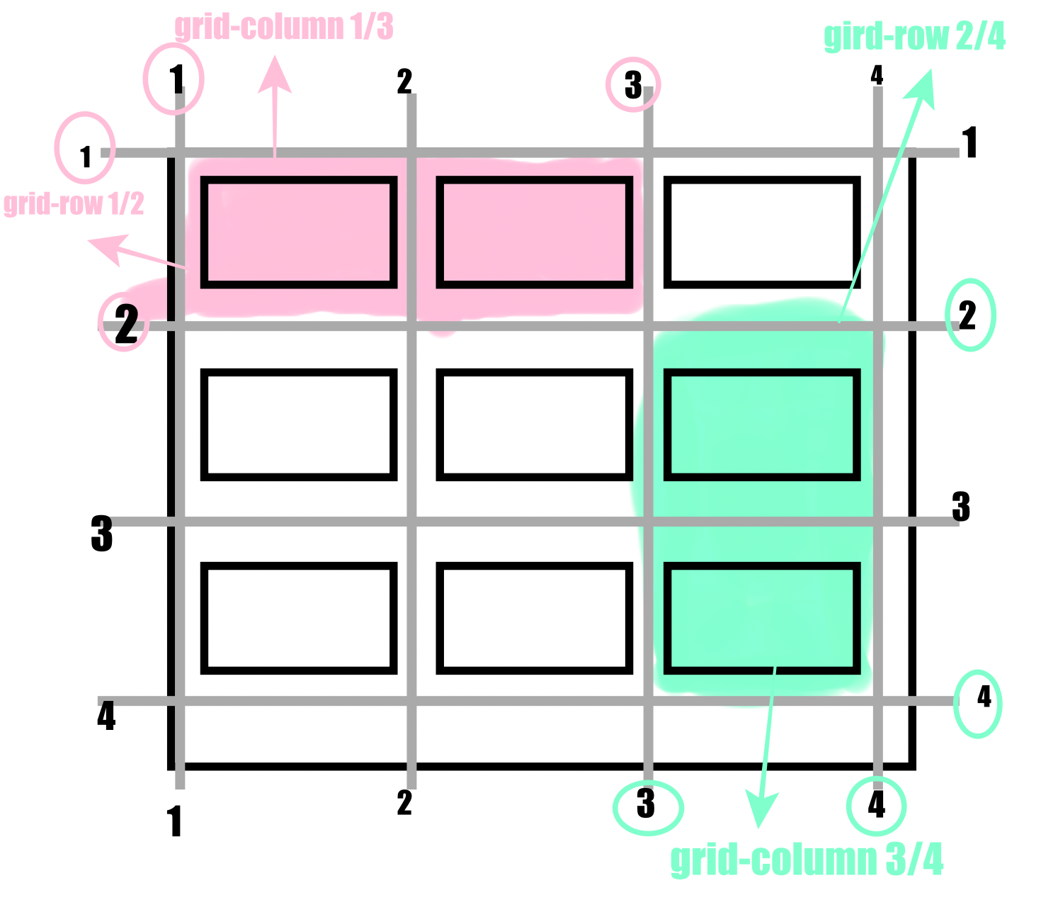
}- grid-column-start
grid-column-end
grid-column
grid-row-start
grid-row-end
grid-row
- align-items : 아이템 세로 방향 정렬
.container {
	align-items: stretch;
	 align-items: start;
	 align-items: center;
	 align-items: end;
}- justify-items : 아이템 가로 방향 정렬
.container {
	justify-items: stretch;
	 justify-items: start;
	 justify-items: center;
	 justify-items: end;
}- align-content : 아이템 그룹 세로 정렬
.container {
	align-content: stretch;
	 align-content: start;
	 align-content: center;
	 align-content: end;
	 align-content: space-between;
	 align-content: space-around;
	 align-content: space-evenly;
}- justify-content : 아이템 그룹 가로 정렬
.container {
	justify-content: stretch;
	 justify-content: start;
	 justify-content: center;
	 justify-content: end;
	 justify-content: space-between;
	 justify-content: space-around;
	 justify-content: space-evenly;
}
손으로 직접 그려가면서 그리다 보니깐 그래도 더 잘 이해가 된다 !!
내일은 예제 문제들도 풀어봐야겠다

뜨내기 FE 개발자