
12일차 과제(220413)
flex 정리하기
flex
컨텐츠를 정렬하거나 공간을 나눌 수 있는 CSS 속성의 집합이다.
블록 레벨 요소의 성질을 가지며, 새로운 display 속성이다.
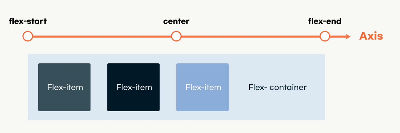
부모를 Flex-container, 영향을 받는 자식들을 Flex-item이라고 부릅니다.
flex는 자신의 직계자식까지만 영향을 준다.-
https://codepen.io/enxaneta/full/adLPwv 눌러보면서 익히기
-
flex-direction
정렬 방향을 결정한다. -
- ✍
.container {
	display: flex;
	flex-direction : row;
    flex-direction : row-reverse;
    flex-direction : column;
    flex-direction : column-reverse;
}
- 💻
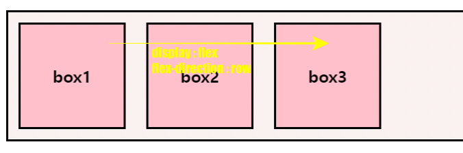
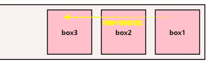
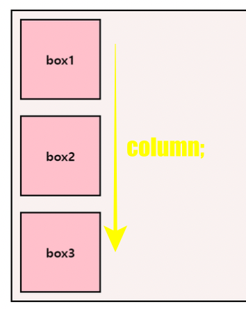
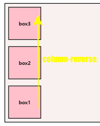
- flex-item들은 기본적으로 Axis를 기준으로 정렬된다.
-
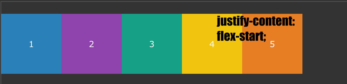
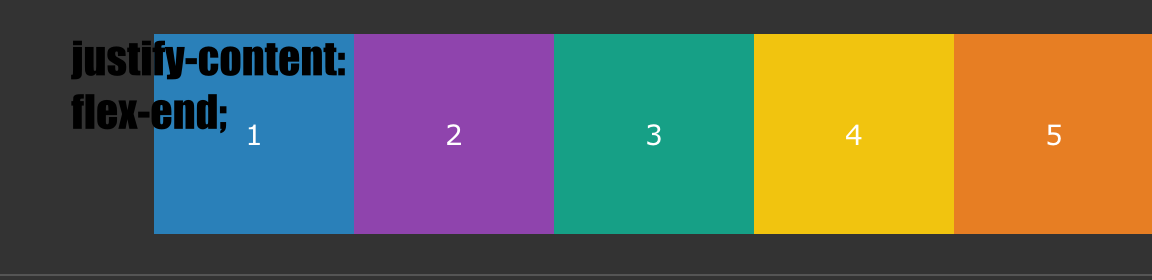
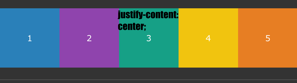
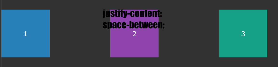
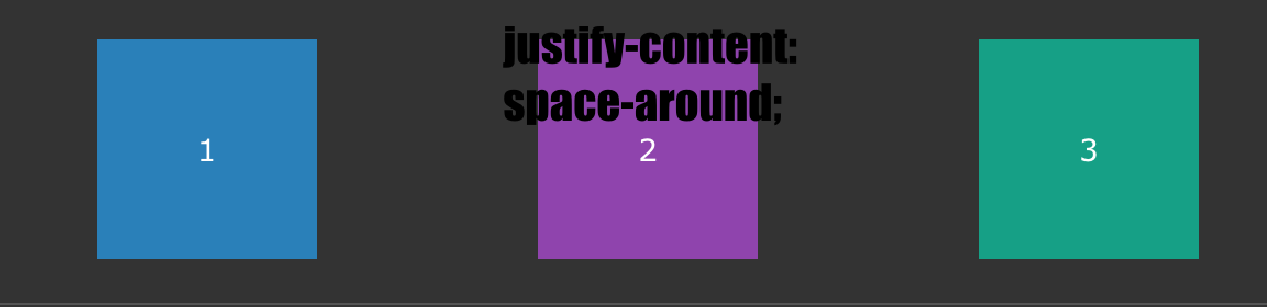
justify-content
수평축을 기준으로 배열의 위치를 조종하거나 아이템 간의 간격을 설정할 수 있다 !
.container {
  display: flex;
  /* justify-content: flex-start; */
  /* justify-content: flex-end; */
	/* justify-content: center; */
  /* justify-content: space-between; */
  /* justify-content: space-around; */
}
-
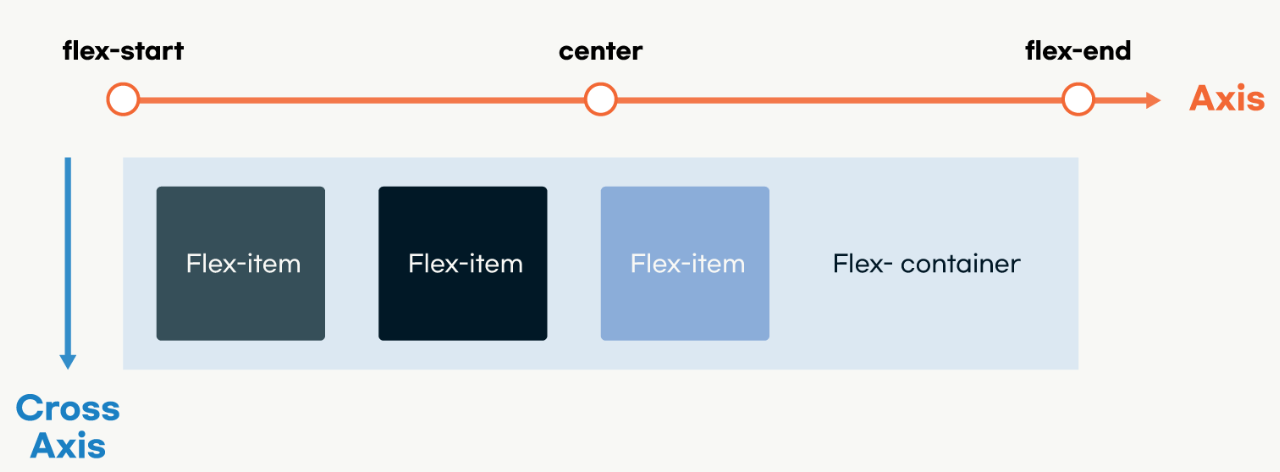
Axis 와 Cross-Axis
	flex에는 axis와 짝을 이루는 cross-axis가 있다.
	axis가 row 상태라면 cross-axis는 column 이고, axis 가 column 이면 cross-axis는 row이다.
-
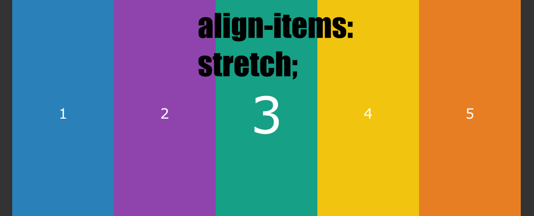
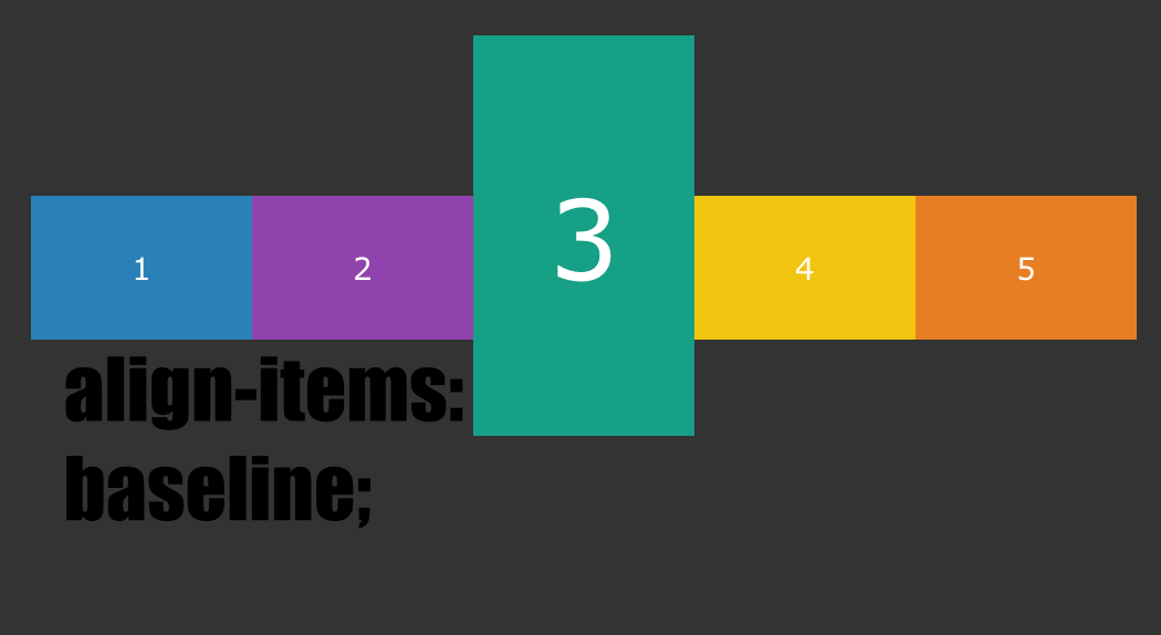
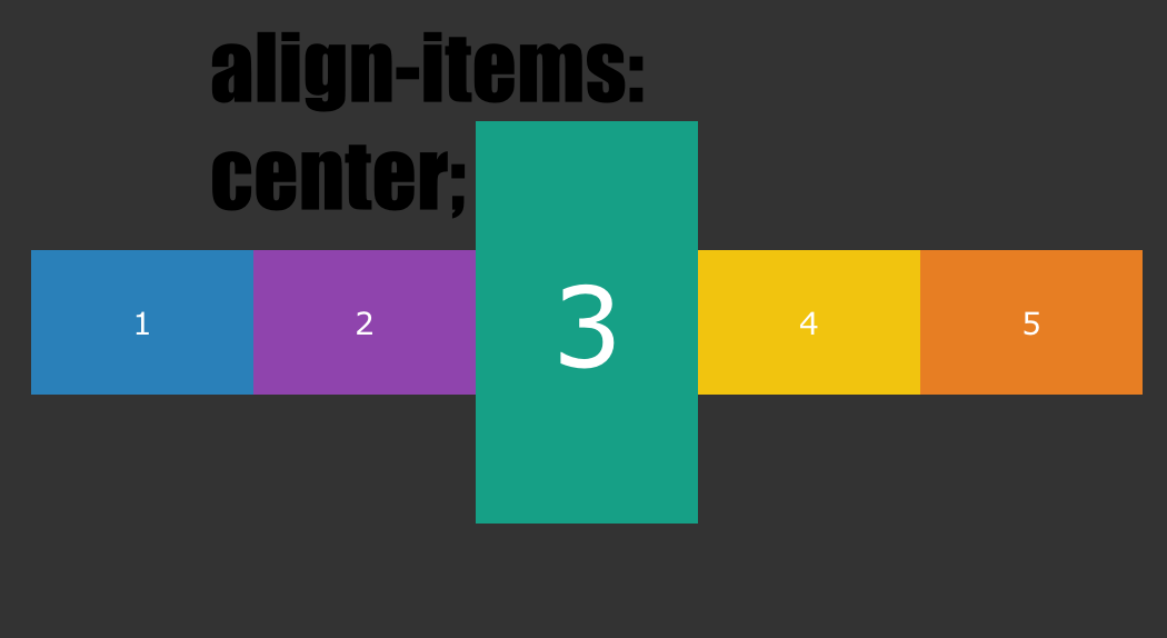
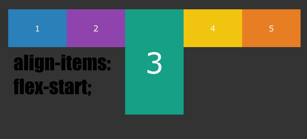
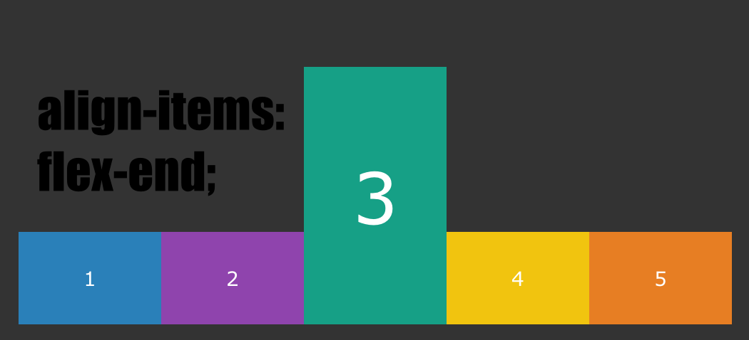
align-items, align-content
	align-items : cross-axis를 기준으로 이동한다.
	align-content : flex-container의 cross-axis 축의 아이템들이 여러 줄일 때 사용 가능, 따라서 두 줄의 flex-wrap:wrap인 상태에서 사용해야 한다.
.container {
  display: flex;
	/* align-items: stretch; (기본값) */
    /* align-items: baseline; */
  /* align-items: center; */
  /* align-items: flex-start; */
  /* align-items: flex-end; */
}
-
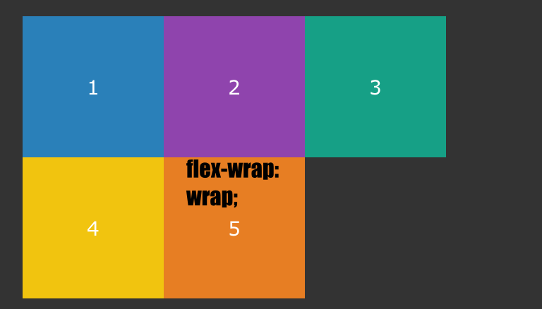
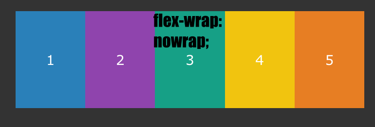
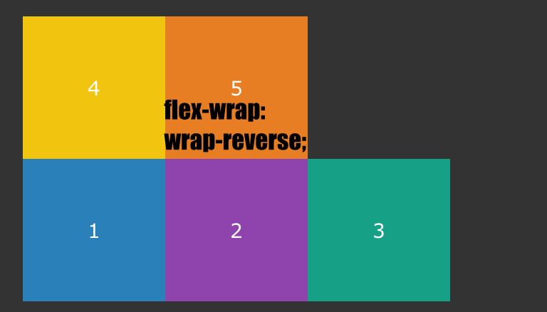
flex-wrap
flex는 자식의 크기가 자신보다 크다고 해서 강제로 조절하지 않습니다. 자식요소를 감싸주는 기능
.container {
  display: flex;
  /* flex-wrap: wrap; */
  /* flex-wrap: nowrap; */
/* flex-wrap: wrap-reverse; */
}
오늘의 꿀팁(?)
-
필수과제는 레파 새로 파서 담기 (readme.md 이쁘게 잘 쓰기)
-
align-items : center; (수직축)
justify-content: center; (수평축)
-
align-items: 1줄일때 사용
align-content: 2줄 이상일때 사용 -
잘 따라가고있다의 척도는 출석!!!!!
포기만 하지 말자 출석은 잘 따라가고있다는 척도이다
‘내가 원하는 게 있으면 그걸 할 수 있는 장소에 가서 그걸 하고 있는 사람들을 직접 만나는 것이다.’
들이는 시간에 비례해서 성장하는 것은 당연하다!!

뜨내기 FE 개발자