A hero section is the area that is immediately shown when the user visits a website. This section of the website should be able to introduce the overall aspects of the website.
Key Factors:
- What does the website offer?
- Why should users trust this website?
- What are the benefits?
- What action should users take next?
Today, I attempted to create an example hero section that was provided in my udemy course. As always, I began by creating all the content elements that will be displayed on the web page using html. I divided all the contents into either header or section in order to differentiate the texts that are used in different components.
Inside the header, I created a nav component where the logo and the navigation tool for the website will be created. Additionally, I created another text component that briefly explains and advertises what the website is for. I also added a button element for some user interaction.
Inside the section, I created another text component that will futher explain features of the website in greater detail. For now, I only added some random text which I will change later after giving some structure to the overall layout.
    // html
    <header>
      <nav>
        <div>LOGO</div>
        <div>NAVIGATION</div>
      </nav>
      <div>
        <h1>A healthy meal delivered to your door, every single day</h1>
        <p>
          The smart 365-days-per-year food subscription that will make you eat
          healthy again. Tailored to your personal tastes and nutritional needs
        </p>
        <a href="#" class="btn">Start eating well</a>
      </div>
    </header>
    <section>
      <div>
        <h2>Some random heading</h2>
        <p>
          Lorem ipsum dolor sit amet consectetur adipisicing elit. Mollitia vel
          nam totam, provident eligendi facilis saepe eum veniam laborum id
          magnam nobis dicta rerum ullam quibusdam officiis autem nesciunt
          dolore?
        </p>
      </div>
    </section>
// css html { font-family: "Rubik", sans-serif; color: #444; }
Although there are some contents displayed on the website, it looks very boring without any colors or layout. Now would be a very good time to add some css effects to the website. For css, I always set all my margin and padding size to 0. I also set box-sizing to border-box. Setting these as default will clear any restrictions when I want to freely size elements.
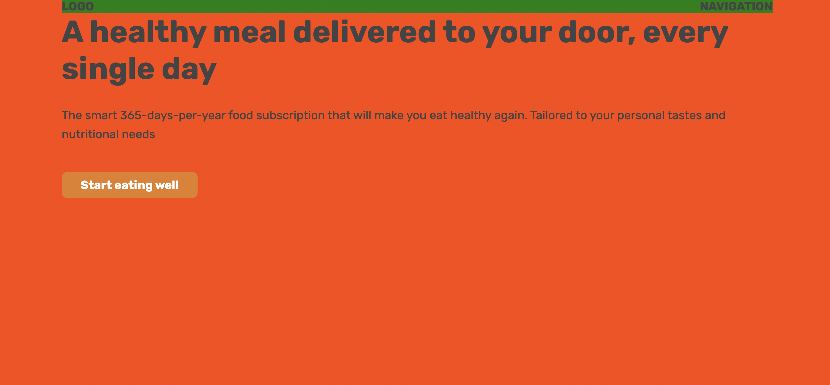
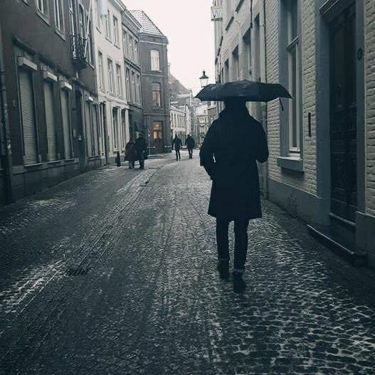
For the entire header section, I gave a random background-color of orange-red to see how much space is occupied. Later, this will be replaced with an image.
I started with the nav element and went all the way down in order. For the navigation bar, I set the display property to flex and gave space between the logo and navigation by setting the justify-content property to space-between. For now, I gave a random background-color of green to the bar to see how much space is occupied.
For the text elements, I quickly adjusted their font-size and line-height while placing them in the appropriate location with margin and padding.
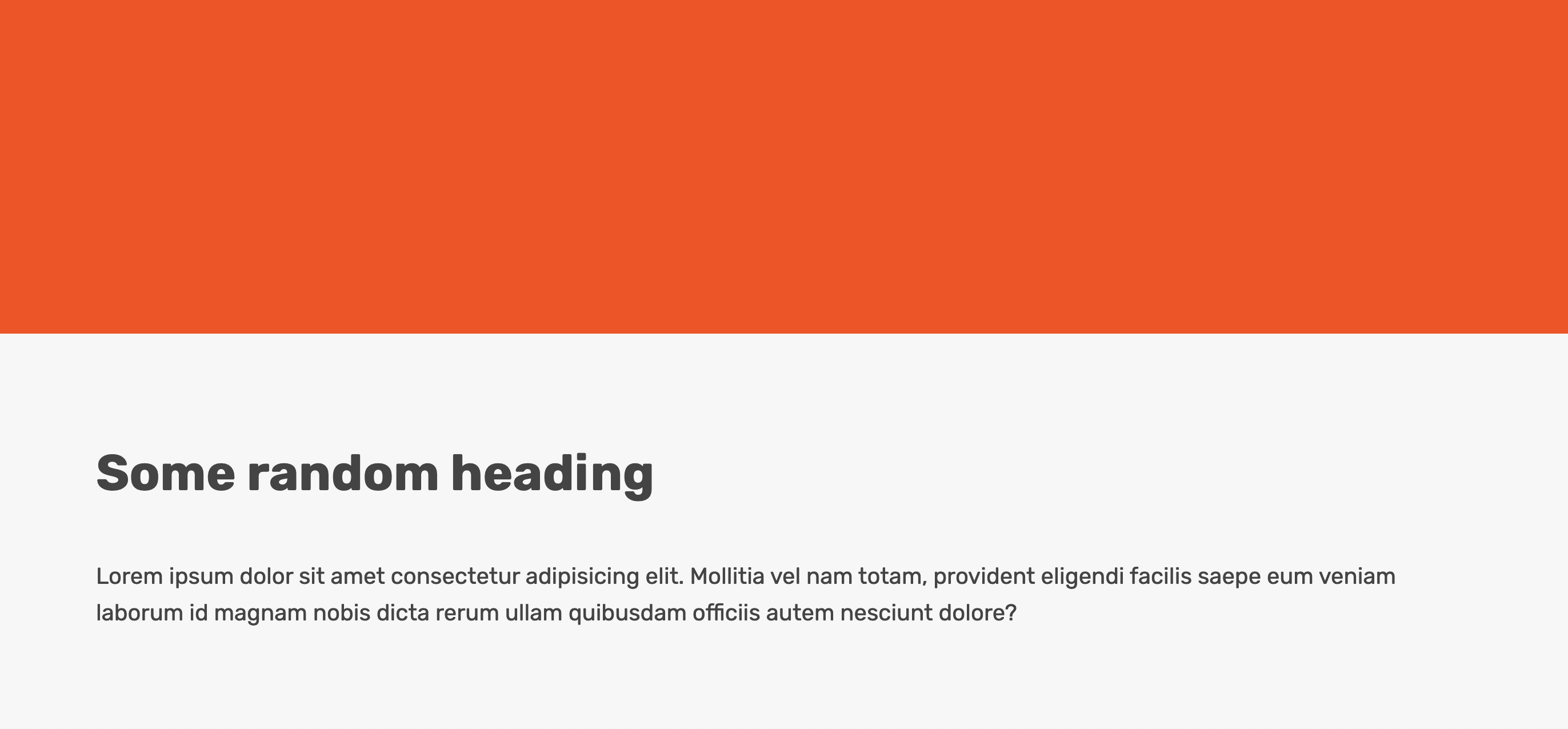
There was no need to give any background-color for the section component.
      // css
      nav {
        font-size: 20px;
        font-weight: 700;
        display: flex;
        justify-content: space-between;
        background-color: green;
      }
      h1 {
        font-size: 52px;
        margin-bottom: 32px;
      }
      p {
        font-size: 20px;
        line-height: 1.6;
        margin-bottom: 48px;
      }
      .btn:link,
      .btn:visited {
        font-size: 20px;
        font-weight: 600;
        background-color: #e67e22;
        color: #fff;
        text-decoration: none;
        display: inline-block;
        padding: 10px 32px;
        border-radius: 9px;
      }
      h2 {
        font-size: 44px;
        margin-bottom: 48px;
      }
      section {
        padding: 96px 0;
        background: #f7f7f7;
      }
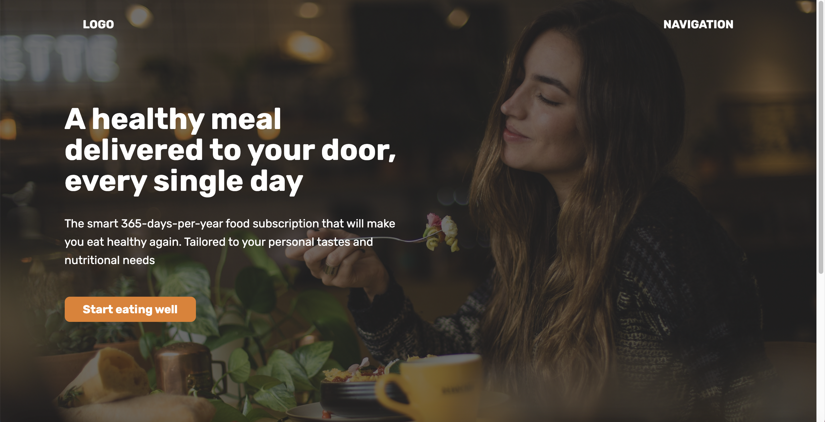
Before moving on, I added an extra div element within the header container and in order to adjust the width of the header text to lean towards the left.
Using absolute positioning, I moved the header text on the center without affecting any other components.
Now its time to get add an image background to the header section and make some final adjustments for sizes. By using a property known as background-image, I was able to instantly apply an image file onto the website. Because the text needed to be readable, I made the image to look darker by adjusting the gradient. Additionally, I used the background-size property and set it to cover. This automatically sets the image to fit the size according to the screen.
With this, the hero section was finally complete! 😀!
      // css
      header {
        height: 100vh;
        position: relative;
        background-image: linear-gradient(
            rgba(34, 34, 34, 0.6),
            rgba(34, 34, 34, 0.6)
          ),
          url(hero.jpg);
        background-size: cover;
        color: #fff;
      }
      .header-container {
        width: 1200px;
        position: absolute;
        left: 50%;
        top: 50%;
        transform: translate(-50%, -50%);
      }
      .header-container-inner {
        width: 50%;
      }
Reference Code
<!DOCTYPE html>
<html lang="en">
  <head>
    <meta charset="UTF-8" />
    <meta http-equiv="X-UA-Compatible" content="IE=edge" />
    <meta name="viewport" content="width=device-width, initial-scale=1.0" />
    <title>Omnifood Hero Section</title>
    <link rel="preconnect" href="https://fonts.gstatic.com" crossorigin />
    <link
      href="https://fonts.googleapis.com/css2?family=Rubik:wght@400;500;700&display=swap"
      rel="stylesheet"
    />
    <style>
      * {
        margin: 0;
        padding: 0;
        box-sizing: border-box;
      }
      html {
        font-family: "Rubik", sans-serif;
        color: #444;
      }
      .container {
        margin: 0 auto;
        width: 1200px;
      }
      header {
        height: 100vh;
        position: relative;
        background-image: linear-gradient(
            rgba(34, 34, 34, 0.6),
            rgba(34, 34, 34, 0.6)
          ),
          url(hero.jpg);
        background-size: cover;
        color: #fff;
      }
      nav {
        font-size: 20px;
        font-weight: 700;
        display: flex;
        justify-content: space-between;
        padding: 32px;
      }
      .header-container {
        width: 1200px;
        position: absolute;
        left: 50%;
        top: 50%;
        transform: translate(-50%, -50%);
      }
      .header-container-inner {
        width: 50%;
      }
      h1 {
        font-size: 52px;
        margin-bottom: 32px;
        line-height: 1.05;
      }
      p {
        font-size: 20px;
        line-height: 1.6;
        margin-bottom: 48px;
      }
      .btn:link,
      .btn:visited {
        font-size: 20px;
        font-weight: 600;
        background-color: #e67e22;
        color: #fff;
        text-decoration: none;
        display: inline-block;
        padding: 10px 32px;
        border-radius: 9px;
      }
      h2 {
        font-size: 44px;
        margin-bottom: 48px;
      }
      section {
        padding: 96px 0;
        background: #f7f7f7;
      }
    </style>
</head>
  <body>
    <header>
      <nav class="container">
        <div>LOGO</div>
        <div>NAVIGATION</div>
      </nav>
      <div class="header-container">
        <div class="header-container-inner">
          <h1>A healthy meal delivered to your door, every single day</h1>
          <p>
            The smart 365-days-per-year food subscription that will make you eat
            healthy again. Tailored to your personal tastes and nutritional
            needs
          </p>
          <a href="#" class="btn">Start eating well</a>
        </div>
      </div>
    </header>
    <section>
      <div class="container">
        <h2>Some random heading</h2>
        <p>
          Lorem ipsum dolor sit amet consectetur adipisicing elit. Mollitia vel
          nam totam, provident eligendi facilis saepe eum veniam laborum id
          magnam nobis dicta rerum ullam quibusdam officiis autem nesciunt
          dolore?
        </p>
      </div>
    </section>
  </body>
</html>
21개의 댓글

What a fantabulous post this has been. Never seen this kind of useful post. I am grateful to you and expect more number of posts like these. Thank you very much. افضل موقع زيادة متابعين
Wow, this is really interesting reading. I am glad I found this and got to read it. Great job on this content. I like it. hagia sophia visiting hours
This is definitely the knowledge We are acquiring all over the place. Cheers for ones web site, I merely join your blog. This is the wonderful web site. . Comment fidéliser ses clients B2B ?
I have read your article, it is very informative and helpful for me.I admire the valuable information you offer in your articles. Thanks for posting it.. https://www.ini188pp.com/

Continue the nice function, We study couple of articles about this web site as well as I believe that the internet weblog is actually actual fascinating and it has obtained arenas associated with wonderful info. https://thebeerstore.co.za/

I did experience checking articles or reviews shared here. They are simply exceptional there are a large amount of advantageous knowledge. https://waxedbranding.co.za/
You there, this is really good post here. Thanks for taking the time to post such valuable information. Quality content is what always gets the visitors coming. 급전대출
I just couldn't leave your website before telling you that I truly enjoyed the top quality info you present to your visitors? Will be back again frequently to check up on new posts. agen toto
This is my first time i visit here and I found so many interesting stuff in your blog especially it's discussion, thank you. best prop firm passing service
This is such a great resource that you are providing and you give it away for free. I love seeing blog that understand the value of providing a quality resource for free. pasar bola
I have recently started a blog, the info you provide on this site has helped me greatly. Thanks for all of your time & work. Satta chart
Please continue this great work and I look forward to more of your awesome blog posts. Content Creation Lawyers

I got what you mean , thanks for posting .Woh I am happy to find this website through마사지제주도유흥Kvtotositus toto slotslot gacor

I’ve been searching for some decent stuff on the subject and haven't had any luck up until this point, You just got a new biggest fan!.. compound-crypto.org
hi was just seeing if you minded a comment. i like your website and the thme you picked is super. I will be back. mexc-exchange.org
You make so many great points here that I read your article a couple of times. Your views are in accordance with my own for the most part. This is great content for your readers.miototoolxtoto loginpaito macautogel onlineolxtoto slotkoi toto
You make so many great points here that I read your article a couple of times. Your views are in accordance with my own for the most part. This is great content for your readers.miototoolxtoto loginpaito macautogel onlineolxtoto slotkoi toto
nice post, keep up with this interesting work. It really is good to know that this topic is being covered also on this web site so cheers for taking time to discuss thisSkrotbilarna GöteborgBlanca Citysshh.uk.comdata toto macaurtp olxtoto
Hi there! Nice post! Please tell us when I will see a follow uptuning duster[http://autogrande.ro/](togel online)[https://bigredpedaltours.com/book/](toto macau)[https://infobiomed.org/](bandar togel)[https://www.spartanhack.com/]
Wow, this is really interesting reading. I am glad I found this and got to read it. Great job on this content. I like it. fototapety 3d