저번주에 공부한 Pandas, 그리고 이번주에 공부한 Matplotlib과 Seaborn을 이용하여 여러 시각 자료를 생성해보았다.
데이터는 titanic과 관련된 csv로, 아래와 같은 정보가 저장되어있는 dataframe을 사용하였다.
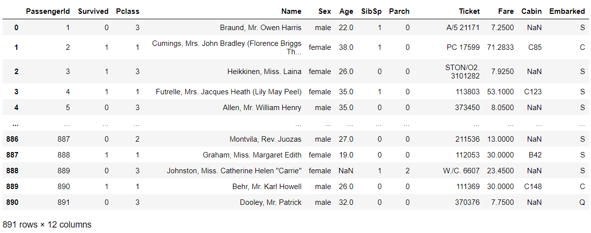
import pandas as pd
titanic_df = pd.read_csv("train.csv")
1. Pclass 별 탑승객 수 파악하기
p = titanic_df.groupby('Pclass')['PassengerId']

plt.figure()
plt.bar(['1','2','3'], p.count())
plt.xlabel('Pclass')

plt.show()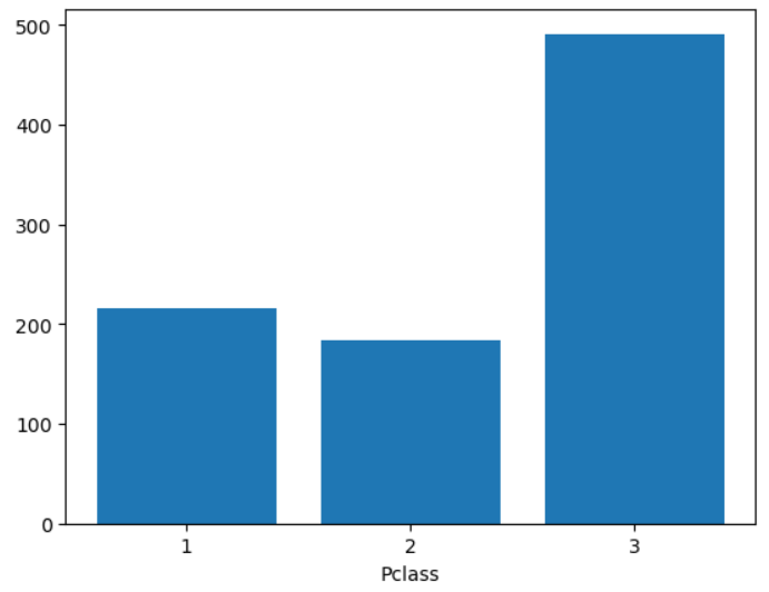
2. 탑승객의 나이대 분석하기
def categorized_age(age) :
    res = (age // 10) * 10
    if res > 60 :
        return 60
    return res

age_df = titanic_df['Age'].apply(categorized_age)
titanic_df.insert(0, 'Cat_age', age_df)
age_count = titanic_df.groupby('Cat_age')['PassengerId'].count()

plt.figure()

plt.pie(age_count, labels = age_count.index.astype(int), autopct = '%.1f%%', counterclock = False, startangle = 90)

plt.show()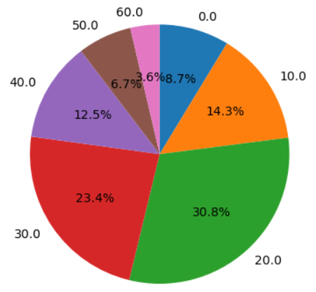
3. 탑승객의 성비 비교하기
df = titanic_df.groupby(['Sex'])['PassengerId'].count()

plt.figure()
plt.pie(df, labels = df.index, autopct = '%.1f%%')

plt.show()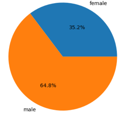

성장 중독 | 서버, 데이터, 정보 보안을 공부합니다.