styled-components React 스타일 적용하기 (1)
styled-components 기본 설치와 예제는 위 링크부터.
5. animation
animation을 주는 방법은, helper function을 먼저 import해주기.
import styled, {keyframes} from "styled-components";
const rotateAnimation = keyframes`
0% {
transform: rotate(0deg);
border-radius: 0px;
}
50% {
border-radius: 100px;
transform: rotate(360deg);
}
100% {
border-radius: 0px;
}
`
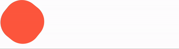
const Box = styled.div`
height: 200px;
width: 200px;
background-color: tomato;
animation: ${rotateAnimation} 1s linear infinite;
`
function App() {
return (
<>
<Box/>
</>
)
}
export default App;
결과, 기존css그대로인데 다른점은 js문자열 보간을 ${} 사용한다는 것.
6. Pseudo Selectors
styled compnent 안에 있지 않은 태그도 컴포넌트 스타일안에 써줄 수 있다.
한 컴포넌트만 styled해주고, 다른 element는 그냥 target해줄 수 있다.
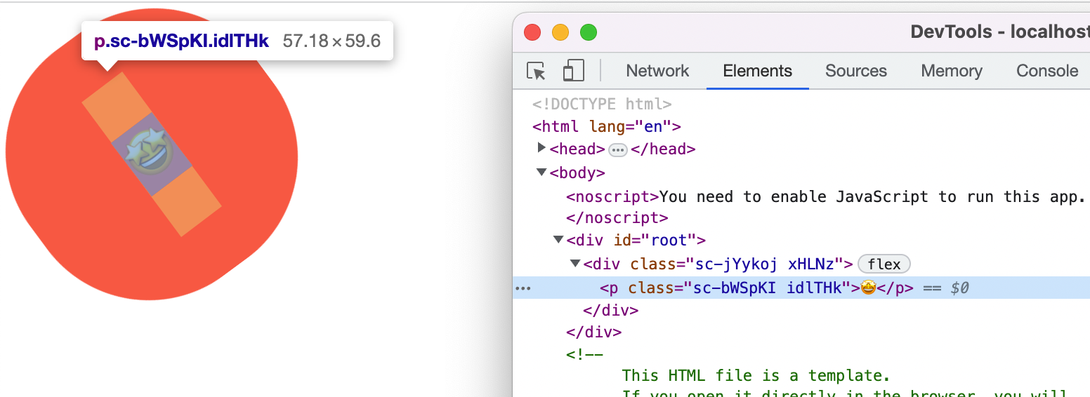
const Box = styled.div`
  height: 200px;
  width: 200px;
  background-color: tomato;
  display: flex;
  justify-content: center;
  align-items: center;
  animation: ${rotateAnimation} 1s linear infinite;
  span {
    font-size: 36px;
    &:hover {
      font-size: 50px;
    }
    &:active {
      opacity: 0;
    }
  }
`
function App() {
  return (
    <>
      <Box>
        <span>🤩</span>
      </Box>
    </>
  )
}
위와 같이 Box안에 span을 target해주고 있다.
모든게 다 컴포넌트일 필요 없고, 컴포넌트안에서 element를 선택할 수 있다.

(2) Styled component selector
타겟 지정하는 방식.
const Emoji = styled.span`
  font-size: 36px;
`
onst Box = styled.div`
  height: 200px;
  width: 200px;
  background-color: tomato;
  display: flex;
  justify-content: center;
  align-items: center;
  animation: ${rotateAnimation} 1s linear infinite;
  ${Emoji} {
    &:hover {
      font-size: 90px;
    }
  }
`

function App() {
  return (
    <>
      <Box>
        <Emoji as="p">🤩</Emoji>
      </Box>
    </>
  )
}
Emoji컴포넌트를 따로 생성해주고, Box컴포넌트 안에 Emoji를 직접적으로
${Emoji} 타겟팅 해준다.
이처럼 태그대신 컴포넌트를 지목하면, as="" 를 써서 태그를 자유롭게 바꿀 수 있다.
결과, span에서 p태그로 바뀐 것을 볼 수 있다.
7. Themes
컴포넌트의 색을 일일이 바꾸지 않고, 바꾸고 싶은 해당object만 변경이 가능하다.
먼저, index.js로 가서 ThemeProvider를 import해야한다.
App을 ThemeProvider로 감싸준다.
//index.js
import React from 'react';
import ReactDOM from 'react-dom/client';
import App from './App';
import { ThemeProvider } from "styled-components";

const root = ReactDOM.createRoot(document.getElementById('root'));

const darkTheme = {
  textColor:"whitesmoke",
  backgroundColor: "#111"
}

const lightTheme = {
  textColor:"#111",
  backgroundColor: "whitesmoke"
}
root.render(
  <React.StrictMode>
    <ThemeProvider theme={darkTheme}>
      <App />
    </ThemeProvider>
  </React.StrictMode>
);
ThemeProvider는 props theme={} 가 필요,
라이트모드, 다크모드 사용할 스타일을 정의해준다.
//App.js
import styled from "styled-components";

const Title = styled.h1`
  color: ${props => props.theme.textColor};
`
const Wrapper = styled.div`
  width: 100vw;
  height: 100vh;
  background-color: ${props => props.theme.backgroundColor};
`

function App() {
  return (
    <Wrapper>
      <Title>Hello</Title>
    </Wrapper>
  )
}

export default App;
App.js로 돌아와서,
props를 사용하여 Wrapper, Title에 (index.js에서) 설정한 스타일 프로퍼티 이름 넣어주기.
결과, darkTheme에 설정해준 스타일 다크모드가 나왔다.
property들의 이름은 꼭 같아야 한다. 위 textColor, backgroundColor처럼!
theme={lightTheme} 로 변경해주면,
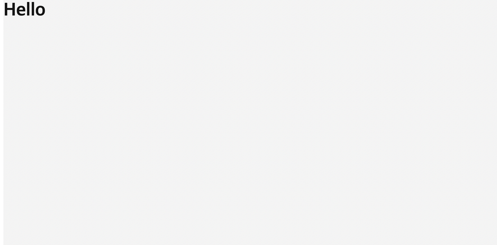
라이트모드로 바로 변경할 수 있다.
컴포넌트를 변경하지 않고도, 코드하나만으로 아주 간단히 말이다. 굿뜨
여기까지 styled-components 이론은 끗!