
📌 먼저 Button 내부 코드를 보자
@Composable
fun Button(
    onClick: () -> Unit,
    modifier: Modifier = Modifier,
    enabled: Boolean = true,
    shape: Shape = ButtonDefaults.shape,
    colors: ButtonColors = ButtonDefaults.buttonColors(),
    elevation: ButtonElevation? = ButtonDefaults.buttonElevation(),
    border: BorderStroke? = null,
    contentPadding: PaddingValues = ButtonDefaults.ContentPadding,
    interactionSource: MutableInteractionSource = remember { MutableInteractionSource() },
    content: @Composable RowScope.() -> Unit
) {
    val containerColor = colors.containerColor(enabled).value
    val contentColor = colors.contentColor(enabled).value
    val shadowElevation = elevation?.shadowElevation(enabled, interactionSource)?.value ?: 0.dp
    val tonalElevation = elevation?.tonalElevation(enabled, interactionSource)?.value ?: 0.dp
    Surface(
        onClick = onClick,
        modifier = modifier.semantics { role = Role.Button },
        enabled = enabled,
        shape = shape,
        color = containerColor,
        contentColor = contentColor,
        tonalElevation = tonalElevation,
        shadowElevation = shadowElevation,
        border = border,
        interactionSource = interactionSource
    ) {
        CompositionLocalProvider(LocalContentColor provides contentColor) {
            ProvideTextStyle(value = MaterialTheme.typography.labelLarge) {
                Row(
                    Modifier
                        .defaultMinSize(
                            minWidth = ButtonDefaults.MinWidth,
                            minHeight = ButtonDefaults.MinHeight
                        )
                        .padding(contentPadding),
                    horizontalArrangement = Arrangement.Center,
                    verticalAlignment = Alignment.CenterVertically,
                    content = content
                )
            }
        }
    }
}
안드로이드 컴포즈 버튼은 위와같은 형식으로 되어있습니다.
버튼을 커스텀하여 나만의 버튼으로 컴포넌트화 하고 싶다면 적절히 바꾸면 될 것입니다.
이번에는 리플 색상을 바꾸는 것이기 때문에 onClick, modifier, shape, content를 가지고 커스텀을 진행해보겠습니다.
추가적으로 버튼 색상을 구성할 buttonColor라는 파라미터를 직접 넣었습니다.
- 리플 색상을 바꾸기 위해서는 interactionSource를 정의해줘야 합니다.
- isPressed변수로 버튼이 눌렸는지 상태를 받아와 색상 분기를 태워줄 것입니다.
- bgColor변수는 코드의 재사용성을 높이기 위해 각 RGB값 * 0.96을 통해 원래 색상보다 살짝 연한 색으로 리플색을 변경했습니다.
- content 파라미터를 SlotApi로 받아 내부 UI를 외부에서 선언할 수 있게 하였습니다.
🔎 코드 :
@Composable
fun ClickableButton(
onClick: () -> Unit,
modifier: Modifier = Modifier,
shape: Shape = ButtonDefaults.shape,
buttonColor: Color = PrimaryColor,
content: @Composable RowScope.() -> Unit
) {
val interactionSource = remember { MutableInteractionSource() }
val isPressed by interactionSource.collectIsPressedAsState()
val bgColor = if (isPressed) buttonColor.copy(
red = buttonColor.red * 0.96f,
blue = buttonColor.blue * 0.96f,
green = buttonColor.green * 0.96f
) else buttonColor
Button(
onClick = onClick,
modifier = modifier,
shape = shape,
colors = ButtonDefaults.buttonColors(bgColor),
interactionSource = interactionSource,
) {
content()
}
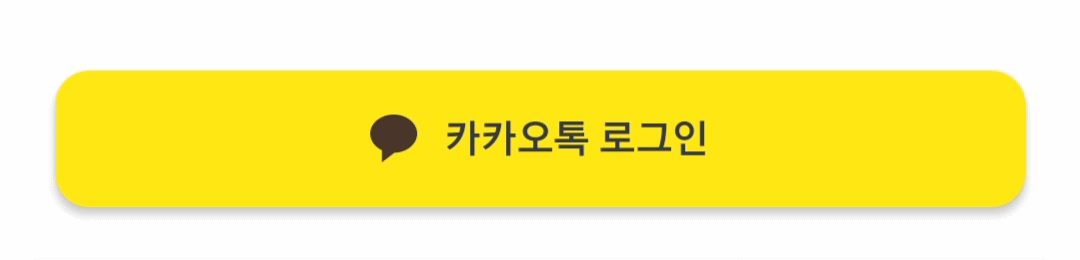
}📍 위 컴포저블을 이용하여 카카오톡 로그인 버튼을 만들어 보았습니다.
@Composable
fun KakaoLoginButton(
    modifier : Modifier = Modifier
) {
    ClickableButton(
        onClick = { /* TODO 로그인 구현 */ },
        modifier = Modifier
            .fillMaxWidth()
            .height(40.sdp)
            .shadow(2.sdp, shape = RoundedCornerShape(10.sdp)),
        shape = RoundedCornerShape(10.sdp),
        buttonColor = KakaoColor
    ) {
        Row(
            modifier = Modifier
                .wrapContentWidth(),
            verticalAlignment = Alignment.CenterVertically
        ) {
            Image(
                painter = painterResource(id = R.drawable.ic_kakao),
                contentDescription = null
            )
            Spacer(modifier.width(8.sdp))
            Text(
                text = "카카오톡 로그인",
                fontSize = 12.ssp,
                color = BlackColor
            )
        }
    }
}

Android Developer