
1. position 보충
- relative: 자기가 있어야 했던 위치 기준
- absolute: static이 아닌 가장 가까운 부모 기준 , body 제외 부모가 없으면 제자리에 뜬다.
- sticky: position: -webkit-sticky; 써줘야 사파리에서 사용가능, 웨일에서는 아직 지원하지 않는 것 같다. 최신 속성이라 한다.
2. float
parents 가 float된 child를 인식하지 못하게 된다.
elements에 float속성을 주게되면 크기값이 사라진다.
형제 level에서 clear를 사용하면 float를 인지하게 된다.
부모가 float를 인지하게 하는법
- display: inline-block;
- overflow: hidden;
- clear fix
selector::after {
display: block;
content: "";
clear:both;
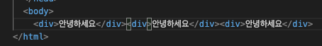
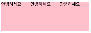
}float 실습 : 네이버 로그인창 만들기
원본

최대한 비슷하게 하려 개발자 도구로 분석하여 만들었습니다. 로그인 버튼 글씨의 정렬이 좀 아쉽다고 생각하였습니다.
해결방법 : vertical-align
3. display:
inline-block
수평정렬 가능
줄바꿈을 하면 약간의 마진, 패딩도 아닌 여백을 가지고 있어 잘 쓰이지 않는다.

해결방법 1: 줄바꿈을 하지않고 일자로 쓴다.
해결방법 2: parents의 font-size를 0으로 바꾼다.
flex
- 컨텐츠를 정렬하거나 공간을 나눌수 있는 CSS 속성의 집합이다.
- Block 레벨 요소의 성질을 가지며 주로 부모의 속성을 통해 자식들을 컨트롤 한다.
- 부모를 Flex-container, 자식들을 Flex-item 이라고 한다.
- flex-container는 직계자식까지만 영향을 미친다.
flex-direction 속성
아이템 정렬 순서를 정해준다.
/* The direction text is laid out in a line */
flex-direction: row;

/* Like <row>, but reversed */
flex-direction: row-reverse;

/* The direction in which lines of text are stacked */
flex-direction: column;

/* Like <column>, but reversed */
flex-direction: column-reverse;

/* Global values */
flex-direction: inherit;
flex-direction: initial;
flex-direction: revert;
flex-direction: unset;justify-content 속성
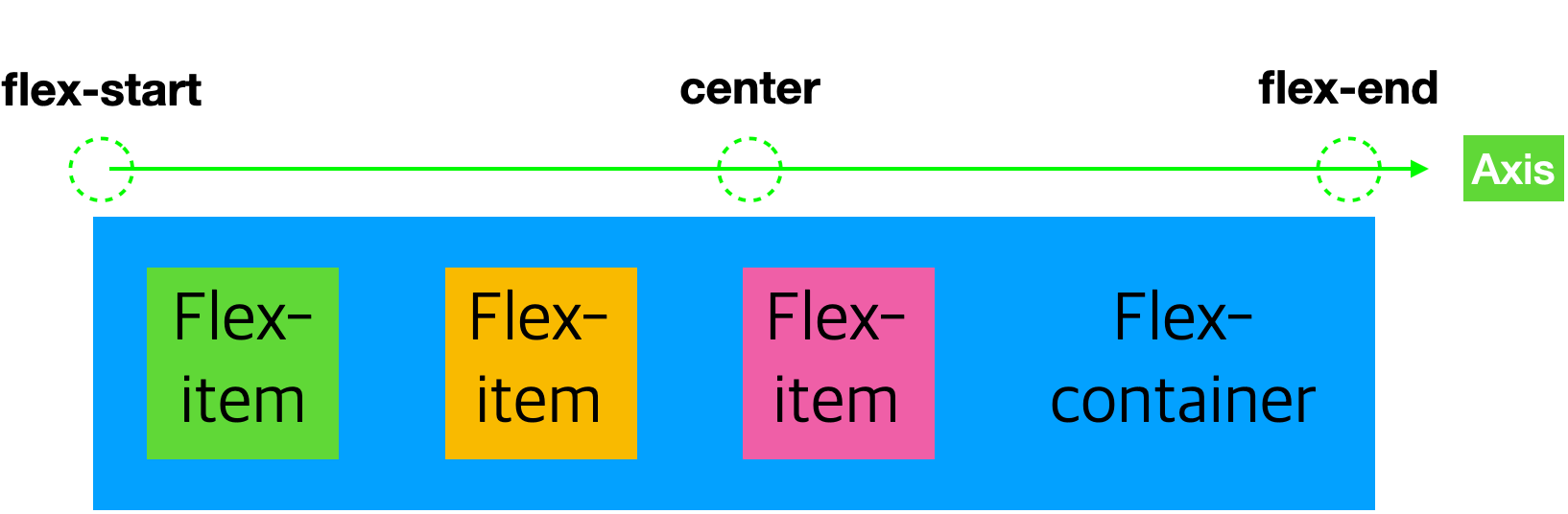
axis(축)를 기준으로 배열의 위치를 조종하거나 아이템 간의 간격을 설정할 수 있다.
/* Positional alignment */
justify-content: center;     /* Pack items around the center */
justify-content: start;      /* Pack items from the start */
justify-content: end;        /* Pack items from the end */
justify-content: flex-start; /* Pack flex items from the start */
justify-content: flex-end;   /* Pack flex items from the end */
justify-content: left;       /* Pack items from the left */
justify-content: right;      /* Pack items from the right */

/* Baseline alignment */
/* justify-content does not take baseline values */

/* Normal alignment */
justify-content: normal;

/* Distributed alignment */
justify-content: space-between; /* Distribute items evenly
                                   The first item is flush with the start,
                                   the last is flush with the end */
justify-content: space-around;  /* Distribute items evenly
                                   Items have a half-size space
                                   on either end */
justify-content: space-evenly;  /* Distribute items evenly
                                   Items have equal space around them */
justify-content: stretch;       /* Distribute items evenly
                                   Stretch 'auto'-sized items to fit
                                   the container */

/* Overflow alignment */
justify-content: safe center;
justify-content: unsafe center;

/* Global values */
justify-content: inherit;
justify-content: initial;
justify-content: revert;
justify-content: unset;4. 기타
떠있다는 표현의 이해를 위한 그림

수평 중앙, 수직 중앙 정렬 하는법
수직 중앙 정렬
- 전체의 높이의 반만큼 요소 top에 50%의 마진을 준다.
- 요소의 높이의 50%만큼 올리기위해 transform:translateY(-50%)를 사용한다.
수평 중앙 정렬
- 전체의 높이의 반만큼 요소 left에 50%의 마진을 준다.
- 요소의 높이의 50%만큼 올리기위해 transform:translateX(-50%)를 사용한다.
