
멋쟁이 사자처럼 프론트엔드스쿨 4일차 수업내용 복습하기, CSS를 더 깊이 배우니 지금까지 구글링으로 내가 원하던 기능만 찾아서 하는 것은 아무것도 아니라고 생각된다. 저번에 만든 싸이월드도 CSS수업 후에 다시한번 만들어 봐야 겠다.
1. border
.c1 {
        border: 1px solid red;
      }

      .c2 {
        border: thick solid green;
      }

      .c3 {
        border: thin dotted blue;
      }

      .c4 {
        border: 3px dashed black;
      }
결과
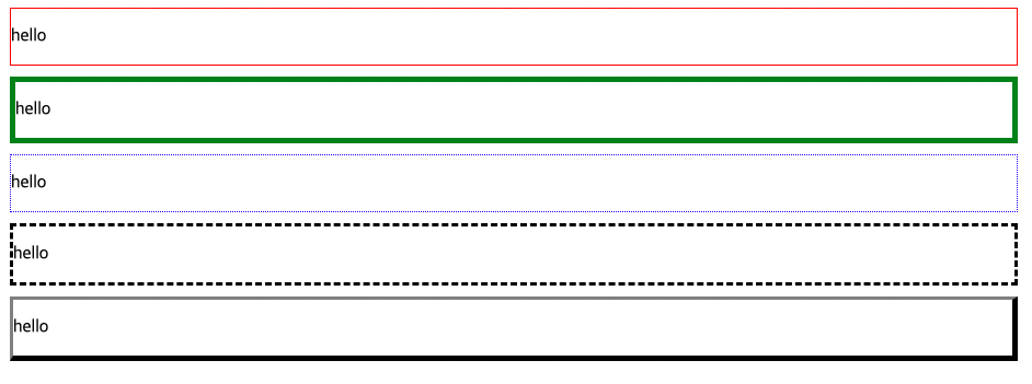
순서대로 굵기, 종류, 색을 집어 넣는다. border-top,border-left등 각개 방향 다른 설정도 가능하다. border-radius 속성으로 각 테두리에 곡률을 줄수도 있으며 border-top-right-radius등 각 테두리도 따로 설정 가능하다.
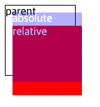
2. position
CSS position 속성은 문서 상에 요소를 배치하는 방법을 지정한다. top, right, bottom, left 속성이 요소를 배치할 최종 위치를 결정한다.
static
요소를 일반적인 문서 흐름(default) 에 따라 배치합니다. top 등의 값이 영향을 주지 않는다.
relative
요소를 일반적인 문서 흐름에 따라 배치하고, 자기자신을 기준(자기자신의 원래 위치)으로 top, left, bottom, right 에 따라 오프셋을 적용한다.
absolute
요소를 일반적인 문서흐름에서 제거하고 레이아웃에 공간도 배정하지 않는다. 대신 가장 가까운 위치 지정 parent에 대해 상대적으로 배치한다.
fixed
요소를 일반적인 문서 흐름에서 제거하고 레이아웃 공간도 배정하지 않는다. 대신 뷰포트의 초기 컨테이닝 블록을 기준으로 삼아 배치된다.(웹 페이지 네비게이션이 사용자의 뷰에 따라 없어지지 않고 계속 따라오는 상태)
sticky
fixed와 비슷하지만 일정부분에서는 고정된 위치를 가지고 주어진 경계선을 지나면 고정 위치를 가지게 된다.
3. animation 맛보기
div를 버튼처럼 만들어 hover를 이용하여 마우스가 올라갔을때 div가 움직일수 있도록 하는 법을 배웠다. 오늘은 맛보기라서 간단한 속성밖에 듣지 못했다.
      .one {
        height: 100px;
        width: 200px;
        box-sizing: border-box;
        background-color: chocolate;
        border: solid 5px darkgoldenrod;
        border-radius: 40px;
        text-align: center;
        line-height: 80px;
        color: white;
        font-size: 28px;
        transition: all 1s;
      }
      .one:hover {
        background-color: teal;
        transform: rotate(720deg) scale(1.2);
      }
      .two {
        height: 100px;
        width: 200px;
        box-sizing: border-box;
        background-color: chocolate;
        border: solid 5px darkgoldenrod;
        border-radius: 40px;
        text-align: center;
        line-height: 80px;
        color: white;
        font-size: 28px;
        transition: all 1s;
      }

      .two:hover {
        background-color: teal;
        transform: translate(100px, 200px);
      }
    </style>
1. transition: all 1s;
/* Apply to 1 property */
/* property name | duration */
transition: margin-left 4s;

/* property name | duration | delay */
transition: margin-left 4s 1s;

/* property name | duration | timing function | delay */
transition: margin-left 4s ease-in-out 1s;

/* Apply to 2 properties */
transition: margin-left 4s, color 1s;

/* Apply to all changed properties */
transition: all 0.5s ease-out;
어떤 변화들이 몇초에 걸쳐서 변화할지 정하는 속성인 transition
2. transform: rotate(720deg) scale(1.2);
one 클래스의 hover에는 720도 돌아가고 크기가 1.2배가 되는 rotate와 scale 속성을 사용하였다.

3. transform: translate(100px, 200px);
two 클래스의 hover에는 x좌표 100px , y좌표 200px을 움직이게 하는 translate 속성을 사용하였다.

4. 과제 : 나만의 캐릭터만들기
처음엔 기린을 만들려고 했는데 점점 쥐같아 져서 쥐로 바꿨다. border, border-radius,rotate, position 등의 배운내용을 가지고 실습하였다.

