
👀 컴포저블의 다양한 조작은 수정자로부터
Modifier 동작
- 컴포저블의 크기, 레이아웃, 동작, 모양 변경
- 접근성 라벨과 같은 정보 추가
- 사용자 입력 처리
- 요소를 클릭 가능, 스크롤 가능, 드래그 가능 또는 확대/축소 가능하게 만드는 것과 같은 높은 수준의 상호작용 추가
- 👉🏻 수정자 안드로이드 공식 문서
- 👉 수정자 메소드 리스트
- 최소 높이 지정
modifier
     .fillMaxWidth()
     .heightIn(min = 56.dp)
🔮 Material Surface
- 색상이 테마에 의해 설정되게 만들어줌
- shape 로 모양 설정 가능함
개발 예시에서 이해한 부분
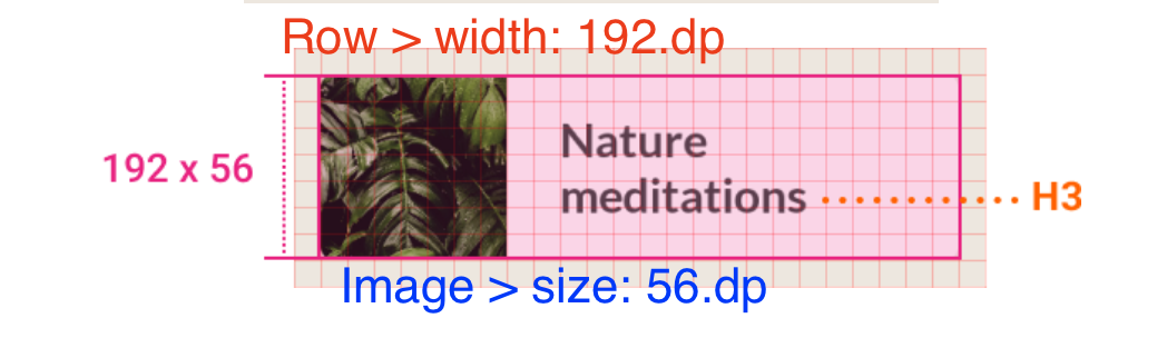
- 192x56 로 요구 시
- 부모(Row)의 넓이를 192로 설정
- 자식(Image)의 사이즈를 56로 설정
- 전체적인 넓이를 설정하고 하위 자식 뷰에서 높이를 설정하면 높이는 자동 설정
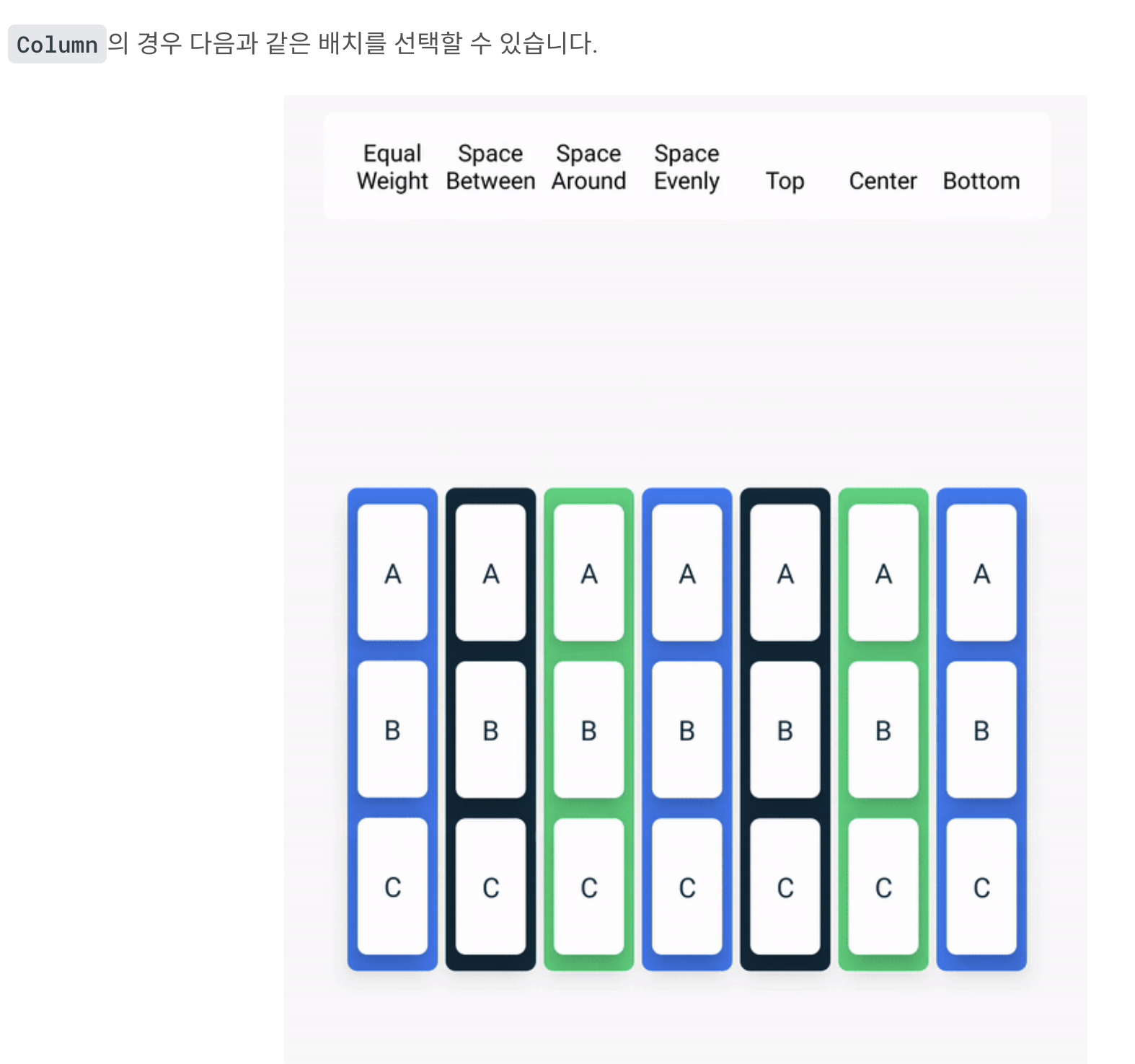
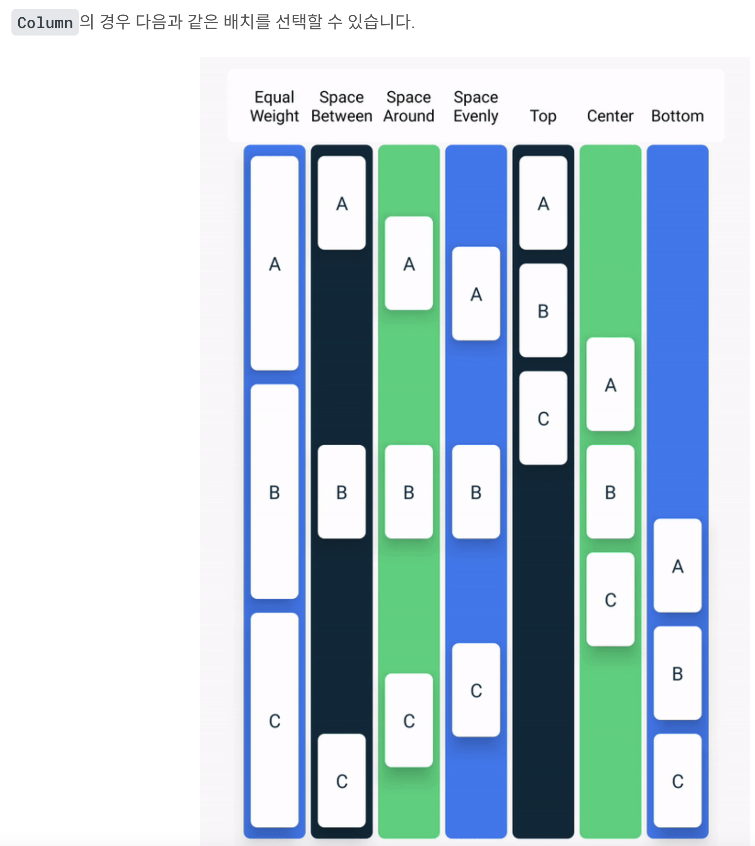
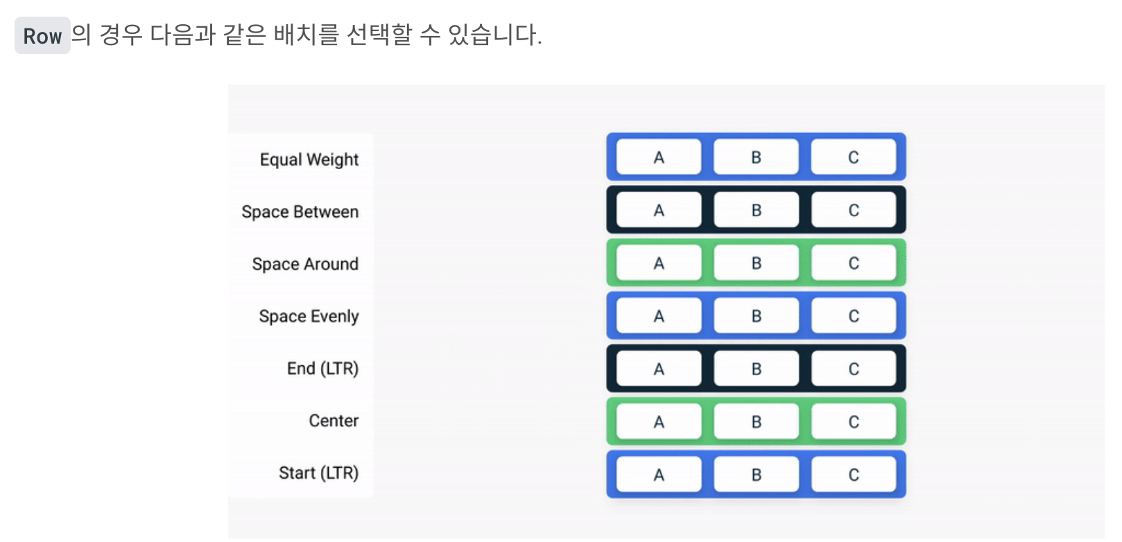
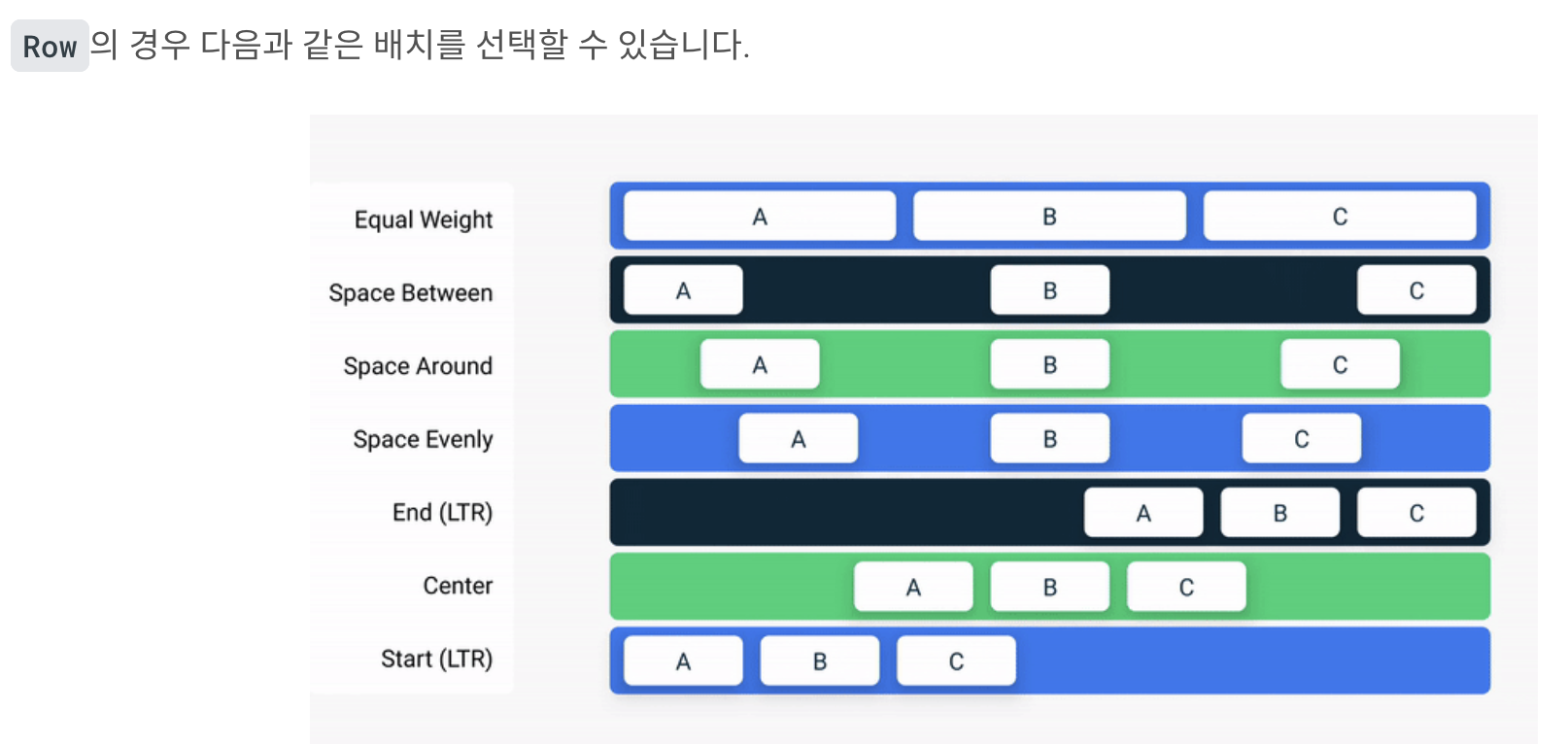
👆 본문 행 정렬 - 배치
Column
- 세로로 정렬
- 교차축은 가로축
- Arrangement
Row
- 가로로 정렬
- 교차축은 세로축
- Arrangement
개발 예시에서 이해한 부분
Arragement.spacedBy()
- RecyclerView의 ItemDecoration과 비슷하게 일정 간격을 설정할 때
PaddingVlaues(horizontal = 16.dp)
- 🛑 스크롤 시 경계에서 콘텐츠가 잘릴 수 있음
- 🟢 스크롤 시 경계 내에서 콘텐츠를 자르지 않게 설정
즐겨찾는 컬렉션 그리드 - Lazy 그리드
@Composable
fun FavoriteCollectionsGrid(
   modifier: Modifier = Modifier
) {
   LazyHorizontalGrid(
       rows = GridCells.Fixed(2),
       contentPadding = PaddingValues(horizontal = 16.dp),
       horizontalArrangement = Arrangement.spacedBy(8.dp),
       verticalArrangement = Arrangement.spacedBy(8.dp),
       modifier = modifier.height(120.dp) // 그리드 전체 높이 설정
   ) {
       items(favoriteCollectionsData) { item ->
           FavoriteCollectionCard(
               drawable = item.drawable,
               text = item.text,
               modifier = Modifier.height(56.dp)
           )
       }
   }
}
홈 섹션 - 슬롯 API
슬롯 기반 레이아웃은 개발자가 원하는 대로 채울 수 있도록
UI에 빈 공간을 남겨 둡니다.
슬롯 기반 레이아웃을 사용하면 보다 유연한
레이아웃을 만들 수 있습니다.
👉🏻 슬롯 기반 레이아웃에 관한 섹션
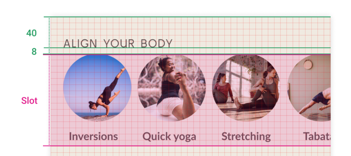
@Composable
fun HomeSection(
    @StringRes title: Int,
    modifier: Modifier = Modifier,
    content: @Composable () -> Unit
) {
    Column(modifier) {
        Text(
            stringResource(title).uppercase(Locale.getDefault()),
            style = MaterialTheme.typography.h2,
            modifier = Modifier
                .paddingFromBaseline(top = 40.dp, bottom = 8.dp)
                .padding(horizontal = 16.dp)
        )
        content()
    }
}
홈 섹션 - 스크롤
- 항상 Lazy 레이아웃 필요x
목록에 포함된 요소가 많거나
로드해야 할 데이터 세트가 많아서
모든 항목을 동시에 내보내면 성능이 저하되고
앱이 느려지게 되는 경우 - 목록 요소의 개수가 많지 않을 때
Column또는Row사용하여 스크롤 수동 추가
@Composable
fun HomeScreen(modifier: Modifier = Modifier) {
    Column(
        modifier
            .verticalScroll(rememberScrollState()) // 👈🏻 Here
            .padding(vertical = 16.dp)
    ) {
        SearchBar(Modifier.padding(horizontal = 16.dp))
        HomeSection(title = R.string.align_your_body) {
            AlignYourBodyRow()
        }
        HomeSection(title = R.string.favorite_collections) {
            FavoriteCollectionsGrid()
        }
    }
}

// 미리보기 시 스크롤 할 수 있게 화면 크기 제약 > heightDp = 180
@Preview(showBackground = true, backgroundColor = 0xFFF0EAE2, heightDp = 180)
@Composable
fun ScreenContentPreview() {
   MySootheTheme { HomeScreen() }
}
하단 탐색
@Composable
private fun SootheBottomNavigation(modifier: Modifier = Modifier) {
    BottomNavigation(
        backgroundColor = MaterialTheme.colors.background, // 하단 전체 네비 색상 변경
        modifier = modifier
    ) {
        BottomNavigationItem( // 바텀 네비 메뉴
            icon = {
                Icon(
                    imageVector = Icons.Default.Spa,
                    contentDescription = null
                )
            },
            label = {
                Text(stringResource(R.string.bottom_navigation_home))
            },
            selected = true,
            onClick = {  }
        )
        BottomNavigationItem( // 바텀 네비 메뉴
            icon = {
                Icon(
                    imageVector = Icons.Default.AccountCircle,
                    contentDescription = null
                )
            },
            label = {
                Text(stringResource(R.string.bottom_navigation_profile))
            },
            selected = false,
            onClick = {  }
        )
    }
}
Scaffold
- 앱의 최상위 수준 컴포저블이므로 다음을 해야 합니다.
-MySootheThemeMaterial 테마 적용
-Scaffold추가
- 하단 막대가SootheBottomNavigation컴포저블이 되도록 설정
- 콘텐츠가HomeScreen컴포저블이 되도록 설정
    @Composable
	fun MySootheApp() {
    	MySootheTheme {
        	Scaffold(
            	bottomBar = { SootheBottomNavigation() }
        	) { padding ->
            	HomeScreen(Modifier.padding(padding))
        	}
    	}
	}
공부하는 개발자