
데이터시각화 : 1. Matplotlib
데이터시각화 : 2. Seaborn(1)
데이터시각화 : 3. Seaborn(2)
📢matplotlib
- Matplotlib는 다양한 종류의 플롯, 차트 및 그림을 생성하는 데 사용되는 강력한 데이터시각화 라이브러리이다.
import matplotlib📢pyplot
- 라이브러리의 서브모듈인 pyplot은 Matplotlib의 간단하고 사용하기 편리한 인터페이스를 제공하여 다양한 종류의 그래프를 생성하고 조작할 수 있게 해준다.
import matplotlib.pyplot as plt📌1. plot()
- ✂선 그래프
- plot() 함수는 두 개의 인자를 받는다.
- 첫 번째 인자는 x 축에 대한 데이터이고, 두 번째 인자는 그래프의 스타일을 지정하는 문자열이다.
- 스타일 문자열은 색상, 마커, 선 스타일의 조합으로 이루어질 수 있다.
# 데이터 준비
x = [1, 2, 3, 4, 5]
y = [2, 4, 6, 8, 10]

# 그래프 그리기
plt.plot(x, y)

# 그래프 보여주기
plt.show()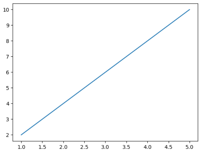
📍axis()
- axis()는 Matplotlib에서 그래프의 축을 제어하는 데 사용된다.
- 그래프의 축은 가로 축(x 축)과 세로 축(y 축)으로 이루어져 있으며, 이를 통해 데이터의 값 범위와 표시 방법을 조절할 수 있다.
plt.axis([xmin, xmax, ymin, ymax])그래프의 축 범위를 지정할 수 있습니다. 각각의 값은 x 축의 최솟값, 최댓값, y 축의 최솟값, 최댓값을 나타냅니다.
📍xlabel()
- ✂축 레이블 지정
- xlabel()은 Matplotlib에서 그래프의 x 축에 레이블을 추가하는 함수이다.
- x 축 레이블은 그래프의 가로 축에 해당하는 값을 설명하거나 표시하기 위해 사용된다.
# 데이터 준비
x = [1, 2, 3, 4]
y = [2, 4, 6, 8]

# 그래프 그리기
plt.plot(x, y)

# x 축 레이블 추가
plt.xlabel('X-axis Label')

# 그래프 보여주기
plt.show()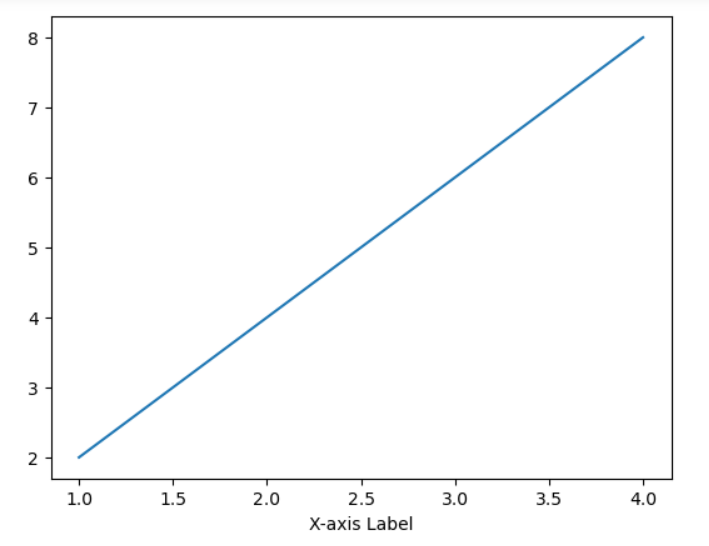
📍legend()
- ✂범례 추가
- legend() 함수는 Matplotlib에서 그래프에 범례(legend)를 추가하는 데 사용된다.
- 범례는 그래프에 플롯된 데이터의 각 항목을 식별하기 위해 사용되며, 각 항목에 대한 설명을 제공한다.
x = [1, 2, 3, 4]
y1 = [2, 4, 6, 8]
y2 = [1, 3, 5, 7]

# 그래프 그리기
plt.plot(x, y1, label='Line 1')
plt.plot(x, y2, label='Line 2')

# 범례 추가
plt.legend()

# 그래프 보여주기
plt.show()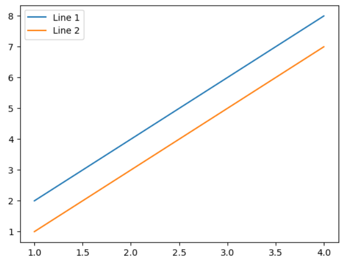
📍title()
- ✂제목 추가
- title() 함수는 Matplotlib에서 그래프의 제목을 추가하는 데 사용된다.
- 그래프의 제목은 그래프 전반적인 내용을 간결하게 요약하거나 추가 설명을 제공하는 데 사용된다.
plt.title('Graph Title')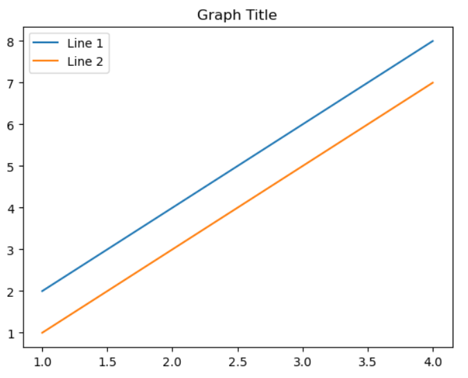
📍grid()
- ✂격자 추가
- grid() 함수는 Matplotlib에서 그래프에 격자(grid)를 추가하는 데 사용된다.
- 격자는 가로선과 세로선의 네트워크로 그래프의 배치와 구조를 시각적으로 나타낸다.
# 데이터 준비
x = [1, 2, 3, 4]
y = [2, 4, 6, 8]

# 그래프 그리기
plt.plot(x, y)

# 격자 추가
plt.grid()

# 그래프 보여주기
plt.show()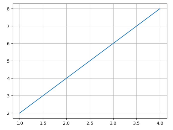
❗시각화 단축어
📍응용하기(1)
import matplotlib.pyplot as plt

# 선 그래프
plt.plot([1, 2, 3, 4], 'b*:', label='graph1')   # (0, 1), (1, 2), ....
plt.plot([1, 2, 3, 4], [1, 2, 3, 4], linestyle='dashed', color="#8f34eb", label='graph2')   # (1, 1), (2, 2), ....

font1 = {'family': 'fantasy', 'color': 'red', 'weight': 'normal', 'size': 'xx-large'}

# 축 레이블 지정
plt.axis([0, 5, 0, 10])
plt.xlabel('xxxxx', labelpad=30, loc='right', fontdict=font1)
plt.ylabel('yyy', labelpad=0, loc='top')

# 범례
plt.legend(loc="upper right", ncol=2, fontsize=20, frameon=True, shadow=True)

# 타이틀
plt.title('Title', loc='right', pad=50)

# 그리드
plt.grid(True, axis='y')

plt.show()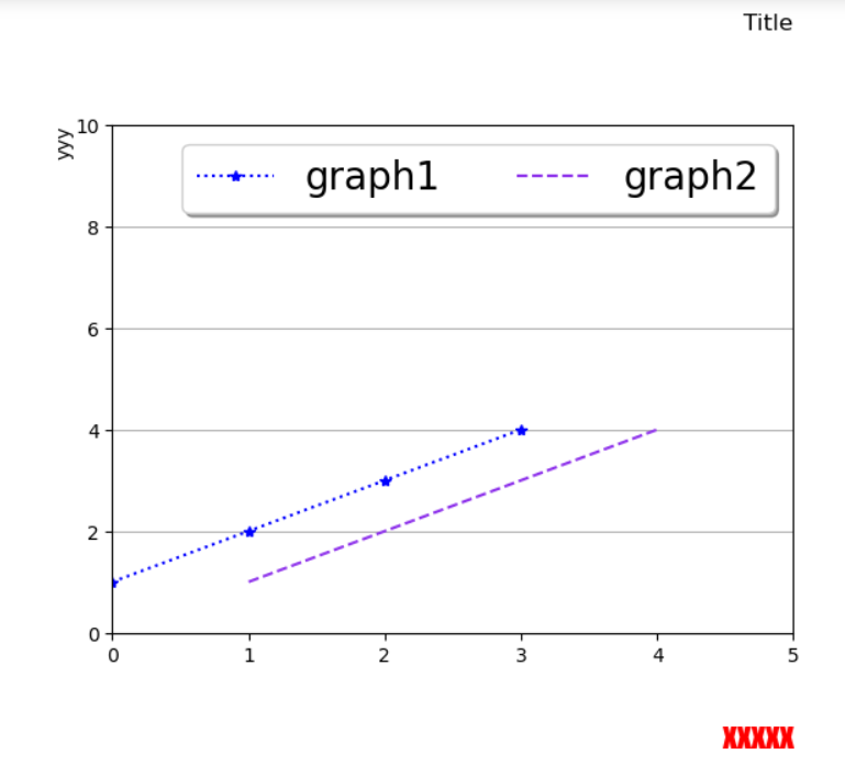
📍응용하기(2)
import matplotlib.pyplot as plt

# 데이터 준비
x = ['Jan', 'Feb', 'Mar', 'Apr', 'May', 'Jun', 'Jul', 'Aug', 'Sep', 'Oct', 'Nov', 'Dec']
y1 = [1000, 1200, 1400, 1100, 1300, 1500, 1600, 1700, 1800, 2000, 1900, 2100]
y2 = [900, 1100, 1300, 1200, 1400, 1600, 1700, 1600, 1500, 1800, 2000, 1900]

# 그래프 그리기
plt.plot(x, y1, color='blue', label='2022')
plt.plot(x, y2, color='orange', label='2023')

# 가로축 눈금 설정
plt.xticks(x)

#축 레이블 지정
plt.xlabel('Month')
plt.ylabel('Sales')

# 그래프 제목 설정
plt.title('Monthly Sales Comparison (2022-2023)')

# 범례 추가
plt.legend()

# 그래프 보여주기
plt.show()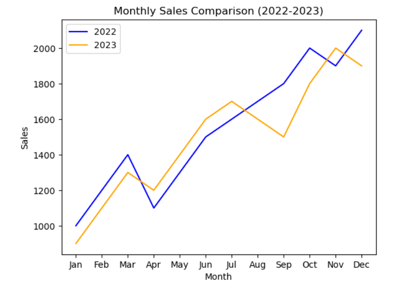
📍응용하기(3)
# x 값 범위 설정
x = np.linspace(0, 10, 100)
print(x)

# sin 함수와 cos 함수 계산
y_sin = np.sin(x)
y_cos = np.cos(x)

# 그래프 그리기
plt.plot(x, y_sin, color='green', label='sin(x)')
plt.plot(x, y_cos, color='orange', label='cos(x)')

# 가로축 눈금 설정
plt.xticks(rotation=180)
plt.yticks(rotation=180)

#축 레이블 지정
plt.xlabel('x')
plt.ylabel('y')

# 그래프 제목 설정
plt.title('sine and cosice Funtions')

# 격자 추가
plt.grid()

# 범례추가
plt.legend()

# 그래프 보여주기
plt.show()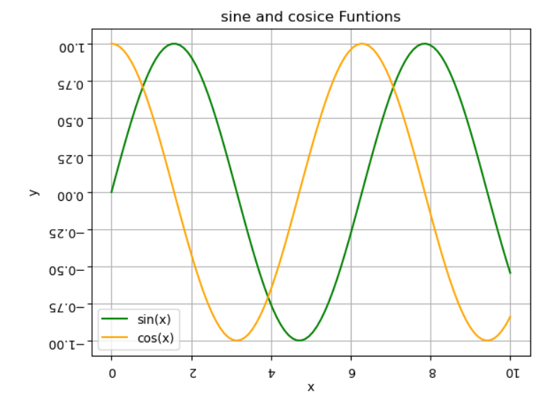
- np.linspace() 함수를 사용하여 0부터 2파이까지의 범위에서 100개의 x 값들을 생성합니다.
- 그리고 np.sin() 함수와 np.cos() 함수를 사용하여 해당 x 값에 대한 sin 값과 cos 값들을 계산합니다.
📌2. bar()
- ✂바 그래프
- bar() 함수는 Matplotlib에서 막대 그래프(bar plot)를 그리는 데 사용된다.
- 막대 그래프는 범주형 데이터의 값을 막대로 나타내어 각 범주 간의 비교를 시각적으로 보여준다.
# 데이터 준비
categories = ['A', 'B', 'C', 'D']
values = [10, 20, 15, 25]

# 막대 그래프 그리기
plt.bar(categories, values)

# 그래프 보여주기
plt.show()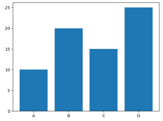
- plt.bar(categories, values)는 categories에 있는 범주들과 values에 해당하는 값들을 이용하여 막대 그래프를 그린다.
- categories는 x 축에 표시되는 범주들의 레이블을 나타내고, values는 각 범주에 대한 막대의 높이를 나타낸다.
❗numpy사용하여 응용해보기
import numpy as np

x = np.arange(3)  # [0 1 2]

plt.bar(x, [100, 200, 300], color=['r', 'g', 'b'], width=0.6)
plt.xticks(x, ['a', 'b', 'c'])
plt.show()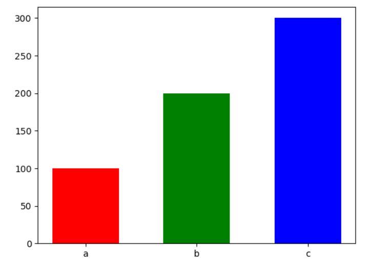
📍barh()
- ✂가로 바
import numpy as np

y = np.arange(3)  # [0 1 2]

plt.barh(y, [100, 200, 300], color=['r', 'g', 'b'], height=0.6)
plt.yticks(y, ['a', 'b', 'c'])
plt.show()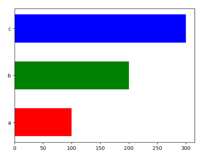
📍xticks()
- ✂축 눈금 설정
- xticks() 함수는 Matplotlib에서 x 축의 눈금(tick)을 설정하는 데 사용된다.
- 눈금은 그래프의 축에 위치한 작은 표시물로, 축의 범위를 표시하거나 범주형 데이터를 나타낼 때 사용된다.
# 데이터 준비
x = [1, 2, 3, 4]
y = [10, 20, 15, 25]

# 그래프 그리기
plt.plot(x, y)

# x 축 눈금 설정
plt.xticks(x, ['A', 'B', 'C', 'D'])

# 그래프 보여주기
plt.show()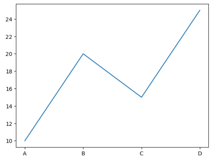
📍응용하기(1)
# 데이터 준비
categories = ['Category 1', 'Category 2','Category 3', 'Category 4', 'Category 5']
data = [20, 35, 15, 27, 45]

# 막대 그래프 그리기
plt.bar(categories, data)

# 가로축 눈금 설정
plt.xticks(categories, rotation=45)

#축 레이블 지정
plt.xlabel('Categories')
plt.ylabel('Value')

# 그래프 제목 설정
plt.title('Bar Chart')

# 격자 추가
plt.grid()

# 그래프 보여주기
plt.show()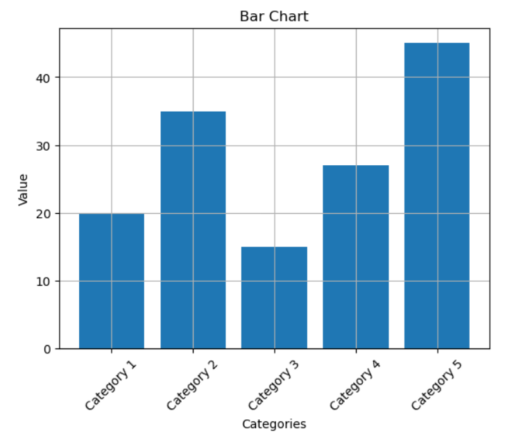
📌scatter()
- ✂산점도
- scatter() 함수는 x와 y 값의 쌍으로 이루어진 데이터를 받아와서 각 쌍을 점으로 나타내는 산점도를 그린다.
# 데이터 준비
x = [1, 2, 3, 4, 5]
y = [3, 5, 4, 6, 8]

# 산점도 그리기
plt.scatter(x, y)

# 그래프 보여주기
plt.show()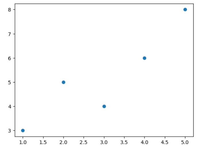
❗scatter 응용해보기:
import numpy as np

n = 50
x = np.random.rand(n)   # n개의 난수 array
y = np.random.rand(n)

area = (10 * np.random.rand(n)) ** 2
colors = np.random.rand(n)

plt.scatter(x, y, s=area, cmap='plasma', c=colors, alpha=0.5 )
plt.show()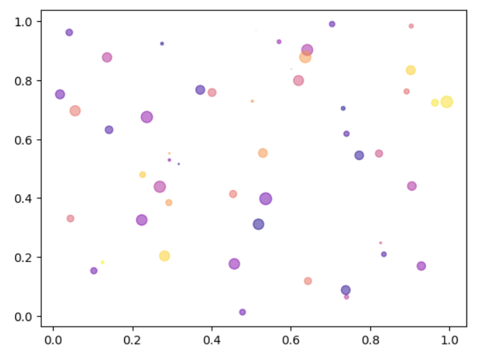
📌pie()
- ✂원 차트
- pie() 함수는 Matplotlib에서 파이 차트(pie chart)를 그리는 데 사용된다.
- 파이 차트는 전체 데이터에서 각 부분의 상대적인 비율을 원의 조각으로 나타내는 시각화 방법이다.
# 데이터 준비
sizes = [30, 40, 20, 10]
labels = ['A', 'B', 'C', 'D']

# 파이 차트 그리기
plt.pie(sizes, labels=labels)

# 그래프 보여주기
plt.show()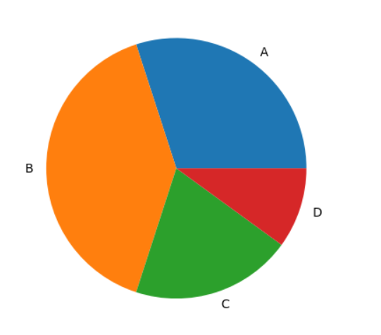
❗pie() 응용해보기
ratio = [34, 32, 16, 18]
labels = ['a', 'b', 'c', 'd']

wedgeprops = {'width': 0.7, 'edgecolor': 'k', 'linewidth': 1}

plt.pie(ratio, labels=labels, autopct="%.1f%%", explode=[0, 0.1, 0, 0.1], colors=['red', 'yellow', 'green', 'blue'], wedgeprops=wedgeprops)
plt.show()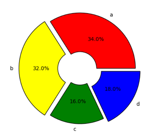

성공의 반대는 실패가 아닌 도전하지 않는 것이다.