팀 프로젝트를 진행하면서 물고기 관련 서비스를 개발했는데 서비스와 물고기에 대한 가이드가 많았다. 이러한 가이드를 대부분 모달창으로 구현하였는데 모달 상태에 대한 코드가 너무 많이 생겨서 좀 더 쉽게 구현해보자 하여 redux를 사용하게 되었다. 그래도 각각 뷰로 보일 모달 창의 내용이 달라서 하나하나 컴포넌트를 만들었고 각각의 액션 타입을 지정하였다.
먼저 모달의 뷰 컴포넌트를 작성하고 store와 reducer관련 코드를 확인해보고자 한다.
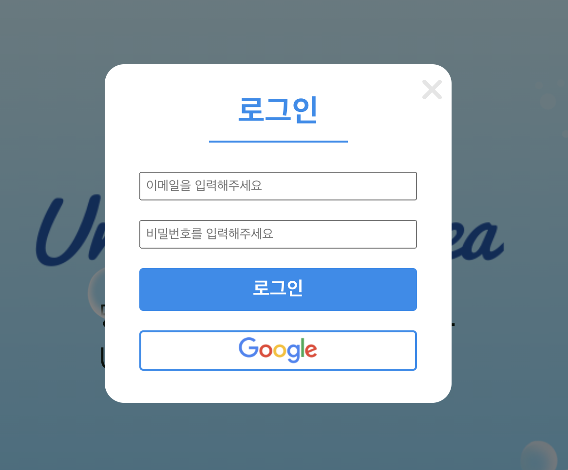
1. 로그인 모달 창 스타일 주기
<styled-component 기준>
모달창 뒤에 백그라운드로 깔릴 DarkBackGround를 작성해준다. 기본적으로 position, left, top, background를 작성하고 화면 비율에 맞춰서 가로 세로 값을 정해준다. 그리고 센터에 올 수 있게 align-items, justify-content를 center로 맞춰준다.
배경을 작성하였으면 모달 창이 될 ModalContainer를 작성해준다. 이건 본인 기준에 맞춰서 어떻게 컨테이너를 디자인해줄지 설정해주면 된다. 나는 로그인에 들어갈 아이디, 패스워드, 로그인, 구글로그인 빼고는 들어갈 컨텐츠가 없어서 작은 사이즈로 맞춰주었다.
필요한 내용도 만들어준 다음 모달의 창을 끄고 닫는 것을 redux로 살펴보자.
modalComponent/Login.js
const DarkBackGround = styled.div`
position: fixed;
left: 0;
top: 0;
width: 100%;
height: 100%;
display: flex;
align-items: center;
justify-content: center;
background: rgba(0, 0, 0, 0.5);
z-index: 999;
`;
const ModalContainer = styled.div`
width: 25%;
height: 45%;
background: white;
flex-direction: column;
position: relative;
justify-content: center;
display: flex;
border-radius: 20px;
align-items: center;
z-index: 999;
@media screen and (max-width: 480px) {
width: 70%;
height: 65%;
margin-right: 5%;
}
`;
const CloseBtnContainer = styled.div`
position: absolute;
top: 0px;
width: 100%;
padding: 10px;
box-sizing: border-box;
display: flex;
justify-content: flex-end;
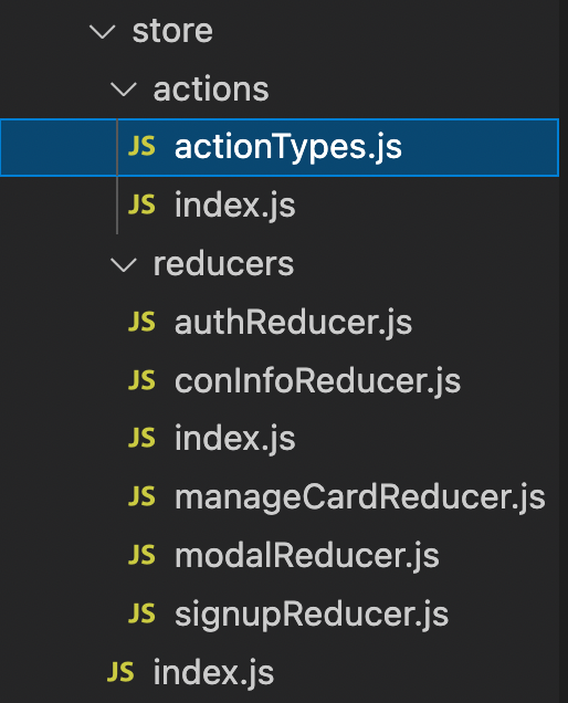
`;폴더의 구조를 보면 store 안에 actions/ reducers/ index를 다 나누어서 만들었는데 먼저 asctions에서 타입을 설정해준다.
store/actions/actionTypes.js
액션 타입을 정의한 뒤,
export const LOG_IN_MODAL_ON = "LOG_IN_MODAL_ON";
export const MODAL_OFF = "MODAL_OFF";
store/actions/index.js
index.js에서 불러와서 액션 생성 함수를 만들어 준다.
import { LOG_IN_MODAL_ON, MODAL_OFF } from "./actionTypes";


export const loginModalOnAction = {
  type: LOG_IN_MODAL_ON,
};
export const modalOff = {
  type: MODAL_OFF,
};
store/reducers/modalReducer.js
리듀서 파일에서는 위의 타입을 불러와서 초기 상태를 설정해주고 switch문을 통해서 간단하게 false -> true 값으로만 설정해준다.
모달 창 닫기는 어차피 false한 값이어야 하기때문에 초기 상태를 사용하면 된다.
import { LOG_IN_MODAL_ON, MODAL_OFF } from "./actionTypes";

const initialState = {
	isLoginModal: false,
}

const modalReducer = (prevState = initialState, action) => {
  let state;
  switch (action.type) {
    case LOG_IN_MODAL_ON:
      state = { ...prevState, isLoginModal: true };
      break;
    case MODAL_OFF:
      state = { ...initialState };
      break;
    default:
      state = { ...prevState };
  }
  return state;
};

export default modalReducer;
store/index.js
이제 스토어를 만들고 리덕스를 적용시키면 된다.
import { createStore } from "redux";
import reducers from "./reducers";

/* eslint-disable no-underscore-dangle */
const store = createStore(
  reducers,
  window.__REDUX_DEVTOOLS_EXTENSION__ && window.__REDUX_DEVTOOLS_EXTENSION__() // Redux DevTools Extension
);
/* eslint-enable */

export default store;
index.js
import React from "react";
import ReactDOM from "react-dom";
import "./index.css";
import App from "./App";
import { Provider } from "react-redux";
import store from "./store";

ReactDOM.render(
  <Provider store={store}>
    <App />
  </Provider>,
  // </React.StrictMode>,
  document.getElementById("root")
);
useSelector사용하기
App.js
모달의 상태를 참조해서 false인 경우에는 로그인 창을 켜준다.
Login 은 위에서 styeld-component로 만들어 준 모달 창이다.
홈페이지에서 login을 누르면 모달 창이 켜지고 x모양의 아이콘을 누르면 모달 창이 꺼지게 만들어 주었다.
import { useSelector } from "react-redux";
import Login from "./modalComponent/Login";

function App() {
  const state = useSelector((state) => state.modalReducer);
  const { isLoginModal } = state;

    return (
    <BrowserRouter>
      <Routes>
        <Route path="/" element={<Main />}></Route>
        <Route path="/guide" element={<Guide />}></Route>
 	  </Routes>
      {isLoginModal && <Login/>} //상태가 false이니 로그인창을 켜준다.
    </BrowserRouter>
  );
}
export default App;
import { useDispatch } from "react-redux";
import { modalOff, loginAction } from "../store/actions";
const DarkBackGround = styled.div`
position: fixed;
left: 0;
top: 0;
width: 100%;
height: 100%;
display: flex;
align-items: center;
justify-content: center;
background: rgba(0, 0, 0, 0.5);
z-index: 999;
`;
const ModalContainer = styled.div`
width: 25%;
height: 45%;
background: white;
flex-direction: column;
position: relative;
justify-content: center;
display: flex;
border-radius: 20px;
align-items: center;
z-index: 999;
@media screen and (max-width: 480px) {
width: 70%;
height: 65%;
margin-right: 5%;
}
`;
const CloseBtnContainer = styled.div`
position: absolute;
top: 0px;
width: 100%;
padding: 10px;
box-sizing: border-box;
display: flex;
justify-content: flex-end;
`;
//(...)내용 컴포넌트는 생략
function Login() {
const dispatch = useDispatch();
return (
<DarkBackGround>
<ModalContainer>
<CloseBtnContainer>
<FontAwesomeIcon
icon={faTimes}
size="2x"
onClick={() => dispatch(modalOff)}
color="#e5e5e5"
/>
//여기서 액션을 디스패치 해준다.
</CloseBtnContainer>
<Title>로그인</Title>
<Form>
<Email
placeholder="이메일을 입력해주세요"
type="email"
name="email"
onChange={handleInputValue}
/>
<Pwd
placeholder="비밀번호를 입력해주세요"
type="password"
name="user_pwd"
onChange={handleInputValue}
/>
<LoginBtn type="button" onClick={handleLogin}>
로그인
</LoginBtn>
</Form>
<Warning>{errMsg}</Warning>
</ModalContainer>
</DarkBackGround>
);
}
export default Login;