Transition 개요
- transition은 A라는 상태가 B라는 상태로 변할 때 시간차를 갖고 변환하는데 이 변환되는 모습을 보여주는게 transition임
- 버튼의 색깔이 Fade In과 같이 요소가 위에서 아래로 열리는 등 이러한 효과들을 transition을 만듬
- 이를 통해서 별도의 js 없이 웹 요소를 다이나믹하게 만들어줄 수 있음
- transition은 상태로 변할 떄의 시간차이기 떄문에 시간에 대한 개념이 추가됨
- 참고자료
transition-property transition-duration 1
- A 상태가 B의 상태로 바뀌는게 어느정도 시간을 두고 바뀐다고 했는데 A상태와 B상태는 A의 CSS요소가 B의 CSS요소로 바뀐다는 개념임
- 특정 요소만 바뀌게끔 결정해서 처리할 수 있음, 그리고 시간을 두고 처리할 수 있음
- 이 2가지 요소가 필수적으로 들어가는데 어떤 항목인지는
transition-property를 통해서 하고 얼마나 시간이 걸릴지는transition-duration을 통해서 조정함 - transition-property로 margin-right, color 등과 같은 요소를 직접 그리고 여러개 바꾸게 지정해서 처리할 수 있음
- transition-duration의 경우 같이 쓰는데, 말 그대로 지정한 시간만큼 property를 바꾸겠다는 의미임
- time의 자료형을 쓰는데 단위는
ms,s를 써서 시간을 지정해서 처리할 수 있음
transition-property transition-duration 2
- 이 때 가상 클래스 선택자를 활용해서 css 요소를 변경할 수 있음, 이 경우 transition을 줘서 조정할 수 있음
- 그러면 아래 예시처럼 hover를 한 경우, 요소의 변경과 시간을 조정할 수 있으며 그에 따라서 항목이 딱 변함
- all이 아닌 경우 지정한 항목만 transition으로 바뀜 즉, 아래의 예시의 경우도 hover할 때 찰나의 순간 바뀌지만 background-color만 시간을 두고 바뀜
- all을 하면 아래의 hover의 항목이 duration을 준만큼 바뀌는 것임
- 그리고 만약 hover에 해당 속성을 둔다면 hover할 때만 적용되고 hover가 풀리면 또 바로 css 요소로 바뀌어버림(모두 다 적용하고 싶다면 class, id에 직접 정하면 됨)
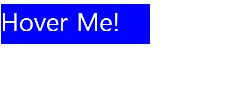
- 예시
        <div class="box">
            Hover Me!
        </div>
.box {
width: 300px;
height: 80px;
border: 2px dashed teal;
background-color: darkslategray;
font-size: 50px;
color: white;
transition-property: background-color;
transition-duration: 2s;
}
.box:hover {
width: 340px;
background-color: indianred;
color: black;
font-size: 60px;
}
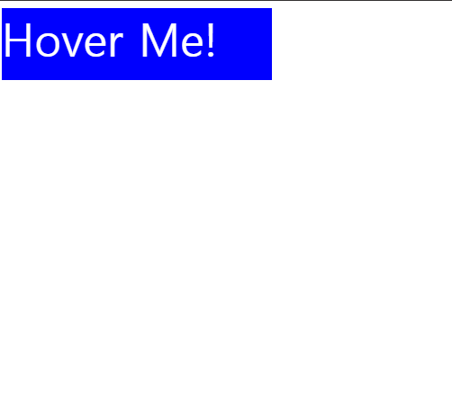
transition-delay, transition-timing-function
- transition-delay를 쓰게 된다면, 아래 예시의 경우 hover를 하고 1초 뒤에나 transition이 됨.
- 그래서 transition-delay의 경우 요소가 여러개 있을 경우, 도미노처럼 효과가 쭉 적용되고자 할 때 처리해볼 수 있음
- 트리거가 되는 시점을 정해서 변경을 하는 것
- 예시
.box {
    width: 300px;
    height: 80px;
    background-color: blue;
    font-size: 50px;
    color: white;

    transition-property: all;
    transition-duration: 0.8s;
    transition-delay: 1s;
}

.box:hover {
    background-color: red;
}
- transition-timing-function의 경우 transtion이 되는 중간 과정에 시간이 있는데, 이 중간 과정에 대해서 linear하게 할 지 빠르게 넘길 것이지 등 조절을 할 수 있음
- 주로 키워드를 작성해서 처리함, 이에 대한 변화는 mdn을 참고해서 보는 것이 좋음(변화의 차이기 때문에)
- 예시
.box {
    width: 300px;
    height: 80px;
    background-color: blue;
    font-size: 50px;
    color: white;

    transition-property: all;
    transition-duration: 0.8s;
    transition-timing-function: linear;
}

.box:hover {
    background-color: red;
    height: 400px;
}
transition(shorthand)
- 앞서 배운 4가지 속성을 한 줄에 작성할 수 있는 속성이 transition임
- 그리고 다 연관성이 있기 때문에 단축 속성을 작성하는 경우가 많음
- duration과 delay 다 시간을 쓰기 때문에 앞 쪽에 있는 것이 duration 뒤에 있는 것이 delay로 해석이 됨, 그리고 그에 맞게 작성하면 됨
- 앞에는 무조건 transition-property를 써주는게 좋음
- 예시
.box {
    width: 300px;
    height: 80px;
    background-color: blue;
    font-size: 50px;
    color: white;

    transition: all 3s ease-in-out 1s;
}

.box:hover {
    background-color: red;
    height: 400px;
}
- 예시
/* Apply to 1 property */
/* property name | duration */
transition: margin-left 4s;

/* property name | duration | delay */
transition: margin-left 4s 1s;

/* property name | duration | timing function | delay */
transition: margin-left 4s ease-in-out 1s;

/* Apply to all changed properties */
transition: all 0.5s ease-out;transition + transform 활용 예
- 아래 예시와 같이 transform이 되는 것에 대해서 transition을 줘서 복합적으로 다이나믹하게 요소를 만들어 볼 수 있음
- 웹 사이트의 다양한 애니메이션 유저 액션에 따라 만들어 볼 수 있음
- 예시
        <div class="box">
            Hover Me!
        </div>
.box {
width: 100px;
height: 100px;
border: 10px solid seagreen;
background-color: rgb(204, 253, 225);
border-radius: 30px;
transition: all 1s ease-in-out;
}
.box:hover {
transform: rotate(360deg);
transform-origin: bottom right;
}

측정할 수 없으면 관리할 수 없고, 관리할 수 없으면 개선시킬 수도 없다