수업 내용
JavaScript에 대해서 교육을 받았다.
📌 DOM 이란 ?
-
넓은 의미로 웹 브라우저가 HTML로 만들어진 페이지를 인식하는 방식을 의미한다.
-
문서 객체가 생성되는 방식
- 정적으로 문서 객체를 생성 : 웹 브라우저가 HTML 페이지에 적혀 있는 태그를 읽으면서 생성하는 것.
- 동적으로 문서 객체를 생성 : 원래 HTML 페이지에 없었던 문서객체를 JavaScript를 이용해서 생성
📌 캐시(Cash) 란 ?
- 웹 캐시는 사용자가 웹 페이지를 방문할 때 브라우저에 의해 자동으로 처리되며, 네트워크 대역폭을 줄이고 페이지 로딩 속도를 향상시키는데 도움을 준다.
📌 자바스크립트(JavaScipt)란 ?
자바스크립트는 웹페이지에 생동감을 불어넣기 위해 만들어진 프로그래밍 언어이다.
자바스크립트로 작성한 프로그램을 스크립트(script) 라고 부른다.
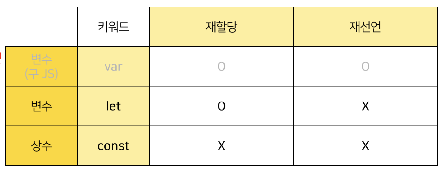
📌 변수와 상수
- 변수 : 데이터 값을 넣을 수 있는 저장소, 바뀔 수 있다.
- 상수 : 값이 변하지 않는 수
📌 this 란 ?
함수를 호출할 때 생성되는 실행 컨텍스트 객체이다.
this가 가리키는 대상은 어떻게 this가 호출되는지에 따라 다르다.
아래 상황별로 this의 의미를 나눌 수 있다.
- 전역 공간에서의 this
- 메서드로서 호출할 때 내부에서의 this
- 함수로서 호출할 때 내부에서의 this
- 콜백 함수 호출 시 내부에서의 this
- 생성자 함수 내부에서의 this
예시 )
var obj = {
  methodA: function () {
    console.log(this)
  },
  inner: {
    methodB: function () {
      console.log(this)
    }
  }
}
console.log(this)            // window임 {alert: f(), atob: f(), blur: f(), ...}
obj.methodA()             // { methodA: f, inner: {...} }       === obj
obj['methodA']()          // { methodA: f, inner: {...} }       === obj

obj.inner.methodB()       // { methodB: f }               === obj.inner
obj.inner['methodB']()    // { methodB: f }               === obj.inner
obj['inner'].methodB()    // { methodB: f }               === obj.inner
obj['inner']['methodB']() // { methodB: f }               === obj.inner
📌 함수란 ?
특정 코드를 하나의 명령으로 실행 할 수 있게 해주는 기능
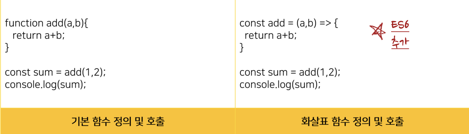
- 왼쪽은 함수 선언식
- 오른 쪽은 함수 선언식 ES6에 추가된 화살표 함수이다.
- function 키워드 대신에 => 사용
- => 좌측에는 함수의 파라미터, 우측에는 코드 블럭
- const add = (a,b) => a + b; 로 한줄이면 return 도 줄일 수 있다. (파라미터도 괄호를 없앨 수 있음.)
❌ 화살표 함수를 쓰면 안되는 경우
- 객체 메소드
- 생성자 함수
- addEventListener() 의 콜백 함수 -> 써도 상관은 없지만 this를 사용 시 스코프가 window를 잡게 된다.
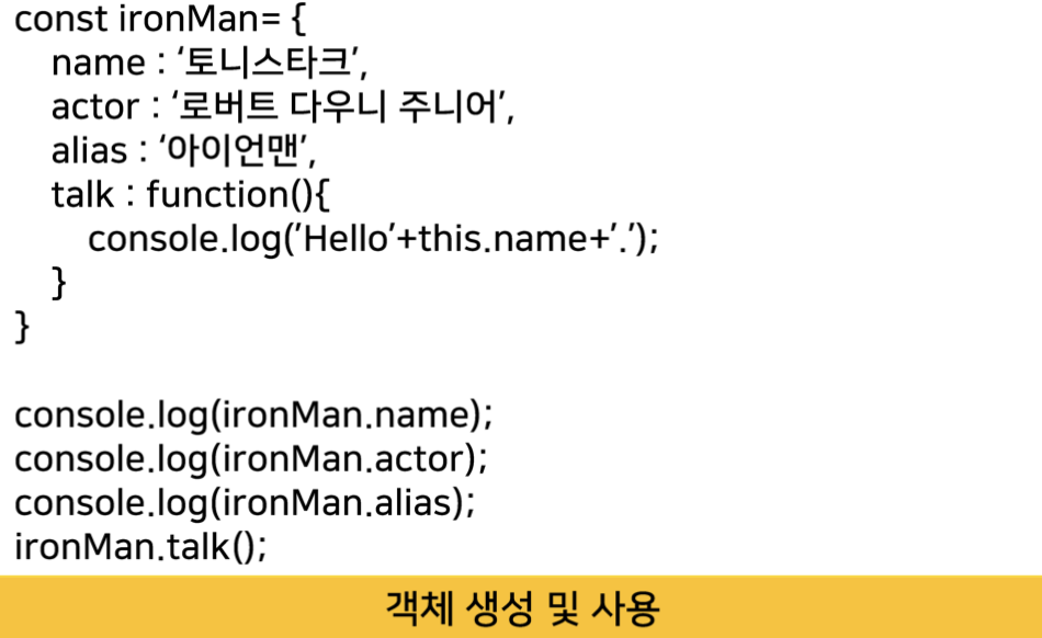
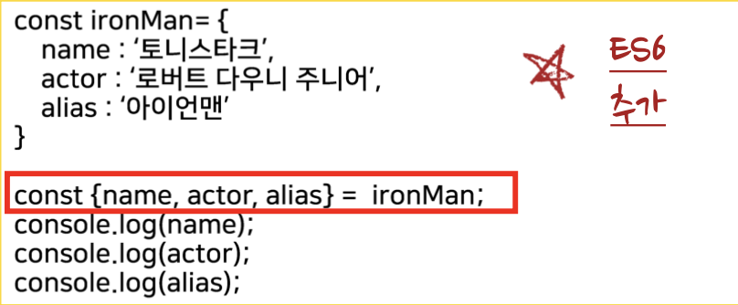
📌 객체란 ?
관련된 데이터와 함수의 집합
객체 구조 분해
ES6에 새로 추가 됨.
짧고 보기 좋게 코드를 작성하기에 좋다.
📌 과제
(구)세이프홈즈 스타일링
1. 요구사항
- (구) 세이프홈즈 : 미디어 쿼리 이용해 반응형으로 만들기.
2. 작성코드 - (구) 세이프홈즈
HTML은 기존 과제로 제출했던 코드에 class만 부여했다.
/* 테블릿 가로, 테블릿 세로 (해상도 768px ~ 1023px)*/
@media screen and (min-width: 768px) and (max-width: 1023px) {
	.section_title img {
		width: 70%;
	}
	.section_content_wrap {
		width: 70% !important;
	}
	.section_content2_wrap {
		width: 70% !important;
	}
	.section_content3 {
		width: 860px !important;
	}
	.section_content4_wrap {
		width: 70% !important;
	}
}

/* 모바일 가로, 모바일 세로 (해상도 480px ~ 767px)*/
@media screen and (max-width: 767px) {
	.section_title img {
		width: 60%;
	}
	.section_content_wrap {
		width: 40% !important;
		justify-content: center !important;
	}
	.section_content2_wrap {
		width: 40% !important;
	}
	.section_content2 strong {
		height: 60px !important;
		margin: 5px 0;
	}
	.section_content2 {
		width: 165px !important;
	}
	.section_content3 {
		width: 500px !important;
		height: 480px !important;
	}
	.section_content3_wrap {
		height: 80% !important;
	}
	.section_content3_info strong {
		width: 200px !important;
		height: 120px !important;
		font-size: 27px !important;
		line-height: 40px !important;
	}
	.section_content3_info p {
		width: 300px !important;
		font-weight: 500 !important;
		font-size: 18px !important;
		line-height: 28px !important;
		color: #6b7684 !important;
	}
	.section_content3_info {
		justify-content: start !important;
	}
	.message {
		height: 76px !important;
		width: 300px !important;
	}
	.message strong {
		font-size: 12px !important;
		line-height: 17px !important;
	}
	.message p {
		font-size: 10px !important;
		line-height: 13px !important;
	}
	.message_info_wrap {
    margin-bottom: 2px !important;
}
	.section_wrap .section_content3:last-child .section_content3_info {
		height: 200px !important;
	}
	.section_content4_wrap {
		width: 40% !important;
		justify-content: center !important;
	}
	.app_img {
		height: 400px !important;
	}
}

* {
	margin: 0;
	padding: 0;
	box-sizing: border-box;
}
body {
	width: 100%;
	overflow-x: hidden;
}
header {
	width: 100%;
	height: 70px;
}
main {
	width: 100%;
}
.header_wrap {
	display: flex;
	justify-content: space-around;
	align-items: center;
	width: 100%;
	height: 70px;
}

main header {
	width: 100%;
	height: 768px;
	background-image: url("./img/haeder.png");
	background-position: center;
	background-repeat: no-repeat;
	background-size: cover;
	margin-bottom: 50px;
}

.main_header {
	display: flex;
	align-items: center;
	justify-content: center;
	flex-direction: column;
	height: 100%;
	position: relative;
	width: 100%;
}

.main_header::before {
	content: "";
	opacity: 0.7;
	position: absolute;
	top: 0px;
	left: 0px;
	right: 0px;
	bottom: 0px;
	background-color: #000;
}
... 내용 생략
미디어 쿼리를 이용해 반응형으로 디자인 해보았다.
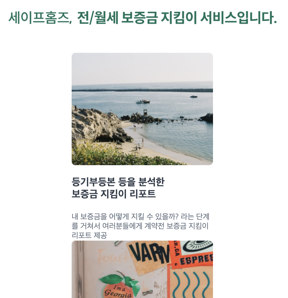
3. 결과
세이프홈즈
- 1024px 이상
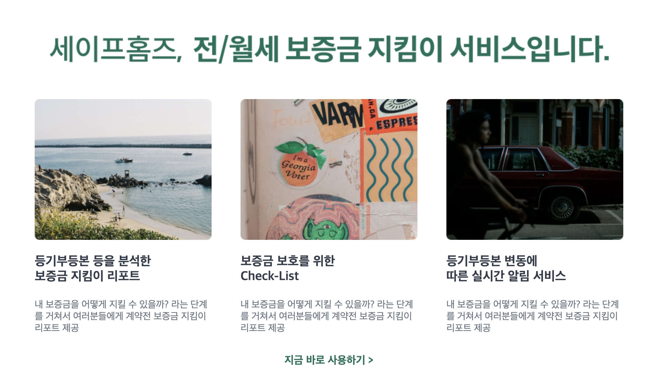
- 1023px - 768px
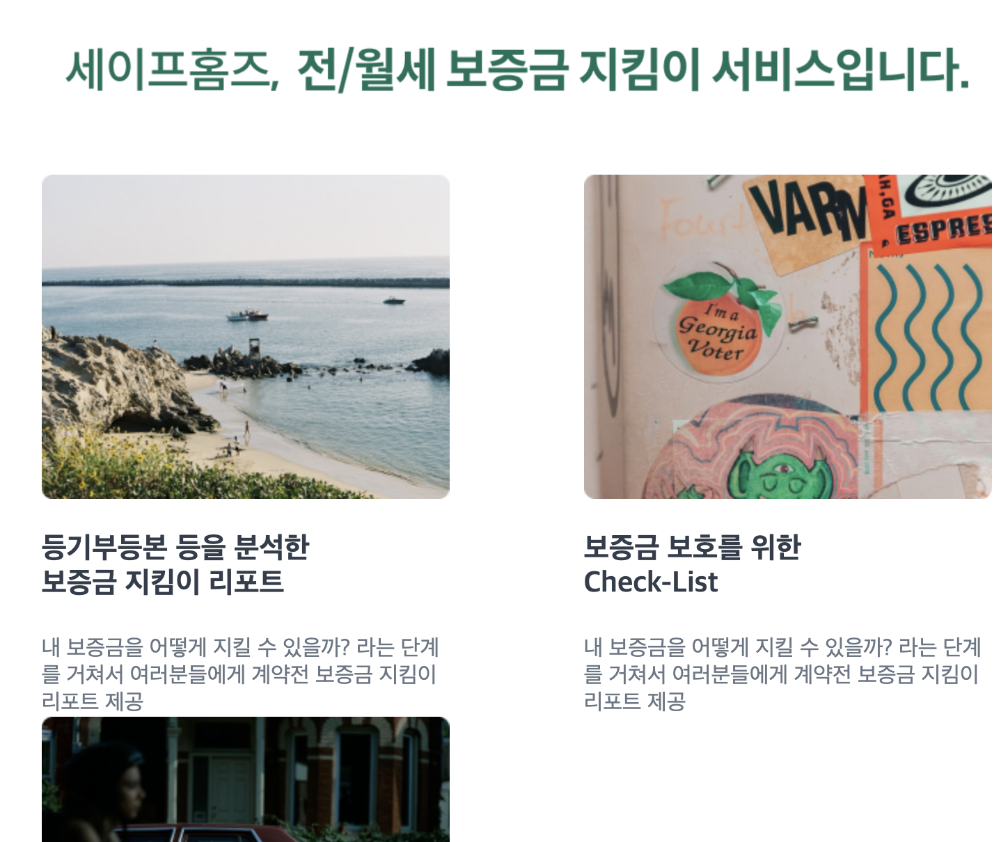
- 768px 미만
후기
이번 수업을 들으면서 Javascript로 DOM 조작하는 실력을 좀 더 높인 것 같다. 또한 과제를 하면서 미디어 쿼리를 숙달하게 되었고, flex 로 레이아웃 짜는 속도가 예전보다 좀 더 빨라진 것 같아서 뿌듯하다.
본 후기는 유데미-스나이퍼팩토리 10주 완성 프로젝트캠프 학습 일지 후기로 작성 되었습니다.
영차 조와쒀