항상 기억하도록
- 범주-범주 일때 :
1) 교차표를 작성하고
2) 시각화 : 교차표를 토대로 mosaic 그래프를 만든다.
3) 수치화 : 카이제곱 검정을 사용하며 카이제곱 검정량이 자유도의 2배 보다 크면 차이가 있다고 판단한다.
- 사용하는 라이브러리 :
import pandas as pd
import numpy as npimport matplotlib.pyplot as plt
import seaborn as sns
from statsmodels.graphics.mosaicplot import mosaicimport scipy.stats as spst
1 교차표 작성 : pd.crosstab(행, 열)
1) pd.crosstab(titanic['Survived'], titanic['Sex'])
<출력>
Sex		female	male
Survived
0		81		468
1		233		109

2) pd.crosstab(titanic['Survived'], titanic['Sex'], normalize = 'columns')
<출력>
Sex		female		male
Survived
0		0.257962	0.811092
1		0.742038	0.188908
- normalize를 사용할 수 있고 'columns', 'index', 'all' 3가지를 입력할 수 있다.
- index면 survived가 0, 1인 얘들끼리 묶어서 비율이 나온다.
- all이면 전체 값들을 대상으로 하여 비율이 나온다.
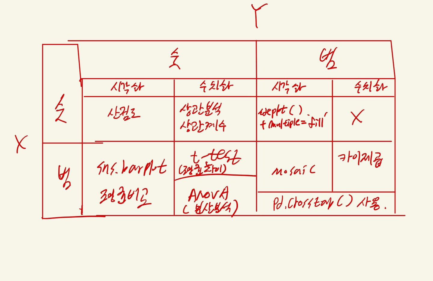
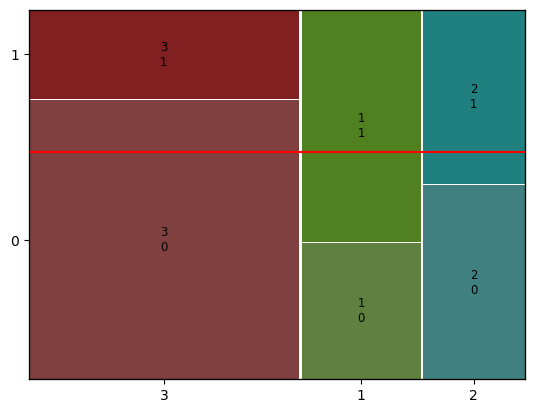
2 시각화 : mosaic
- 교차표 없어도 시각화 가능
mosaic(titanic, [ 'Pclass','Survived'])
plt.axhline(1- titanic['Survived'].mean(), color = 'r')
plt.show()
titanic['Survived'].mean() = 전체 생존률
1- titanic['Survived'].mean() = 전체 사망률
y축에서 사망을 뜻하는 값 0부터 시작하기 때문에, 전체 사망률을 사용한거다.
만약 객실 등급과 사망률이 관련이 없다면 전체 평균 사망률을 나타내는 수평선을 기준으로 동일하게 잘려야됨
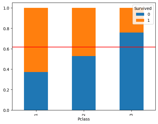
2-1 시각화 : 추가적으로 + pd.crosstab
- 교차표 있어야 하며, 꼭 index를 기준으로 normalize 되야 함.
temp = pd.crosstab(titanic['Pclass'], titanic['Survived'], normalize = 'index')
print(temp)
temp.plot.bar(stacked=True)
plt.axhline(1-titanic['Survived'].mean(), color = 'r')
plt.show()
- 해당 방법은 참고만 하셈.
3 수치화 : 카이제곱 검정
- normalize 하면 안된다.
절대로- f 통계량과 동일하게 카이제곱 통계량 값이 클수록 차이가 크다는 의미이다.
- 자유도의 2~3배 보다 크면, 차이가 있다고 본다.
- 자유도 : (x범주 수 - 1)*(y범주 수-1)
- Pclass : 범주가 3개, Survived : 2개
- (3-1) * (2-1) = 2
- 그러므로, 2의 2 ~ 3배인 4 ~ 6 보다 카이제곱 통계량이 크면, 차이가 있다고 볼수 있음.
# 1) 먼저 교차표 집계
table = pd.crosstab(titanic['Survived'], titanic['Pclass'])
print(table)
print('-' * 50)

# 2) 카이제곱검정
spst.chi2_contingency(table)
<출력>
Pclass      1   2    3
Survived
0          80  97  372
1         136  87  119
--------------------------------------------------
Chi2ContingencyResult(statistic=102.88898875696056, pvalue=4.549251711298793e-23, dof=2, expected_freq=array([[133.09090909, 113.37373737, 302.53535354],
       [ 82.90909091,  70.62626263, 188.46464646]]))
- 1) 통계량 >> 자유도:2
- 2) p-value << 0.05 임으로 차이가 있다고 판단할 수 있다.

큐브가 필요하다...!!!