1. Flex(align-items)
- 메인축이 아닌 교차축의 기준을 결정하는 속성
| 속성 | 내용 |
|---|---|
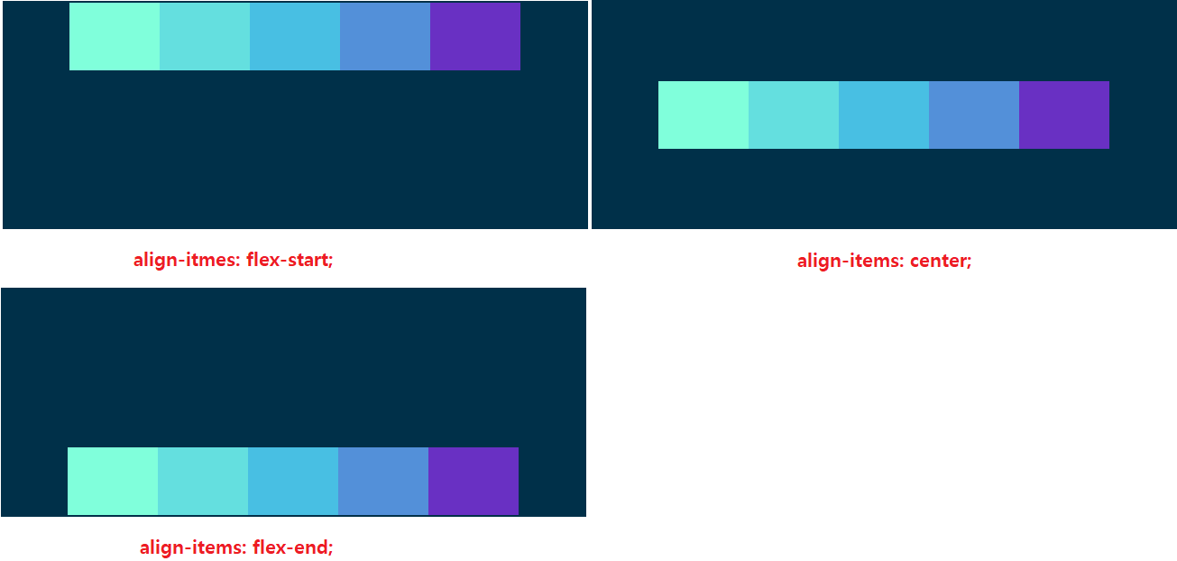
| align-items: flex-start | 교차축을 기준으로 아이템을 시작점으로 부터 배치합니다. |
| align-items: flex-end | 교차축을 기준으로 아이템을 끝점으로 부터 배치합니다. |
| align-items: flex-center | 교차축을 기준으로 아이템을 중간으로 부터 배치합니다. |
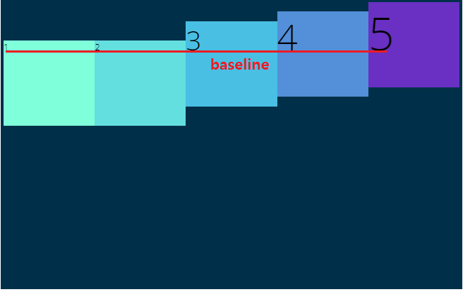
| align-items: flex-baseline | 교차축을 기준으로 아이템을 폰트의 시작점(밑줄) 중점으로 배치합니다. |
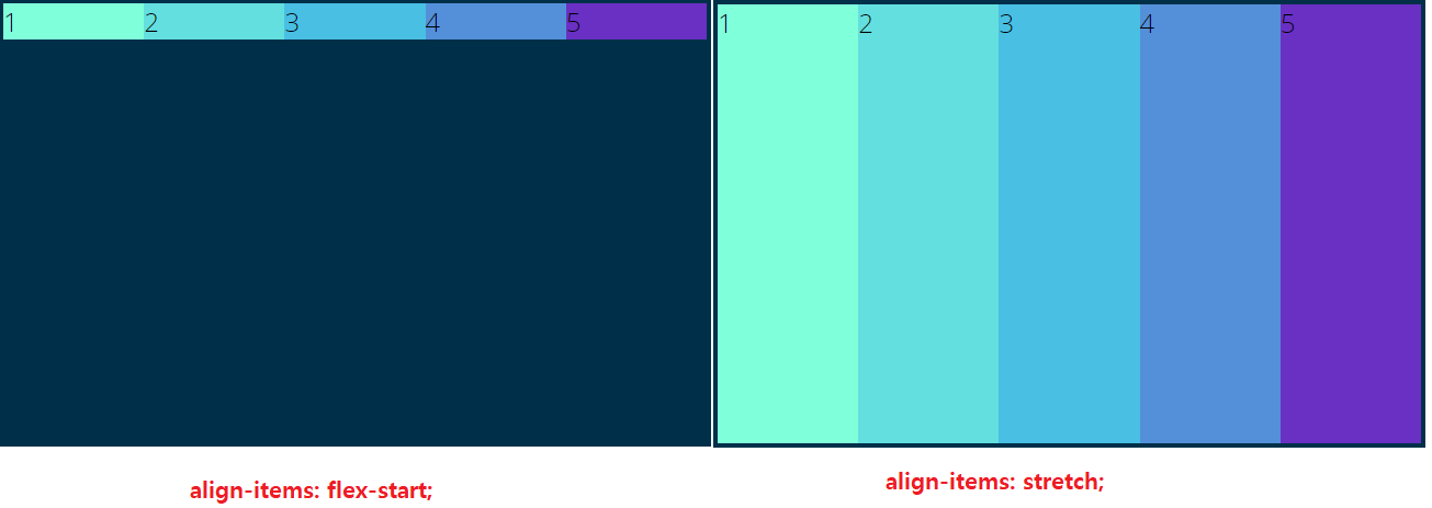
| align-items: stretch | 교차축을 기준으로 아이템의 높이를 교차축의 끝 부분까지 증가한다. |
| 아이템의 크기가 정의 되어 있는 경우에는 변화가 없습니다. |
1.1 align-items
<body>
    <h1>Let's Play With Flexbox</h1>

    <section id="container">
        <div style="background-color: #80ffdb"></div>
        <div style="background-color: #64dfdf"></div>
        <div style="background-color: #48bfe3"></div>
        <div style="background-color: #5390d9"></div>
        <div style="background-color: #6930c3"></div>
    </section>
</body>
body {
font-family: 'Open Sans', sans-serif;
}
h1 {
text-align: center;
}
#container {
background-color: #003049;
width: 1200px;
height: 500px;
margin: 0 auto;
border: 5px solid #003049;
display: flex;
justify-content: center;
/* 메인축의 아이템 배치를 중간으로 */
flex-direction: row;
/* 메인축의 기준 좌->우 */
align-items: flex-start;
/* 교차축의 기준 위->아래 */
/*
align-items: center;
교차축을 기준으로, 아이템을 중앙에 배치
align-items: flex-end;
교차축을 기준으로, 아이템을 끝부분에 배치
*/
}
#container>div {
width: 200px;
height: 150px;
}
1.2 align-items: baseline
<body>
    <h1>Let's Play With Flexbox</h1>

    <section id="container">
        <div style="background-color: #80ffdb">1</div>
        <div style="background-color: #64dfdf">2</div>
        <div style="background-color: #48bfe3; font-size:3em;">3</div>
        <div style="background-color: #5390d9; font-size:4em">4</div>
        <div style="background-color: #6930c3; font-size:5em">5</div>
      	<!-- baseline을 확인하기 위해 아이템에 글꼴 변화를 줌 -->
    </section>
</body>
body {
font-family: 'Open Sans', sans-serif;
}
h1 {
text-align: center;
}
#container {
background-color: #003049;
width: 1200px;
height: 500px;
margin: 0 auto;
border: 5px solid #003049;
display: flex;
justify-content: center;
flex-direction: row;
align-items: baseline;
/* 교차축의 기준을 폰트의 베이스라인(밑줄)로 설정 */
}
#container>div {
width: 200px;
height: 150px;
}
1.3 align-items: stretch
<body>
    <h1>Let's Play With Flexbox</h1>

    <section id="container">
        <div style="background-color: #80ffdb">1</div>
        <div style="background-color: #64dfdf">2</div>
        <div style="background-color: #48bfe3">3</div>
        <div style="background-color: #5390d9">4</div>
        <div style="background-color: #6930c3">5</div>
    </section>
</body>
#container {
background-color: #003049;
width: 90%;
height: 500px;
margin: 0 auto;
border: 5px solid #003049;
display: flex;
flex-direction: row;
justify-content: center;
align-items: stretch;
/* stretch는 align-items의 기본 값이며, 요소에 높이를 지정해주지 않는 이상,
컨테이너의 크기만큼 요소의 높이가 확장 됩니다 */
}
#container>div {
width: 200px;
font-size: 30px;
/* stretch 속성을 확인하기 위해서 아이템의 높이 값을 제거 */
}
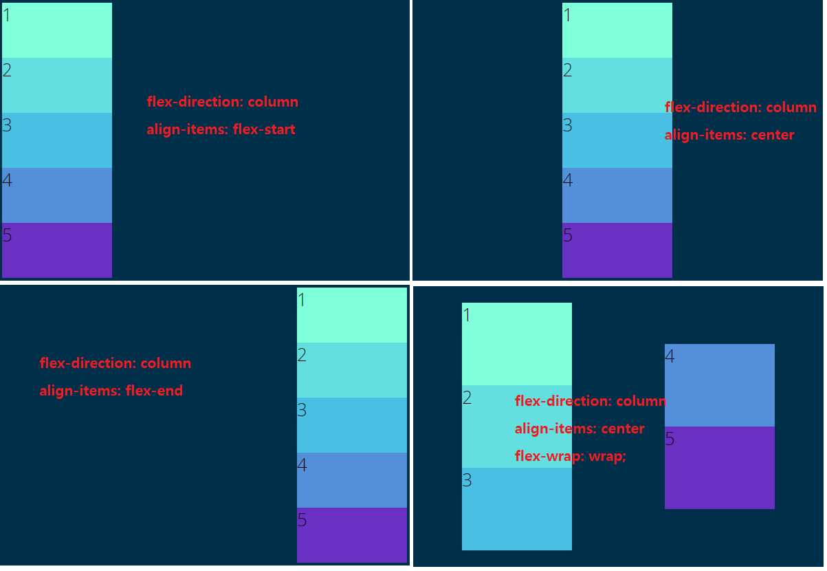
1.4 direction: column, align-items
#container {
    background-color: #003049;
    width: 90%;
    height: 500px;
    margin: 0 auto;
    border: 5px solid #003049;
    display: flex;
    flex-direction: column;
    /* 메인축의 시작점을 열방향으로 설정 위->아래 */
    justify-content: center;
    align-items: flex-start;
    /* 메인축으로 인해 교차축의 시작점이 좌->우로 변경
       메인축이 수직이 되고, 교차축이 수평이 되엇다고 생각! */
}

#container>div {
    width: 200px;
    height: 150px;
    font-size: 2em;
}

프론트엔드 개발자가 되기 위한 학습 과정을 정리하는 블로그