Review
- Practice practice practice! (Flexbox)
- Embedding Google Fonts: it doesn't apply to buttons if font-family is defined in body for some reason, so have to separately set the property for <button>
- opacity: parent container affects everything below. To avoid, use rgba() (ref, doesn't work for all browsers)
- Best practices for using web fonts in CSS
- Try to understand the border-radius property (advanced)
- Cross-browser concerns
	-webkit-justify-content: center;
	-moz-justify-content: center;
	-ms-justify-content: center;
    justify-content: center;

    -webkit-flex-flow: row wrap;
	-moz-flex-flow: row wrap;
	-ms-flex-flow: row wrap;
	flex-flow: row wrap;
웹 앱 개발 단계
1. Wireframe
- 단순한 선이나 도형으로 웹이나 앱의 인터페이스를 시각적으로 묘사
- 레이아웃 (화면의 영역 구분) 과 제품 구조를 보여주는 용도
2. 목업(Mock-up)
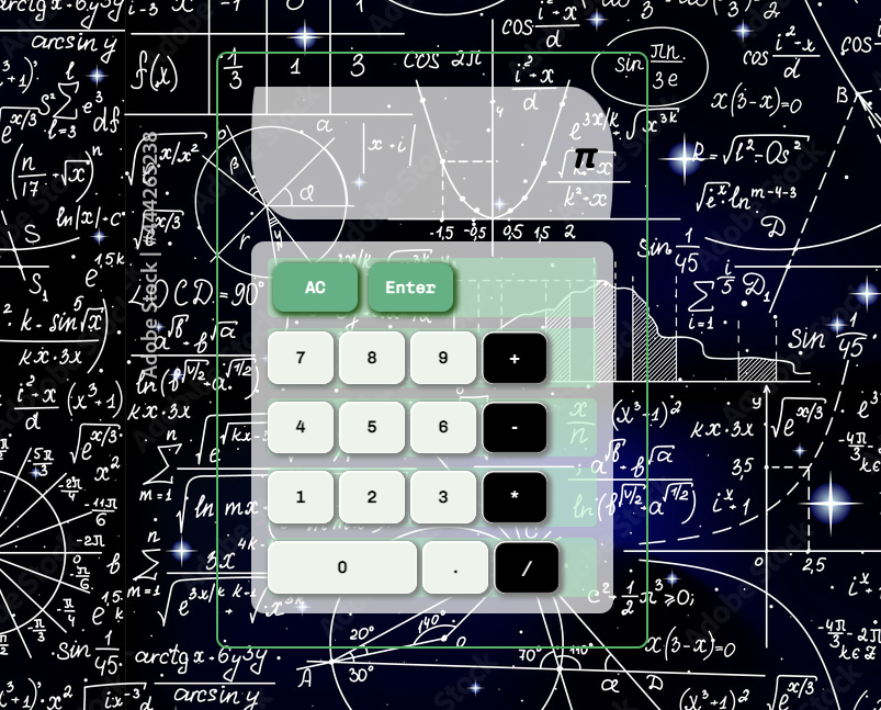
- 실제 제품이랑 작동하는 모습과 동일하게 HTML문서 작성 (하드 코딩)
- div요소에 값을 전달하는 방법 배우기 않았기 때무에 HTML문서에 인풋을 그대로 입력
3. 자바스크립트로 동작하는 애플리케이션 만들기
HTML 구성하기
- 수직분할, 수평분할 차례대로 적용 (height 속성 추가)
- Atomic CSS 방법론
- <body> element에 기본 스타일링 요소가 있음 (약간의 여백)
- width, height 계산이 여백을 포함하지 않아 계산에 어려움
- 초기화(리셋)을 위한 다양한 라이브러리 (Normalize.css)가 등장, 하지만 사실상 그냥 몇줄 코드만 애드하면 됨
* { box-sizing: border-box; } body { margin: 0; padding: 0; }
- 브라우저마다 여백, 글꼴 등 기본 스타일이 조금씩 다름
FLEXBOX
부모적용 (container)
-
include
display: flexto actiate -
flex-direction: row, column, row-reverse, column-reverse -
flex-wrap: nowrap, wrap, wrap-reverse -
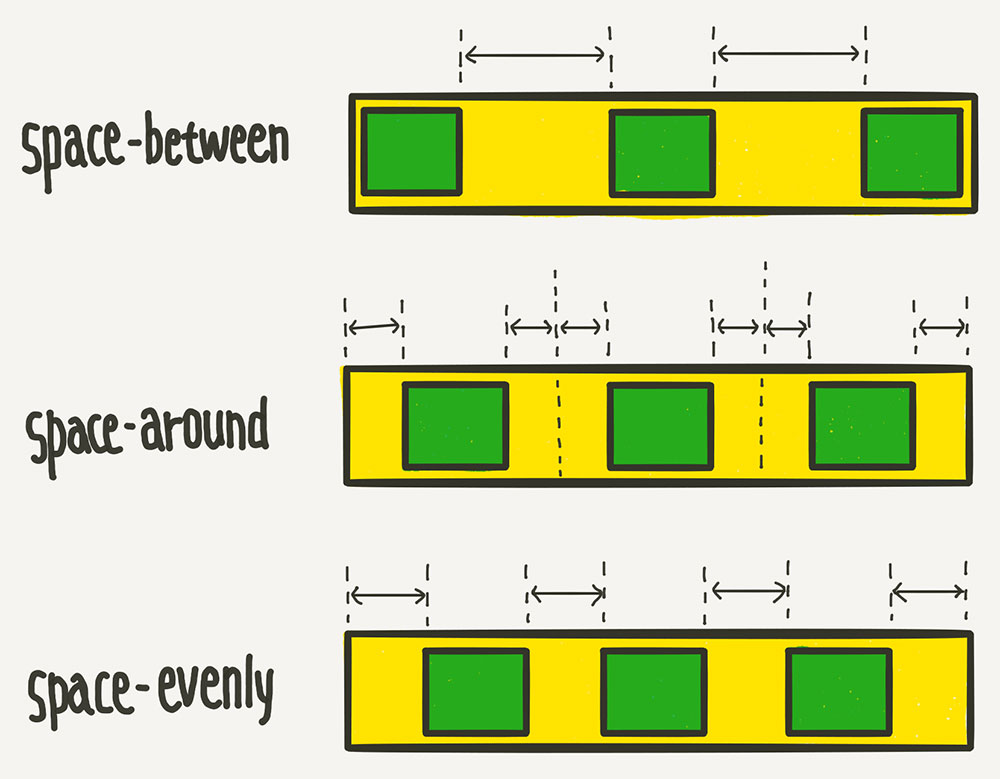
justify-content: along the primary axis
flex-start, flex-end, center, space-between, space-around, space-evenly -
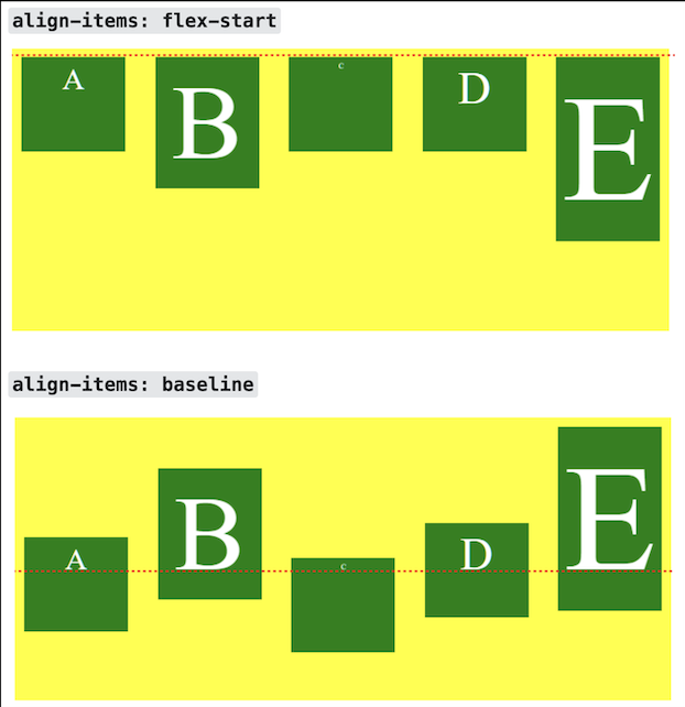
align-items: along the secondary axis
stretch, flex-start, flex-end, center, baseline (like flex-start with no content) -
flex-flow: flex-direction flex-wrap (shorthand) -
align-content: only works for multiline flexible containers with wrap property on
자식적용 (target)
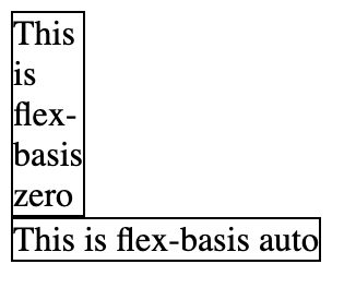
flex: grow, shrink, basisflex: 0 1 auto;- flex-basis has priority over width
flex-basis: automeans "look at my width & height property" /contentwas introduced for automatic sizingflex-basis: 0would collapse the content into the smallest possible width (image too)order: re-orders select items - -1 (front), 0 (as is), 1(back)align-self: overrides align-items for this single item
/* Specify <'width'> */
flex-basis: 10em;
flex-basis: 3px;
flex-basis: 50%;
flex-basis: auto;

/* Intrinsic sizing keywords */
flex-basis: max-content;
flex-basis: min-content;
flex-basis: fit-content;

/* Automatically size based on the flex item's content */
flex-basis: content;

/* Global values */
flex-basis: inherit;
flex-basis: initial;
flex-basis: revert;
flex-basis: revert-layer;
flex-basis: unset;
학습목표:
- VSCode의 레이아웃을 Flexbox를 이용하여 구현할 수 있다. -> 아직 안해봄

la, di, lah