Flexbox
-
기본개념
1) 부모 요소(flex container)
-
flex-direction : row가 기본
(이때 중심 축은 수평) -
flex-wrap: nowrap이 기본
(그외: wrap,wrap-reverse) -
flex-flow: flex-direction과 flex-wrap 한꺼번에 씀
ex) flex-flow:row wrap / flex-flow:column wrap
-
justify-content: 중심 축 아이템 정렬
flex-start, flex-end, space-around, space-between
-
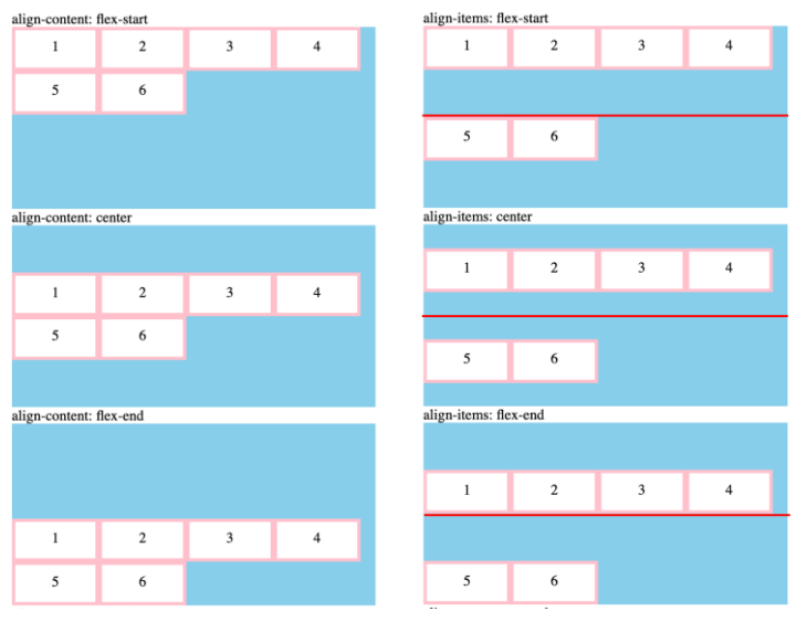
align-items: 반대 축 정렬
flex-start,flex-end
baseline(글꼴 기준선으로 아이템 정렬됨, row는 적용되는데 column방향에서는 적용X)
-
align-content: 반대 축 아이템 정렬, 여러 줄 사이의 간격을 지정(flex-wrap:wrap이 반드시 있어야 함), stretch 기본값
align-content를 사용하여 여러 줄 사이의 간격을 지정- align-content VS align-items 차이
- align-content VS align-items 차이
2) 자식 요소(flex item)
- flex-grow: flex container가 커졌을 때 늘어나는 비율=flex item의 확장을 정의
- 0 → 원래 크기 유지
- 1 이상 → flex container 크기에 맞춰서 flex item 크기도 커짐
- flex-shrink: flex item의 축소 정의
- flex-basis: flex item의 기본 크기 결정, auto가 기본값
- 0
- 100px
- flex: flex-grow, flex-shrink, flex-basis를 한꺼번에 설정
- order: 기본은 0/양수,음수
- align-self: 개별 요소에 정렬 적용
-
-
적용 방법: 자식 요소를 flex로 설정하려면 부모 요소에 display:flex 입력
-
축, 방향
- justify-content는 main axis
- align-items는 cross axis
- vh: viewpoint height

개발 공부한 걸 올립니다