프롤로그
본격 날것의 디자인에서 css 를 입히는 중이다. emotion 을 사용하고 material icon 을이용해 회원가입 폼을 꾸미려고 한다.
material icon 또한 npm 을 이용해 설치를 해주었다. 아이콘은 컴포넌트 형태로 가져 올 수 있어 편했다. (따로 이미지 작업을 하지 않아도 되고, 이미지형태로 불러오지 않아도 된다:-0)
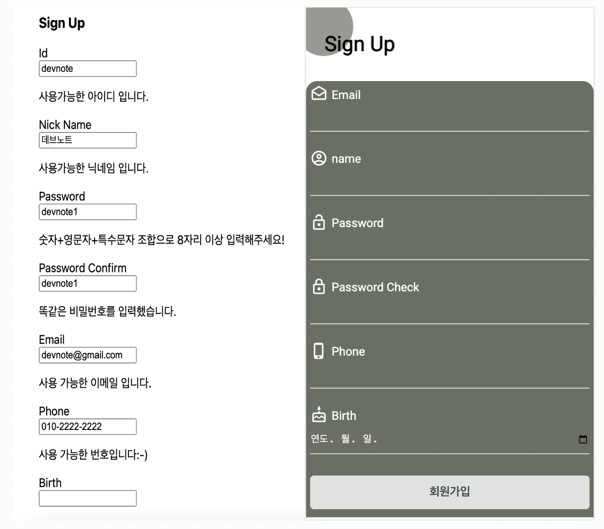
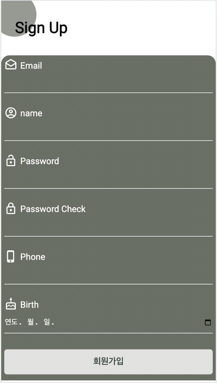
스타일 입힌 화면
emotion 사용한 styling
지난 포스팅에서와 같이 emotion 으로 css 를 입혀 주었다. 클래스를 지정하고, 그에 맞는 스타일을 입혀주었다.
정보를 입력하는 textField 영역은 컴포넌트로 만들었기 때문에 하나하나 클래스를 부여하는게 아니라 그 하나의 컴포넌트만 클래스를 주고 css 를 꾸며 주면 됐었다.
클래스 부여
 <div css={[pageCover]}>
        <h1 css={pageTitle}>Sign Up</h1>
        <span css={[spanStyle]} />
      </div>

      <form onSubmit={handleSubmit(submitForm)} css={[formWrapper]}>
        <TextField
          icon={DraftsOutlinedIcon}
          text={"Email"}
          name={"email"}
          inputType={"email"}
          errorMsg={errors.email && "이메일 형식이 맞지 않습니다."}
          register={register}
        />

        <button type="submit" css={button}>
          회원가입
        </button>
      </form>
`` 으로 감싼 css style 부여
const pageCover = css`
  position: relative;
  padding: 30px 0;
`;
const spanStyle = css`
  width: 80px;
  height: 80px;
  background: #696f64;
  border-radius: 50%;
  position: absolute;
  top: 50%;
  transform: translate(-20%, -80%);
  opacity: 0.7;
  z-index: -1;
`;
const pageTitle = css`
  font-size: 7.5vw;
  font-weight: 800;
  padding: 1.5vw;
  padding-left: 25px;
`;

const formWrapper = css`
  /* width: 500px; */
  margin: 0 auto;
  padding: 1.5vw;
  background: #696f64;
  color: #fff;
  border-radius: 15px 15px 0 0;
`;

const button = css`
  color: #3a3a3a;
  background-color: #fff;
  opacity: 0.8;
  border-radius: 5px;
  outline: none;
  appearance: none;
  border: none;
  padding: 13px;
  margin: 5px 0;
  font-size: 2vw;
  color: #2a4337;
  font-weight: 600;
  font-size: inherit;
  width: 100%;
`;
material Icon
이제 textField 부분도 스타일링을 해 줄 차례이다. 하나의 단위 컴포넌트만 css 를 입히는 것은 사실 쉬운 일이었다.
그러나 아이콘을 넣으려고 하니까 컴포넌트를 공통으로 사용해서 어떻게 각각 다르게 넘겨주지?? 라는 의문이 들었다.
일단 설치해주자
npm install @mui/icons-material
머터리얼 아이콘은 svg icon 컴포넌트로 받아 올 수 있다. 홈페이지에서 원하는 아이콘을 고른 후 import 시켜주면 끝이다.
하나의 아이콘을 따로 사용할 때에는 문제 없지만,
공통 컴포넌트를 쓰고 있는데 각각 다른 아이콘만 사용하고 싶은 경우에는 이 svg icon 도 props 로 넘겨 줘야 했다!
Icon 컴포넌트 props 넘기기
1. SvgIcon import 시키기
import SvgIcon from "@mui/material/SvgIcon";
import { SvgIconComponent } from "@mui/icons-material";
2. 컴포넌트 추가 & props 설정
<SvgIcon component={icon} inheritViewBox /> 컴포넌트를 추가해 주고 icon 을 props 로 받아왔다.
  return (
    <div css={[fieldWrapper]}>
      <div css={[title]}>
        <i>
          <SvgIcon component={icon} inheritViewBox />
        </i>
        <label htmlFor={name} css={[label]}>
          {text}
        </label>
      </div>

      <input type={inputType} {...register(name)} css={[inputStyle]} />
      {errorMsg && <span css={[errorMsgStyle]}>{errorMsg}</span>}
    </div>
  );
3. 타입 설정
타입스크립트를 사용하면 타입도 지정해 줘야한다. 처음에 컴포넌트를 string 으로 지정해줬는데 오류가 났다. 컴포넌트를 받는 것이니 SvgIconComponent 타입을 써줘야 한다. 오류 메세지 타고 따라가니 타입설정이 나왔다.
interface IProps {
  icon: SvgIconComponent;
  text: string;
  inputType?: string;
  name: Path<ISignUpForm>;
  register: UseFormRegister<ISignUpForm>;
  errorMsg?: string;
}
4. props 원하는 아이콘 보내주기
원하는 아이콘을 홈페이지에서 설정해서 받아온다. import 로 꼭 받아와줘야 한다. (import 는 해당 컴포넌트를 props 로 보내주는 곳에 써줘야 한다.) 그리고 컴포넌트를 props 로 보내준다. 이때 "" 로 감쌀 필요는 없다.
<TextField
          icon={DraftsOutlinedIcon}
          text={"Email"}
          name={"email"}
          inputType={"email"}
          errorMsg={errors.email && "이메일 형식이 맞지 않습니다."}
          register={register}
        />
결과
각가의 아이콘이 잘 가져 와졌다. 컴포넌트도 props 로 보내 줄 수 있어 정말 간편하고 코드가 깔끔했다. 전과 후를 살펴보자! 😊

에필로그
컴포넌트로 props 를 보내주고 공통화 시킨다는 것은 정말 효율적이고 깔끔한 코드가 완성 되는 것 같다. 아주 편리하다. css styling 을 해놓으니까 일단 마음도 편안해 졌다. 이번주에는 강점인 css 를 다뤄서 재미있기도 했다. 동시에 api 도 붙여야 하는데 이론 공부를 좀 하고 실제로 구현 해 볼 것 같다. 일주일에 하나씩 뭔가가 완성되니까 아주 좋다.🔥