[scss]화면 크기에 따라 간격 조절
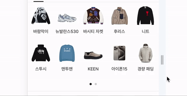
예시 gif는 크림 화면
이미지 크기는 유지하고 간격이 늘어나 도록
<div class="box">
    <a href="#">
        <span class="img_wrap">
            <img src="https://dummyimage.com/300x200/000/fff" alt="이미지1" />
        </span>
        <p class="name">이미지1</p>
    </a>
      <a href="#">
        <span class="img_wrap">
            <img src="https://dummyimage.com/300x200/000/fff" alt="이미지2" />
        </span>
        <p class="name">이미지2</p>
    </a>
      <a href="#">
        <span class="img_wrap">
            <img src="https://dummyimage.com/300x200/000/fff" alt="이미지3" />
        </span>
        <p class="name">이미지3</p>
    </a>
      <a href="#">
        <span class="img_wrap">
            <img src="https://dummyimage.com/300x200/000/fff" alt="이미지4" />
        </span>
        <p class="name">이미지4</p>
    </a>
      <a href="#">
        <span class="img_wrap">
            <img src="https://dummyimage.com/300x200/000/fff" alt="이미지5" />
        </span>
        <p class="name">이미지5</p>
    </a>
      <a href="#">
        <span class="img_wrap">
            <img src="https://dummyimage.com/300x200/000/fff" alt="이미지6" />
        </span>
        <p class="name">이미지6</p>
    </a>
</div>
.box {
display: flex;
gap: 12px 6px;
flex-wrap: wrap;
margin-top: 16px;
padding: 0 12px;
a {
display: inline-flex;
align-items: center;
justify-content: flex-start;
flex-direction: column;
width: calc((100% - 12px) / 3);
overflow: hidden;
.img_wrap {
width: 52px;
height: 52px;
overflow: hidden;
border-radius: 12px;
img {
width: 100%;
height: 100%;
}
}
.name {
margin-top: 8px;
font-size: 12px;
font-weight: $fw-regular;
line-height: 1.33;
color: $gray2;
text-align: center;
}
}
}
dev-riverkim