Frontend: design side
Backend: server, database
Bootstrap
here
Frontend library or framework by Twitter and opensourced
Responsive: adaptable to viewport. Mobile, Desktop needs to have a different layout
Pre-styled Elements
Pre-specified Classes
Adding Bootstrap on html file.
CDN
Submarine Cable Map under the sea, connecting points in the world. CDN(Content Delivery Network) is a contact point to download html, css etc. Browser caches the files to cut down on the downloading.
<link href="https://cdn.jsdelivr.net/npm/bootstrap@5.0.0-beta1/dist/css/bootstrap.min.css" rel="stylesheet" integrity="sha384-giJF6kkoqNQ00vy+HMDP7azOuL0xtbfIcaT9wjKHr8RbDVddVHyTfAAsrekwKmP1" crossorigin="anonymous">
Starter template
at bootstrap getting started
<head>
  <meta charset="utf-8">
  <title>TinDog</title>

  <!--  CSS Stylesheets -->
  <link rel="stylesheet" href="https://cdn.jsdelivr.net/npm/bootstrap@4.6.0/dist/css/bootstrap.min.css" integrity="sha384-B0vP5xmATw1+K9KRQjQERJvTumQW0nPEzvF6L/Z6nronJ3oUOFUFpCjEUQouq2+l" crossorigin="anonymous"> <link rel="stylesheet" href="static/styles.css">

  <!--  Google Fonts -->
  <link rel="stylesheet" href="https://fonts.googleapis.com/css2?family=Montserrat:wght@100;400;900&family=Ubuntu&display=swap">


  <!--  Font Awesome -->
  <script src="https://kit.fontawesome.com/567b8330e2.js" crossorigin="anonymous"></script>

  <!-- Bootstrap Scripts: JS -->
  <script src="https://cdn.jsdelivr.net/npm/@popperjs/core@2.5.4/dist/umd/popper.min.js" integrity="sha384-q2kxQ16AaE6UbzuKqyBE9/u/KzioAlnx2maXQHiDX9d4/zp8Ok3f+M7DPm+Ib6IU" crossorigin="anonymous"></script>
  <script src="https://cdn.jsdelivr.net/npm/bootstrap@5.0.0-beta1/dist/js/bootstrap.min.js" integrity="sha384-pQQkAEnwaBkjpqZ8RU1fF1AKtTcHJwFl3pblpTlHXybJjHpMYo79HY3hIi4NKxyj" crossorigin="anonymous"></script>

</head>
Wireframing
Work flow of frontend dev
1) Wireframing: low fidelity design of final product. Quick.
Sneakpeekit: template for wireframing
balsamiq: industry standard tool
2) Mock-up: High fidelity representation of website. Screen shots. Taking time.
3) Prototype: animated version.
Awwwards: References for layout, structure
ui-patterns: UI design patterns
dribbble: sorting by colour
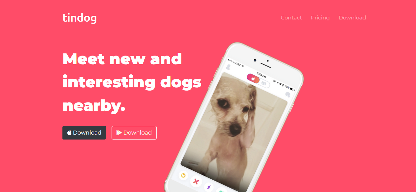
Tindog
- Goal: using skeleton project to complete the designs with bootstrap
 Codeply: HTML, CSS application
Nav bar
- nav bar
Margin auto

- Toggler(hamburger)
Add JS script for drop down menu
  <script src="https://cdn.jsdelivr.net/npm/@popperjs/core@2.5.4/dist/umd/popper.min.js" integrity="sha384-q2kxQ16AaE6UbzuKqyBE9/u/KzioAlnx2maXQHiDX9d4/zp8Ok3f+M7DPm+Ib6IU" crossorigin="anonymous"></script>
  <script src="https://cdn.jsdelivr.net/npm/bootstrap@5.0.0-beta1/dist/js/bootstrap.min.js" integrity="sha384-pQQkAEnwaBkjpqZ8RU1fF1AKtTcHJwFl3pblpTlHXybJjHpMYo79HY3hIi4NKxyj" crossorigin="anonymous"></script>
Grid layout systems
Being responsive: airbnb example -> col-lg md sm
total number of columns 12
col for colunm<div class="row">
- large-desktop, 6 bars taking 2 each : col-lg-2
- medium-tablet, 6 bars taking 4 each : col-md-3
- small-phone, 6 bars taking 1 each : col-sm-12 or by default all the columns taking 100% of the width
col-lg-2 
col-md-3 
col-sm-12 or default 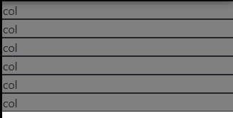
<div class="row">
    <div class="col-lg-2 col-md-3 col-sm-12" style="background-color:gray; border: 1px solid">
        col
    </div>
    <div class="col-lg-2 col-md-3 col-sm-12" style="background-color:gray; border: 1px solid">
        col
    </div>
    <div class="col-lg-2 col-md-3 col-sm-12" style="background-color:gray; border: 1px solid">
        col
    </div>
    <div class="col-lg-2 col-md-3 col-sm-12" style="background-color:gray; border: 1px solid">
        col
    </div>
    <div class="col-lg-2 col-md-3 col-sm-12" style="background-color:gray; border: 1px solid">
        col
    </div>
    <div class="col-lg-2 col-md-3 col-sm-12" style="background-color:gray; border: 1px solid">
        col
    </div>
</div>
Container Fluid
bootstrap code
automatically responsive
div container-fluid : not jumpy!
Buttons
Font Awsome: for apple, adroid button icon
Similar to Bootstrap, we need to add it to our html.
best to add custom names rather than modifying btn
  <!--  Font Awesome -->
<script src="https://kit.fontawesome.com/567b8330e2.js" crossorigin="anonymous"></script>- size
fa-4x
<i class="fas fa-check-circle feature fa-4x"></i>Rotating image in CSS
Negative to anti-clockwise
.title-image {
    width: 60%;
    transform: rotate(45deg)
}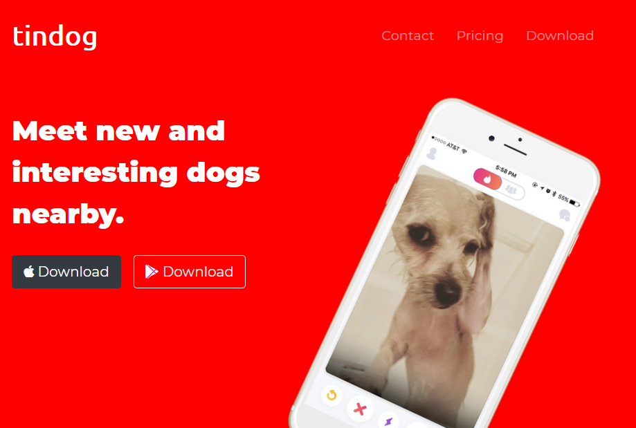
Visual hirearchy
To attract viewer's attention
- feature explanation
- download btn (CTA)
- logo
Carousel
active one is currently shown
data interval ="5000"
slide
keyboard
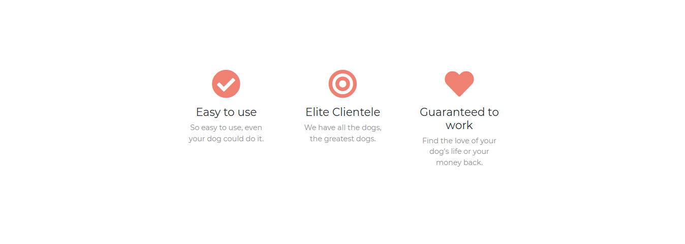
Card
Card column: to lay them horizantally
Z-index
dimension
-position: absolute, last html is toward the viewer (stacking order, overlapping)
-default z-index is 0
-it only works when you set position (absolute, relative ~ any)
(css file)
z-index: 1; (front)
Mobile-First: Media Query Breakpoint
Google ranking is affected: mobile-friendly test
Making mobile version: needs to make two.. takes resources
Bottom line is... Make it responsive!
Media Query
-on the very bottom part of css file.
@media<type><feature>
@media screen (min-width:900px) {
//change something
}
only activated when it's on screen, checking if screen size screen (min-width:900px) is True or False.
@media (max-width: 900px) and (min-width: 1000px) {
h1 {
	color:red;
}
}
tablet: 880x264
desktop: 1182x264
screen: size, resolution
speech: if website read for visually impaired people
To avoid confusion, be very exact about:
size of the Device
size of Browser
size of Viewport (size of screen)
href to target section
use ID at href to navigate to the tartget section on screen
<a class="nav-link" href="#footer">Contact</a>Refactoring
- Get rid of repetition: multiple selectors
- Modularity for reuse and maintenance: custom class
Multiple selectors
- Grouping
Applied to across all website
h1, h2, h3, h4, h5, h6 {
    font-family: 'Montserrat';
}
body {
font-family: 'Montserrat';
text-align: center;
}Custom class
for Modularity
-h1, h2 are too general and broad. Give custom class name to be more specific.
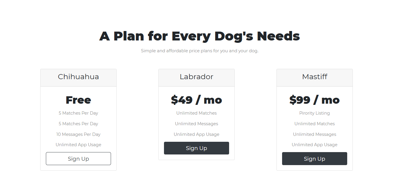
    <h2 class="section-heading">A Plan for Every Dog's Needs</h2>


.section-heading {
    font-size: 3rem;
    line-height: 1.5;
    font-weight: 700;
}
Combining selectors
#title .container-fluid { }only for the container-fluid inside title section, {do this}
It's very specific, it will override general one.
- Hierarchical Selectors
-> Space and order is very important
-Space btw two
Only workes in parent-child relationship
reading from right to left
HTML
<div class="container">
	<h1 class="title>Hello World</h1>


 CSS (notice the space)
 .container .title {
 	color: red;
 }
/* Title Section */
@parent @child
#title .container-fluid {
padding: 3% 15% 7%;
}e.g. all the h1s on the webpage, that is the child of an element class= ".container-fluid" should be coloured red
.container-fluid h1 {color: red;}- Not Hierarchical(no parent-child relationship): No space, within the same html element.
reading from left to right
h1#title {color: red;}
HTML
<h1 class="title container>Hello World</h1>

 CSS (No space)
 .container.title {
 	color: red;
 }
Overriding hierarchy
-
Higher priority
Id > Class > html elements h1 h2 etc -
Reading code top to bottom
-
inline style than internal or external
Best practice
Use Id very sparingly(only use it for sections)
First consider class
Avoid inline style


5 hours lecture took nearly 5 days. I am not good at designing. I like the point that I can see the result right away but I feel frustrated that I need to know lots and even think about logic flow only to move the boxes. It will take some time to get used to it. Front side is important too. I will come back to studying routine to achieve my goal this week. Let's go through Flask quickly and have lots of practice time. I will get the hang of it. I will be able to build a portfolio soon.
