
xml에서 pressed 상태가 되었을때, 색깔을 바꾸는것은 2가지 방법으로 가능하다.
1. xml을 통해 state가 pressed 상태일때의 색을 설정하여 xml을 background로 지정
2. view 위에 같은 크기의 view를 덮어씌워 색을 opacity 주기
compose에도 당연히 pressed 색깔만 넣으면 pressed 되었을때 색이 바뀔줄 알았지 ...
하지만 compose는 만만콩떡이 아니므로 쉽게 내가 원하는 바를 이루어 줄 리가 없다 ^^
compose에서는 3가지의 방법으로 pressed 상태의 색을 바꿀수 있는데 사실 3가지 방법이라기 보다는 widget에 따라 구현하는 방식이 다르다고 할 수 있다.
먼저 가장 많이 쓰일 Button에 pressed 상태에 따라 색을 바꾸는 방법은 다음과 같다.
Button
- interactionSource 를 remeber로 선언한다.
- developers 문서에 설명된 바와 같이 MutableInteractionSources는 컴포넌트가 pressed된 상태나 dragged되는 상태 등을 감지할 수 있다.
val interactionSource = remember {
MutableInteractionSource() }- pressed 상태를 observing 한다. 여기서는 pressed 상태에 따라 변화를 주기 때문에 pressed State를 observing 한다.
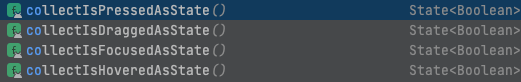
val isPressed by interactionSource.collectIsPressedAsState()pressed 상태 외에도 다양한 상태들이 있다. 필요한 것을 선택하여 사용하면 된다.
- pressed 되었을때의 color와 원래 상태의 color를 설정한다.
val color = if (isPressed) Color(0x0D000000) else Gray20- Button에서 interactionSource를 설정하고 colors에 containerColor를 pressed color로 설정해준다.
 interactionSource = interactionSource,
 colors = ButtonDefaults.buttonColors(containerColor = color),
Full code
 val interactionSource = remember { MutableInteractionSource() }
 val isPressed by interactionSource.collectIsPressedAsState()
 val color = if (isPressed) Color(0x0D000000) else Gray20

                Button(
                    modifier = Modifier.fillMaxWidth(),
                    interactionSource = interactionSource,
                    colors = ButtonDefaults.buttonColors(containerColor = color),
                    shape = RoundedCornerShape(8.dp),
                    onClick = {}
                ) {


                }
Button은 이렇게 해주면 pressed 되었을 때의 색상이 변하게 된다.
하지만 image에 pressed 될때마다 색상을 바꾸고 싶다면 ? ? ? ? ? Button과 달리 그런 기능이 없는 곳에서는 직접 구현해주어야한다.
버튼이 아닌 Widget
가장 쉬운 방법으로는 같은 사이즈의 Box 객체를 만들고 그 Box 객체의 opacity를 설정하여 색을 바꿔주는 방법이 있다.
반복적으로 만드는 것이 싫어서 이를 쉽게 구현해주는 Composable을 생성하였다.. 유용하게 쓰이길 바라며
@Composable
fun PressedEffectComposable(
    content: @Composable () -> Unit,
    modifier: Modifier,
    pressedColor: Color,
    interactionSource: MutableInteractionSource,
    onClickListener: () -> Unit
) {
    Box(
        modifier = modifier.clickable(interactionSource = interactionSource,
            indication = LocalIndication.current, onClick = {
                onClickListener.invoke()
            })
    ) {
        content()
        Box(
            modifier = modifier.background(color = pressedColor)
        )
    }
}
사용법은 다음과 같다.
val interactionSource = remember { MutableInteractionSource() }
val isPressed by interactionSource.collectIsPressedAsState()
val color = if (isPressed) Color(0x0D000000) else Gray20

  PressedEffectComposable(
                content = {
                    AsyncImage(
                        modifier = Modifier
                            .padding(top = 12.dp, start = 12.dp)
                            .size(80.dp)
                            .clip(RoundedCornerShape(8.dp)),
                        model = image_thumbnail_url,
                        contentDescription = "",
                        contentScale = ContentScale.Crop,
                    )
                },
                modifier = Modifier
                    .padding(top = 12.dp, start = 12.dp)
                    .size(80.dp)
                    .clip(RoundedCornerShape(8.dp)),
                interactionSource = interactionSource,
                pressedColor = color,
                onClickListener = {

                }
            )
        }
다음으로 진짜 뭘 해도 안될때는 widget위에 직접 rect를 그려서 opacity를 설정해 주는 방법이 있다.
말안듣는 애들
다음 코드로 위에 그려주는 것인데 카드의 경우에는 코너 Radius 값이 존재하여 Radius 값을 주었다. Rect 외에도 다른 모양도 그릴 수 있으니 범용적으로 적용될 수 있다고 생각한다.
.drawWithCache {
            onDrawWithContent {
                drawContent()
                if (isPressed){
                    drawRoundRect(color = color, blendMode = BlendMode.SrcOver, cornerRadius = CornerRadius(20f))
                }
            }
        }
Full Code
val interactionSource = remember { MutableInteractionSource() }
val isPressed by interactionSource.collectIsPressedAsState()
val color = if (isPressed) AppColors.Gray10 else Color.White

Card(
    Modifier
        .fillMaxWidth()
        .wrapContentHeight()
        .padding(top = 6.dp, bottom = 6.dp)
        .clickable(
            interactionSource = interactionSource,
            indication = LocalIndication.current,
            onClick = {}
        )
        .drawWithCache {
            onDrawWithContent {
                drawContent()
                if (isPressed){
                    drawRoundRect(color = color, blendMode = BlendMode.SrcOver, cornerRadius = CornerRadius(20f))
                }
            }
        },
    shape = RoundedCornerShape(12.dp),
) {

}
