
코드스테이츠 프론트엔드 부트캠프에 합격하여 코스 교육 진행중이다
위와같이 계산기의 형태를 만드는 과제가 주어졌다. 기능이 아닌 형태만 만들면 되는거니까 HTML과 CSS만으로 금방 만들 수 있을 것 같다
<!DOCTYPE html>
<html lang="en">
  <head>
    <meta charset="UTF-8" />
    <meta name="viewport" content="width=device-width, initial-scale=1.0" />
    <title>Calculator</title>
    <link rel="stylesheet" href="style2.css" />
  </head>
  <body>
      <div class="calculator">
        <button class="exit"></button>
        <button class="max"></button>
        <button class="min"></button>
        <div class="calculator__display--bare">
          <span class="calculator__result">0</span>
        </div>
        <div class="main">
          <div class="clear__and__enter">
            <button class="high">AC</button>
            <button class="high">+/-</button>
            <button class="high">%</button>
            <button class="operator">÷</button>
          </div>
          <div class="button__row">
            <button class="number">7</button>
            <button class="number">8</button>
            <button class="number">9</button>
            <button class="operator">×</button>
          </div>
          <div class="button__row">
            <button class="number">4</button>
            <button class="number">5</button>
            <button class="number">6</button>
            <button class="operator">-</button>
          </div>
          <div class="button__row">
            <button class="number">1</button>
            <button class="number">2</button>
            <button class="number">3</button>
            <button class="operator">+</button>
          </div>
          <div class="button__rows">
            <button class="zero">0</button>
            <button class="demical">.</button>
            <button class="operator">=</button>
          </div>
        </div>
      </div>
  </body>
</html>
HTML은 위처럼 각각의 버튼을 따로따로 선언하여 간단하게 구현하였다.
.calculator {
  background-color: #464646;
  border: 1px solid black;
  width: 350px;
  border-radius: 10px;
  font-family:"나눔스퀘어";
}
.exit {
  background-color: red;
  cursor: pointer;
  border: 1px solid red;
  height:15px;
  border-radius: 50%;
}
.max {
  background-color: yellow;
  cursor: pointer;
  border: 1px solid yellow;
  height:15px;
  border-radius: 50%;
}
.min {
  background-color: green;
  cursor: pointer;
  border: 1px solid green;
  height:15px;
  border-radius: 50%;
}
.calculator__display--bare {
  /* display: none; */
  background-color: #464646;
  text-align: right;
  vertical-align: middle;
  height: 100px;
  width: 100%;
  font-size: 20px;
  overflow: hidden;
  overflow-wrap: break-word;
}

.calculator__display--bare > span {
  display: inline-block;
  text-align: center;
  background-color: #464646;
  color:white;
  margin: 5px;
  width: 40px;
  height: 45px;
  border-radius: 10px;
  font-size: 40px;
  padding: 10px 5px;
}

.calculator__display--for-advanced {
  display: none;
  background-color: #464646;
  height: 100px;
  width: 100%;
  border-radius: 10px;
  font-size: 20px;
  text-align: center;
  vertical-align: middle;
  overflow: hidden;
  overflow-wrap: break-word;
}
.clear__and__enter {
  display:flex;
  height: 60px;
  background-color: white;

}
.clear__and__enter > button {
  flex : 1 1 50px;
  color: white;
  cursor: pointer;
  outline: none;
  font-size:150%;
  border:0.1px solid rgb(63, 63, 63);
}
.high {
  background-color: #575757;
}
.operator {
  background-color: #ffa600;
}
.button__row {
  display:flex;
  height: 60px;
  background-color: white;
}
.button__rows {
  display:flex;
  height: 60px;
  background-color: white;
}
.button__row > button {
  flex : 1 1 50px;
  cursor: pointer;
  outline: none;
  color:white;
  background-color: #b1b1b1;
  font-size:150%;
  border:0.1px solid rgb(63, 63, 63);
}
.button__row > .operator {
  color: #ffffff;
  background-color: #ffa600;
}
.button__rows > button {
  flex:1;
  cursor: pointer;
  outline: none;
  color:white;
  background-color: #b1b1b1;
  font-size:150%;
  border:0.1px solid rgb(63, 63, 63);
}
.button__rows > .operator {
  color: #ffffff;
  background-color: #ffa600;
  border-radius: 0 0 10px 0;

}
.button__rows > .zero {
  flex: 2 1 28px;
  border-radius: 0 0 0 10px;
}
.button__rows > .demical {
  flex-grow:1;
  border-radius: 0 0 0 10px;
}
CSS파일도 버튼 클래스 별로 하나씩 만들어보았다. 폰트는 무조건 나눔스퀘어로 나오게 하였다.(본인 나눔스퀘어 폰트 굉장히 좋아하는편)
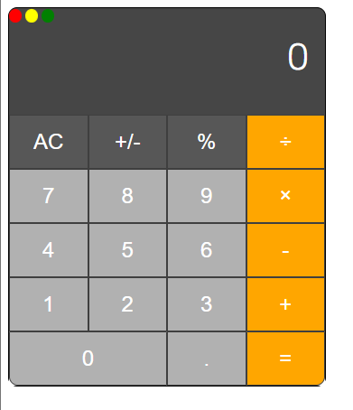
잘 나온것같긴한데 뭔가 심심하다. 이대로 제출해도 문제없긴한데 심심하니까 좀 꾸며보자
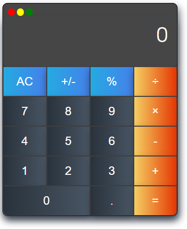
그림자 추가하고 그라데이션을 넣어보았다. 좀 분위기가 사는군.
background-image: linear-gradient(to right, #25aae1, #4481eb, #04befe, #3f86ed);
box-shadow: 4px 8px 15px 0 rgba(45, 54, 65, 0.75);
버튼 클래스 별로 각각 다른 그래디언트와 Box-Shadow를 삽입하였다.
심심하니까 마우스 hover 기능도 추가해보자.
저 버튼들에 hover 효과를 넣으면 마우스가 버튼 위에 올라갈때 지정된 효과가 실행된다!
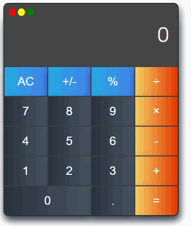
이제야 좀 있어보이는 목업이 완성되었다.
background-size: 300% 100%;
  -o-transition: all .4s ease-in-out;
  -webkit-transition: all .4s ease-in-out;
  transition: all .4s ease-in-out;
색깔을 4개를 지정한 이유이다. Background-size를 늘려서 왼쪽 두개만 나오게 했다가
hover를 하면 오른쪽 두개가 나오도록 구현해보았다.
.high:hover{
  background-position: 100% 0;
  -o-transition: all .4s ease-in-out;
  -webkit-transition: all .4s ease-in-out;
  transition: all .4s ease-in-out;
}