
📌
relative = 흐름대로 // 시작점 : 각자위치
absolute = 흐름무시 // 시작점 : 부모요소위치 부모요소중에 relative가 있으면 그게 시작점! relative 없으면 body가 시작점!
fixed = 흐름무시, 스크롤 내려도 고정위치 // 시작점 : 부모요소 상관없이 그냥 전체페이지 기준
📖 transition : 바뀌는 효과
1. transition-property = 효과가 적용될 속성 이름
2. transition-duration = 효과가 지속되는 시간
3. transition-delay = 지연되는 시간
4. transition-timing-funtion = 효과 속도(패턴) 지정
linear : 일정한 속도
ease : 빨라지다가 느려짐
ease-in : 느리다가 빨라짐
ease-out : 빨라지다가 점점 느려짐
ease-in-out : 느리다가 점점 빨라지다가 다시 느려짐
cubic-bezier(1,0,.89,1.2) : 빠르기를 내가 지정할 수 있다!
👉 5. transition: property duration timing-funtion delay = 한번에 적용
ex) transition: all 1s linear 1s;
=> 모든 속성을 1초동안 일정한속도로 커서올려놓고 1초 후에
💡적용💡
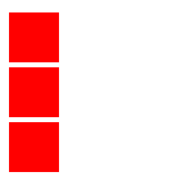
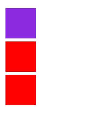
<style>
	.box {
		width: 100px;
        height: 100px;
        background-color: red;
        margin: 10px;
        transition: background-color 2s cubic-bezier(1,0,.9,.76) 1s; /*한줄로 한번에 적용*/
 	}

   	/* 마우스를 올리면 -> 가상선택자 */
    .box:hover {
		background-color: blueviolet;
	}
</style><body>
<div class="box"></div>
<div class="box"></div>
<div class="box"></div>
</body>=> 💻
=> 마우스 올려놓으면 transition: background-color 2s cubic-bezier(1,0,.9,.76) 1s;
이거대로 배경색상이 2초동안 1초후에 보라색으로 바뀐다!
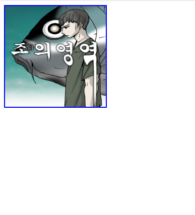
💡적용💡
<style>
	/* 바뀌기 전 */
    .box {
		width: 200px;
        height: 200px;
        border: 2px solid blue;
        background-image: url(../../day01/images/imgtest3.jpg);
        background-size: 200px 200px;
        transition: all 1s linear 0.5s;
    }
    /* 마우스 올리고 난 후 */
    .box:hover {
        width: 600px;
        height: 600px;
        border: 2px solid red;
        background-image: url(../../day01/images/imgtest3.jpg);
        background-size: 200px 200px;
    }
</style>
<body>
    <div class="box"></div>
</body>
=> 💻
=> 마우스 올리면
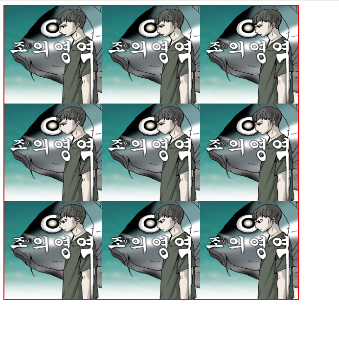
=> transition: all 1s linear 0.5s; 모든속성이 마우스올리면 0.5초 있다가 1초동안 일정한속도로 동작!
📖 animation
@keyframes -> 단계별로 적용할 스타일 (0% 25% 50% 100%)
1. animation-name: 키프레임 이름
2. animation-duration: 지속되는 시간
3. animation-delay: 지연 시간(몇초있다가 실행될건지)
4. animation-fill-mode (시작과 끝)
	none        :   시작적용X   끝나면 원래대로
    forwards    :   시작적용X   끝나면 마지막 스타일로 적용
    backwards   :   시작적용O   끝나면 원래대로
    both        :   시작적용O   끝나면 마지막 스타일로 적용 @
5. animation-iteration-count: 몇번 반복할거냐 횟수 // 무제한? infinite
6. animation-direction:
    normal              : 0% -> 100% (노랑 주황 빨강)
    reverse             : 100% -> 0% (빨강 주황 노랑)
    alternate           : 0% -> 100% -> 0% -> 100% (normal->reverse) (왔다갔다)
    alternate-reverse   : 100% -> 0% -> 100% -> 0% (reverse->normal) (거꾸로 왔다갔다)
💡적용💡
- 먼저 @keyframes boxAni {} 로 스타일 잡아주고
@keyframes boxAni {
0% {
background-color: red;
margin-left: 0px;
}
25% { background-color: red;
margin-left: 0px;
}
50% {
	background-color: red;
   	margin-left: 0px;
}
}
2. 실행 하고 싶은 박스클래스에 animation-name: boxAni; 넣어주고 animation-duration 등등등 속성 적어주면 된다!
.box {
animation-name: boxAni;
animation-duration: 2s;
animation-delay:1s
animation-fill-mode: both;
animation-iteration-count: infinite;
animation-direction: alternate;
animation-play-state: paused(정지) , running(실행) => 커서올려놨을때 실행되고 커서올려놨을때 정지되게 하는 거 하고 싶을때!!
}
📖 transform : 크기변화를 주는 용도
1. 이동 : translate(x,y)
=> x,y 좌표만큼 이동
2. 크기 : scale(2,2)
=> 가로,세로 2배
3. 기울이기 : skew(xdeg, ydeg)
=> x축 y축 기준 기울이기
4. 회전시키기 : rotate(90deg)
=> 90도 돌려라
5. 기준점 : transform-origin: x y
x = left center right
y = top center bottom
이런식으로 한번에 다 쓸 수 있다!
transform:scale(2,2) rotate(45deg);
📌정리
transition : 다른 속성들의 변화, 일정시간동안 자연스럽게 // 이벤트(마우스오버)
animation : 여러단계로 나눠서, 움직임 // 몇회반복, 무제한 반복
transform : 크기,회전,이동
transition => 마우스오버일때 다시 원래대로 돌아오는효과OOOO
animation => 마우스오버일때 다시 원래대로 돌아오는효과XXXX
transition + transform
animation + transform
