
시작하기
Why Story book ?
-
컴포넌트 단위의 개발을 지향하는 React, Vue, Angular를 위해 등장 => 모든 컴포넌트들을 테스트하기 어려움..
-
business logic과 UI로직을 분리하기위해 storybook이 등장함. 바로 UI만 테스트 가능, 협업시 용이함
설치
-
아래 명령어를 입력하면 알아서 best configuration을 설정해 줌.
-
npm run storybook을 통해 시작함.(7.5버전 기준 작성)
npx storybook@latest init
npm run storybook
Story란?
-
컴포넌트 또는 UI요소에 대한 예제를 말한다. 하나의 컴포넌트에 대해 여러가지 story(시나리오..?)가 있을 수 있는데, 이를 각각 정의해서 storybook에서 볼 수 있도록 한다!
-
첫번째 story book을 설치하면 나오는 예제코드이다. => 여기서 Button은 props에 따라 여러가지 형태로 사용되는데, 이 prop과 이벤트 핸들러들을 GUI환경에서 볼 수 있게 해준다.
import type { Meta, StoryObj } from '@storybook/react';

import { Button } from './Button';

// More on how to set up stories at: https://storybook.js.org/docs/react/writing-stories/introduction#default-export
const meta = {
  title: 'Example/Button',
  component: Button,
  parameters: {
    // Optional parameter to center the component in the Canvas. More info: https://storybook.js.org/docs/react/configure/story-layout
    layout: 'centered',
  },
  // This component will have an automatically generated Autodocs entry: https://storybook.js.org/docs/react/writing-docs/autodocs
  tags: ['autodocs'],
  // More on argTypes: https://storybook.js.org/docs/react/api/argtypes
  argTypes: {
    backgroundColor: { control: 'color' },
  },
} satisfies Meta<typeof Button>;

export default meta;
type Story = StoryObj<typeof meta>;

// More on writing stories with args: https://storybook.js.org/docs/react/writing-stories/args
export const Primary: Story = {
  args: {
    primary: true,
    label: 'Button',
  },
};

export const Secondary: Story = {
  args: {
    label: 'Button',
  },
};

export const Large: Story = {
  args: {
    size: 'large',
    label: 'Button',
  },
};

export const Small: Story = {
  args: {
    size: 'small',
    label: 'Button',
  },
};
Addons
-
애드온이란 스토리북의 core 기능을 확장 시킬 수 있는 plug-in이다.
-
addon panel에서 그 기능들을 확인 가능하다.
-
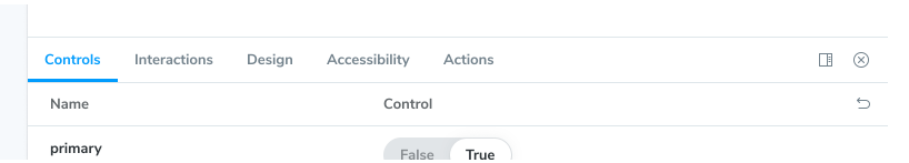
Control Tab : 컴포넌트 prop들을 동적으로 상호작용 할 수 있는 탭
-
Action : 이벤트 callback을 통해 올바른 결과값을 도출했는지를 확인 할 수 있는 탭
-
interaction : interaction test(상호작용 테스트를 적용 할 수 있게 해주는 탭)
=> 6.4 버전부터 적용됨, testing library와 결합해 storybook 안에서 interaction test 작성가능.
Story 작성법
기본
-
story file은 개발모드에서만 작동 => production 모드에서 추가 x
-
Component Story Format(CSF) 형식으로 정의 => default export 방식과 named export 방식이 존재함 (2가지 용도가 다름) => Storybook 7버전부터는 CSF3형식을 사용한다.
-
default 방식으로는 컴포넌트에 대한 설명인 meta data을 export 한다.
-
named export 방식으로는 컴포넌트별 각각의 story를 내보낸다.
-
여기서 컴포넌트 스토리를 내보낼때는 UpperCamelCase 를 사용한다.
// Button.stories.ts|tsx

import type { Meta, StoryObj } from '@storybook/react';

import { Button } from './Button';

const meta: Meta<typeof Button> = {
  component: Button,
};

export default meta;
type Story = StoryObj<typeof Button>;

/*
 *👇 Render functions are a framework specific feature to allow you control on how the component renders.
 * See https://storybook.js.org/docs/react/api/csf
 * to learn how to use render functions.
 */
export const Primary: Story = {
  render: () => <Button primary label="Button" />,
};
CSF2 VS CSF3 버전
ref) : https://dev.to/boyum/update-your-storybook-stories-from-csf-2-to-csf-3-now-136g
https://storybook.js.org/blog/storybook-csf3-is-here/
-
Spread Operator를 통한 story 복사 가능( Template..을 정의하고 bind하는 패턴이 사라짐)
-
play function은 story가 렌더링 된 이후에 작동 => play function 을 통한 interaction 작성가능함.
export const FilledForm = {
  args: {
    email: 'marcus@acme.com',
    password: 'j1287asbj2yi394jd',
  }
};

export const FilledFormMobile = {
  ...FilledForm,
  parameters: {
    viewports: { default: 'mobile' }
  },
};

// RegistrationForm.stories.ts|tsx
import { userEvent, within } from '@storybook/testing-library';

// ...

export const FilledForm = {
  play: async ({ canvasElement }) => {
    const canvas = within(canvasElement);

    const emailInput = canvas.getByLabelText('email', {
        selector: 'input'
    });
    await userEvent.type(emailInput, 'example-email@email.com', {
        delay: 100
    });

    const passwordInput = canvas.getByLabelText('password', {
        selector: 'input'
    });
    await userEvent.type(passwordInput, 'ExamplePassword', {
        delay: 100
    });

    const submitButton = canvas.getByRo	le('button');
    await userEvent.click(submitButton);
  },
};
React Hook과 함께 사용하기
-
arg를 사용 할 것을 권장, hook을 사용해서 stories를 작성 할 수도 있다.
-
React hook을 꼭 써야만 하는 상황이 있을까?
Using Args
-
bolierplate 코드 제거가능 => props만 넘겨서 컴포넌트 작성
-
preview.js에서 global args를 정의 가능
import type { Meta, StoryObj } from '@storybook/react';

import { Button } from './Button';

const meta: Meta<typeof Button> = {
  component: Button,
};

export default meta;
type Story = StoryObj<typeof Button>;

/*
 *👇 Render functions are a framework specific feature to allow you control on how the component renders.
 * See https://storybook.js.org/docs/react/api/csf
 * to learn how to use render functions.
 */
export const Primary: Story = {
  render: () => <Button backgroundColor="#ff0" label="Button" />,
};

export const Secondary: Story = {
  render: () => <Button backgroundColor="#ff0" label="😄👍😍💯" />,
};

export const Tertiary: Story = {
  render: () => <Button backgroundColor="#ff0" label="📚📕📈🤓" />,
};

// arg를 사용해 코드 작성을 권장함.

export const Primary: Story = {
  args: {
    backgroundColor: '#ff0',
    label: 'Button',
  },
};

export const Secondary: Story = {
  args: {
    ...Primary.args,
    label: '😄👍😍💯',
  },
};

export const Tertiary: Story = {
  args: {
    ...Primary.args,
    label: '📚📕📈🤓',
  },
};- arg의 재사용 가능함. => Button Group이라는 컴포넌트 story를 작성하고 싶을 때 => 이미 정의한 각각의 button들의 args를 재사용 가능하다는 패턴임.
// ButtonGroup.stories.ts|tsx

// ButtonGroup.stories.ts|tsx

import type { Meta, StoryObj } from '@storybook/react';

import { ButtonGroup } from '../ButtonGroup';

//👇 Imports the Button stories
import * as ButtonStories from './Button.stories';

const meta: Meta<typeof ButtonGroup> = {
  component: ButtonGroup,
};

export default meta;
type Story = StoryObj<typeof ButtonGroup>;

export const Pair: Story = {
  args: {
    buttons: [{ ...ButtonStories.Primary.args }, { ...ButtonStories.Secondary.args }],
    orientation: 'horizontal',
  },
};
Play function
-
컴포넌트 스토리를통해 interaction을 테스트하고 싶을 때 play function 을 사용 가능함.
-
user intervention이 있을때, story 가 렌더링될 경우 실행되는 코드임.
@storybook/addon-interactions 를 따로 설치해야함.
Parameters
-
스토리의 메타데이터를 정의할 때 사용함.
-
예를들어 Button Component를 다양한 background에서 test하고 싶다면 컴포넌트 레벨에서 background parameter를 넣으면 됨. (개별적으로 스토리를 생성하는게 아니라, 컴포넌트 레벨에서 값을 변경하며 테스트 가능함.)
-
Component level에서 파라미터를 설정할수도, preview.js라는 파일에서 global parameter를 설정할 수도 있음
// Button.stories.ts|tsx

import type { Meta } from '@storybook/react';

import { Button } from './Button';

const meta: Meta<typeof Button> = {
  component: Button,
  //👇 Creates specific parameters for the story
  parameters: {
    backgrounds: {
      values: [
        { name: 'red', value: '#f00' },
        { name: 'green', value: '#0f0' },
        { name: 'blue', value: '#00f' },
      ],
    },
  },
};

export default meta;
decorators
-
컴포넌트가 렌더링 될때 임의의 마크업에 감싸서 컴포넌트를 렌더링하도록 해주는 속성이다.
-
margin을 추가하는 예시, addon에 의해 더 다양한 기능이 있으며 story, component, global level에서 configuration을 설정 할 수 있다.
// Button.stories.ts|tsx

import type { Meta, StoryObj } from '@storybook/react';

import { Button } from './Button';

const meta: Meta<typeof Button> = {
  component: Button,
  decorators: [
    (Story) => (
      <div style={{ margin: '3em' }}>
        {/* 👇 Decorators in Storybook also accept a function. Replace <Story/> with Story() to enable it  */}
        <Story />
      </div>
    ),
  ],
};

export default meta;
2개이상의 컴포넌트 스토리 작성
- List와 ListItem의 경우 동시에 스토리를 만들어서 테스트해야한다. 이럴때는 render function 을 사용해 직접 렌더링 할 수 있다.
// List.stories.ts|tsx

import type { Meta, StoryObj } from '@storybook/react';

import { List } from './List';
import { ListItem } from './ListItem';

const meta: Meta<typeof List> = {
  component: List,
};

export default meta;
type Story = StoryObj<typeof List>;

export const Empty: Story = {};

/*
 *👇 Render functions are a framework specific feature to allow you control on how the component renders.
 * See https://storybook.js.org/docs/react/api/csf
 * to learn how to use render functions.
 */
export const OneItem: Story = {
  render: (args) => (
    <List {...args}>
      <ListItem />
    </List>
  ),
};

export const ManyItems: Story = {
  render: (args) => (
    <List {...args}>
      <ListItem />
      <ListItem />
      <ListItem />
    </List>
  ),
};
Theme Provider와 함께 사용하기
-
css파일에 MUI와 같이 themeprovider를 사용하는 경우 추가적인 addon을 설치해줘야한다.
-
emotion 이나 MUI와 같은 theme provider에 storybook은 접근 할 수 없기 때문
ref) https://storybook.js.org/recipes/@mui/material#@mui/material
- preview.ts 파일안에 withThemeFromJSXProviderdmf 을 사용해 theme, provider, globalStyle을 정의 가능하게 할 수 있다.
// .storybook/preview.js
import { CssBaseline, ThemeProvider } from '@mui/material';
import { withThemeFromJSXProvider } from '@storybook/addon-themes';
import { lightTheme, darkTheme } from '../src/themes.js';

/* snipped for brevity */

export const decorators = [
  withThemeFromJSXProvider({
  themes: {
    light: lightTheme,
    dark: darkTheme,
  },
  defaultTheme: 'light',
  Provider: ThemeProvider,
  GlobalStyles: CssBaseline,
})];