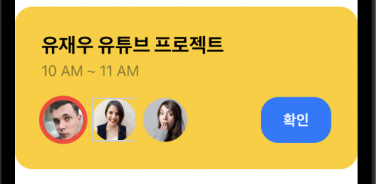
메인 프로젝트 카드
var body : some View {
        VStack(alignment: .leading, spacing: 0) {
            Rectangle().frame(height: 0)
            Text("유재우 유튜브 프로젝트")
                .font(.system(size: 23))
                .fontWeight(.black)
                .padding(.bottom, 5)
            Text("10 AM ~ 11 AM")
                .foregroundColor(.secondary)
            Spacer().frame(height: 20)
            HStack {
                Image("random1")
                    .resizable()
                    .frame(width: 50, height: 50)
                    .clipShape(Circle())
                    .overlay(
                        Circle()
                            .stroke(lineWidth: 5)
                            .foregroundColor(Color.red))
                Image("random2")
                    .resizable()
                    .frame(width: 50, height: 50)
                    .clipShape(Circle())
                Image("random3")
                    .resizable()
                    .frame(width: 50, height: 50)
                    .clipShape(Circle())
                Spacer()
                Text("확인")
                    .fontWeight(.bold)
                    .foregroundColor(.white)
                    .padding()
                    .frame(width: 80)
                    .background(Color.blue)
                    .cornerRadius(20)
            }
        }
        .padding(30)
        .background(Color.yellow)
        .cornerRadius(20)
    }
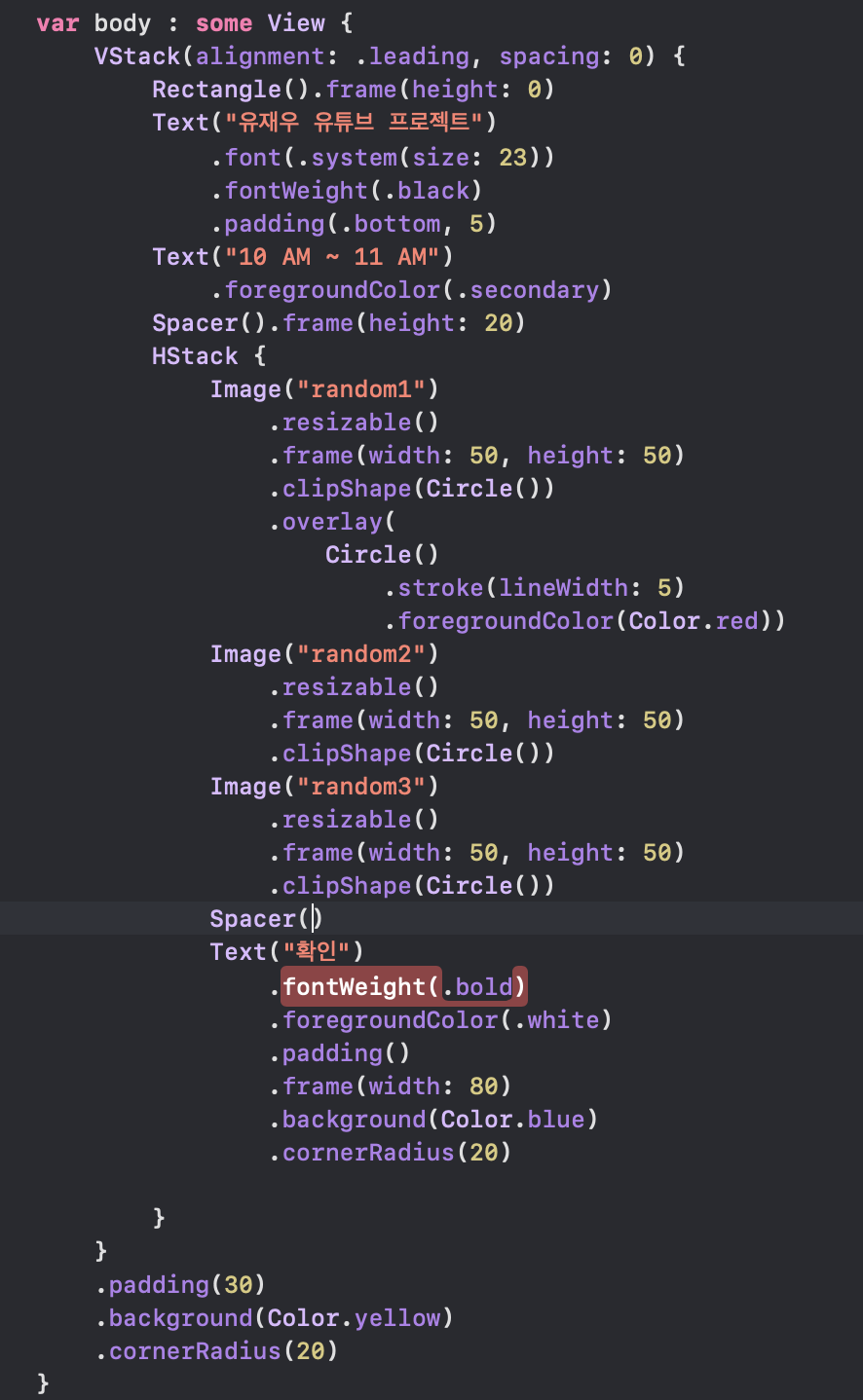
베이직 프로젝트 카드
var body : some View {
        HStack(spacing: 20){
            Image(systemName: "flame.fill")
                .font(.system(size: 40))
                .foregroundColor(Color.white)
            VStack(alignment: .leading, spacing: 0) {
                Divider().opacity(0)
//                Rectangle().frame(height: 0)
                Text("유재우 유튜브 프로젝트")
                    .font(.system(size: 23))
                    .foregroundColor(.white)
                    .fontWeight(.bold)
                Spacer().frame(height: 5)
                Text("10 AM ~ 11 AM")
                    .foregroundColor(.white)
            }
        }
        .padding(20)
        .background(Color.purple)
        .cornerRadius(20)
    }
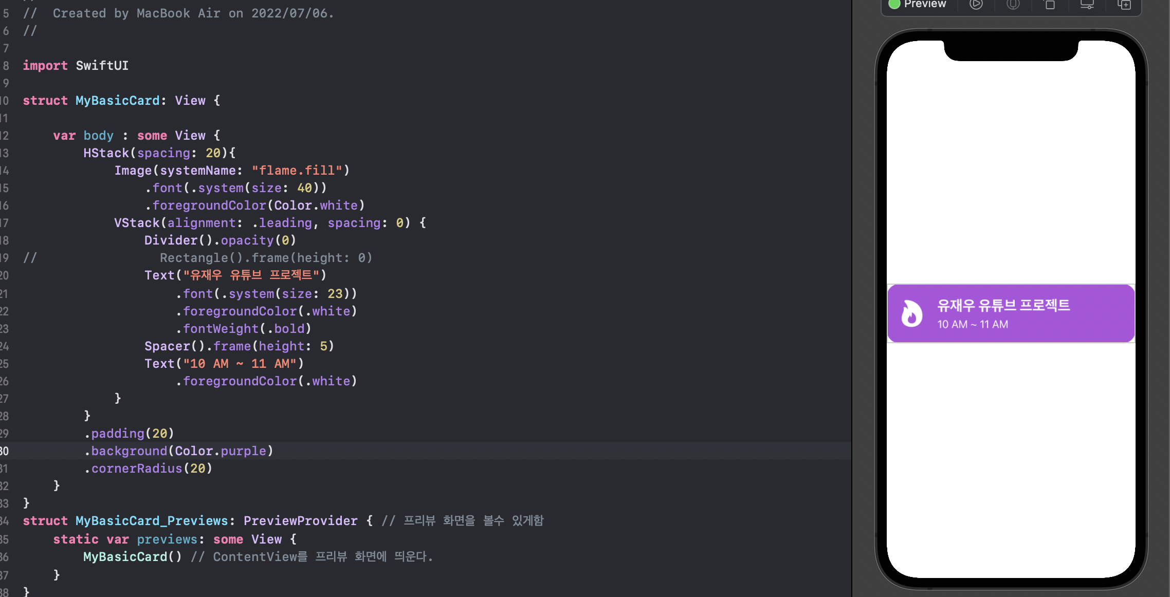
contentView에서 활용 되는 법
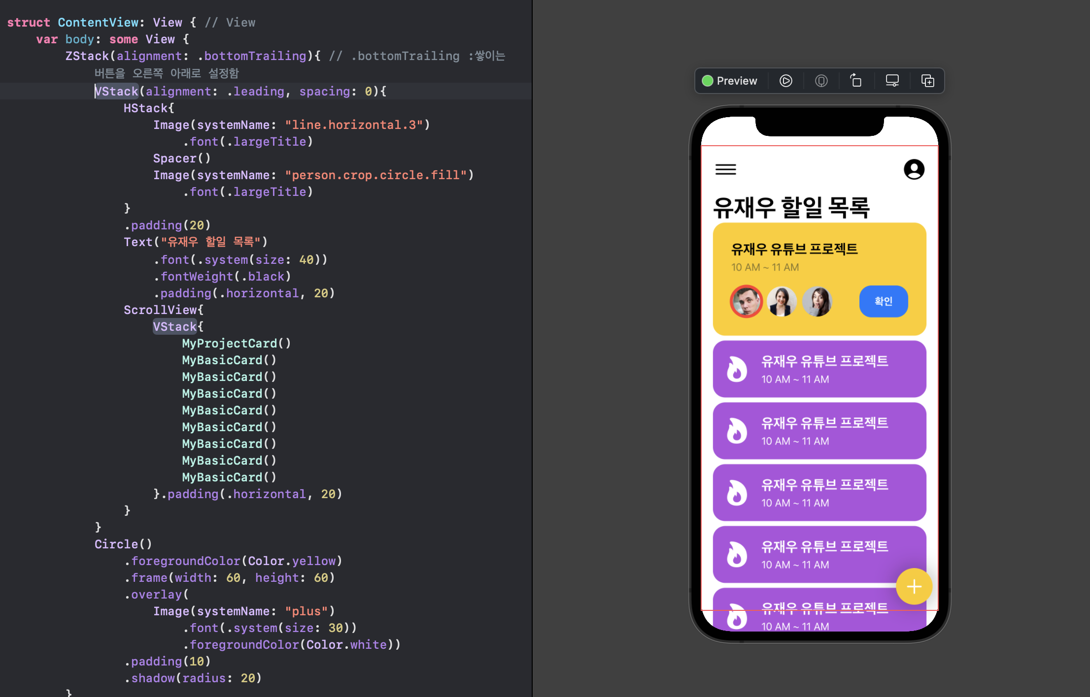
var body: some View {
        ZStack(alignment: .bottomTrailing){ // .bottomTrailing :쌓이는 버튼을 오른쪽 아래로 설정함
            VStack(alignment: .leading, spacing: 0){
                HStack{
                    Image(systemName: "line.horizontal.3")
                        .font(.largeTitle)
                    Spacer()
                    Image(systemName: "person.crop.circle.fill")
                        .font(.largeTitle)
                }
                .padding(20)
                Text("유재우 할일 목록")
                    .font(.system(size: 40))
                    .fontWeight(.black)
                    .padding(.horizontal, 20)
                ScrollView{
                    VStack{
                        MyProjectCard()
                        MyBasicCard()
                        MyBasicCard()
                        MyBasicCard()
                        MyBasicCard()
                        MyBasicCard()
                        MyBasicCard()
                        MyBasicCard()
                        MyBasicCard()
                    }.padding(.horizontal, 20)
                }
            }
            Circle()
                .foregroundColor(Color.yellow)
                .frame(width: 60, height: 60)
                .overlay(
                    Image(systemName: "plus")
                        .font(.system(size: 30))
                        .foregroundColor(Color.white))
                .padding(10)
                .shadow(radius: 20)
        }
    }
}

끝없이 탐구하는 iOS 개발자 유재우입니다!