- 본래는 이미지 좌 우 주변으로 텍스트를 둘러싸는 레이아웃을 위해 도입
- 이미지가 아닌 다른 요소에도 적용해 웹 사이트 전체 레이아웃을 만드는 것까지 발전
- none left right : 요소를 좌우로 띄움
<body>
	<div class="box left"> float left</div>
</body>

.box{
	width: 150px;
	height: 150px;}
.left{
	float: left;
}
Float clear 🧹
- 선택한 요소의 맨 마지막 자식으로 가상 요소를 하나 생성
- 보통 content 속성과 함께 짝지어, 요소에 장식용 컨텐츠를 추가할 때 사용
- 기본값은 inline
.clearfix::after{
	content:"";
	display:block;
	clear:both;
}- 선행 floating 요소 다음일 수 있는지 또는 그 아래로 내려가야 하는지를 결정
- clear 속성은 부동 및 비부동 요소 모두에 적용됨
flex 박스와 gird 출현으로 float 이미지를 위한 역할로 돌아감
FLEX-BOX 💸
-
요소
- Flex Container 부모요소
- Flex Item 자식요소
-
축
- main axis 메인축
- cross axis 교차축

.flex-container{
	display: flex;
}
Flex에 적용하는 속성 🦁
- flex- direction(배치 방향 설정) : row, column main-axis 방향이 바뀐다. flexbox는 단방향 레이아웃이기 때문이다.
- justify-content(메인축 기준 정렬) (좌우정렬) flex-start —flex-end — space-between — space-around— space-evenly
- 교차축 방향 정렬(align-items) (상하정렬) items : 한 줄 — self : **flex item 개별 요소 — content**: 여러줄 ex) align-items : 교차축 기준 한 줄 정렬 flex-start — flex-end — center — stretch — baseline
- flex-wrap, flex-flow, flex-grow, order
<style>
	.flex-container{
		flex-direction: row;
		display:flex;  1번그림

		flex-wrap: wrap; 2번그림
		요소들이 강제로 한줄에 배치되게 할 것인지 여부

		flex-direction: column; 3번그림

		flex-flow: column wrap;  4번그림, shorthand
}
</style>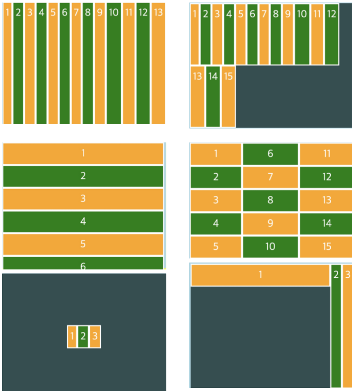
.flex-con{
	display: flex;
	justify-content: center;
	align-items: center;
}
.item1{
align-self: flex-start;
order:0;
flex-grow: 1;
}
.item2{
align-self: center;
order:-1;
flex-grow:2;
}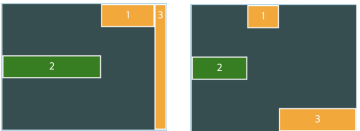
.item1{
align-self: flex-start;
order: 0;
주축에서 남는 공간을 항목들에게 분배
flex-grow:1;
}
.item1{
align-self: flex-start;
order:0;
flex-grow: 1;
}
.item2{
align-self: flex-center;
order:-1;
flex-grow: 2;
}
.items{
align-self: flex-end;
order:1;
flex-grow:3;
}order : 배치순서
flex-grow: 주축에서 남는 공간을 분배

FE - devp