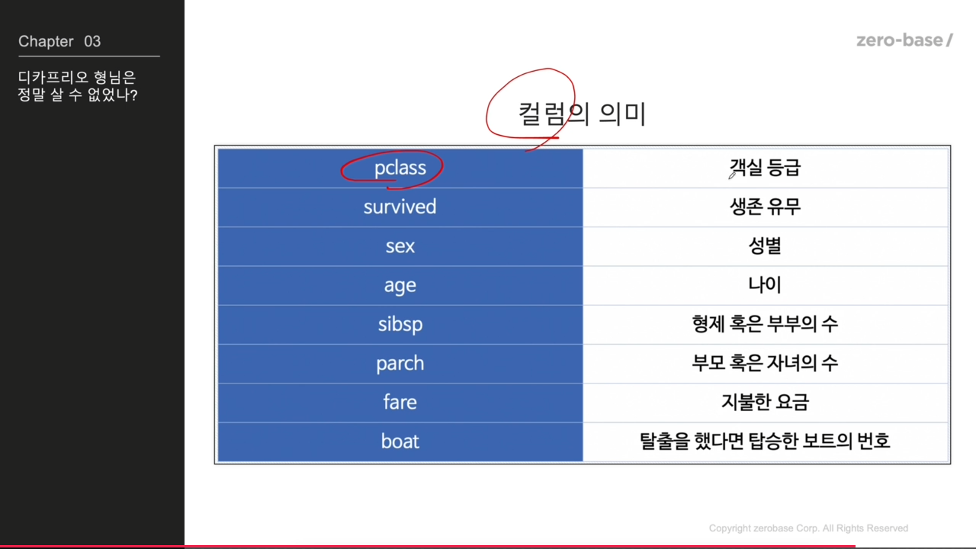
타이타닉 생존자 분석
데이터
https://github.com/PinkWink/ML_tutorial/tree/master/dataset
EDA 진행
plotly_express 설치
pip install plotly_express
데이터 읽기
import pandas as pd

titanic_url = 'https://raw.githubusercontent.com/PinkWink/ML_tutorial'+\
                '/master/dataset/titanic.xls'
titanic = pd.read_excel(titanic_url)
titanic.head()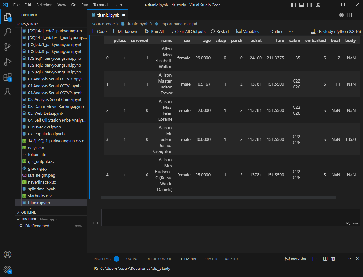
titanic['survived'].value_counts()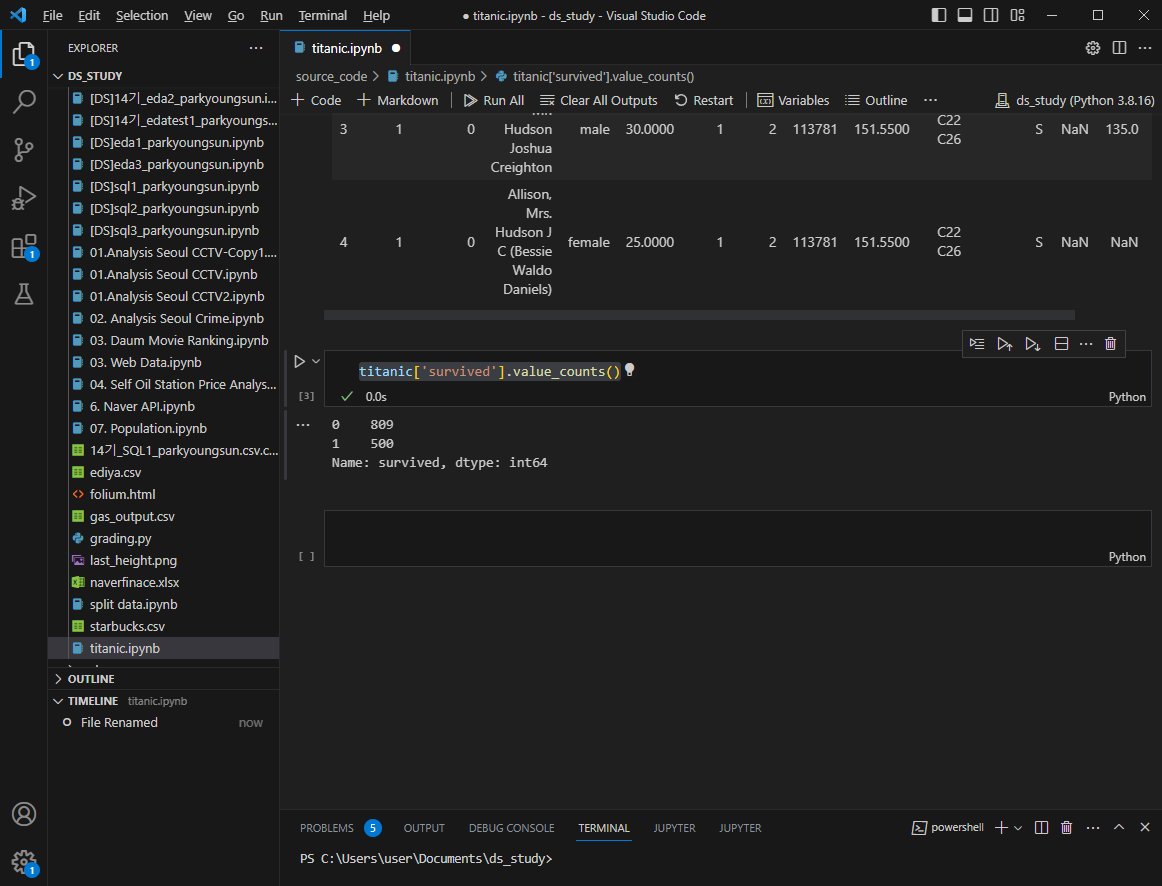
1은 생존, 0은 사망
그래프 그리기
f, ax = plt.subplots(1,2, figsize=(16,8))

titanic['survived'].value_counts().plot.pie(ax=ax[0], autopct ='%1.1f%%',shadow = True, explode =[0,0.05])
ax[0].set_title('Pie plot - survived')
ax[0].set_ylabel('')

sns.countplot(x='survived', data = titanic, ax=ax[1])
ax[1].set_title('Count plot - survived')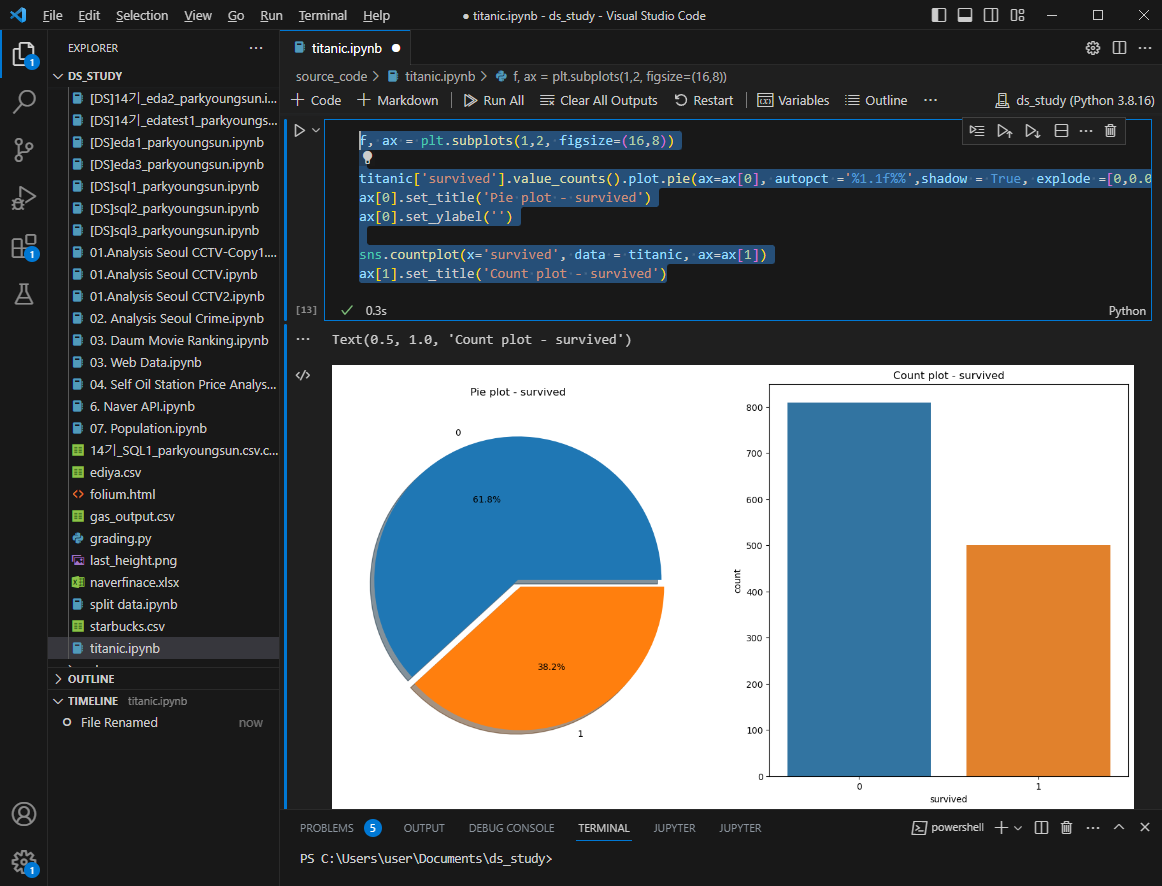
성별에 따른 생존현황
f, ax = plt.subplots(1,2, figsize=(16,8))

sns.countplot(x='sex', data = titanic, ax=ax[0])
ax[0].set_title('Count of passengers of sex')
ax[0].set_ylabel('')

sns.countplot(x='sex', data = titanic, ax=ax[1])
ax[1].set_title('sex - survived')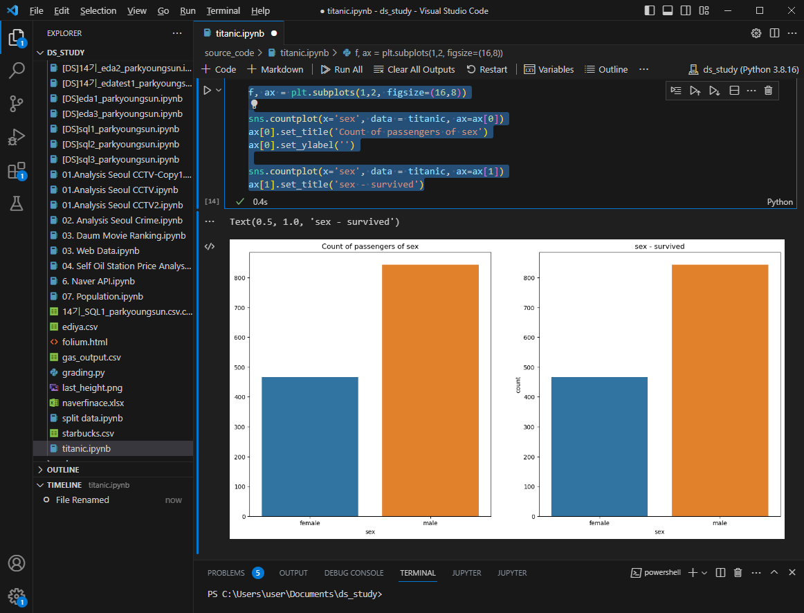
여성의 탑승인원이 남성보다 적음에도 생존인원은 더 많다
pd.crosstab(titanic['pclass'],titanic['survived'],margins = True)pclass = 두번째 입력된 컬럼을 종류별로 구분
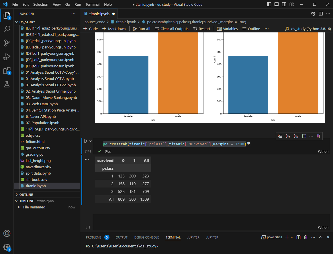
객실 별 사망자 수 확인
1등실의 생존률이 높다
여성의 생존률도 높은데... 그럼 1등실에 여성이 많았나?
grid = sns.FacetGrid(titanic, row='pclass', col='sex',height = 4, aspect = 2)
grid.map(plt.hist, 'age', alpha=0.8, bins=20)
grid.add_legend();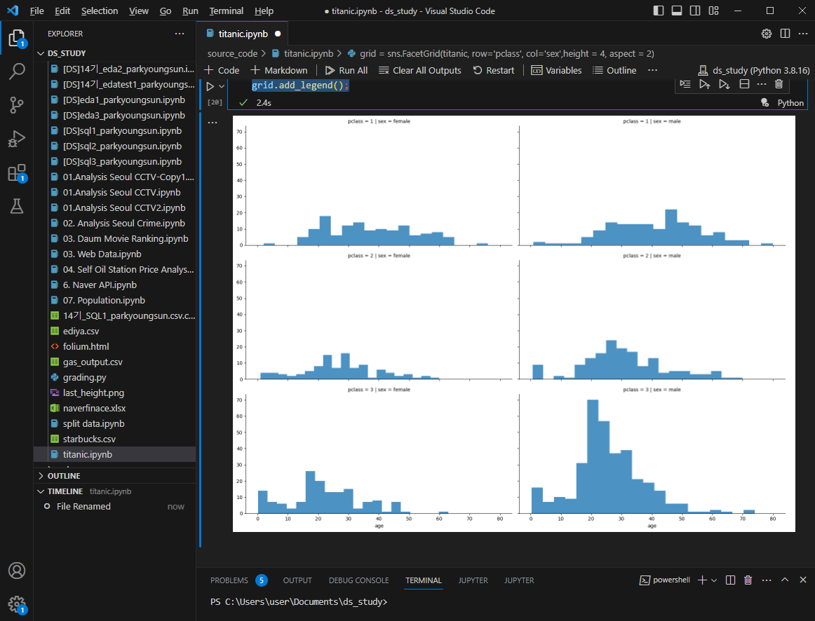
3등실에 20대 남성이 많았다.
나이별 승객현황 확인
import plotly.express as px
fig = px.histogram(titanic, x='age')
fig.show()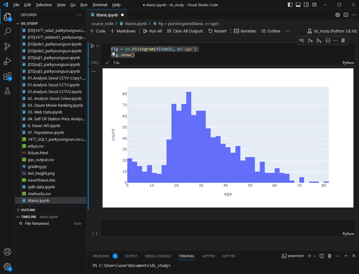
나이를 구간별로 5단계로 정리하기
titanic['age_cat'] = pd.cut(titanic['age'], bins=[0,7,15,30,60,100],
include_lowest= True,
labels= ['baby','teen','young','adult','old'])

titanic.head()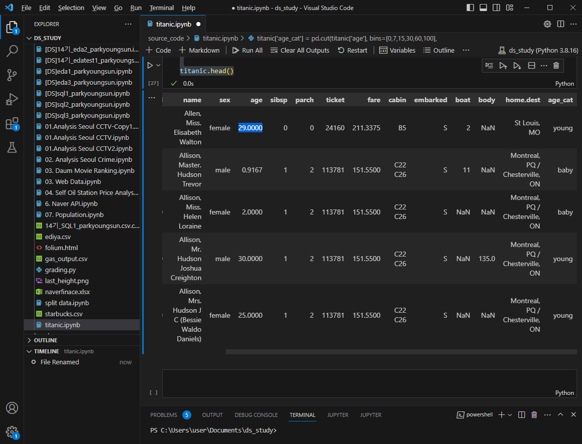
어리고 여성이고 1등실일수록 생존에 유리했을까?
plt.figure(figsize=(14,4))
plt.subplot(131)
sns.barplot(x='pclass',y='survived',data=titanic)

plt.subplot(132)
sns.barplot(x='age_cat',y='survived',data=titanic)

plt.subplot(133)
sns.barplot(x='sex',y='survived',data=titanic)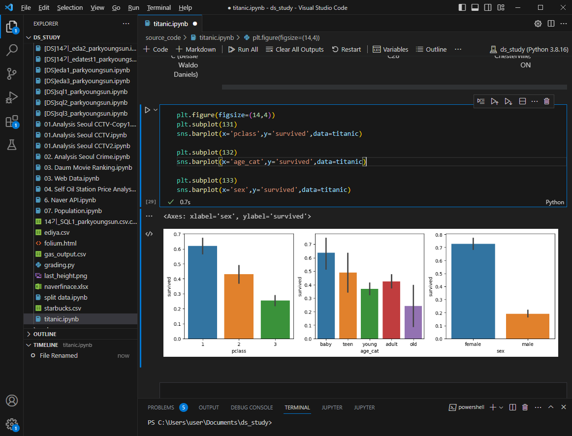
남녀 나이별 생존상황 더 들여다보기
fig, axes = plt.subplots(nrows=1, ncols=2, figsize = (14,6))

women = titanic[titanic['sex']=='female']
men = titanic[titanic['sex']=='male']

ax = sns.distplot(women[women['survived']==1]['age'],bins=20,
                  label = 'survived', ax=axes[0],kde=False)

ax = sns.distplot(women[women['survived']==0]['age'],bins=40,
                  label = 'not_survived', ax=axes[0],kde=False)
ax.legend(); ax.set_title('Female')

ax = sns.distplot(men[men['survived']==1]['age'],bins=18,
                  label = 'survived', ax=axes[1],kde=False)

ax = sns.distplot(men[men['survived']==0]['age'],bins=40,
                  label = 'not_survived', ax=axes[1],kde=False)
ax.legend(); ax.set_title('male')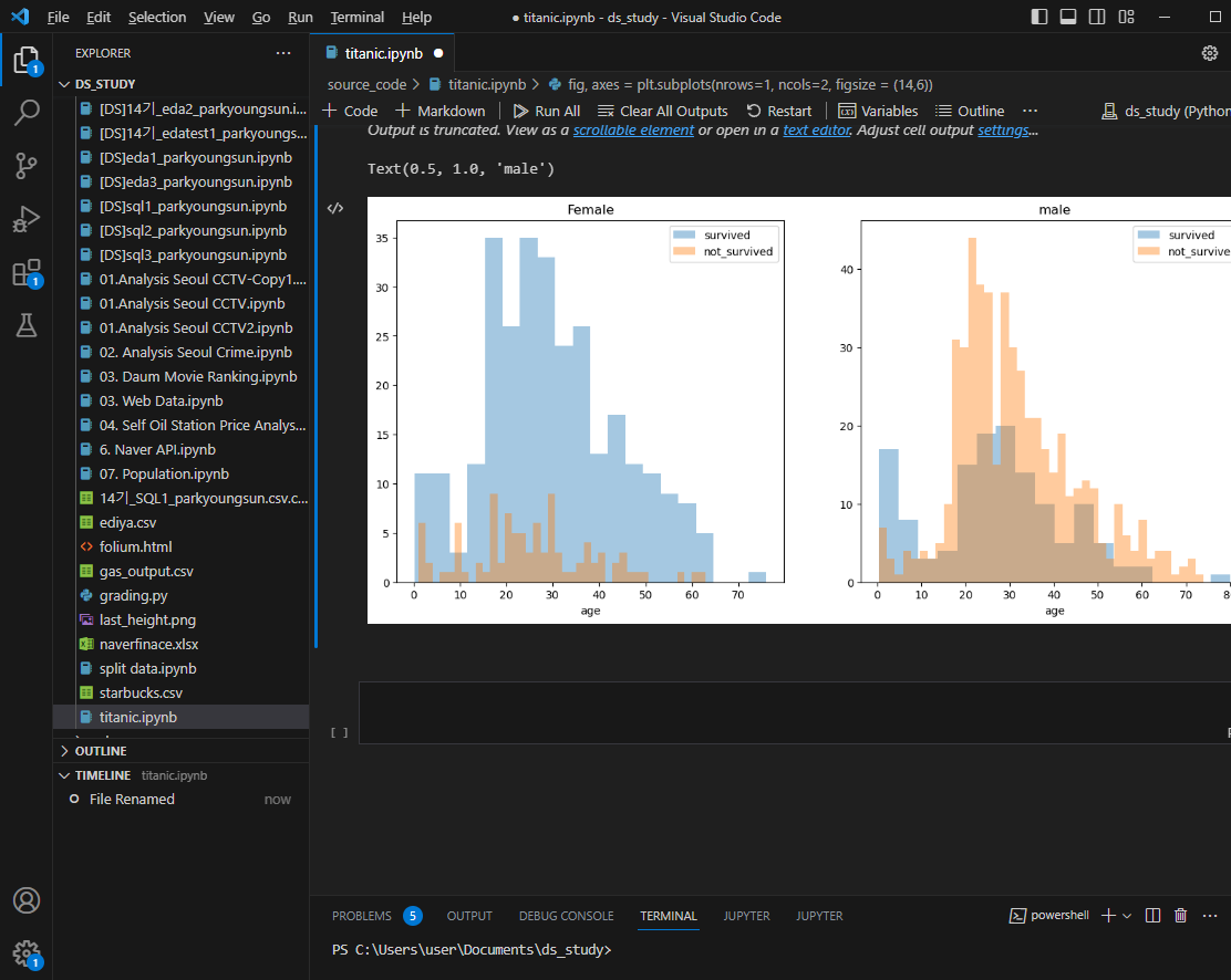
탑승객 이름에서 신분을 알 수 있다. (Mr, Mrs 등)
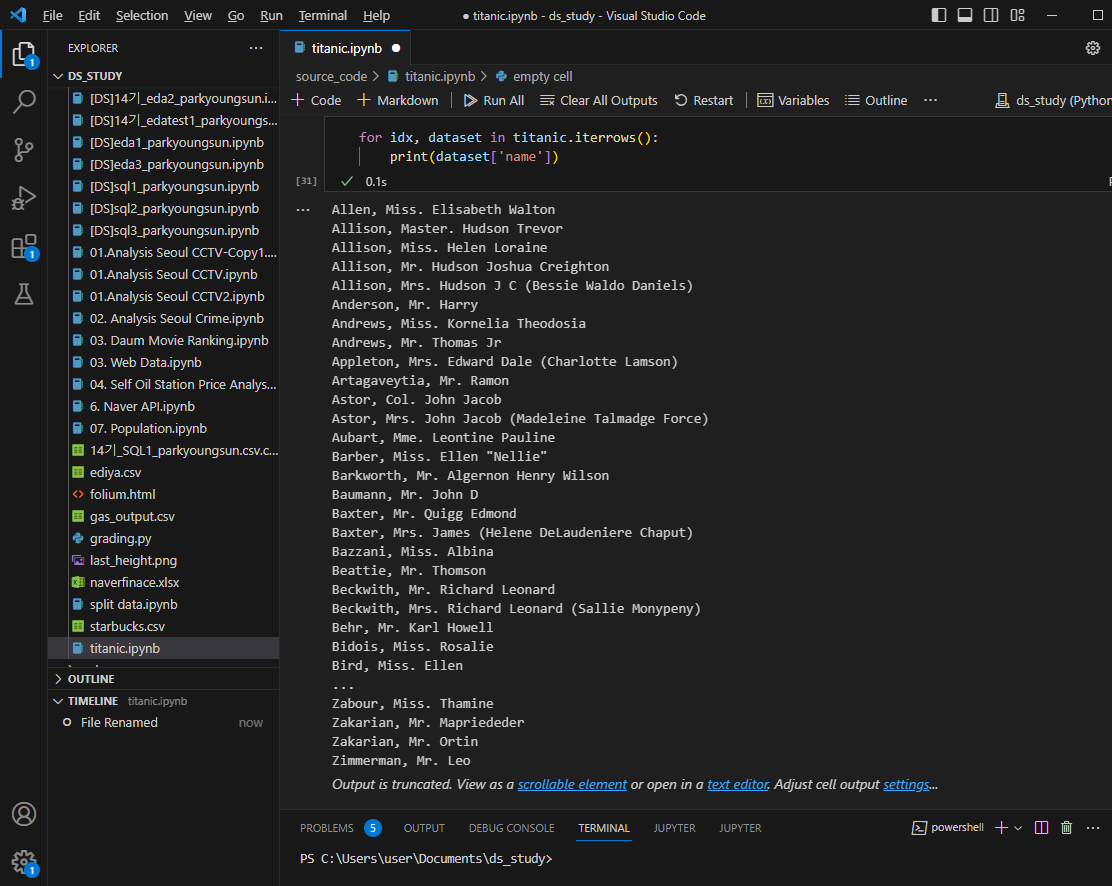
import re

title = []
for idx, dataset in titanic.iterrows():
    tmp=dataset['name']
    title.append(re.search('\,\s\w+(\s\w+)?\.',tmp).group()[2:-1])

titanic['title'] = title
titanic.head()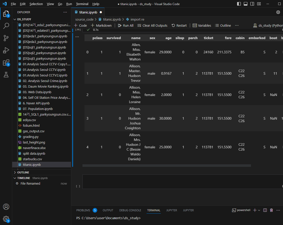
성별별로 본 귀족
pd.crosstab(titanic['title'],titanic['sex'])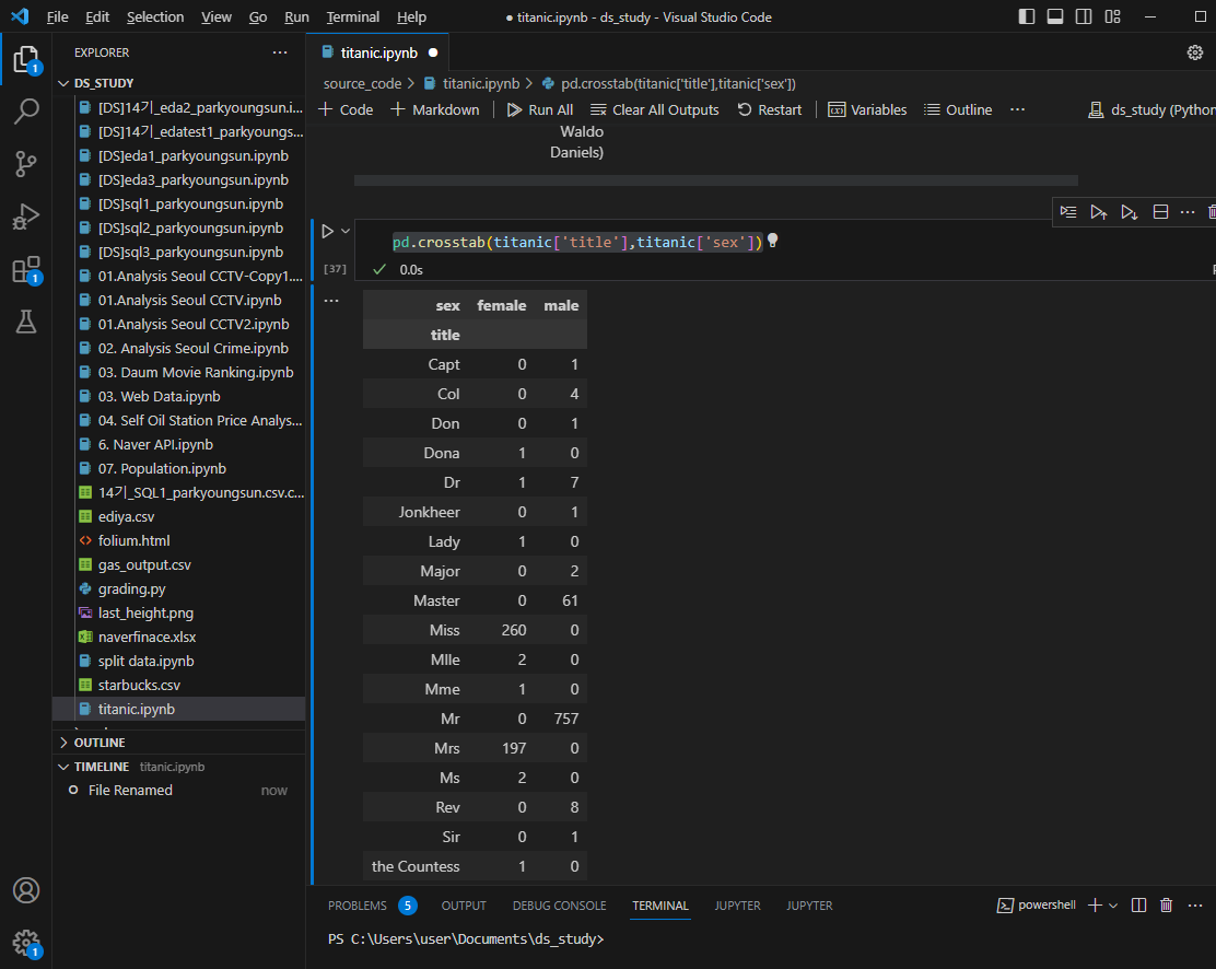
신분 조금 더 디테일하게 정리
titanic['title']=titanic['title'].replace('Mlle','Miss')
titanic['title']=titanic['title'].replace('Ms','Miss')
titanic['title']=titanic['title'].replace('Mme','Mrs')

Rare_f = ['Dona','Lady','the Countess']
Rare_m = ['Capt','Col','Dr','Don','Major','Rev','Sir','Jonkheer','Master']

for each in Rare_f:
    titanic['title']= titanic['title'].replace(each, 'Rare_f')

for each in Rare_m:
    titanic['title']= titanic['title'].replace(each, 'Rare_m')

titanic['title'].unique()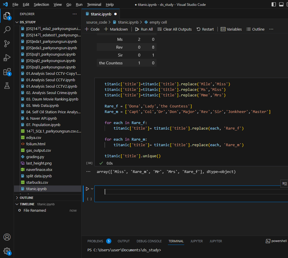
titanic[['title','survived']].groupby(['title'],as_index=False).mean()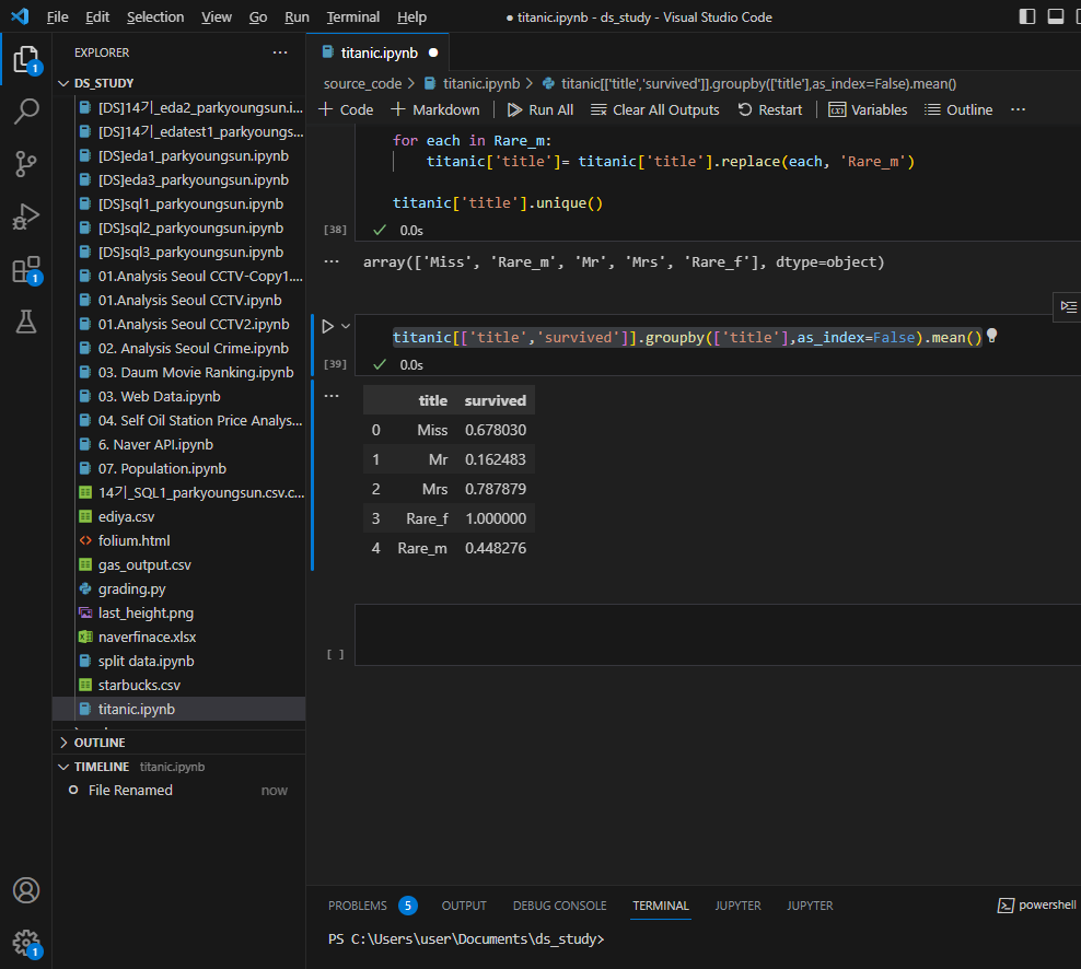
귀족이라고 생존률이 높지 않았다.
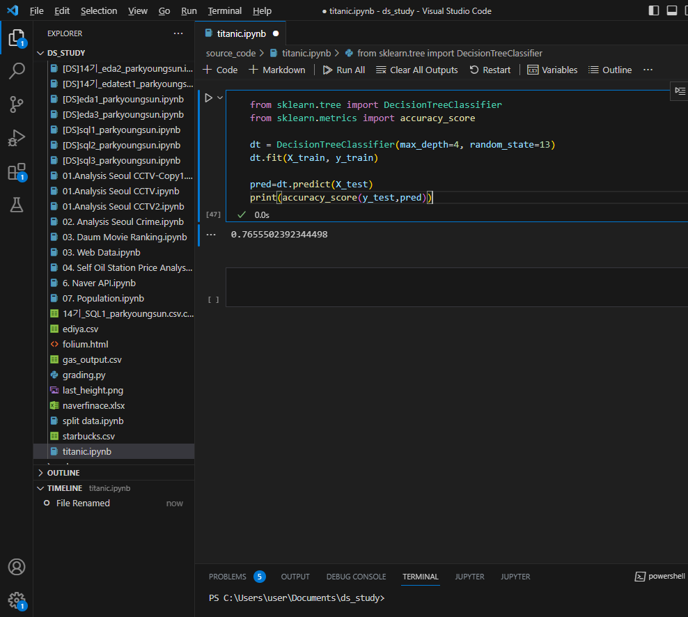
머신러닝을 이용한 생존자 예측
구조확인
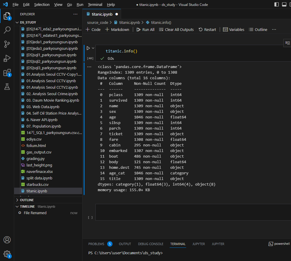
성별이 숫자가 아니므로 숫자로 바꾸는 작업 실행
from sklearn.preprocessing import LabelEncoder

le = LabelEncoder()
le.fit(titanic['sex'])
titanic['gender']=le.transform(titanic['sex'])
titanic.head()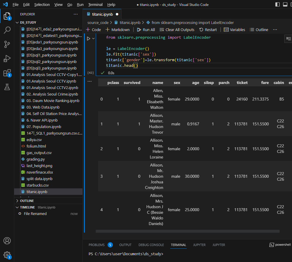
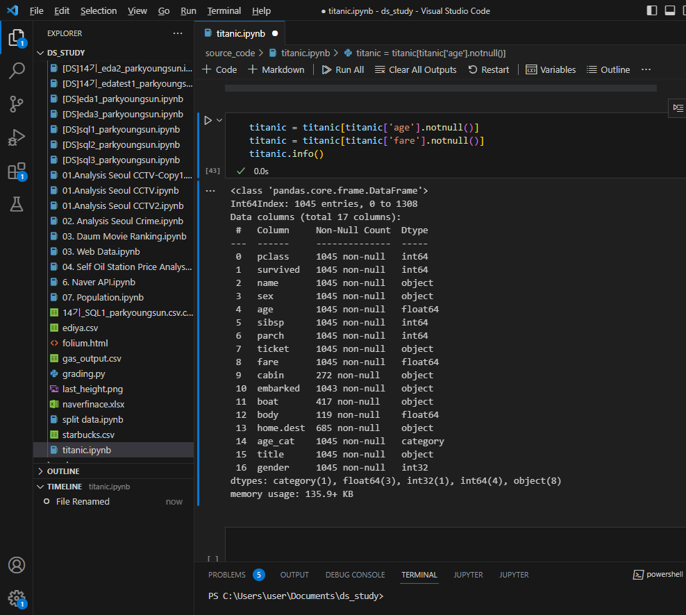
결측치는 처리하기 어려우니 포기
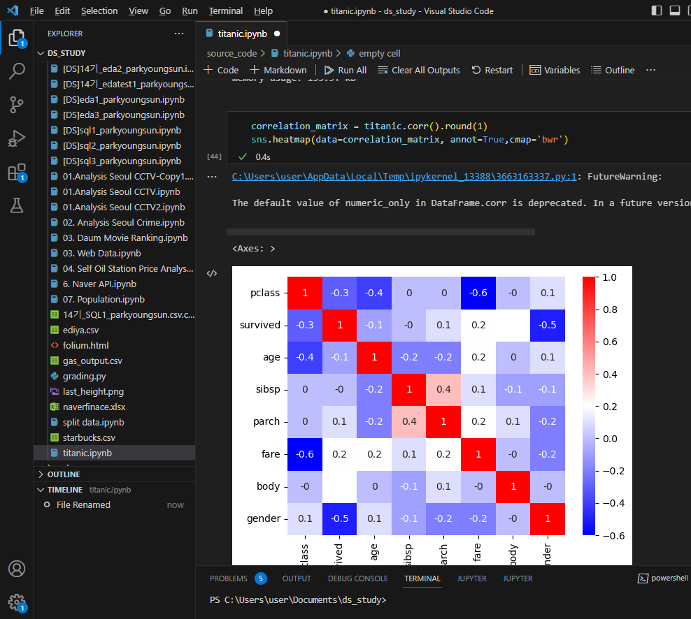
상관관계
특성 선택 후 데이터 나누기
from sklearn.model_selection import train_test_split

X = titanic[['pclass','age','sibsp','parch','fare','gender']]
y = titanic['survived']

X_train, X_test, y_train, y_test = train_test_split(X,y,test_size=0.2,random_state
디시젼트리
디카프리오의 생존률 특정짓기

윈슬렛은?


데이터분석 공부 시작했습니다