
먼저 실습을 위해 html 하나 준비!
<html lang="en">
<head>
    <meta charset="UTF-8">
    <meta http-equiv="X-UA-Compatible" content="IE=edge">
    <meta name="viewport" content="width=device-width, initial-scale=1.0">
    <title>Document</title>


    <style>
        .wrapper{
           display:flex
        }

        .item{
            width: 100px;
            height: 100px;
        }

        .item:nth-child(1){
            background-color: red;
        }

        .item:nth-child(2){
            background-color: green;
        }

        .item:nth-child(3){
            background-color: blue;
        }
    </style>

    <div class="wrapper">
        <div class="item">1</div>
        <div class="item">2</div>
        <div class="item">3</div>
    </div>
</head>
<body>

</body>
</html>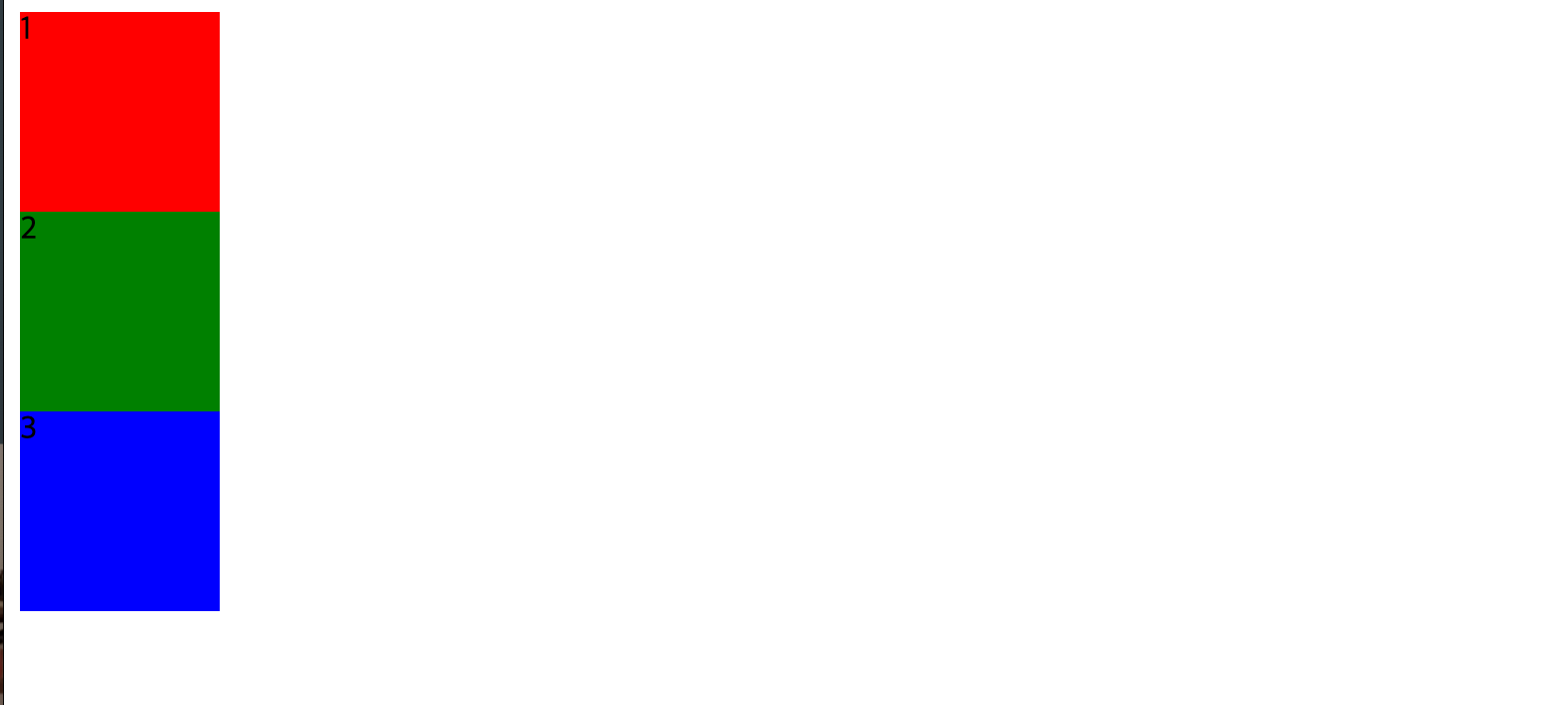
이렇게 준비가 됐다.
 .wrapper{
           display: flex;
        }
wrapper에 플렉스를 적용하면?
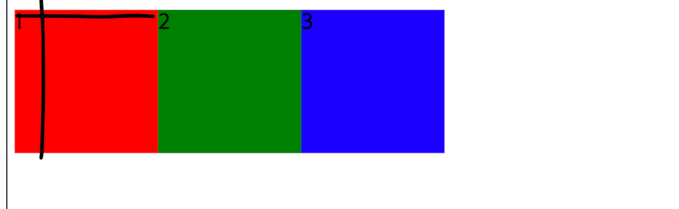
<div class="wrapper">
       <div class="item">1</div>
       <div class="item">2</div>
       <div class="item">3</div>
   </div>
wrapper안에 들어있던 자식요소들이 좌측 상단을 기준으로 순서대로 따다닥 붙게 된다.
조금 더 자세히 알아보기 위해 wrapper안에>item2안에>inner 자식요소 2개를 더 추가해 보겠다.
<style>
        .inner:nth-child(1){
            background-color: aqua;

        }

        .inner:nth-child(2){
            background-color: yellow;

        }
    </style>

    <div class="wrapper">
        <div class="item">1</div>
        <div class="item">
            <div class="inner">1</div>
            <div class="inner">2</div>
        </div>
        <div class="item">3</div>
    </div>
대충 추가된 코드~.~ 그러면
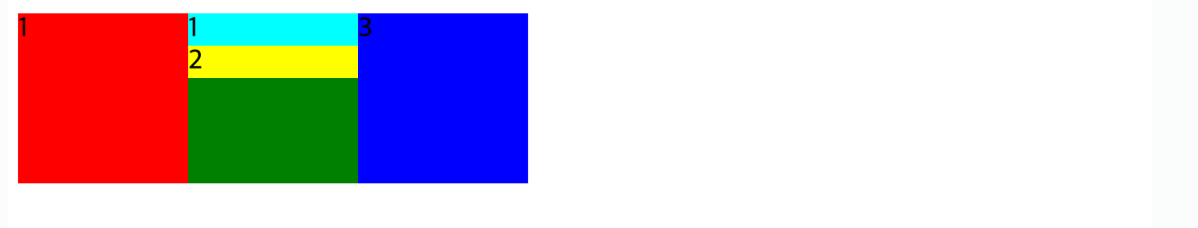
요롷게 나온다.
flex요소를 적용하면 왼쪽 위를 기준으로 가로정렬된다고 했는데, 2번째 초록 item에 inner1(하늘색), inner2(노랑색)이 위아래로 정렬된 것은 flex는 자기 바로 밑에 자식에게만 영향을 끼치기때문이다. 자기 자식요소인 item에만 적용되었고, item의 자식요소인 inner에는 적용 되지 않았다. (🧞♂️ 매우 중요!)
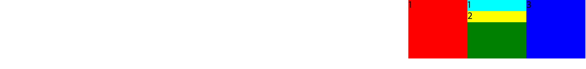
다음으로 flex와 같이 쓰일 수 있는 요소에 대해서 알아보자.
- justify-content : (가로기준) 가운데 정렬 / 오른쪽 정렬 / 공평하게 띄어서 정렬 할 수 있는 space-시리즈 등이 있음!
  .wrapper{
           display: flex;
           justify-content: flex-end;

        }

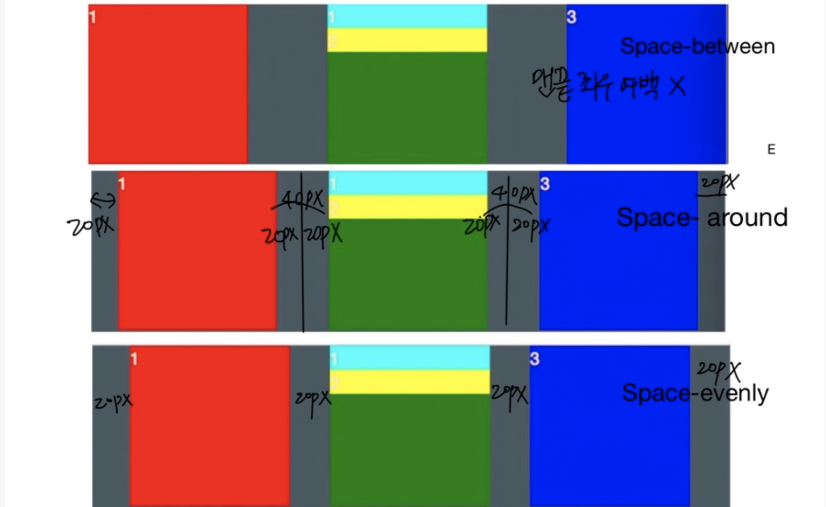
(1) justify-content: flex-end / (2) justify-content: flex-end (3) space-시리즈
.wrapper{
display: flex;
/* justify-content: flex-end; 오른쪽 정렬
justify-content: flex-start; 아무런 변화 없음
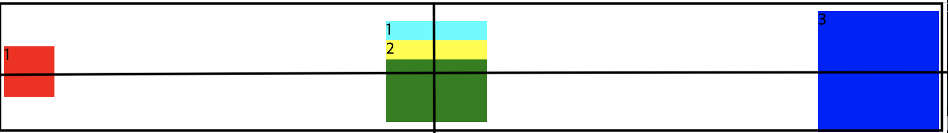
justify-content: center; 가운데정렬
justify-content: space-around; 각 요소 좌우에 마진이 똑같이 정렬된다.
justify-content: space-between; 맨끝 좌우여백 없이 좌우마진 동일 정렬
justify-content: space-evenly; 가운데 중복 마진 제외 정렬*/
}가로정렬할때 매우 유용하다!
그럼 세로정렬은 어떻게 할까? 분별하기 쉽게 item의 크기를 다 다르게 설정해보겠다!
        .wrapper{
            display:flex;
            justify-content: space-between;
        }

        .item{
            width: 100px;
            height: 100px;
        }

        .item:nth-child(1){
            width:50px;
            height: 50px;
            background-color: red;

        }

        .item:nth-child(2){
            background-color: green;
        }

        .item:nth-child(3){
            width: 120px;
            height: 120px;
            background-color: blue;
        }


        .inner:nth-child(1){
            background-color: aqua;

        }

        .inner:nth-child(2){
            background-color: yellow;

        }
flex의 디폴트 값은 좌측과 상단을 기준으로 하기떄문에 요소들이 위로 붙은걸 알 수 있다. 내가 원하는건 모든 요소들이 세로를 기준으로 가운데 오게 하는것!
- *align-items 을 지정해 보자. (세로기준) 가운데정렬, 상단에 붙게하기, 하단에 붙게하기 등이 있다.
    .wrapper{
            display:flex;
            justify-content: space-between;
            /* align-items: flex-start -기본값 변화X 좌측 상단 기준정렬
            align-items:felx-end -하단 기준 정렬
            align-items: center 찾았다 내사랑 세로기준 가운데정렬!*/
        }
(위) align-items: flex-end 지정 / (아래) align-items: center 지정
가로정렬, 세로정렬 이제 잘할 수 있겠다!
다음으로 알아볼 속성값은 flex-direction! 가로로만 정렬하던 자식 요소들을 아예 세로로 바꿔버리는 속성값이다.
      .wrapper{
            display:flex;
            justify-content: space-between;
            align-items: center;
            flex-direction: column;
            /*flex-direction: row -디폴트값. 그대로.
            flex-direction:row-reverse -좌우반전
            flex-direction:column-reverse -상하반전
            */

        }

(위) flex-direction: column 지정 / (아래) flex-direction:column-reverse 지정
💡 주의사항! justify-contents:space-between을 줬는데 왜 요소들이 띄어지지 않을까?
답: height를 지정 안해줬기때문에요소들의 크기만큼만height가 생겨서 따닥 붙어있는 것. height:500px을 주면 그 안에서 자동 정렬된 만큼 여백이 생긴다.
justify-contents, align-items, flex-direction만 잘 알아두면 flex를 이용하여 왠만한 요소들을 다 정렬할 수 있을 것 같다.
근데 정말 중요한건, 모두 부모요소에 flex를 적용해야 한다는 것이다.!
처음 할때 이거 잘 몰라서 시간 많이 잡아 먹었다ㅠ_ㅠ..
만약 내가 instagram nav-bar를 만든다면
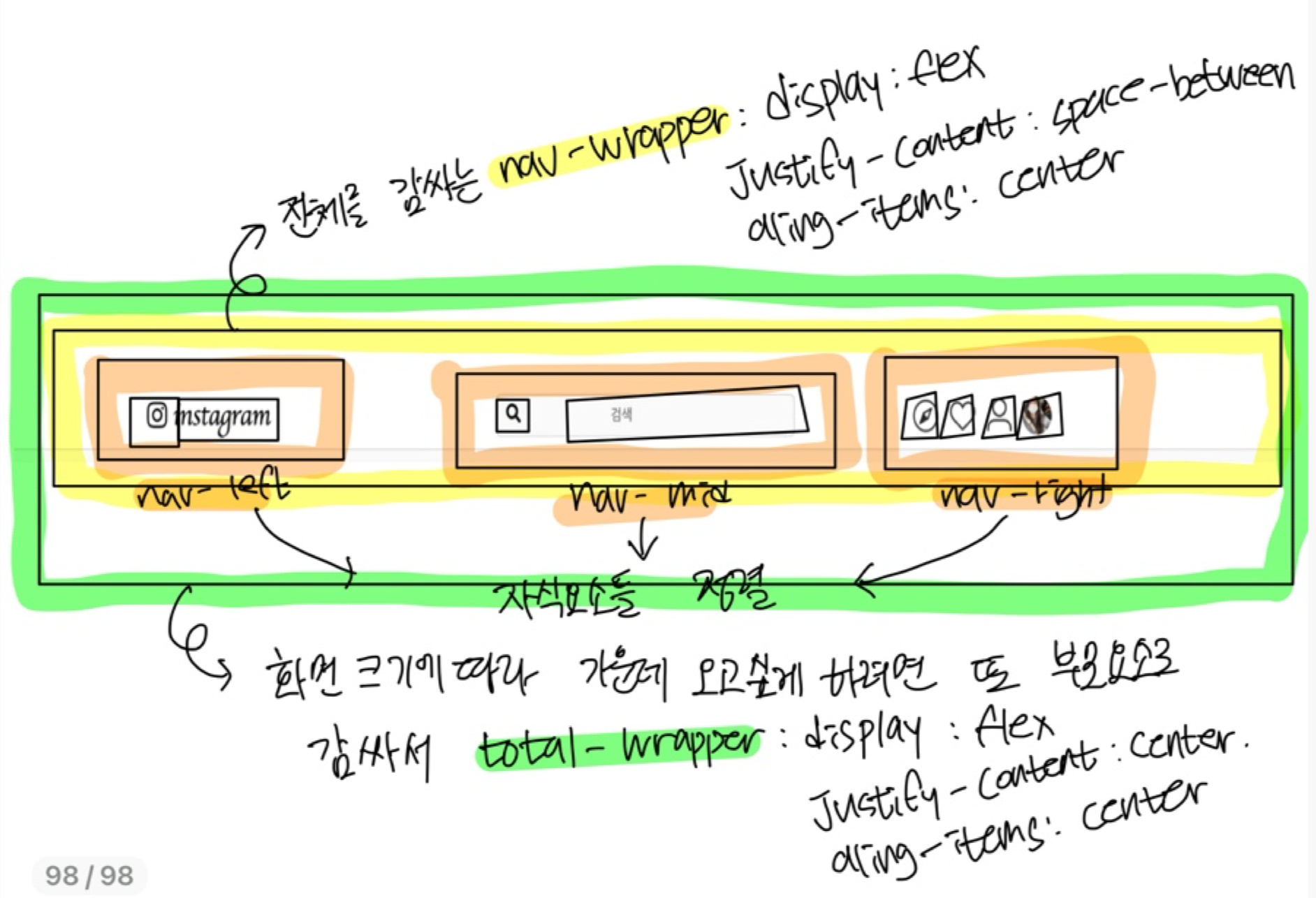
완성본

   <div class="total-wrapper">
        <div class="nav-wrapper">
            <nav>
                <span class="nav-left">
                    <i class="fab fa-instagram"></i>
                    <button>instagram</button>
                </span>

                <span class="nav-mid"> <i class="fas fa-search"></i><input placeholder="검색" /></span>
                <span class="nav-right">
                    <img alt="explore" src="https://s3.ap-northeast-2.amazonaws.com/cdn.wecode.co.kr/bearu/explore.png" />
                    <img alt="heart"src=" https://s3.ap-northeast-2.amazonaws.com/cdn.wecode.co.kr/bearu/heart.png" />
                    <img alr="profile" src="https://s3.ap-northeast-2.amazonaws.com/cdn.wecode.co.kr/bearu/profile.png" />
                    <div class="menu-user-pic"><img class="menu-profile" src="/img/profile.jpeg" /></div>

                </span>
            </nav>
        </div>
</div>
.nav-wrapper {
display: flex;
position: fixed;
justify-content: center;
align-items: center;
width: 100%;
background-color: white;
border-bottom: 1px solid lightgray;
margin-bottom: 10px;
}
nav {
display: flex;
justify-content: space-between;
align-items: center;
width: 1100px;
padding: 0.5%;
}
.nav-left {
display: flex;
align-items: center;
font-size: 25px;
width: 30%;
}
.nav-mid {
width: 30%;
height: 36px;
background-color: #fafafa;
padding-left: 10px;
border-radius: 5px;
border: 1px solid lightgray;
}
.nav-right {
display: flex;
justify-content: flex-end;
align-items: center;
width: 30%;
}
nav button {
background-color: white;
font-family: "Lobster", cursive;
font-size: 26px;
border: 0;
}
nav img {
width: 30px;
padding-right: 0px;
margin-right: 10px;
}대애충 뭐 이렇게 만들어야 된다. ^^
계속 자식요소에 felx넣다가 왜 맘대로 안되는거야!!! 하고 시간 다보냈음 정렬하고 싶은 자식요소들 위 부모요소에 flex지정하기 기억~⚡️