1. 시각화라이브러리, Seaborn
데이터 추출, 그리고 끝?
지금 까지 한 결과는 대부분 텍스트이다.
정보를 요약해서 한 눈에 보여주면 좋을 듯!
시각화(Visualization)가 필요!
여러 기법을 통해서 스크래핑을 진행할 수 있었다.
스크래핑 결과가 너무 분산되어있어 한 눈에 보기 어렵다.
시각화를 통해 해결
시각화로 결과 떠먹여주기
똑똑하고 수려한 시각화 라이브러리
matplotlib을 기반으로 하는 시각화 라이브러리
Seaborn은 matplotlib을 기반으로 만들어졌다.
이는 다양한 고수준(high-level)에서 쉽게 그릴 수 있다.
Seaborn 설치 & 사용하기
Seaborn 라이브러리
seaborn은 파이썬의 데이터 시각화 라이브러리이다. 이를 기반으로 수려한 그래프를 그릴 수 있다.
pip를 사용해 다운로드를 받을 수 있다.
%pip install seabornSeaborn Essentials
seaborn 은 다양한 그래프를 그릴 수 있다.
링크를 통해 다양한 그래프를 확인할 수 있다.
자주 사용되는 꺾은선 그래프와 막대 그래프를 그려보면서 사용 방법을 익혀보기
# 시각화에 필요한 라이브러리를 불러와보기.

import seaborn as sns
꺾은선 그래프(Line Plot)
두 변수의 값에 따른 추이를 선으로 이은 그래프이다.
.lineplot()를 이용해서 이를 그릴 수 있다.
#가능하지만 아래처럼 명확하게 정의해주는 게 좋음
sns.lineplot([1, 3, 2, 4],[0.7,0.2,0.1,0.05])

sns.lineplot(x = [1, 3, 2, 4],y = [0.7,0.2,0.1,0.05])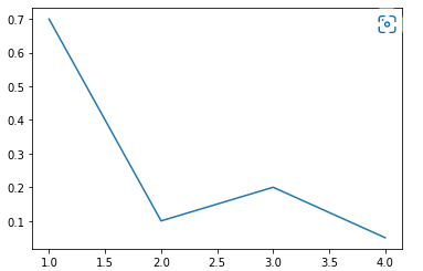
막대 그래프(Bar Plot)
범주형 데이터의 "값"과 그 값의 크기를 직사각형으로 나타낸 그림이다.
.barplot()를 이용해서 이를 그릴 수 있다.
sns.barplot(x=[1,2,3,4],y=[0.7,0.2,0.1,0.05] )
sns.barplot(x=['amy','bob','cat','Dog'],y=[0.7,0.2,0.1,0.05] )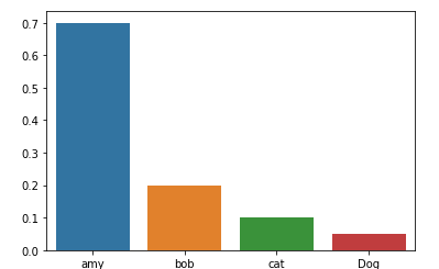
Plot의 속성
seaborn은 파이썬의 시각화 라이브러리 matplotlib을 기반으로 만들어졌다.
matplotlib.pyplot의 속성을 변경해서 그래프에 다양한 요소를 변경/추가할 수 있다.
import matplotlib.pyplot as pltplt.title() : 그래프에 제목 을 추가
#TODO: 제목을 추가

sns.barplot(x=[1,2,3,4],y=[0.7,0.2,0.1,0.05])
plt.title("Bar Plot")

plt.show()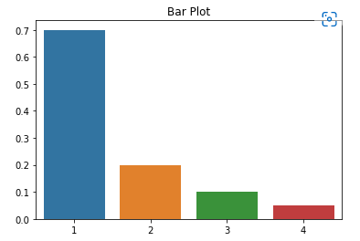
plt._label() : 그래프의 축에 설명 을 추가
#TODO: xlabel과 ylabel을 추가

sns.barplot(x=[1,2,3,4],y=[0.7,0.2,0.1,0.05])
plt.xlabel("X Label")
plt.ylabel("Y Label")

plt.show()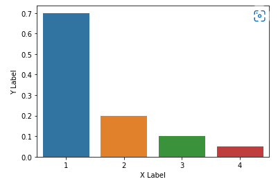
plt._lim() : 그래프의 축의 범위 를 지정
#TODO: lineplot에서 ylim을 2~3으로 제한

sns.lineplot(x=[1, 3, 2, 4], y=[4, 3, 2, 1])

plt.ylim(2,3)

plt.show()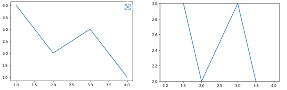
plt.figure(figsize = (x, y)) : 그래프의 크기 를 지정
#TODO: 크기를 (20, 10)으로 지정

sns.lineplot(x=[1, 3, 2, 4], y=[4, 3, 2, 1])

plt.show()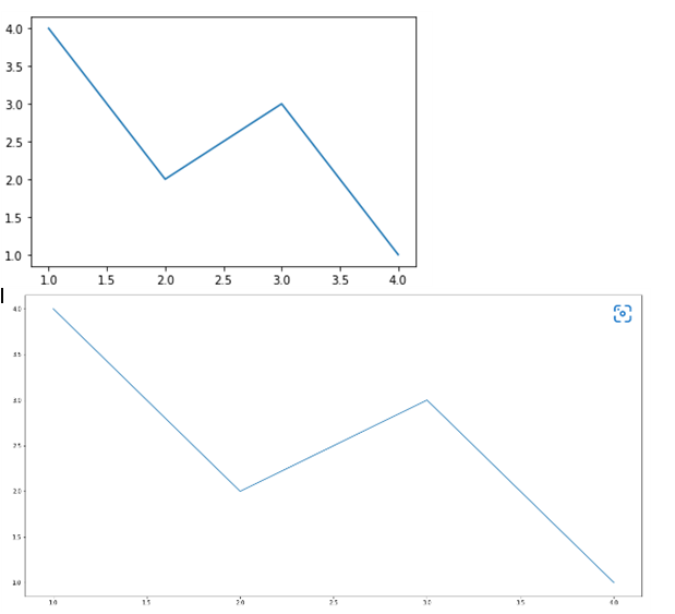
2. 스크래핑 결과 시각화하기 I
기상청 날씨 정보 시각화 하기
Target: 기상청 날씨 스크래핑하기
다음 사이트에 Selenium을 이용해서 날씨 정보를 가져오기 : https://www.weather.go.kr/w/weather/forecast/short-term.do
# 스크래핑에 필요한 라이브러리를 불러오기.

from selenium import webdriver
from webdriver_manager.chrome import ChromeDriverManager
from selenium.webdriver.chrome.service import Service
from selenium.webdriver.common.by import By
# driver를 이용해 해당 사이트에 요청 보내기.
driver = webdriver.Chrome(service = Service(ChromeDriverManager().install()))
driver.get("https://www.weather.go.kr/w/weather/forecast/short-term.do")
driver.implicitly_wait(1)
temps = driver.find_element(By.ID,'my-tchart').text
temps = [int(i) for i in temps.replace("℃","").split("\n") ] ## 타입과 뒷 값을 모두 자름
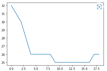
print(temps)꺾은선 그래프(Line Plot) 을 이용해 앞으로의 기온의 추이를 나타내기
# 받아온 데이터를 통해 꺾은선 그래프를 그려보기
# x = Elapsed Time(0~len(temperatures)
# y = temperatures

import seaborn as sns

sns.lineplot(
    x = [ i for i in range(len(temps))],
    y = temps

)
# 받아온 데이터의 ylim을 조금 더 길게 잡아보기
import matplotlib.pyplot as plt

plt.ylim(min(temps)-2, max(temps) +2)
plt.title("Expected Temperature from now on")

sns.lineplot(
    x = [ i for i in range(len(temps))],
    y = temps

)

plt.show()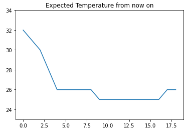
3. 스크래핑 결과 시각화하기 II
해시코드 질문 코드 빈도
Target: 해시코드 질문 태그의 빈도 확인
이전에 진행한 해시코드(https://hashcode.co.kr) 사이트에선 다양한 질문이 올라왔는데,
질문제목 아래에 "태그"가 있다.
이 태그의 빈도를 측정하면 어떤 주제의 질문이 많이 올라오는지 알 수 있을 것 같다.
이를 스크래핑 후 시각화하기
# 필요한 라이브러리를 불러온 후, 요청을 진행.
# 질문의 빈도를 체크하는 dict를 만든 후, 빈도를 체크.

import time

frequency = {}

import requests
from bs4 import BeautifulSoup

for i in range(1,11):
    res = requests.get("https://hashcode.co.kr/?page{}".format(i),user_agent)
    soup = BeautifulSoup(res.text, "html.parser")

    #1. ul태그 모두 찾기
    #2. 1번 안에 있는 li 태그의 text 추출

    ul_tags = soup.find_all("ul","question-tags")
    for ul in ul_tags :
        li_tags = ul.find_all("li")
        for li in li_tags:
            tag = li.text.strip()
            if tag not in frequency:
                frequency[tag] = 1
            else:
                frequency[tag] += 1
    time.sleep(0.5)

print(frequency)

# Counter를 사용해 가장 빈도가 높은 value들을 추출

from collections import Counter

counter = Counter(frequency)

counter.most_common(10) #상위 10개

# figure, xlabel, ylabel, title을 적절하게 설정해서 시각화를 완성

import matplotlib.pyplot as plt

plt.figure(figsize = (20, 10))
plt.title("Frequency of question in Hashcode")
plt.xlabel("Tag")
plt.ylabel("Frequency")

sns.barplot(x=x,y=y)

plt.show()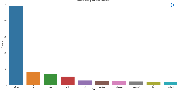
4. 뭉게뭉게 단어구름, Wordcloud
Word Cloud
자주 등장하는 텍스트를 중요도나 인기도를 고려해 표현하는 것
Word Cloud를 만들기 위한 과정
- 자연어 문장에서 키워드 추출
- 키워드가 등장한 빈도 측정
- 전처리한 정보와 Wordcloud 라이브러리를 바탕으로 Wordcloud 생성
Wordcloud 만들어보기
wordcloud 라이브러리와 konlpy 라이브러리
wordcloud는 파이썬의 텍스트 클라우드 라이브러리이다. 이를 기반으로 텍스트 구름을 그릴 수 있다.
konlpy는 한국어 형태소 분석기 라이브러리로, 주어진 문장에서 명사 등을 뽑아 내는 데에 사용할 수 있다.
pip를 사용해 다운로드를 받을 수 있다.
%pip install wordcloud
%pip install konlpy
Wordcloud 만들기
WordCloud를 만드는 방법.
- KoNLPy 라이브러리로 한국어 문장을 전처리
- Counter를 이용해 빈도수 측정
- WordCloud를 이용해 시각화
# 텍스트 구름을 그리기 위해 필요한 라이브러리를 불러오기

# 시각화에 쓰이는 라이브러리
import matplotlib.pyplot as plt
from wordcloud import WordCloud

# 횟수를 기반으로 딕셔너리 생성
from collections import Counter

# 문장에서 명사를 추출하는 형태소 분석 라이브러리
from konlpy.tag import Hannanum
# 워드클라우드를 만드는 데 사용할 애국가 가사이다.
national_anthem = """
동해물과 백두산이 마르고 닳도록
하느님이 보우하사 우리나라 만세
무궁화 삼천리 화려 강산
대한 사람 대한으로 길이 보전하세
남산 위에 저 소나무 철갑을 두른 듯
바람 서리 불변함은 우리 기상일세
무궁화 삼천리 화려 강산
대한 사람 대한으로 길이 보전하세
가을 하늘 공활한데 높고 구름 없이
밝은 달은 우리 가슴 일편단심일세
무궁화 삼천리 화려 강산
대한 사람 대한으로 길이 보전하세
이 기상과 이 맘으로 충성을 다하여
괴로우나 즐거우나 나라 사랑하세
무궁화 삼천리 화려 강산
대한 사람 대한으로 길이 보전하세
"""형태소 분석기 객체를 사용해서 주어진 문자열에서 명사를 추출
이때 사용하면 에러가 발생한다.
(이건 검색하면 나오니 참고..! 환경변수를 설정하였더니 에러가 없어졌다.)
# hannanum 객체를 생성한 후, .nouns()를 통해 명사를 추출

hannanum = Hannanum()
nouns = hannanum.nouns(national_anthem)

nouns[:10]

# counter를 이용해 각 단어의 개수를 세어야한다.

counter = Counter(nouns)

counter

# WordCloud를 이용해 텍스트 구름을 만들기

wordcloud = WordCloud(
    #폰트 위치
    font_path = "C:\EINDOWS\FONTS\HMFMMUEX.TTC",
    background_color = "white",
    width = 1000,
    height = 1000
)

#key가 빈도를 값으로 그려짐
img = wordcloud.generate_from_frequencies(counter)

plt.imshow(img)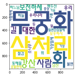
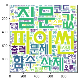
5. 워드클라우드 만들기
해시코드 질문 키워드
Target: 해시코드 질문 제목의 키워드
해시코드(https://hashcode.co.kr) 질문태그를 활용해 Bar Plot을 그렸다면,
이번에는 질문 제목을 스크래핑한 후, 형태소 분석을 진행해서 워드클라우드를 그려보기.
# Pagination이 되어있는 질문 리스트의 제목을 모두 가져와 리스트 questions에 저장

questions = []

import time
import requests
from bs4 import BeautifulSoup

for i in range(1,6):
    res = requests.get("https://hashcode.co.kr/?page={}".format(i),user_agent)
    soup = BeautifulSoup(res.text, "html.parser")

    parsed_datas = soup.find_all("li", "question-list-item")
    for data in parsed_datas:
        questions.append(data.h4.text.strip())

    time.sleep(0.5)

# 텍스트 구름을 그리기 위해 필요한 라이브러리를 불러오기

# 시각화에 쓰이는 라이브러리
import matplotlib.pyplot as plt
from wordcloud import WordCloud

# 횟수를 기반으로 딕셔너리 생성
from collections import Counter

# 문장에서 명사를 추출하는 형태소 분석 라이브러리
from konlpy.tag import Hannanum

# Hannanum 객체를 생성한 후, .nouns()를 통해 명사를 추출
words = []

hannanum = Hannanum()

for question in questions:
    nouns = hannanum.nouns(question) #1번 나올 때 나온 명사들
    words += nouns #누적해서 나온 명사들

print(len(words))

# counter를 이용해 각 단어의 개수를 세기.

counter = Counter(words)
counter

# WordCloud를 이용해 텍스트 구름을 만들기

wordcloud = WordCloud(
    font_path = "C:\EINDOWS\FONTS\HMFMMUEX.TTC",
    background_color ="white",
    height = 1000,
    width = 1000,
)

img = wordcloud.generate_from_frequencies(counter)

plt.imshow(img)