Android MDC 101 : 기본 컴포넌트 익히기
MDC는 Material Design Component의 약자로 구글 개발자와 디자이너들이 Material Design을 반영하여 만든 컴포넌트이다. MDC에 대해 알고는 있었지만 현재 하는 일이 UI를 거의 다루지 않으며 라이브러리를 쓸 수 없어 사용할 일이 없었다.
그러나 사이드 프로젝트를 진행하다보니 UI 공부의 필요성을 느끼게 되었다. UI에 대한 지식이 없는 상태로 앱을 만들다보니 디자인에 통일성이 없었으며 기본 컴포넌트만 사용했기에 기능에 제한이 많았기 때문이다. 또한 색상, 글꼴, 컴포넌트의 어트리뷰트 등 고려해야할 사항이 상당히 많았다.
그래서 어떻게 UI를 어떻게 공부하면 좋을까 고민하다가 MDC 강의를 듣기로 결정했다. 왜냐하면 안드로이드 공식 문서에서 추천하는 UI 컴포넌트 라이브러리이기 때문이다. 그리고 강의를 들으며 코드상 비어 있는 부분을 채우며 연습할 수 있다는 것도 좋았다. 이렇게 MDC 강의를 들으며 배운 내용을 블로그에 정리하려고 한다.
그러면 가장 첫번째 강의인 MDC 101 를 살펴보자
1. Text Field 사용하기
앱을 사용하다보면 로그인 화면에서 아래와 같은 id, pw TextField를 흔히 볼 수 있다.
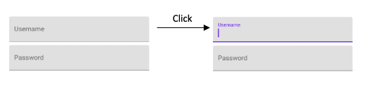
위와 같은 TextField는 어떻게 만들 수 있을까? 아래 동작을 구현해야 한다.
- 클릭시 Username이 작아지며 상단으로 이동하고 EditText가 나타남
- 클릭시 Username, 커서, 컴포넌트 밑단에 보라색 색 적용
- 커서 깜빡임 시작
- 클릭 해제시 보라색이 없어지며 커서 깜빡임 사라짐
기본 컴포넌트만으로 위 동작을 구현하기 위해서는 많은 작업이 필요하다.
다행히도 위 TextField는 MDC에서 제공되는 컴포넌트다. 아래와 같이 사용할 수 있다
        <com.google.android.material.textfield.TextInputLayout
            android:layout_width="match_parent"
            android:layout_height="wrap_content"
            android:layout_margin="4dp"
            android:hint="@string/shr_hint_username">]

            <com.google.android.material.textfield.TextInputEditText
                android:layout_width="match_parent"
                android:layout_height="wrap_content" />
        </com.google.android.material.textfield.TextInputLayout>

        <com.google.android.material.textfield.TextInputLayout
            android:id="@+id/password_text_input"
            android:layout_width="match_parent"
            android:layout_height="wrap_content"
            android:layout_margin="4dp"
            android:hint="@string/shr_hint_password"
            app:errorEnabled="true">

            <com.google.android.material.textfield.TextInputEditText
                android:id="@+id/password_edit_text"
                android:layout_width="match_parent"
                android:layout_height="wrap_content"
                android:inputType="textPassword" />
        </com.google.android.material.textfield.TextInputLayout>
따로 구현하지 않아도 이렇게 편하게 TextField를 사용할 수 있다는것이 감사할 따름이다. MDC TextField는 또 다른 기능이 있다.
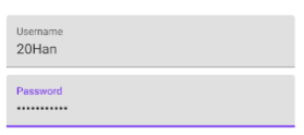
첫 번째는 TextInputEditText의 password 가리기 기능이다
password쪽 TextInputEditText 컴포넌트를 보면 inputType이 "textPassword"로 지정되어 있음을 알 수 있다. 이렇게 어트리뷰트 하나만 설정해주면 해당 값을 입력할 때는 값이 가려져 보이지 않게 된다.
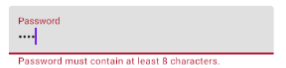
두 번째는 에러 표시 기능이다. 예를 들어서 password의 길이가 8자 이상일때만 유효하다고 가정하자. 그러면 8자 이하일 때 에러 표시를 해야한다. 이는 TextInputLayout에서 "app:errorEnabled"값을 true로 설정함으로써 사용할 수 있다
이후 원하는 상황에서 해당 textInputLayer.error에 메세지를 등록해주면 된다
password_text_input.error = "Password must contain at least 8 characters."아래와 같이 에러가 정상적으로 나타남을 알 수 있다
2. Button 사용하기
MDC Button을 사용하면 여러 형태의 버튼을 만들 수 있다.
이번에 만들어볼 버튼은 TextButton이다. TextButton은 버튼의 background 색이 앱의 배경화면 색과 같아 텍스트만 보이는 버튼이다.
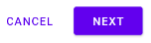
두 버튼 중 cancel 버튼이 textButton이다.
<com.google.android.material.button.MaterialButton
                android:id="@+id/cancel_button"
                style="@style/Widget.MaterialComponents.Button.TextButton"
                android:layout_width="wrap_content"
                android:layout_height="wrap_content"
                android:layout_toStartOf="@id/next_button"
                android:layout_toLeftOf="@id/next_button"
                android:layout_marginEnd="12dp"
                android:layout_marginRight="12dp"
                android:text="@string/shr_button_cancel"/>
style 어트리뷰트를 보면 TextButton 스타일이 적용되었음을 알 수 있다. 이렇게 MaterialComponent에서 제공하는 스타일만 적용하면 손쉽게 TextButton을 만들 수 있다.
텍스트 버튼 말고도 아래와 같이 다양한 형태의 버튼을 만들 수도 있다.
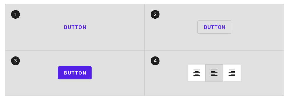
이외에도 버튼의 elevation, stroke, corner radius등 기본 버튼으로는 구현하기 까다라운 부분도 MDC 버튼을 사용하면 손쉽게 구현할 수 있다. 자세한 사항은 여기를 참조하자.