컴포넌트 스타일링
-css 사용 -> import 'CSS 경로'
(사용 빈도가 높지 않음)
Sass
Sass(Syntactically Awesome Style Sheets)
-> 세미콜론, 중괄호 사용 불가
-설치
yarn add sass
scss
-> 세미콜론, 중괄호 사용가능
$red: #fa5252;
$orange: #fd7e14;
$yellow: #fcc419;
$green: #40c057;
$blue: #339af0;
$indigo: #5c7cfa;
$violet: #7950f2;
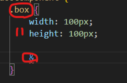
.SassComponent {
.box {
width: 100px;
height: 100px;
&.red {
background: $red;
}
}
}&는 아래 사진과 같이 가르킴
- utils 함수 분리하기
여러 파일에서 사용될 수 있는 Sass 변수 및 믹스인을 다른 파일로 분리하여 작성한 뒤 필요한 곳에서 쉽게 불러와 사용할 수 있다.
$red: #fa5252;
$orange: #fd7e14;
$yellow: #fcc419;
$green: #40c057;
$blue: #339af0;
$indigo: #5c7cfa;
$violet: #7950f2;

@mixin square($size) {
    $calculated: 50px * $size;

    width: $calculated;
    height: $calculated;
}
- Sass와 함께 사용하기
- Sass를 사용할 때도 파일 이름 뒤에 .module.scss 확장자를 사용해 주면 CSS Module로 사용할 수 있다. - 조건부 클래스 라이브러리
classnames
클래스의 추가 제거를 간단히 설정하기 위한 라이브러리
-설치
yarn add classnames return (
<>
<div className={styles.wrapper}>
<span className="commonColor">안녕하세요</span>,
<span className={styles.highlight}>반갑습니다.</span>
</div>
<div className={classNames({ on: visible })}>메뉴</div>
<button type="button" onClick={() => setVisible(!visible)}>
클릭
</button>
</>
);
<div className={visible && 'on'}>메뉴</div>
->
<div className={classNames({ on: visible })}>메뉴</div>classnames/bind
const cx = classNames.bind(styles);styled-components
yarn add styled-components
npm i styled-components- Tagged 템플릿 문법: 태그
function tagged(...params) {
    console.log(params);
}

const a = 10, b = 'abc';

tagged`출력 : ${a},${b}`;

->(3) [Array(3), 10, 'abc']
0: (3) ['출력 : ', ',', '', raw: Array(3)]
1: 10
2: "abc"
length: 3
[[Prototype]]: Array(0)
0번째 요소에는 띄어쓰기를 기준으로 요소로 들어가게 된다.
1번째 부터 함수 값이 들어가게 된다.
const InputBox = styled.input`
  display: block;
  height: 45px;
  border: 1px solid #ccc;
  border-radius: 5px;
  width: 100%;
  padding: 0 10px;

  & + & {
    margin-top: 5px;
  }
`;


<InputBox type="text" placeholder="아이디" />
이렇게 작성할 경우 스타일이 클래스로 정의되게된다.
공통된 스타일을 정의할 경우
import styled, { css } from 'styled-components';

const commonStyle = css`
  width: 100%;
`;

const OuterBox = styled.div`
  position: fixed;
  ${commonStyle}
  height: 100%;
  left: 0;
  top: 0;
  display: flex;
  align-items: center;
`;
이렇게 작성할 경우 각자 요소에 대해서 공통된 스타일을 정의할 수 있다.