반응형 디자인(Responsive Web) 과 미디어 쿼리(Media query)란?
- 반응형 디자인(Responsive Web)이란 다양한 디바이스들이 사용됨에 따라 화면 크기에 따라서 웹페이지의 각 요소들이 반응해서 동작하게 되는 것을 의미한다.
- 미디어 쿼리(Media query)란 화면의 크기,다양한 화면의 특성에 따라 조건을 만족할때에 CSS를 동작하게 할 수 있는 것을 말한다.
코드 예시
<!doctype html>
<html>
<head>
<title>WEB - CSS</title>
<meta charset="utf-8">
<style>
body{
margin:0;
}
a {
color:black;
text-decoration: none;
}
h1 {
font-size:45px;
text-align: center;
border-bottom:1px solid gray;
margin:0;
padding:20px;
}
ol{
border-right:1px solid gray;
width:100px;
margin:0;
padding:20px;
}
#grid{
display: grid;
grid-template-columns: 150px 1fr;
}
#grid ol{
padding-left:33px;
}
#grid #article{
padding-left:25px;
}
@media(max-width:800px){
#grid{
display: block;
}
ol{
border-right:none;
}
h1 {
border-bottom:none;
}
}
</style>
</head>
<body>
<h1><a href="index.html">WEB</a></h1>
<div id="grid">
<ol>
<li><a href="1.html">HTML</a></li>
<li><a href="2.html">CSS</a></li>
<li><a href="3.html">JavaScript</a></li>
</ol>
<div id="article">
<h2>CSS</h2>
<p>
Cascading Style Sheets (CSS) is a style sheet language used for describing the presentation of a document written in a markup language.[1] Although most often used to set the visual style of web pages and user interfaces written in HTML and XHTML, the language can be applied to any XML document, including plain XML, SVG and XUL, and is applicable to rendering in speech, or on other media. Along with HTML and JavaScript, CSS is a cornerstone technology used by most websites to create visually engaging webpages, user interfaces for web applications, and user interfaces for many mobile applications.
</p>
</div>
</div>
</body>
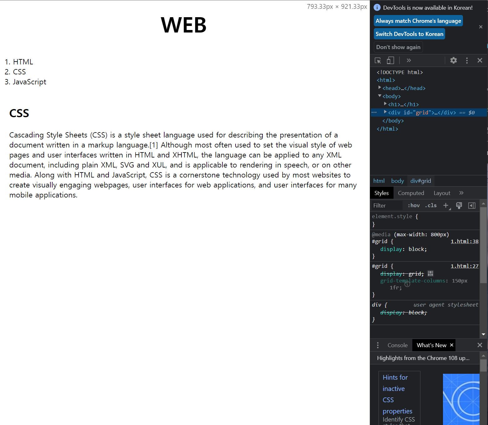
</html>실제 웹 화면 (화면 너비가 800px 이하 일때)
실제 웹 화면 (화면 너비가 800px 이상 일때)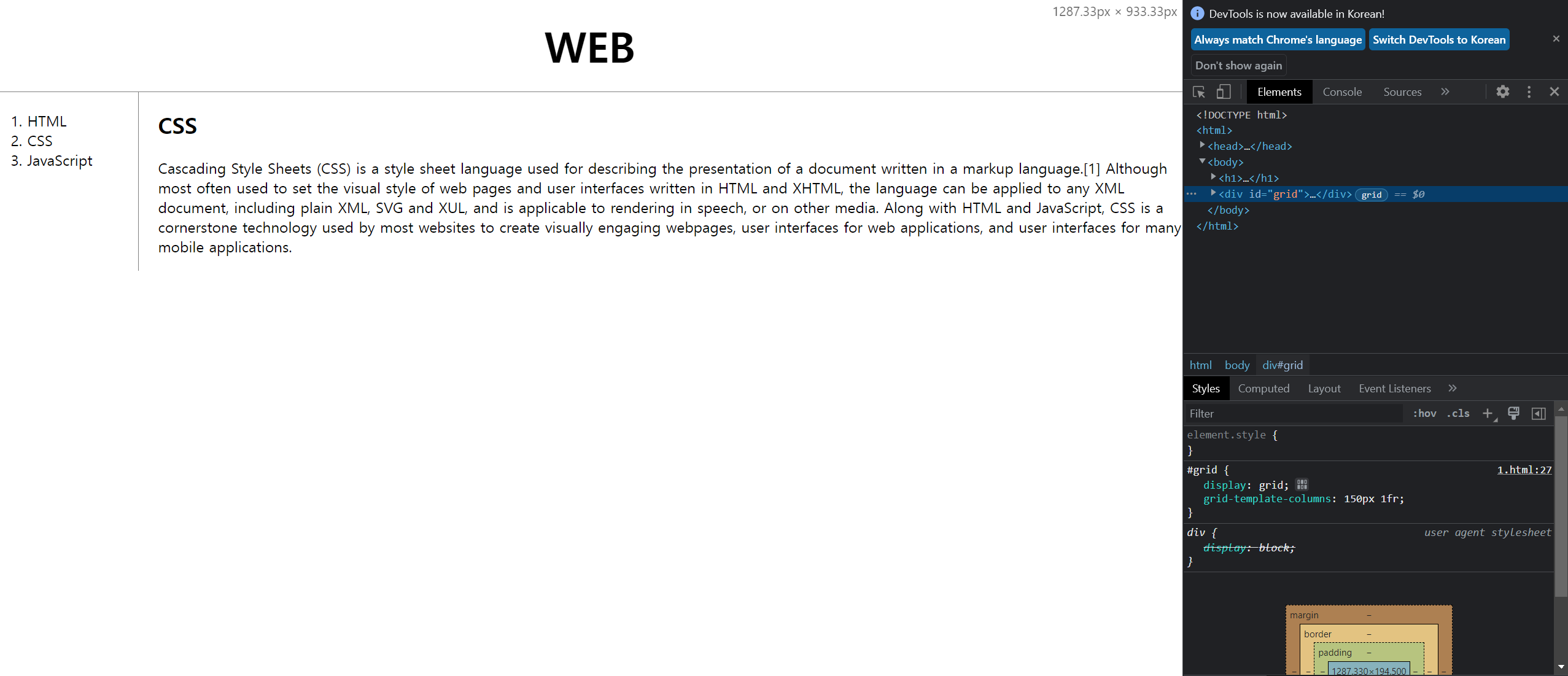
- @media 쿼리를 사용해서 화면의 너비가 800px 보다 작을 때 조건을 주었다.
- 먼저 ID값이 gird인 태그의 display가 block으로 바뀌고, ol 태그와 h1 태그의 테두리의 줄을 없어지게 만들었다.

학생의 자세로 살아가는 개발자