들어가며
앱에서 Carousel 같은 Slider를 구현하면서 page indicator로 default 이미지가 아닌 내가 지정한 이미지를 사용하여 indicator 를 custom 하기.
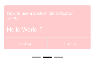
결과 화면
필요한 사전 지식
- UIViewRepresentable
SwiftUI로 page indicator에 이미지를 적용하는 코드가 iOS 16 이상에서 지원하고 있기 때문에 iOS 16 미만 버전은 UIKit의 코드를 빌려와 사용해야 한다. - ViewBuilder
실제 화면이 표시되는 tab view 영역과 indicator가 표시되는 controller 의 영역을 분리하여 구현해서 나만의 tabview를 구현할 것인데 이 때에 view가 @ViewBuilder의 구현체이다.
Indicator 코드
struct PageIndicator: UIViewRepresentable {
    @Binding var currentPage: Int // 현재 페이지 값
    var numberOfPages: Int // 총 페이지의 수
    var indicatorImage: String = "minus_sign" // 사용할 이미지 이름

    func makeUIView(context: Context) -> UIPageControl {
        let control = UIPageControl()
        control.numberOfPages = 1 // 초기화 값이고 update 하면서 덮어씌워질 것

        // 이미지를 적용하는 부분
        control.preferredIndicatorImage = UIImage(named: indicatorImage)
        control.currentPageIndicatorTintColor = UIColor(.black) // 현재 페이지 indicator의 강조 색상
        control.pageIndicatorTintColor = UIColor(.gray) // 기본 indicator의 강조 색상

        control.translatesAutoresizingMaskIntoConstraints = false // if you want to use auto layout to dynamically calculate the size and position of your view, you must set this property to false and then provide a non ambiguous, nonconflicting set of constraints for the view
        control.setContentHuggingPriority(.required, for: .horizontal) // hugging priority 낮을 수록 공간 차지 required = 1000 으로 최상위 우선순위

        return control
    }

    // binding property인 page 값이 update 시 call 된다.
    func updateUIView(_ control: UIPageControl, context: Context) {
        control.currentPage = currentPage // 현재 페이지 값을 갱신하여 강조 색상이 달라지게 한다.
        control.numberOfPages = numberOfPages
    }
}
ViewBuilder
    @ViewBuilder
    private var Carousel: some View {
        TabView(selection: $page) {
            Page()
                .tag(0)
            Page()
                .tag(1)
            Page()
                .tag(2)
        }
        .tabViewStyle(.page(indexDisplayMode: .never))
    }

    @ViewBuilder
    private var ControlBar: some View {
        HStack {
            PageIndicator(currentPage: $page,
            			  numberOfPages: 3)
        }
    }
SwiftUIView
struct ContentView: View {
    @State var page = 0
    var body: some View {
     NavigationView {
            ZStack {
                VStack {
                    Carousel
                    ControlBar
                }
            }
       }
   }

   // 이쯤에 viewbuilder 코드를 넣는다. page 변수를 공유
}
🤬 주의!
본래 이미지의 색상이 유지되지 않고 tint color로 덮어 씌워 진다는 점을 이해할 수 없다. 원래의 이미지를 그대로 사용할 수 있는 방법을 찾아 볼 예정이다.
느려도 한 걸음 씩 끝까지