Pie Chart
-
많이 사용되는 차트이지만, 비교하기 어렵고, 유용성이 떨어지기 때문에 지양하는 차트
-
사용을 꼭 하고 싶다면 함께 사용할 것을 권장
-
Pie plot은 값에 대한 비교가 어렵지만, bar plot은 값에 대한 비교가 쉬우므로 적재적소에 잘 사용하면 될 것 같다.
-
parameter
- startangle : 시작점 각도 조정
- explode : 숫자 리스트로 전달하며, 해당 부분을 강조할 때 사용(피자 한 조각 처럼 튀어나옴)
- shadow : 그림자 설정(bool type)
- autopct : fotmat을 전달하면 각 데이터의 비율을 자동적으로 나타내줌
- labeldistance : label text가 길어질 때 겹치는 경우를 방지하기 위해 label 위치 조정
- rotatelabels : label 각도를 중심점을 기준으로 설정됨
- counterclock : pie를 시계방향으로 하여 그려줌(원래 반시계 방향)
- radius : 반지름을 조정
# 기본적인 pie chart
labels = ['A', 'B', 'C', 'D']
data = np.array([60, 90, 45, 165]) # total 360

fig, ax = plt.subplots(1, 1, figsize=(7, 7))
ax.pie(data,labels=labels)
plt.show()

# custom pie chart
fig, ax = plt.subplots(1, 1, figsize=(7, 7))
explode = [0, 0, 0.2, 0]

ax.pie(data, labels=labels, explode=explode, startangle=90,
      shadow=True, autopct='%1.1f%%', labeldistance=1.15, #rotatelabels=90
      )
plt.show()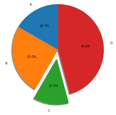
Donut Chart
-
중간이 비어있는 Pie chart로 디자인적으로는 선호되어 인포그래픽에서 종종 사용
-
pctdistance : percentage가 원의 공간에서 얼마나 떨어져서 나타낼지 지정
-
textprops : text 색 변경
fig, ax = plt.subplots(1, 1, figsize=(7, 7))

ax.pie(data, labels=labels, startangle=90,
      shadow=True, autopct='%1.1f%%', pctdistance=0.85, textprops={'color':"w"})

# 좌표 0, 0, r=0.7, facecolor='white'
centre_circle = plt.Circle((0,0),0.70,fc='white')
ax.add_artist(centre_circle)

plt.show()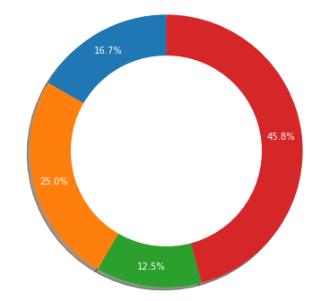
Sunburst chart
- 햇살을 닮은 차트로, 중심에서 동심원으로 뻗어나가면서 분할되는 것
- 계층적 데이터를 시각화 하는데 유용하며, 구현 난이도에 비해 화려하다는 장점이 있다.

