시각화에서 Text가 필요한 이유
- Visual representation으로 줄 수 없는 설명을 추가할 수 있다.
- 잘못된 전달에서 생기는 오해를 방지할 수 있다.
하지만 Text를 과하게 사용하게 된다면 가독성과 이해를 방해할 수 있다.
Anatomy of a Figure(Text Ver.)
| Title | 가장 큰 주제를 설명 |
| Lable | 축에 해당하는 데이터 정보를 제공 |
| Tick Label | 축에 눈금을 사용하여 스케일 정보를 추가 |
| Legend | 한 그래프에서 2개 이상의 서로 다른 데이터를 분류하기 위해서 사용하는 보조 정보 |
| Annotation(Text) | 그 외의 시각화에 대한 설명을 추가 |
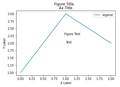
fig, ax = plt.subplots()

fig.suptitle('Figure Title')

ax.plot([1, 3, 2], label='legend')
ax.legend() # 범례

ax.set_title('Ax Title') # 전체 제목
ax.set_xlabel('X Label') # X label
ax.set_ylabel('Y Label') # y label

ax.text(x=1,y=2, s='Text') # 좌표기반 text 생성
fig.text(0.5, 0.6, s='Figure Text') # 비율기반 text 생성

plt.show()
Text properties
- 가장 쉽게 바꿀 수 있는 요소들
- family(폰트), size(크기), style(기울임), weight(굵기)
fig, ax = plt.subplots()
ax.set_xlim(0, 1)
ax.set_ylim(0, 1)

ax.text(x=0.5, y=0.5, s='Text\nis Important',
        fontsize=20, # 크기 20
        fontweight='bold', # 두껍게
        fontfamily='serif') # serif 글씨체 사용

plt.show()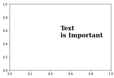
- 폰트 자체와는 조금 다르지만 커스텀할 수 있는 요소들
- color(색상), linespacing(줄 간격), backgroundcolor(배경 색), alpha(투명도), zorder(맨 앞 또는 맨 뒤로 가져오기), visible(Text 나타내는 유무)
fig, ax = plt.subplots()
ax.set_xlim(0, 1)
ax.set_ylim(0, 1)

ax.text(x=0.5, y=0.5, s='Text\nis Important',
        fontsize=20,
        fontweight='bold',
        fontfamily='serif',
        color='royalblue', # royalblue 색 적용
        linespacing=2, # 줄 간격 2
        backgroundcolor='lightgray', # 밝은 회색 배경 색
        alpha=0.5 # 0.5 투명도)

plt.show()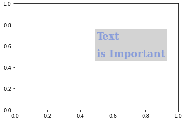
- Alignment
- 정렬과 관련된 요소들을 조정
- ha(가로축 정렬), va(세로축 정렬), rotation(회전)
fig, ax = plt.subplots()
ax.set_xlim(0, 1)
ax.set_ylim(0, 1)

ax.text(x=0.5, y=0.5, s='Text\nis Important',
        fontsize=20,
        fontweight='bold',
        fontfamily='serif',
        color='royalblue',
        linespacing=2,
        va='center', # top, bottom, center
        ha='center', # left, right, center
        rotation='horizontal' # vertical )

plt.show()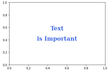
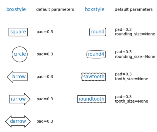
- bbox
- text 박스 생성
fig, ax = plt.subplots()
ax.set_xlim(0, 1)
ax.set_ylim(0, 1)

ax.text(x=0.5, y=0.5, s='Text\nis Important',
        fontsize=20,
        fontweight='bold',
        fontfamily='serif',
        color='black',
        linespacing=2,
        va='center',
        ha='center',
        rotation='horizontal',
				# wheat색에 투명도 0.4 의 테두리가 blue인 box 생성
        bbox=dict(boxstyle='round', facecolor='wheat', alpha=0.4,
									ec="blue",pad=1)
       )

plt.show()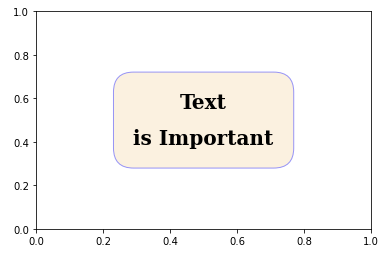
- Title/Legend
# loc를 통해 Title 위치 조정
ax.set_title('Score Relation',
             loc='left', va='bottom',
             fontweight='bold', fontsize=15
            )

# Legend 조정
ax.legend(
    title='Gender',
    shadow=True, # 그림자
    labelspacing=1.2, # 범례 간 간격 조정
#     loc='lower right', # 위치 조정
    bbox_to_anchor=[1.2, 0.5] # 원하는 위치 지정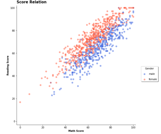
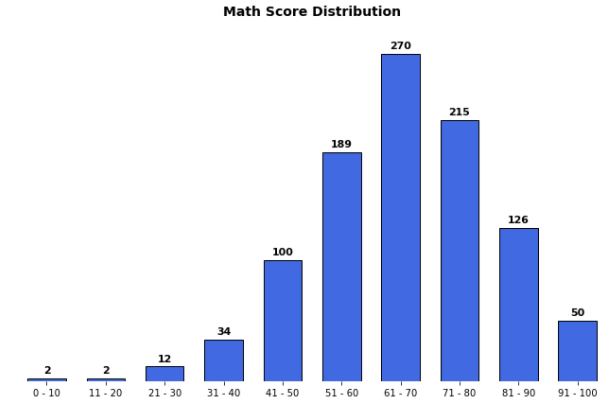
- Ticks/Text
ax.set(frame_on=False) # 격자선 삭제
ax.set_yticks([]) # 테두리 삭제
ax.set_xticks(np.arange(len(math_grade))) # x label 조정
ax.set_xticklabels(math_grade.index) # x label index 조정

# 막대그래프에 Text 추가
for idx, val in math_grade.iteritems():
    ax.text(x=idx, y=val+3, s=val,
            va='bottom', ha='center',
            fontsize=11, fontweight='semibold'
           )
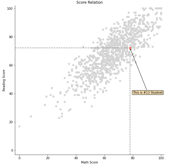
- Annotate
- 화살표 그리기
fig = plt.figure(figsize=(9, 9))
ax = fig.add_subplot(111, aspect=1)

i = 13

# 전체적인 scatter plot
ax.scatter(x=student['math score'], y=student['reading score'],
           c='lightgray',
           alpha=0.9, zorder=5)

# 13번째 scatter plot
ax.scatter(x=student['math score'][i], y=student['reading score'][i],
           c='tomato',
           alpha=1, zorder=10)

ax.set_xlim(-3, 102)
ax.set_ylim(-3, 102)

ax.spines['top'].set_visible(False)
ax.spines['right'].set_visible(False)

ax.set_xlabel('Math Score')
ax.set_ylabel('Reading Score')

ax.set_title('Score Relation')

# x축과 평행한 선
ax.plot([-3, student['math score'][i]], [student['reading score'][i]]*2,
        color='gray', linestyle='--',
        zorder=8)

# y축과 평행한 선
ax.plot([student['math score'][i]]*2, [-3, student['reading score'][i]],
       color='gray', linestyle='--',
       zorder=8)

bbox = dict(boxstyle="round", fc='wheat', pad=0.2)
arrowprops = dict(
    arrowstyle="->")

# annotation 추가
ax.annotate(text=f'This is #{i} Studnet',
            xy=(student['math score'][i], student['reading score'][i]),
            xytext=[80, 40],
            bbox=bbox,
            arrowprops=arrowprops, # 화살표 설정
            zorder=9
           )

plt.show()