CSS grid layout
0

🎐 CSS grid layout
컨테이너를 지정하는 display 속성
| 종류 | 설명 |
|---|---|
| grid | 컨테이너 안의 항목을 블록 레벨 요소로 배치 |
| inline-grid | 컨테이너 안의 항목을 인라인 레벨 요소로 배치 |
<style>
    #wrapper {
      display: grid;
      /* 그리드 컨테이너 지정 */
      grid-template-columns: 200px 200px 200px;
      /* 넓이가 200px 인 컬럼 3개*/
      grid-template-rows: 100px;
      /* 줄 높이 100px */
    }

    .items {
      padding: 10px;
      background-color: #eee;
    }

    .items:nth-child(odd) {
      background-color: #bbb;
    }
  </style>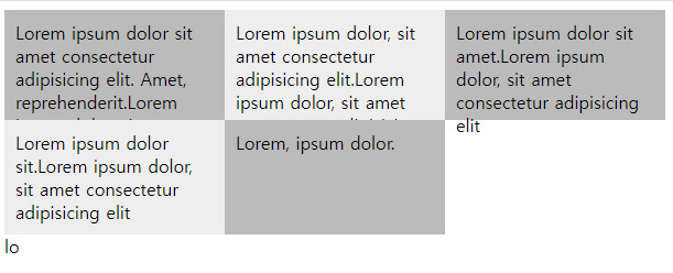
상대적인 크기를 지정하는 fr 단위
그리드 레이아웃에서 칼럼이나 줄의 크기를 지정할 때 px을 이용하면 항상 크리가 고정되므로 반응형 웹 디자인에는 적합하지 않다. 그래서 그리드 레이아웃에서는 상대적인 크기를 지정할 수 있도록 fr 단위를 사용한다 .
예를 들어 너비가 같은 칼럼을 3개 배치한다면 fr 단위를 사용해 다음과 같이 지정한다.
grid-template-columns: 1fr 1fr 1fr;
또는 칼럼을 2:1:2 로 배치하고 싶으면
grid-template-columns: 2fr 1fr 2fr;
값이 반복될때 줄여서 표현할수 있는 repeat()함수
grid-template-columns: 1fr 1fr 1fr;
grid-template-columns: repeat(3,1fr);
최솟값과 최댓값을 지정하는 minmax() 함수
minmax() 함수를 사용하면 줄 높이를 고정하지 않고 최솟값과 최댓값을 사용해서 유연하게 지정할 수 있다.
 <style>
     #wrapper{
      width:600px;
      display:grid;  /* 그리드 컨테이너 지정 */
      grid-template-columns:repeat(3, 1fr);  /* 너비가 같은 칼럼 3개 */
      grid-template-rows: minmax(100px, auto);  /* 줄 높이 최소 100px */
    }
    .items{
      padding:10px;
      background-color:#eee;
    }
    .items:nth-child(odd){
      background-color:#bbb;
    }
    </style>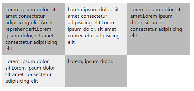
auto-fit 이나 auto-fill을 지정하면 화면 너비에 따라 칼럼 개수를 조절할 수 있다. 예를 들어 다음과 같이 너비가 200px 칼럼을 화면 너비에 가득 찰때까지 배치한다. auto-fit이나 auto-fill 모두 칼럼 개수를 자동으로 조절해 주므로 화면이 넓어지면 칼럼 개수가 많아지고 반대로 화면이 좁아지면 칼럼 개수가 줄어든다.
grid-template-columns: repeat(auto-fit, 200px);
<script>
#wrapper1{
      display:grid;
      grid-template-columns:repeat(auto-fit, minmax(200px, 1fr));  /* 화면을 꽉 채울만큼 칼럼 너비를 늘려서 표시 */
      margin-bottom:20px;
    }
#wrapper2{
      display:grid;
      grid-template-columns:repeat(auto-fill, minmax(200px, 1fr));  /* 칼럼 최소 너비만큼 채워서 표시 */
    }
</script>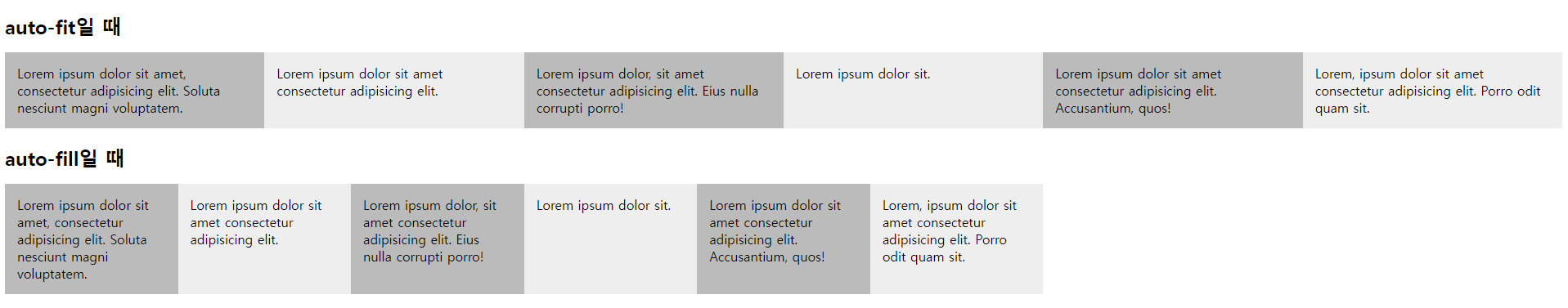
grid 항목의 간격을 지정하는 속성
| 종류 | 설명 |
|---|---|
| grid-column-gap | 칼럼과 칼럼 사이의 간격을 지정한다. |
| grid-row-gap | 줄과 줄 사이의 간격을 지정한다. |
| grid-gap | 칼럼과 줄 사이의 간격을 한꺼번에 지정한다. |
grid-row-gap: 20px;
grid-column-gap: 30px;
 <style>
      #wrapper{
        display:grid;
        grid-template-columns:repeat(3, 200px);  /* 너비 200px인 칼럼 3개 */
        grid-template-rows: minmax(100px, auto);
        grid-gap:20px 30px;  /* 칼럼 간격 30px, 줄 간격 20px  */
        /* grid-column-gap:30px; */
        /* grid-row-gap:20px; */
      }
 </style>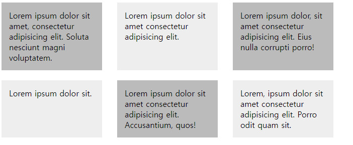
glid line 이용해서 그리드 항목을 배치할수 있다.
| 종류 | 설명 | 예시 |
|---|---|---|
| grid-column-start | 칼럼 시작의 라인 번호를 지정 | grid-colums-start:1 |
| grid-column-end | 칼럼의 마지막 라인 번호를 지정 | grid-column-end: 4 |
| grid-column | 칼럼 시작 번호와 끝ㅌ 번호 사이에 (/)넣어 사용 | grid-column: 1/4 |
| grid-row-start | 줄 시작의 라인 번호를 지정 | grid-end-start: 2 |
| grid-row-end | 줄마지막의 라인 번호 | grid-row-end: 4 |
| grid-row | 줄시작 번호와 줄끝 번호 사이에 (/)를 넣어 사용 | grid-row: 2/4 |
<style>
      #wrapper{
        width:700px;
        display:grid;
        grid-template-columns:repeat(3, 1fr);
        grid-template-rows:repeat(3, 100px);
      }
      .box{
        padding:15px;
        color:#fff;
        font-weight:bold;
        text-align:center;
      }
      .box1 {
        background-color:#3689ff;
        grid-column:1/4;
      }
      .box2 {
        background-color:#00cf12;
        grid-row:2/4;
        /* grid-column:1/2; */
        grid-column-start:1;
      }
      .box3 {
        background-color:#ff9019;
        grid-column:2/4;
        /* grid-row:2/3; */
        grid-row-start:2;
        }
      .box4 {
        background-color:#ffd000;
        grid-column-start:3;
        grid-row-start:3;
      }
    </style>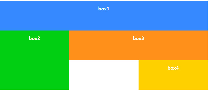
템플릿 영역을 만들어 배치하기
<style>
      #wrapper{
        width:700px;
        display:grid;
        grid-template-columns:repeat(3, 1fr);
        grid-template-rows:repeat(3, 100px);
        grid-template-areas:
          "box1 box1 box1"
          "box2 box3 box3"
          "box2 . box4"; /* .은 빈칸이다 */
      }
      .box{
        padding:15px;
        color:#fff;
        font-weight:bold;
        text-align:center;
      }
      .box1 {
        background-color:#3689ff;
        grid-area:box1;
      }
      .box2 {
        background-color:#00cf12;
        grid-area:box2;
      }
      .box3 {
        background-color:#ff9019;
        grid-area:box3;
        }
      .box4 {
        background-color:#ffd000;
        grid-area:box4;
      }
    </style>
안녕하세요~