출처: https://data101.oopy.io/plolty-tutorial-guide-in-korean
px와 go
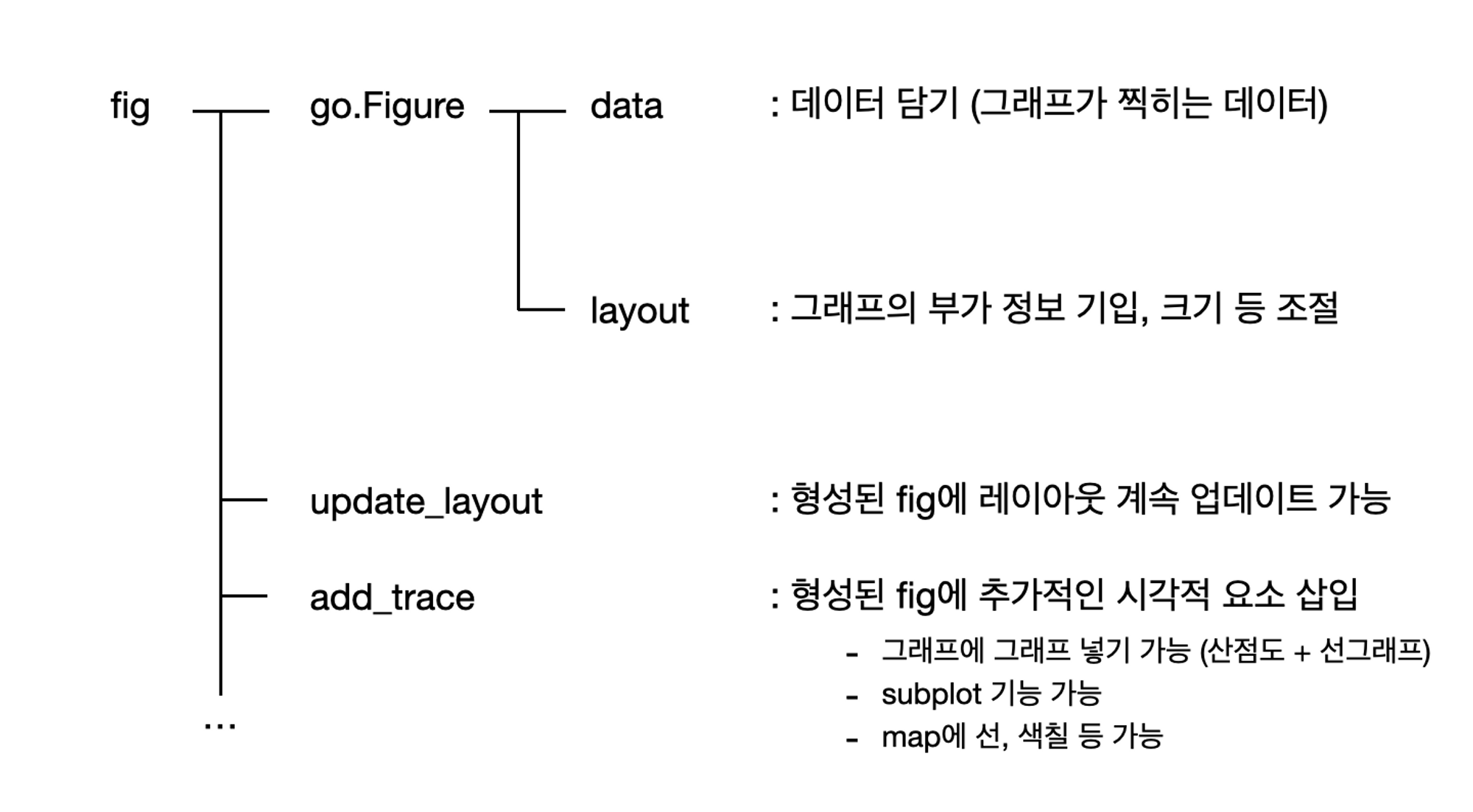
fig = go.Figure() : go를 통해 그래프를 하나하나 설정하며 제작
fig = px.scatter() : px를 통해 템플릿으로 그래프를 빠르게 제작
설치
pip install plotly # 설치pip install plotly --upgrade # 업데이트그래프 종류
- Bar graph
- Scatter Plot
a. Dot Plot
b. Bubble Chart- Line chart
- Pie graph
a. Treemap
b. Sunburst Chart- Statistical Charts
a. Box Plot
b. Strip Plot
c. Violin Plot
d. Histogram
* chart studio
: plotly로 시각화한 차트를 chart studio에 upload
pip install chart_studio로 설치!- username과 api_key를 활용해 연결
  import chart_studio

  username = ''  # 자신의 username (plotly account를 만들어야 함)
  api_key = ''    # 자신의 api key (settings > regenerate key)

chart_studio.tools.set_credentials_file(username=username, api_key=api_key)- 작성한 차트를 upload하는 코드
  chart_studio.plotly.plot(fig, filename = '파일이름', auto_open=True)  # fig: 작성한 차트를 저장한 변수
  ## 위 코드를 실행하면 새로운 window로 해당 차트의 링크가 열리고, notebook에도 link를 아래에 return해줌
기본으로 제공되는 데이터 가져오기
import plotly.express as px
bills_df = px.data.tips()  # plotly express에서 제공되는 기본 data 사용
bills_df.head()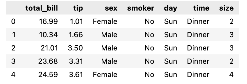
✏️ 1. Bar graph
1-1. daily average bills per sex
 fig = px.bar(bills_df.groupby(['day', 'sex'])[['total_bill']].mean().reset_index(),
             x='day', y='total_bill', color='sex',
             title='Average Bills per Day', category_orders={'day':['Thur', 'Fri', 'Sat', 'Sun']},
             color_discrete_sequence=px.colors.qualitative.Pastel)
 fig.show()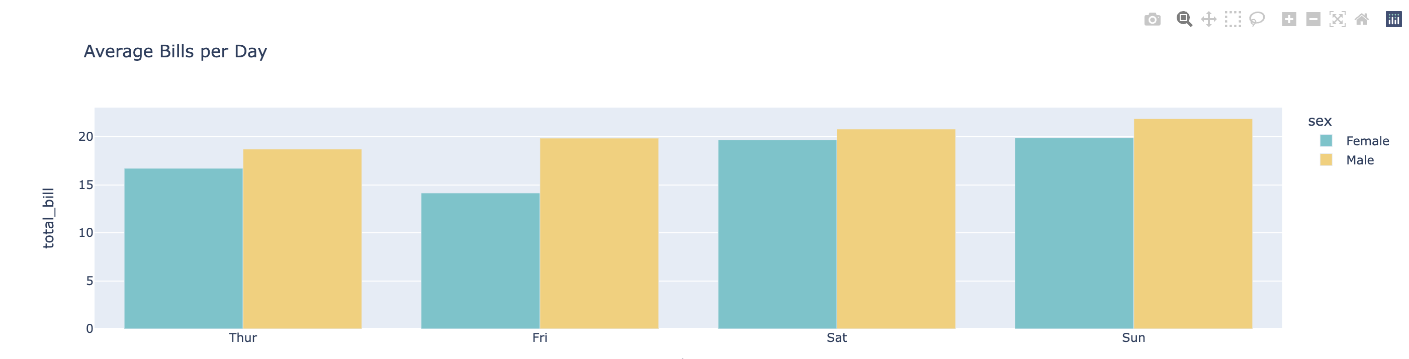
- color로 구분을 넣으면 default로 누적 그래프 형태로 시각화됨
1-2. daily average bills per sex
 fig = px.bar(bills_df.groupby(['day', 'sex'])[['total_bill']].mean().reset_index(),
             x='day', y='total_bill', color='sex', height=400,
             title='Average Bills per Day', category_orders={'day':['Thur', 'Fri', 'Sat', 'Sun']},
             color_discrete_sequence=px.colors.qualitative.Pastel,
             barmode='group')  # 양 옆으로 놓이는 구조  # barmode='stack'라고 하면 누적 (dafault setting)
 fig.show()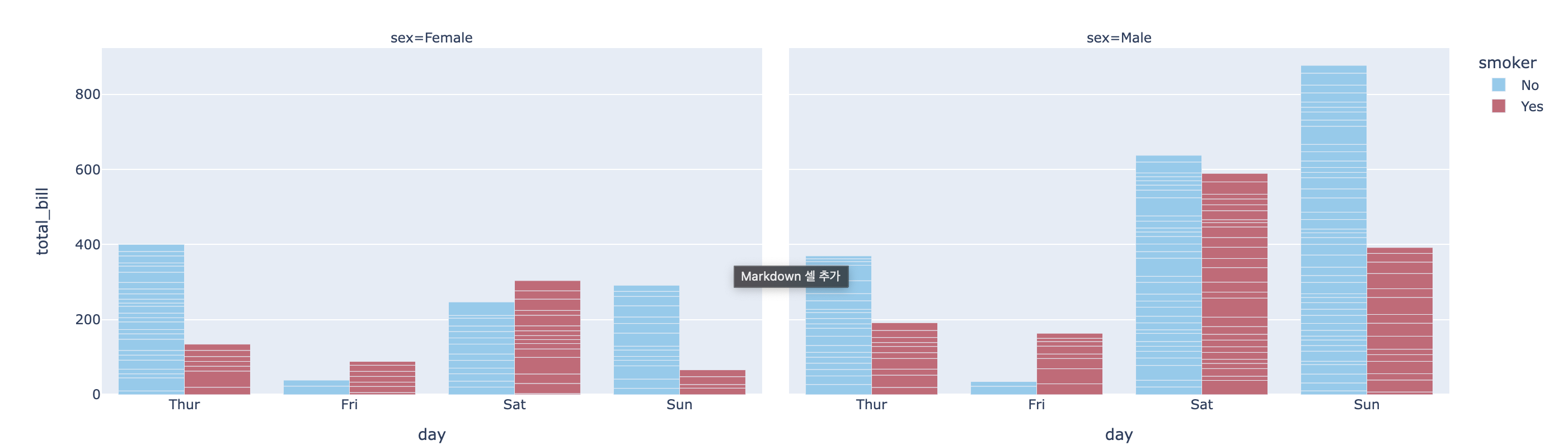
- barmode='group' 옵션을 추가해주면 그룹별 값이 위아래 대신 양옆으로 배치됨
- height 옵션으로 크기를 지정해주는 것도 가능 (+. width 옵션도 가능)
1-3. daily total bills per sex
 fig = px.bar(bills_df, x='day', y='total_bill', color='sex',
             title='Total Bills per Day', category_orders={'day':['Thur', 'Fri', 'Sat', 'Sun']},
             color_discrete_sequence=px.colors.qualitative.Pastel)
 fig.show()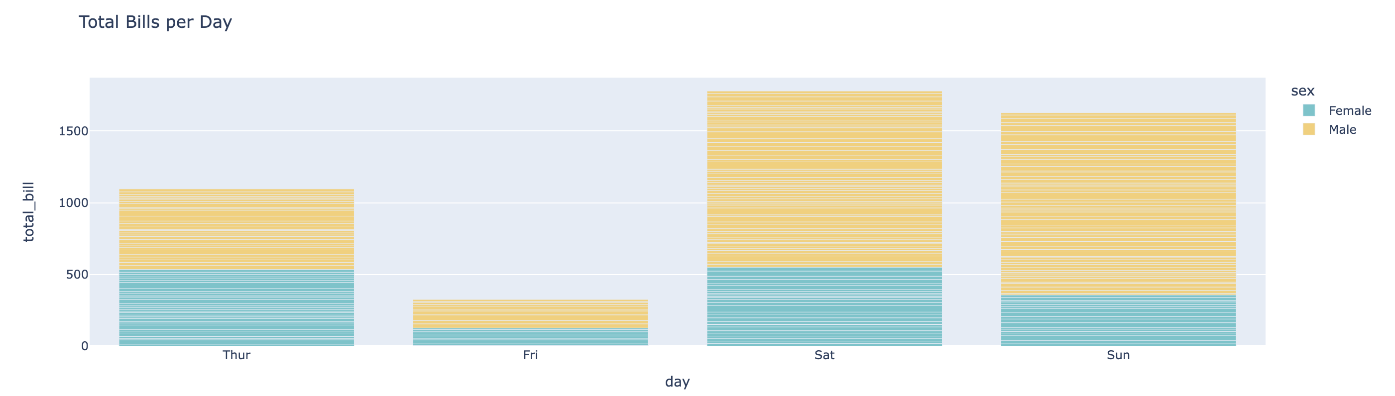
1-4. category별로 영역을 나누어 그리기
 fig = px.bar(bills_df, x='day', y='total_bill', color='smoker', barmode='group', facet_col='sex',
             category_orders={'day':['Thur', 'Fri', 'Sat', 'Sun']},
             color_discrete_sequence=px.colors.qualitative.Safe, template='plotly')
 fig.show()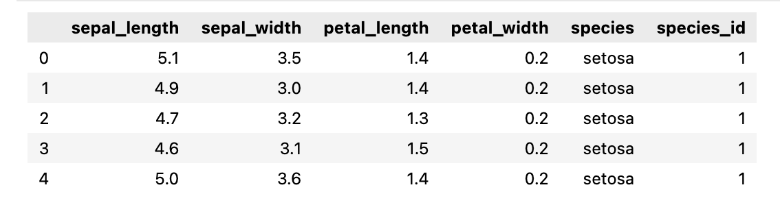
- facet_col 옵션을 통해 특정 그룹별로 영역을 나눠서 시각화할 수 있다
- template 옵션을 통해 각 그래프별 template을 별도로 지정할 수도 있다
✏️ 2. Scatter Plot
iris_df = px.data.iris()
iris_df.head()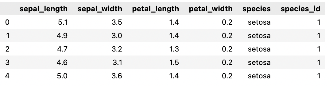
2-1. 기본 scatter plot
 fig = px.scatter(iris_df, x='sepal_width', y='sepal_length', color='species',
                 color_discrete_sequence=px.colors.qualitative.Safe)
 fig.show()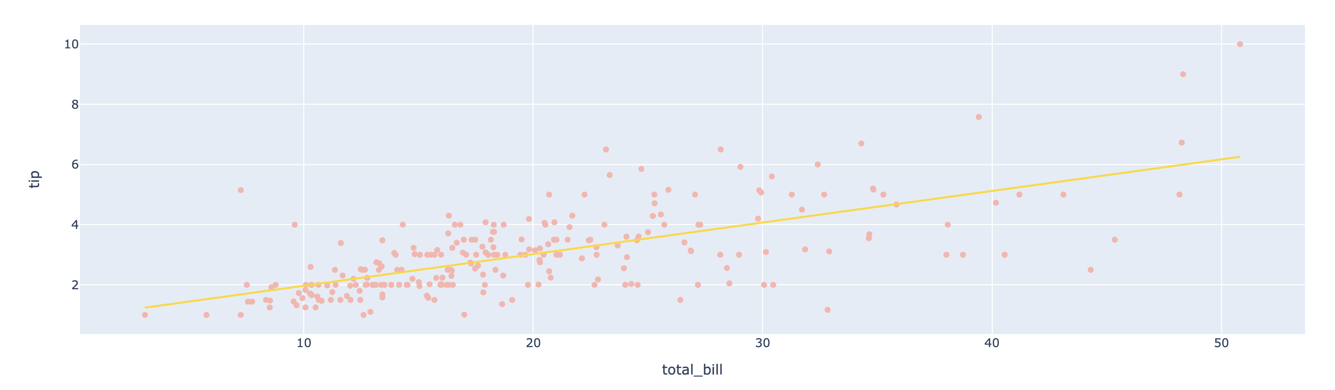
2-2. trendline을 포함한 scatter plot
 fig = px.scatter(bills_df, x='total_bill', y='tip', trendline='ols',
                 color_discrete_sequence=px.colors.qualitative.Pastel1,
                 trendline_color_override='gold')
 fig.show()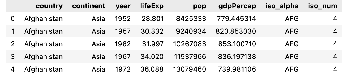
- trendline='ols' 옵션을 통해 선형회귀선을 함께 시각화
✏️ 3. Dot Plot
데이터 가져오기
gapminder_df = px.data.gapminder()
gapminder_df.head()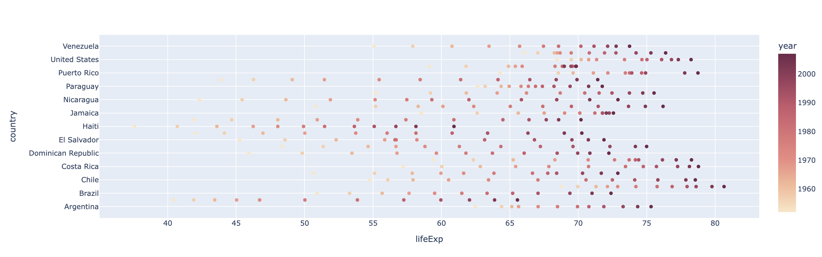
fig = px.scatter(gapminder_df.query("continent=='Americas'"), x='lifeExp', y='country',
color='year',
color_continuous_scale='Burgyl')
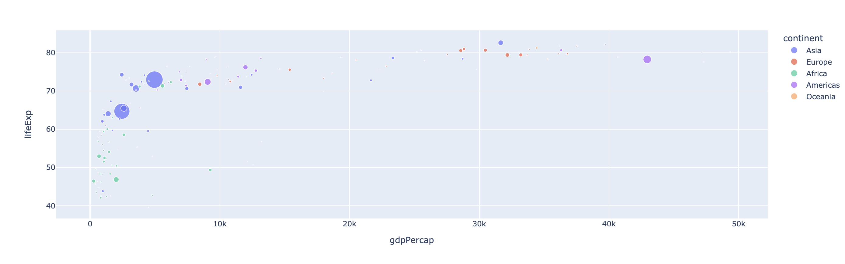
fig.show()✏️ 4. Bubble chart
fig = px.scatter(gapminder_df.query("year == 2007"),
                 x='gdpPercap', y='lifeExp', size='pop', color='continent',
                 hover_name='country')
 fig.show()
✏️ 5. Line Chart
fig = px.line(gapminder_df.query("continent == 'Oceania'"),
              x='year', y='lifeExp', color='country', symbol='country',
              color_discrete_sequence=px.colors.qualitative.Pastel1)
fig.show()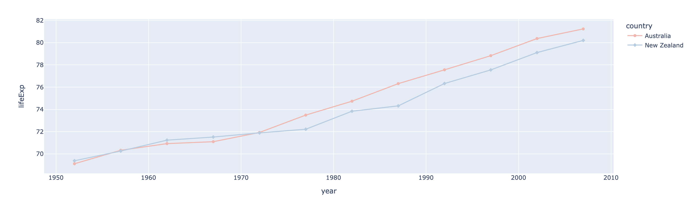
✏️ 6. Pie Graph
# 2007년 gapminder 수치 중, Asia 지역의 국가별 population 비중을 시각화

temp_df = gapminder_df.query("year == 2007").query("continent == 'Asia'")
# population이 가장 많은 top 15 국가를 제외하고는 다 'Other countries'로 처리
temp_df.sort_values(by='pop', ascending=False, inplace=True)
temp_df.iloc[15:, 0] = 'Other countries'

fig = px.pie(temp_df, values='pop', names='country',
             color_discrete_sequence=px.colors.qualitative.Antique)
fig.show()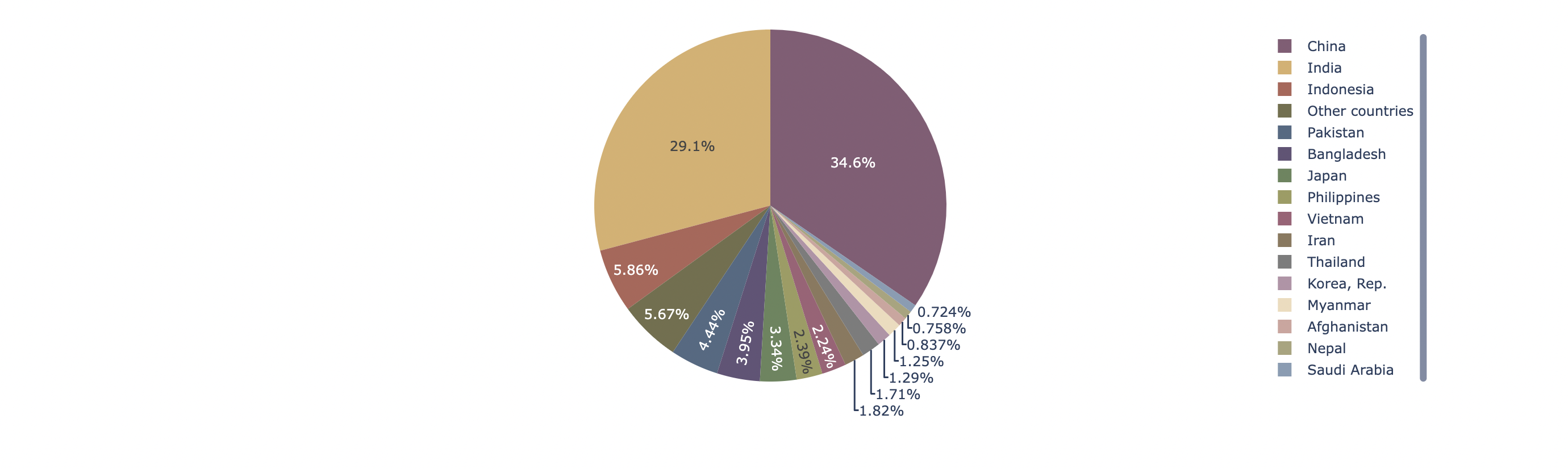
✏️ 7. Treemap
temp_df = gapminder_df.query("year == 2007")
fig = px.treemap(temp_df, path=[px.Constant('world'), 'continent', 'country'],
                values='pop', color='lifeExp', color_continuous_scale='RdBu',
                color_continuous_midpoint=np.average(temp_df['lifeExp'], weights=temp_df['pop']))

fig.update_layout(margin = dict(t=50, l=25, r=25, b=25))
fig.show()
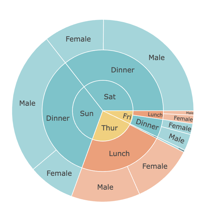
✏️ 8. Sunburst Chart
fig = px.sunburst(bills_df, path=['day', 'time', 'sex'], values='tip',
                 color='time', color_discrete_sequence=px.colors.qualitative.Pastel)
fig.show()
✏️ 9. Statistical Charts
9-1. 기본 box plot
 fig = px.box(bills_df, x='sex', y='total_bill', color='smoker',
             color_discrete_sequence=px.colors.qualitative.Pastel)
 fig.show()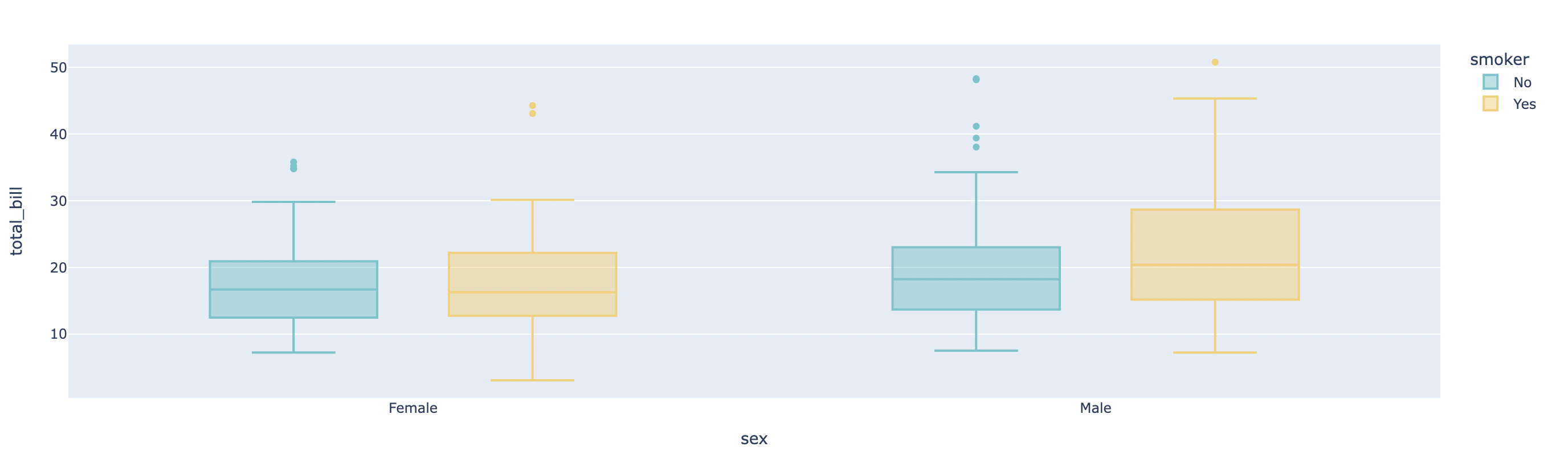
9-2. 각 point를 함께 시각화
 fig = px.box(bills_df, x='sex', y='total_bill', color='smoker', points='all',
             color_discrete_sequence=px.colors.qualitative.Pastel)
 fig.show()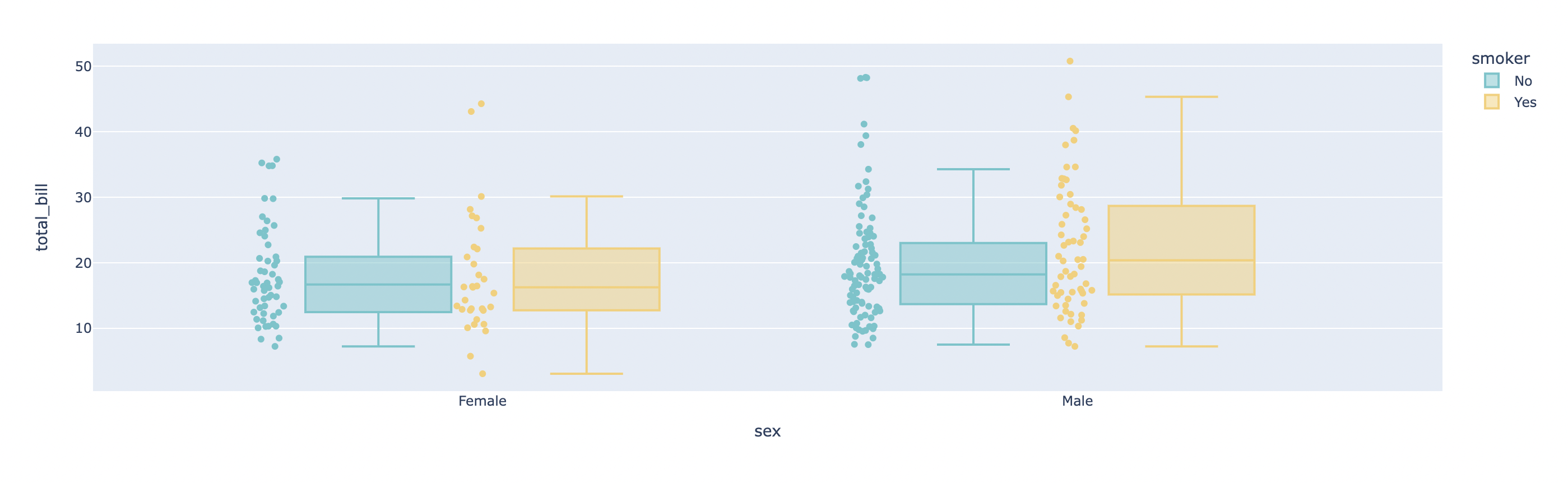
✏️ 10. Strip Plot
10-1. 기본 strip plot
fig = px.strip(bills_df, x='sex', y='total_bill', color='smoker',
             color_discrete_sequence=px.colors.qualitative.Pastel)
 fig.show()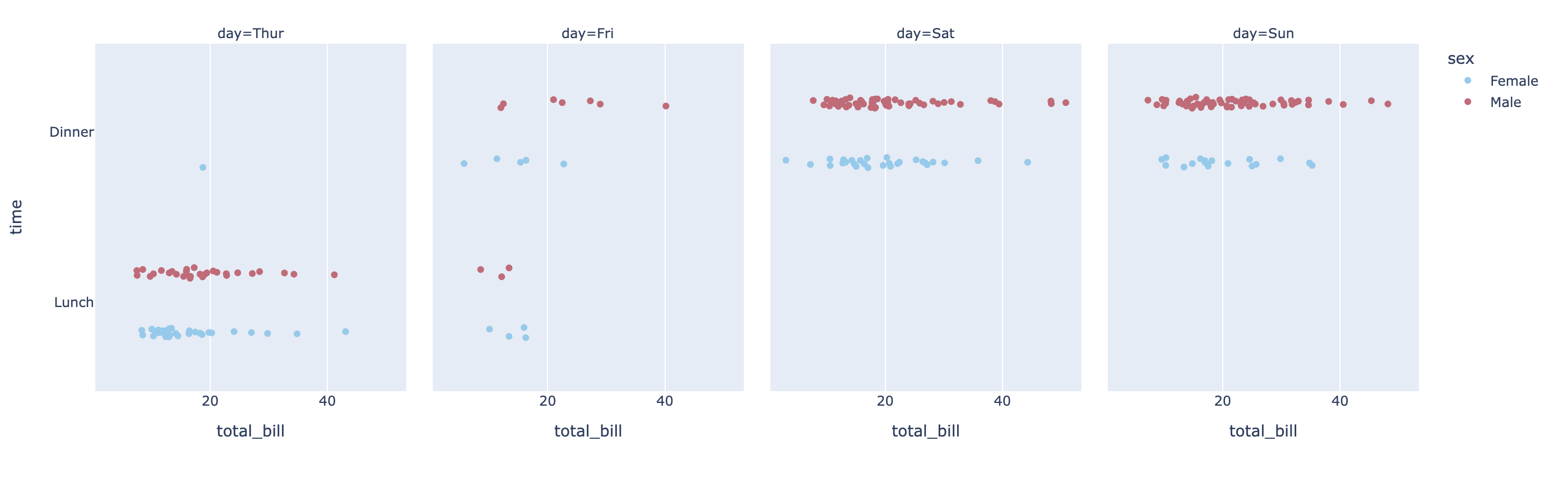
10-2. category별로 세분화해 시각화
 fig = px.strip(bills_df, x='total_bill', y='time', color='sex', facet_col='day',
             category_orders={'day':['Thur', 'Fri', 'Sat', 'Sun']},
             color_discrete_sequence=px.colors.qualitative.Safe, template='plotly')
 fig.show()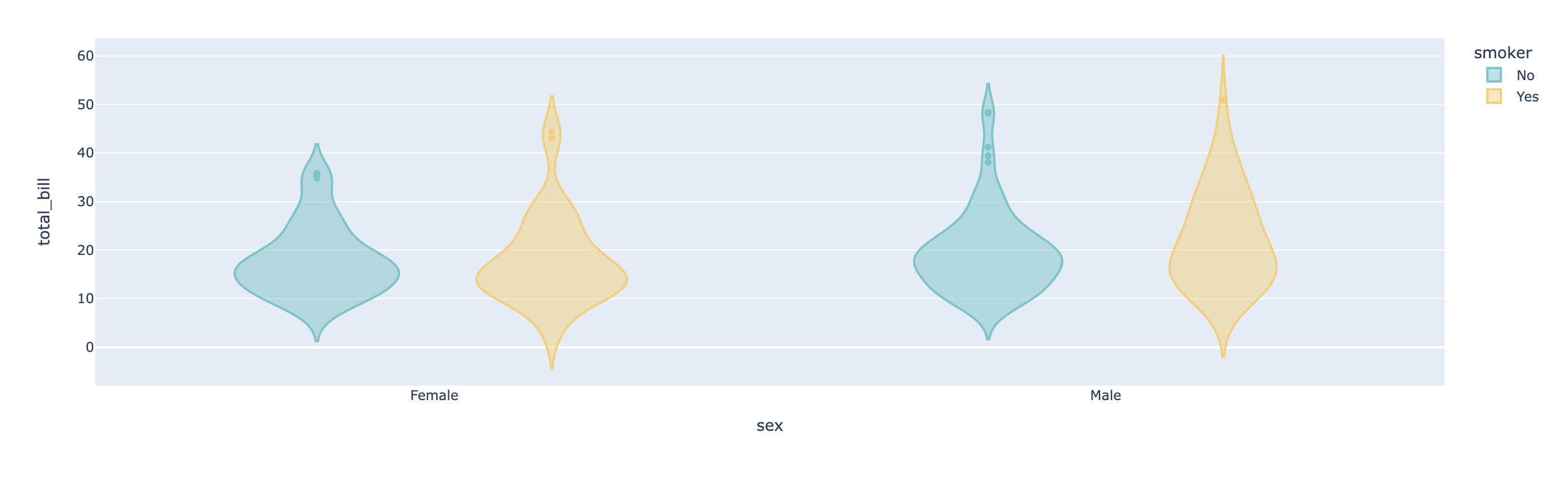
✏️ 11. Violin Plot
11-1. violin plot
 fig = px.violin(bills_df, x='sex', y='total_bill', color='smoker',
                 color_discrete_sequence=px.colors.qualitative.Pastel)
 fig.show()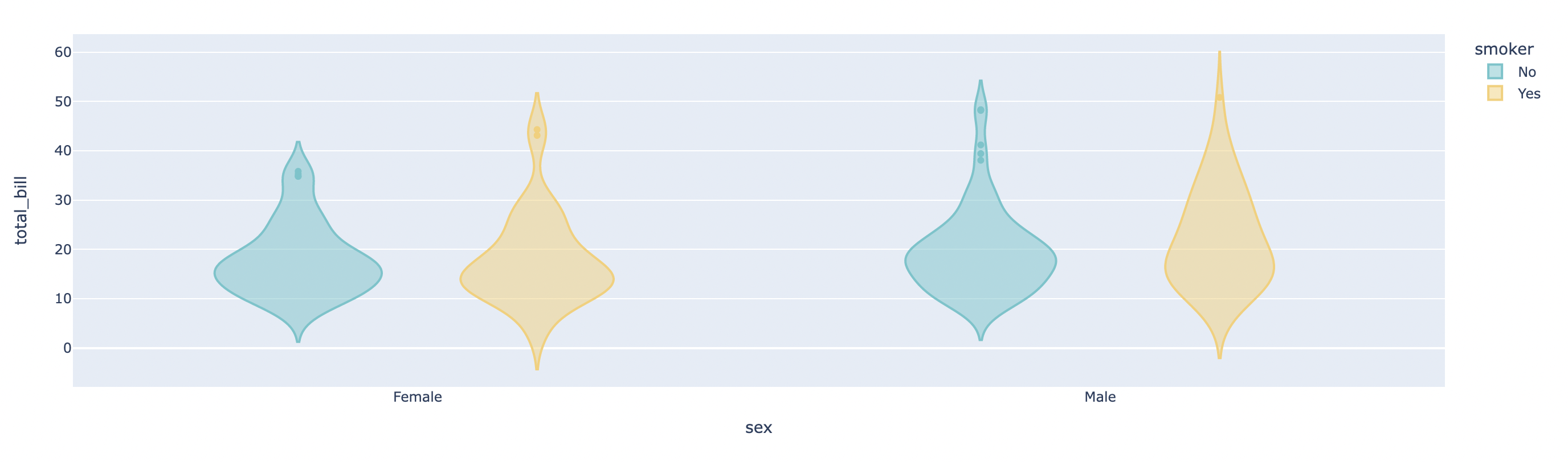
11-2. box, points 옵션 지정
 fig = px.violin(bills_df, y='total_bill', color='sex', box=True, points='all',
                 color_discrete_sequence=px.colors.qualitative.Pastel)
 fig.show()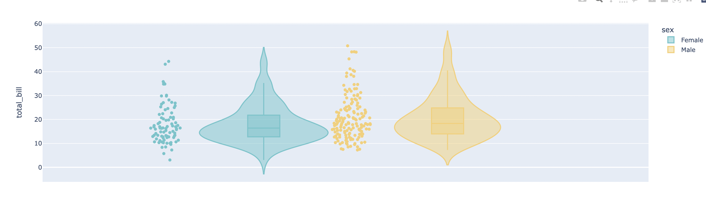
✏️ 12. Histogram
12-1. 기본 histogram
 fig = px.histogram(bills_df, x='total_bill', nbins=10)
 fig.show()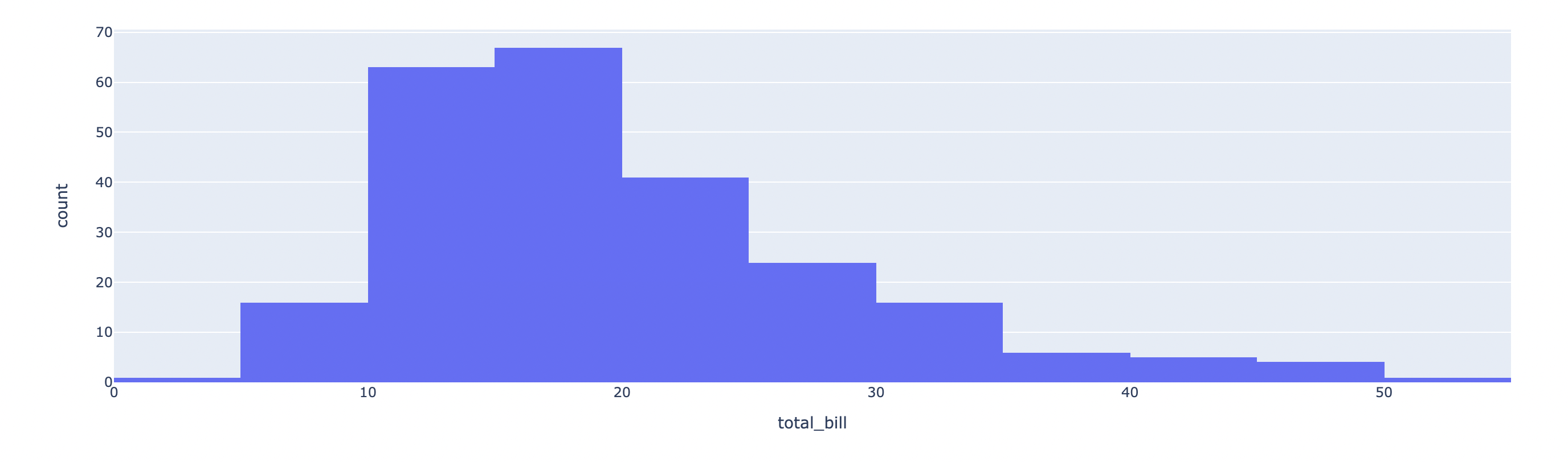
- nbis 옵션으로 number of bins를 조절
12-2. categorical data를 넣으면 count plot처럼 적용
 fig = px.histogram(bills_df, x='day', category_orders={'day':['Thur', 'Fri', 'Sat', 'Sun']})
 fig.show()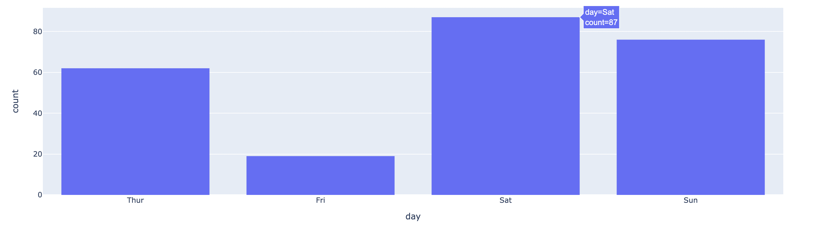
12-3. histogram과 각 값의 분포를 함께 시각화
 fig = px.histogram(bills_df, x='total_bill', y='tip', color='sex', marginal='box',
                 color_discrete_sequence=px.colors.qualitative.Pastel)
 fig.show()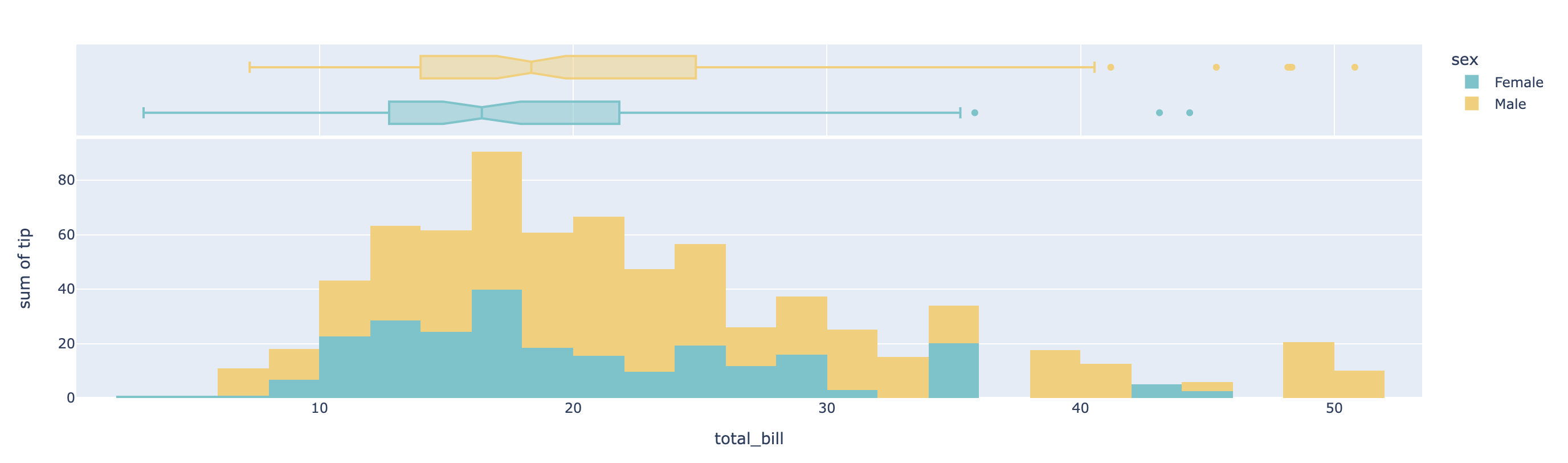
- marginal='box' 옵션을 추가하면 각 값의 분포를 box plot으로 함께 시각화해줌
(marginal: box, violin, rug 중에 선택 가능)

윤쓰네뽀끼