
프로젝트 소개
간단한 기능 3가지를 구현하였다.
첫번째는 카드를 누르면 늘어나는 기능,
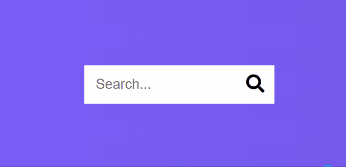
두번째는 검색 버튼을 눌렀을때 비로소 검색창이 나타나는 기능,
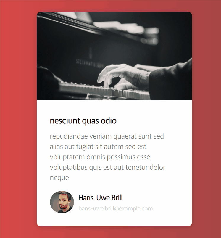
세번째는 카드 정보 로딩되는 공간을 알려주는 스켈레톤 기능이다.
코드는 여기!
1. 카드 확장
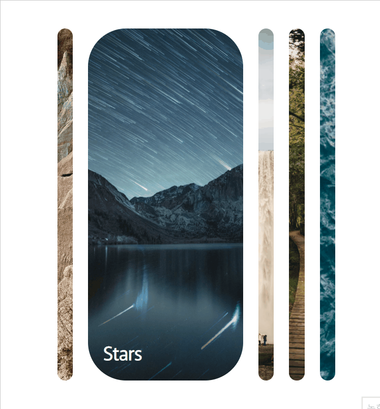
배운점
- HTML
- h3를 panel div안에 감쌌다. 그리고 panel div는 container div안에 감쌌다. 이렇게 감싸줘야 style을 적용했을때 안에 있는 자식들이 영향을 받게 된다.
<div class="container">
  <div
    class="panel"
    style="
          background-image: url('https://images.unsplash.com/photo-1638218022343-3158d732f5b8?ixlib=rb-1.2.1&ixid=MnwxMjA3fDB8MHxwaG90by1wYWdlfHx8fGVufDB8fHx8&auto=format&fit=crop&w=735&q=80');
        "
  >
    <h3>Rock</h3>
  </div>
</div>- CSS
-
panel에 relative를 줘야 h3가 absolute가 될 수 있음.
-
flex관련된 내용은 여길 참고하길.
flex라는 property 를 이용해서 다른 panel과 다른 크기변화를 구현할 수 있음
-
transition의 4번째 args는 delay를 뜻함.
- JS
- null은 0보다 크거나 같다고 나온다. 따라서 prevIndex를 null로 설정하고 아래와 같이 코드를 짜면 오류가 난다.
let prevPanelIdx = null;
if (prevPanelIdx >= 0) {
  console.log(childrenNodes[prevPanelIdx]);
  childrenNodes[prevPanelIdx].classList.remove('active');
}
2. 검색버튼확장
배운점
- CSS
- 무언가를 숨기거나 나타낼때 우선 absoulute를 이용해서 위치를 변경시켜 덮어버리고 active 클래스, transform을 이용해서 드러나게 하는 거네.
.btn {
  background-color: #fff;
  border: 0;
  cursor: pointer;
  font-size: 24px;
  position: absolute;
  top: 0;
  left: 0;
  height: 50px;
  width: 50px;
  transition: transform 0.3s ease;
}

.btn:focus,
.input:focus {
  outline: none;
}

.search.active .input {
  width: 200px;
}

.search.active .btn {
  transform: translateX(198px);
}
1. 스켈레톤
배운점
- CSS
-
linear-gradient에서 각도는 색깔이 변하는 방향을 뜻함.
- 색깔 10%의 의미는 그 색깔의 10%만 사용하겠다는 의미이다.
-
이미지 크기 제한 =>
max-width을 기억하자! -
object-fit으로 맞추자. 그리고 height,width를 100%로 하면 부모크기에 맞춰짐.(header img)
-
bgPos animation은 회색 placeholder의 위치를 옮김으로써 구현하였다. duration의 반은 원래 넓이의 50%까지 옮기고 나머지는 -150%위치까지 옮김으로써 약간 진한 회색 부분이 이동하는 효과를 주었다.
- HTML
- author안에 profile / author-info 로 나누었다. 그리고 author-info는 또다시 name 과 date로 나누어짐.
<div class="card">
<div class="card-header animated-bg" id="header"></div>
<div class="card-content">
<h3 class="card-title animated-bg animated-bg-text" id="title"> </h3>
<p class="card-excerpt" id="excerpt">
<span class="animated-bg animated-bg-text"> </span>
<span class="animated-bg animated-bg-text"> </span>
<span class="animated-bg animated-bg-text"> </span>
</p>
<div class="author">
<div class="profile-img animated-bg" id="profile_img">
<a id="profile-anchor" href="/hidden search bar/index.html"> </a>
</div>
<div class="author-info">
<strong class="animated-bg animated-bg-text" id="name"> </strong>
<small class="animated-bg animated-bg-text" id="email"> </small>
</div>
</div>
</div>
</div>-
은 공백을 추가하고 싶을때 사용. -
애니메이션을 추가하고 싶은곳에
animated-bg,animated-bg-text클래스를 추가함.

'과연 이게 최선일까?' 끊임없이 생각하기