
Chapter1. Component Driven Development
Chapter2. CDD 개발 도구
2-1 Styled Components
2-2 StorybookChapter3. useRef
Chapter1. Component Driven Development
재사용할 수 있는 UI 컴포넌트 개발
레고처럼 조립해 나갈 수 있는 부품 단위로 UI 컴포넌트를 만들어 나가는 개발을 진행할 수 있다.
컴포넌트 단위로 만들어 페이지를 조립하는 상향식 개발 방법
Chapter2. CDD 개발 도구
📌 Styled Components
React 환경에서 사용 가능한 Styled-Component는 기능적(Functional) 혹은 상태를 가진 컴포넌트들로부터 UI를 완전히 분리해 사용할 수 있는 아주 단순한 패턴을 제공한다.
CSS in JS 라는 개념이 대두되면서 나온 라이브러리
CSS-in-JS
- JavaScript에서 CSS를 작성하는 방식
- 상태가 변경되면 자바스크립트의 CSS 코드를 읽어와 파싱하는 단계부터 시작. 따라서 CSS-in-CSS에 비해 CSS 적용이 느리다.
- CSS 작성을 위해 여러 라이브러리를 사용하게 되므로, 번들의 크기가 커진다
- class 명이 빌드 시 유니크한 해시값으로 변경되기 때문에 별도의 명명 규칙이 필요X
CSS-in-JS 라이브러리를 사용하면 ...
CSS도 쉽게 JS 안에 넣어줄 수 있으므로 HTML + JS + CSS까지 묶어서 하나의 JS파일 안에서 컴포넌트 단위로 개발할 수 있게 된다.
Styled Components
- 특징 : 컴포넌트 기반으로 CSS를 작성할 수 있게 도와주는 라이브러리
- 장점 : CSS를 컴포넌트 안으로 캡슐화, 네이밍이나 최적화를 신경쓸 필요가 없음
- 단점 : 빠른 페이지 로드에 불리
Styled Components 설치
터미널에 아래의 명령어 한 줄을 입력해 Styled Components 라이브러리를 설치할 수 있다
# with npm
$ npm install --save styled-components

# with yarn
$ yarn add styled-components
Styled Components는 package.json에 다음 코드를 추가하면 여러 버전의 Styled Components가 설치되어 발생하는 문제를 줄여준다
{
  "resolutions": {
    "styled-components": "^5"
  }
}
그 다음 Styled Components를 사용할 파일로 불러와주면 사용 준비는 완료
import styled from "styled-components"Styled Components 문법
1. 컴포넌트 만들기
백틱을 사용한다
컴포넌트를 선언한 후 styled.태그종류를 할당,
백틱 안에 기존에 CSS작성하던 문법과 똑같이 스타일 속성을 작성해주면 된다.
예시
import styled from "styled-components";

//Styled Components로 컴포넌트를 만들고
const BlueButton = styled.button`
  background-color: blue;
  color: white;
`;

export default function App() {
  // React 컴포넌트를 사용하듯이 사용하면 됩니다.
  return <BlueButton>Blue Button</BlueButton>;
}
2. 컴포넌트를 재활용해서 새로운 컴포넌트 만들기
이미 만들어진 컴포넌트를 재활용해서 새로운 컴포넌트를 만들 수도 있다. 컴포넌트를 선언하고 styled()에 재활용할 컴포넌트를 전달해준 다음 추가하고 싶은 스타일 속성을 작성
import styled from "styled-components";

const BlueButton = styled.button`
  background-color: blue;
  color: white;
`;

//만들어진 컴포넌트를 재활용해 컴포넌트를 만들 수 있습니다.
const BigBlueButton = styled(BlueButton)`
  padding: 10px;
  margin-top: 10px;
`;

//재활용한 컴포넌트를 재활용할 수도 있습니다.
const BigRedButton = styled(BigBlueButton)`
  background-color: red;
`;

export default function App() {
  return (
    <>
      <BlueButton>Blue Button</BlueButton>
      <br />
      <BigBlueButton>Big Blue Button</BigBlueButton>
      <br />
      <BigRedButton>Big Red Button</BigRedButton>
    </>
  );
}
3. Props 활용하기
Styled Components는 템플릿 리터럴 문법(${ })을 사용하여 JavaScript 코드를 사용. props를 받아오려면 props를 인자로 받는 함수를 만들어 사용.
ex)
const 컴포넌트 이름 = styled.태그종류`
  css속성 : ${(props) => 함수코드 }
  `;
3-1 Props로 조건부 렌더링하기
const Button = styled.button`
 background: ${ (props) => props.skyblue ?"skyblue":"white"}
 `;
위 코드는 삼항연산자를 활용해 <Button> 컴포넌트에 skyblue 라는 props가 있는지 확인하고, 있으면 배경색으로 skyblue를, 없을 경우 white를 지정해주는 코드. 이 코드에 따라 렌더링된 <Button> 컴포넌트는 아래와 같다
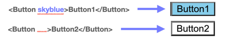
Button1 : skyblue 라는 props가 있어 배경색이 skyblue 로 지정됨
Button2 : props가 아예 없어 배경색이 white 로 지정됨
import styled from "styled-components";
import GlobalStyle from "./GlobalStyle";
//받아온 prop에 따라 조건부 렌더링이 가능합니다.
const Button1 = styled.button`
  background: ${(props) => (props.skyblue ? "skyblue" : "white")};
`;

export default function App() {
  return (
    <>
      <GlobalStyle />
      <Button1>Button1</Button1>
      <Button1 skyblue>Button1</Button1>
    </>
  );
}
--
3-2 Props 값으로 렌더링하기
3번과 비슷하게, props의 값을 통째로 활용해서 컴포넌트 렌더링에 활용할 수 있다
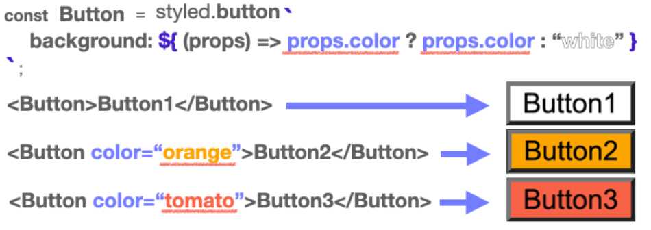
똑같이 삼항연산자를 사용하고 있지만, 이번에는 props.color가 없다면 white를, props.color가 있다면 props.color의 값을 그대로 가져와서 스타일 속성으로 리턴해주고 있다. 그 결과 color라는 이름으로 받은 props의 값으로 배경색이 지정됨. 꼭 삼항연산자만 사용할 필요는 없다. 아래 참고
import styled from "styled-components";
import GlobalStyle from "./GlobalStyle";

//받아온 prop 값을 그대로 이용해 렌더링할 수도 있습니다
const Button1 = styled.button`
  background: ${(props) => (props.color ? props.color : "white")};
`;
//다음과 같은 형식으로도 활용할 수 있습니다.
const Button2 = styled.button`
  background: ${(props) => props.color || "white"};
`;

export default function App() {
  return (
    <>
      <GlobalStyle />
      <Button1>Button1</Button1>
      <Button1 color="orange">Button1</Button1>
      <Button1 color="tomato">Button1</Button1>
      <br />
      <Button2>Button2</Button2>
      <Button2 color="pink">Button2</Button2>
      <Button2 color="turquoise">Button2</Button2>
    </>
  );
}
4. 전역 스타일 설정하기
Styled Components에서createGlobalStyle 함수 불러온다.
import { createGlobalStyle } from "styled-components";이 함수를 사용해 CSS 파일에서 작성하듯 설정해주고 싶은 스타일을 작성
const GlobalStyle = createGlobalStyle`
	button {
		padding : 5px;
    margin : 2px;
    border-radius : 5px;
	}
`
이렇게 만들어진 <GlobalStyle> 컴포넌트를 최상위 컴포넌트에서 사용해주면 전역에 <GlobalStyle> 컴포넌트의 스타일이 적용된다.
function App() {
	return (
		<>
			<GlobalStyle />
			<Button>전역 스타일 적용하기</Button>
		</>
	);
}
📌 Storybook
UI 개발 즉, Component Driven Development를 하기 위한 도구
각각의 컴포넌트들을 따로 볼 수 있게 구성해 주어 한 번에 하나의 컴포넌트에서 작업할 수 있다. 복잡한 개발 스택을 시작하거나, 특정 데이터를 데이터베이스로 강제 이동하거나, 애플리케이션을 탐색할 필요 없이 전체 UI를 한눈에 보고 개발할 수 있다.
- Storybook은 재사용성을 확대하기 위해 컴포넌트를 문서화하고, 자동으로 컴포넌트를 시각화하여 시뮬레이션할 수 있는 다양한 테스트 상태를 확인할 수 있다.
- 이를 통해 버그를 사전에 방지할 수 있도록 도와준다.
- 또한 테스트 및 개발 속도를 향상시키는 장점이 있으며, 애플리케이션 또한 의존성을 걱정하지 않고 빌드할 수 있다.
Storybook 과 같은 UI 개발 도구를 왜 사용할까
- Storybook은 기본적으로 독립적인 개발 환경에서 실행된다. 개발환경에 종속되지 않음.
- 개발자는 애플리케이션의 다양한 상황에 구애받지 않고 UI 컴포넌트를 집중적으로 개발할 수 있다.
- 회사의 내부 개발자들을 위해 문서화(documentation)를 하여 회사의 UI 라이브러리로써 사용하거나,
- 외부 공개용 디자인 시스템(Design System)을 개발하기 위한 기본 플랫폼으로 사용할 수 있다.
주요 기능
- UI 컴포넌트들을 카탈로그화하기
- 컴포넌트 변화를 Stories로 저장하기
- 핫 모듈 재 로딩과 같은 개발 툴 경험을 제공하기
- 리액트를 포함한 다양한 뷰 레이어 지원하기
Chapter3. useRef
React 애플리케이션을 만들 때 DOM을 직접 조작하는 것은 지양해야함 -> 하지만 개발을 하다보면 DOM을 직접 건드려야하는 상황이 발생 -> 이럴 때
useRef라는 Hook 함수를 사용
DOM 엘리먼트의 주소값을 활용해야 하는 경우
- focus
- text selection
- media playback
- 애니메이션 적용
- d3.js, greensock 등 DOM 기반 라이브러리 활용
React는 이런 예외적인 상황에서useRef로 DOM 노드, 엘리먼트, React컴포넌트 주소값을 참조할 수 있다.
const 주소값을_담는_그릇 = useRef(참조자료형)
return (
    <div>
      <input ref={주소값을_담는_그릇} type="text" />
        {/* React에서 사용 가능한 ref라는 속성에 주소값을_담는_그릇을 값으로 할당하면*/}
        {/* 주소값을_담는_그릇 변수에는 input DOM 엘리먼트의 주소가 담긴다. */}
        {/* 향후 다른 컴포넌트에서 input DOM 엘리먼트를 활용할 수 있다. */}
    </div>);
이 주소값은 컴포넌트가 re-render 되더라도 바뀌지 않음.
이 특성을 활용하여 아래의 제한된 상황에서 useRef 를 활용할 수 있다
function TextInputWithFocusButton() {
  const inputEl = useRef(null);
  const onButtonClick = () => {
    inputEl.current.focus();
  };
  return (
    <>
      <input ref={inputEl} type="text" />
      <button onClick={onButtonClick}>Focus the input</button>
    </>);
}
상태가 변경되는 게 아니므로 리렌더링 되지 않음.
useRef를 사용해 DOM 주소를 받아와서 따로 관리함으로써 리렌더링 되지 않게 한다.