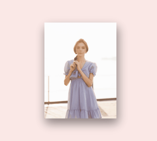
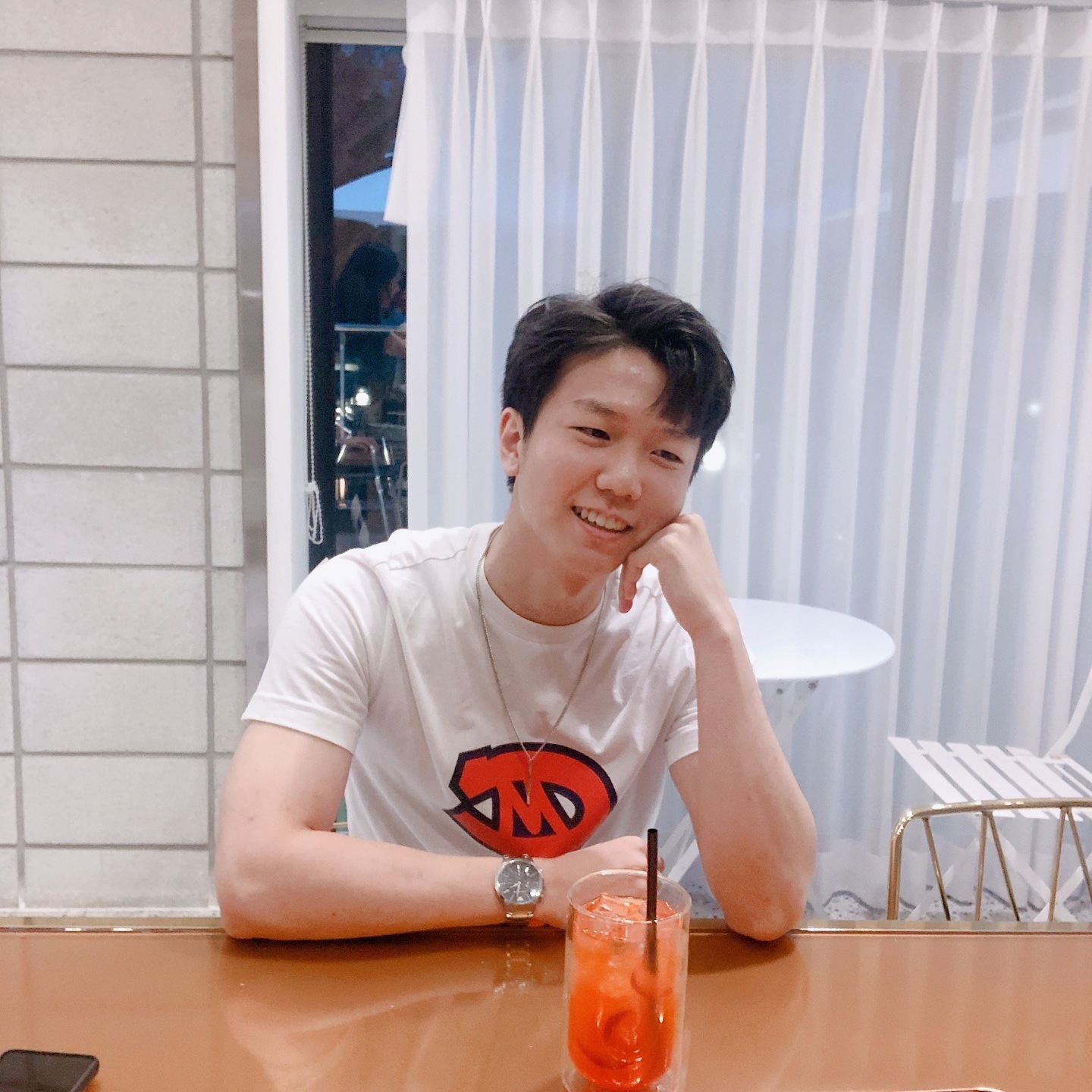
이번에는 3D로 접을 수 있는 카드를 만들어 봤습니다. 따라해볼 수 있는 영상 링크 같이 달아둘게요.
3D로 접는 모션을 구현하기 위해 그에 맞는 속성을 알아야만 했습니다. 그 속성들은 아래와 같습니다.
-
transform-style: preserve-3d;
이 속성을 가진 엘리먼트의 children들은 3d 공간에 놓인 것과 같습니다. -
backface-visibility: hidden;
예를 들어, img태그가 이 속성을 가지고 있으면 뒷 면에 아무것도 보여주지 않습니다. 위의 영상을 보면 뒷 면에 다른 이미지를 렌더링하기 위해 이 속성을 사용했습니다.
코드
html
<!DOCTYPE html>
<html lang="en">
  <head>
    <meta charset="UTF-8" />
    <meta http-equiv="X-UA-Compatible" content="IE=edge" />
    <meta name="viewport" content="width=device-width, initial-scale=1.0" />
    <link
      rel="stylesheet"
      href="https://use.fontawesome.com/releases/v5.15.3/css/all.css"
      integrity="sha384-SZXxX4whJ79/gErwcOYf+zWLeJdY/qpuqC4cAa9rOGUstPomtqpuNWT9wdPEn2fk"
      crossorigin="anonymous"
    />
    <link rel="stylesheet" href="style.css" />
    <title>CSS 3D Foldable Card</title>
  </head>
  <body>
    <div class="card">
      <div class="imgBox">
        <img src="./img1.jpeg" />
        <img src="./img2.jpeg" />
      </div>
      <div class="details">
        <div class="content">
          <h2>Someone Famous<br /><span>Graphic Designer</span></h2>
          <div class="social-icons">
            <a href="#"><i class="fab fa-facebook-f"></i></a>
            <a href="#"><i class="fab fa-twitter"></i></a>
            <a href="#"><i class="fab fa-linkedin-in"></i></a>
            <a href="#"><i class="fab fa-instagram"></i></a>
          </div>
        </div>
      </div>
    </div>
  </body>
</html>
css
* {
  margin: 0;
  padding: 0;
  box-sizing: border-box;
}

a {
  text-decoration: none;
}

body {
  display: flex;
  justify-content: center;
  align-items: center;
  min-height: 100vh;
  background: #fbe9e7;
}
.card {
  position: relative;
  width: 300px;
  height: 400px;
  background: #fff;
  transform-style: preserve-3d;
  transform: perspective(800px);
  box-shadow: 10px 20px 40px rgba(0, 0, 0, 0.25);
  transition: 1s;
}
.card:hover {
  transform: translateX(50%);
}
.card .imgBox {
  position: relative;
  width: 100%;
  height: 100%;
  z-index: 1;
  transform-origin: left;
  transform-style: preserve-3d;
  transition: 1s;
  background: #000;
  box-shadow: 0px 20px 40px rgba(0, 0, 0, 0.25);
}
.card:hover .imgBox {
  transform: rotateY(-180deg);
}
.card .imgBox img {
  position: absolute;
  top: 0;
  left: 0;
  width: 100%;
  height: 100%;
  object-fit: cover;
  backface-visibility: hidden;
  transform-style: preserve-3d;
}
.card .imgBox img:nth-child(2) {
  transform: rotateY(-180deg);
}
.card .details {
  position: absolute;
  top: 0;
  left: 0;
  bottom: 0;
  right: 0;
  padding: 20px;
  display: flex;
  justify-content: center;
  align-items: center;
}
.card .details .content {
  display: flex;
  justify-content: center;
  align-items: center;
  flex-direction: column;
}
.card .details .content h2 {
  text-align: center;
  font-weight: 700;
  line-height: 1em;
}
.card .details .content h2 span {
  color: #e21212;
  font-size: 0.8em;
}
.card .details .content .social-icons {
  position: relative;
  display: flex;
  margin-top: 10px;
}
.card .details .content .social-icons a {
  display: flex;
  justify-content: center;
  align-items: center;
  width: 35px;
  height: 35px;
  margin: 5px;
  font-size: 18px;
  transition: 0.2s;
  background: #333;
  color: #fff;
}
.card .details .content .social-icons a:hover {
  background: #e21212;
}
세계 최고 수준을 향해 달려가는 개발자입니다.