해당 포스팅은 유튜브 영화&드라마 리뷰 영상 큐레이션 플랫폼
Plotz를 개발하면서 도입된 기술 및 방법론에 대한 내용을 다루고 있습니다.
다운로드 링크 : 앱스토어 / 플레이스토어
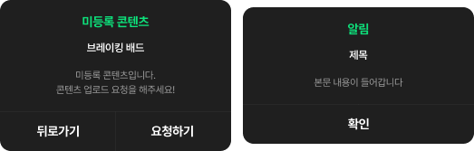
위에는 Plotz앱 전반에 걸쳐 자주 사용되는 위에는 2가지 형태의 다이어로그 입니다. 둘 다 비슷한 디자인으로 구성되어 있지만 하단 버튼의 구성과 개수가 각각 다릅니다.
여러분이라면 다이어로그를 어떻게 모듈화 하실건가요?
여러 방법이 있겠지만 해당 포스팅에서는, factory 생성자를 이용하여 유지보수성, 명확성 그리고 가독성에 초점을 맞추어 자주사용되는 비슷한 성질의 UI를 모듈화 하는 방법에 대해 다루어 보려고 합니다.
1. 서로 다른 두개의 위젯 클래스로 모듈화
아마 제일 간단한 방법은 각각 위젯 클래스를 만드는 거겠죠. 다만 이런 형태는 유지보수에 용이한 형태라고 볼 수 없습니다.
예를 들어 모달의 상단 Padding 간격을 수정해야 될 때 다이어로그가 하나의 코드로 구성되어 있지 않기 때문에 각각 2번을 수정해야 하는 번거로운 일이 생깁니다.
뭐, 2번은 그럴 수 있다고 칩시다. 만약 이런 다이어로그가 10개가 있다면? 그때부턴 굉장히 지루한 작업을 여러 번 해야겠죠. 그리고 사실 이렇게 각각 서로 다른 클래스를 모듈화한 것은 DRY(Don't Repeat Yourself) 원칙을 준수했다고 보기도 어렵습니다.
2. 기본 생성자 프로퍼티 값을 조건으로 모듈 내에서 분기처리
그럼, 하나의 클래스에서 공통되는 부분과 그렇지 않은 하단 버튼영역을 구분해서 적절히 분기처리하는 방법은 어떠할까요? 위 코드에서는 isDivideBtnForamt 라는 Boolean 필드값이 조건 값이 되어 구성이 다른 두 버튼 영역을 모듈 안에서 분기처리하고 있습니다. 이렇게 구성된다면 이전보다 훨씬 유지보수가 편해지겠지만 required 프로퍼티를 optional 프러퍼티를 조건별로 구현하는 데 불편함이 생깁니다.

예를들어 보겠습니다. 버튼이 하나인 다이어로그를 구현한다고 했을 때 아래 코드와 같이 required 프로퍼티만 초기화 시켜주면 됩니다.
AppDialog(title: '제목', btnText: '버튼 텍스트', onBtnClicked: () {...},
isDividedBtnFormat: false)
반면, 버튼이 두 개인 다이어로그는 optional 프로퍼티인 onLeftBtnClicked 과 leftBtnText 필드도 필수적으로 초기화 시켜주어야 합니다.
AppDialog(leftBtnText: '닫기', onLeftBtnClicked: () {...}
,title: '제목', btnText: '버튼 텍스트', onBtnClicked: () {...},
isDividedBtnFormat: true)
여기서 작업자의 실수가 발생할 수 있는데요.
버튼이 두 개일 때 필수적으로 초기화 해줘야하는 필드 값이 optional 프러퍼티로 선언되어 있기 때문에 실수로 optional 프러퍼티를 초기화하지 않는 경우가 생길 수 있습니다.
// 버튼이 두 개인 다이어로그를 구현할 때 실수로 'leftBtnClicked' 프로퍼티를 초기화 시키지 않은 경우
AppDialog(leftBtnText: '닫기', title: '제목',
 btnText: '버튼 텍스트', onBtnClicked: () {...},
isDividedBtnFormat: true)
위 코드에서는 버튼이 2개인 다이어로그를 구현하려고 했지만 leftBtnClicked optional 프러퍼티를 초기화 시켜주고 있지 않죠. optional 프로퍼티로 선언되어 있기 때문에 컴파일 단계에서도 오류를 확인할 수 없습니다.
required 프러퍼티로 변경한다면?
그럼 모든 프러퍼티를 required 프러퍼티면 변경하면 문제를 해결할 수 있을까요? 실수로 필요한 프로퍼티를 초기화하지 않는 실수는 방지할 수 있겠지만 가독성이 떨어질겁니다.
AppDialog(title: '제목', btnText: '버튼 텍스트',
onBtnClicked: () {...}, isDividedBtnFormat: false,
leftBtnText: null, onLeftBtnClicked: null)
위 코드처럼 버튼이 하나인 다이어로그를 만들 때도 사용하지 않은 leftBtnText & onLeftBtnClicked 프로퍼티를 null로 초기화 시켜주어야 하고, 불필요한 코드를 적기 때문에 가독성이 안 좋다고 볼 수 있습니다.
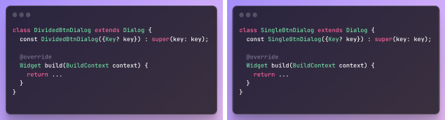
3. Factory 생성자 기반 모듈화
앞서 소개한 모듈화 방법은 크게 3가지 문제점이 있었습니다.
- 유지보수에 용이하지 않음
- 가독성이 떨어짐
- 명시성이 떨어지기 때문에 오류가 발생할 수 있음.
이 3가지 문제점들을 Factory 패턴, 즉 Factory 생성자를 통해 해결할 수 있습니다.
팩토리 패턴이란?
[정의]
팩토리 메서드 패턴(Factory method pattern)은 객체지향 디자인 패턴이다. Factory method는 부모(상위) 클래스에 알려지지 않은 구체 클래스를 생성하는 패턴이며. 자식(하위) 클래스가 어떤 객체를 생성할지를 결정하도록 하는 패턴이기도 하다.
위키백과中
설명이 조금 복잡하지만, factory는 말 그대로 클래스 인스턴스를 공장이 물건을 생성하듯이 인스턴스를 생성하는 것이라고 이해할 수 있습니다.
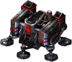
보다 쉽게 factory 패턴을 이해하기 위해 스타크래프트의 테란 배럭스 건물에서 보병 유닛을 생산하는 작동 원리에 비유해 보겠습니다. 배럭스에서는 테란의 보병 유닛을 생산할 수 있는 시설입니다. 게임을 플레이하는 유저는 필요한 자원을 지불하여 원하는 보병을 생산할 수 있습니다.
위 그림은 생산할 수 있는 보병의 종류와 필요한 자원 그리고 생성 단축키에 대한 정보입니다. 그럼 이제 클래스를 배럭스, 그리고 인스턴스를 보병 유닛이라고 가정한다면 아래와 같이 코드를 작성해 볼 수 있겠습니다.
class Barracks {
  final int mineral; // 미네랄
  final int supply; // 인구수
  final int? gauss; // 가스

  Barracks({
    required this.mineral,
    required this.supply,
    this.gauss,
  });

  // 마린
  factory Barracks.M({required int mineral, required int supply}) => Barracks(mineral: mineral, supply: supply);

  // 파이버뱃
  factory Barracks.F({required int mineral, required int gauss, required int supply}) => Barracks(mineral: mineral, gauss: gauss, supply: supply);

  // 고스트
  factory Barracks.G({required int mineral, required int gauss, required int supply}) => Barracks(mineral: mineral, gauss: gauss, supply: supply);

  // 매딕
  factory Barracks.C({required int mineral, required int gauss, required int supply}) => Barracks(mineral: mineral, gauss: gauss, supply: supply);
}
보병을 생성하는 데 필수적인 마네랄과 인구수 자원은 required 프로퍼티로 그리고 선택적으로 필요한 가스는 optional 프로퍼티로 설정했습니다. 그리고 factory 생성자를 유닛의 종류별로 선언하여 유저가 생성할 인스턴스를 선택할 수 있도록 했습니다(factory 생성자의 이름은 유닛의 생성 단축키로 설정).
final marine = Barracks.M(mineral: 50, supply: 1);
final ghost = Barracks.G(mineral: 25,  gauss: 75, supply: 1);
final firebat = Barracks.F(mineral: 50,  gauss: 25, supply: 1);
final medic = Barracks.C(mineral: 50,  gauss: 25, supply: 1);
이처럼 factory 패턴은 하나의 클래스에서 여러 객체가 생성될 수 있는 상황일 때 factory 생성자를 이용해 서로 다른 객체의 유형을 동적으로 결정할 수 있는 유연성을 제공합니다.
Factory 패턴이 적용된 UI 모듈
자, 이제 factory 패턴이 적용된 다이어로그 UI 모듈을 만들어 보겠습니다.
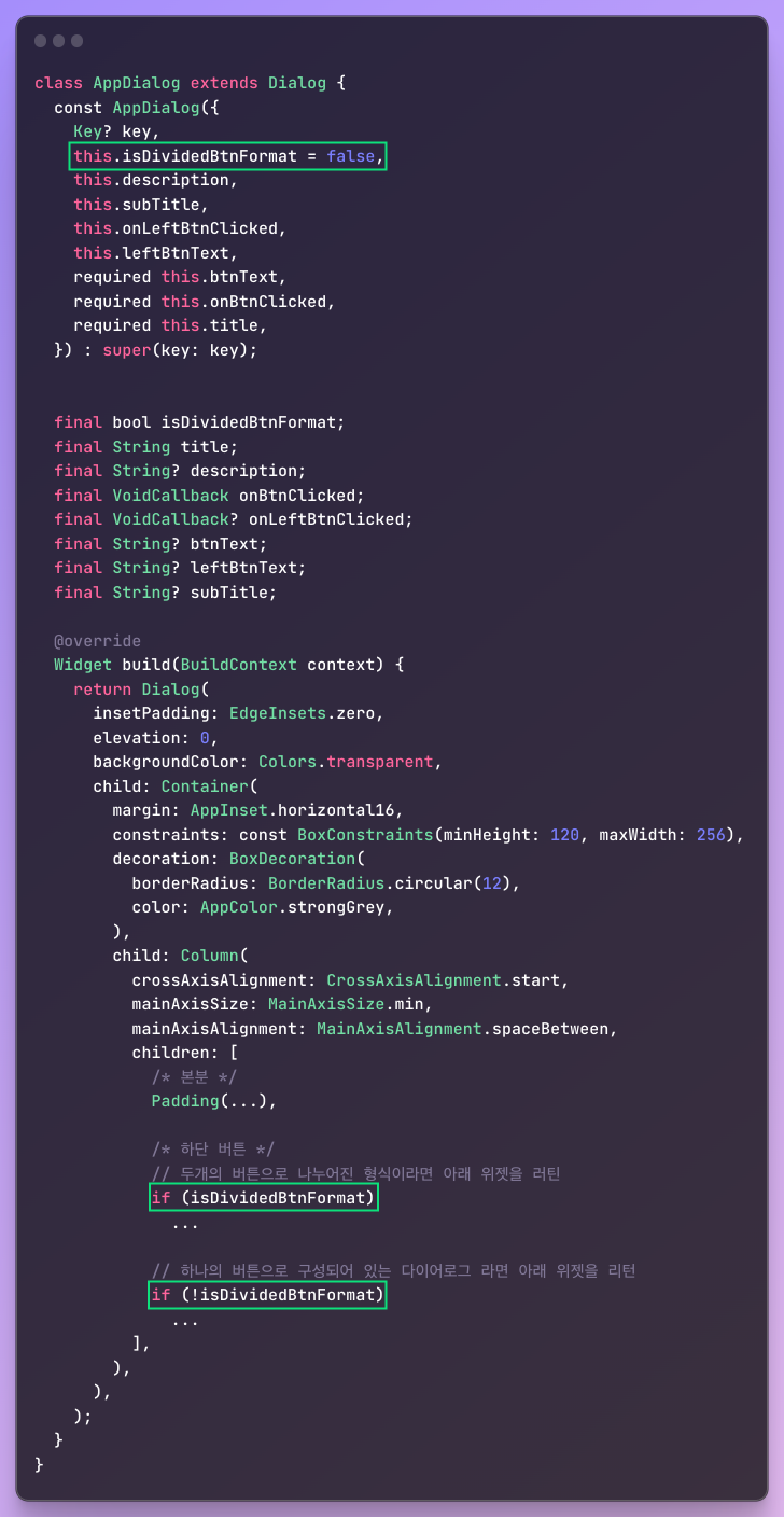
class AppDialog extends Dialog {
const AppDialog({
Key? key,
this.isDividedBtnFormat = false,
this.description,
this.subTitle,
this.onLeftBtnClicked,
this.leftBtnText,
required this.btnText,
required this.onBtnClicked,
required this.title,
}) : super(key: key);
factory AppDialog.singleBtn({
required String title,
required VoidCallback onBtnClicked,
String? subTitle,
String? description,
String? btnText,
}) =>
AppDialog(
title: title,
subTitle: subTitle,
onBtnClicked: onBtnClicked,
description: description,
btnText: btnText,
);
factory AppDialog.dividedBtn({
required String title,
String? description,
String? subTitle,
required String leftBtnText,
required String leftBtnText,
required VoidCallback onRightBtnClicked,
required VoidCallback onLeftBtnClicked,
}) =>
AppDialog(
isDividedBtnFormat: true,
title: title,
subTitle: subTitle,
onBtnClicked: onRightBtnClicked,
onLeftBtnClicked: onLeftBtnClicked,
description: description,
leftBtnText: leftBtnText,
btnText: rightBtnText,
);
final bool isDividedBtnFormat;
final String title;
final String? description;
final VoidCallback onBtnClicked;
final VoidCallback? onLeftBtnClicked;
final String? btnText;
final String? leftBtnText;
final String? subTitle;
Widget build(BuildContext context) {
return Dialog(
insetPadding: EdgeInsets.zero,
elevation: 0,
backgroundColor: Colors.transparent,
child: Container(
margin: AppInset.horizontal16,
constraints: const BoxConstraints(minHeight: 120, maxWidth: 256),
decoration: BoxDecoration(
borderRadius: BorderRadius.circular(12),
color: AppColor.strongGrey,
),
child: Column(
crossAxisAlignment: CrossAxisAlignment.start,
mainAxisSize: MainAxisSize.min,
mainAxisAlignment: MainAxisAlignment.spaceBetween,
children: [
// 본분
Padding(
padding: const EdgeInsets.symmetric(horizontal: 34) +
const EdgeInsets.only(top: 18, bottom: 19),
child: Column(
children: [
Center(
child: Text(
title,
style: AppTextStyle.title3.copyWith(color: AppColor.main),
textAlign: TextAlign.center,
),
),
AppSpace.size12,
if (subTitle.hasData) ...[
Text(
subTitle!,
style: AppTextStyle.alert1,
textAlign: TextAlign.center,
),
AppSpace.size2,
],
if (description.hasData) ...[
Center(
child: Text(
description!,
textAlign: TextAlign.center,
style: AppTextStyle.desc
.copyWith(color: AppColor.lightGrey, height: 1.3),
),
)
]
],
),
),
// 하단 버튼
// 두개의 버튼으로 나누어진 형식이라면 아래 위젯을 러틴
if (isDividedBtnFormat)
Container(
height: 44,
decoration: const BoxDecoration(
border: Border(
top: BorderSide(
color: AppColor.gray06,
width: 0.5,
),
),
),
child: Row(
children: <Widget>[
Expanded(
child: MaterialButton(
padding: EdgeInsets.zero,
shape: const RoundedRectangleBorder(
borderRadius: BorderRadius.only(
bottomLeft: Radius.circular(10),
),
),
onPressed: onLeftBtnClicked,
child: Center(
child: Text(
leftBtnText!,
style: AppTextStyle.title3
.copyWith(color: AppColor.white),
),
),
),
),
Container(
width: 0.5,
color: AppColor.gray06,
),
Expanded(
child: MaterialButton(
padding: EdgeInsets.zero,
shape: const RoundedRectangleBorder(
borderRadius: BorderRadius.only(
bottomRight: Radius.circular(10),
),
),
onPressed: onBtnClicked,
child: Center(
child: Text(
btnText ?? '확인',
style: AppTextStyle.title3
.copyWith(color: AppColor.white),
),
),
),
),
],
),
),
// 하나의 버튼으로 구성되어 있는 다이어로그 라면 아래 위젯을 리턴
if (!isDividedBtnFormat)
MaterialButton(
padding: EdgeInsets.zero,
shape: const RoundedRectangleBorder(
borderRadius: BorderRadius.only(
bottomLeft: Radius.circular(10),
bottomRight: Radius.circular(10),
),
),
onPressed: onBtnClicked,
child: Container(
decoration: const BoxDecoration(
border: Border(
top: BorderSide(
color: AppColor.gray06,
width: 0.5,
),
),
),
height: 50,
child: Center(
child: Text(
btnText ?? '확인',
style:
AppTextStyle.title3.copyWith(color: AppColor.white),
),
),
),
),
],
),
),
);
}
}factory 생성자를 이용해서 버튼의 구성이 다른 2가지 형태의 다이어로그를 반환하도록 했습니다. 기존에는 dividedBtn 위젯을 생성할 때 필수적으로 구현해 줘야 하는 onLeftBtnClicked & leftBtnText들이 optional 이었기 때문에 오류가 발생할 수 있었지만, 변경된 코드에서는 factory 생성자에서 required 파라미터로 필요한 값들을 받고 객체에 전달하기 때문에 컴파일 단계에서 작업자의 실수를 줄일 수 있습니다.
   showDialog(
      context: context,
      builder: (_) => AppDialog.singleBtn(
        onBtnClicked: () {},
        title: '제목',
        description: '본문 내용',
      ),
    );

   showDialog(
     context: context,
     builder: (_) => AppDialog.dividedBtn(
     	title: '제목',
    	subTitle: '부제목',
   	  	description: '본문',
   	    leftBtnText: '왼쪽 버튼 텍스트',
     	rightBtnText: '오른쪽 버튼 텍스트',
     	onRightBtnClicked: () {},
     	onLeftBtnClicked: () {}
     ),
   );
또한 factory 생성자의 이름으로 객체를 생성하고 생성자의 파라미터 이름을 유동적으로 변경할 수 있기 때문에 훨씬 명시적이고 가독성도 훨씬 좋아졌습니다.
ex) btnText -> rightBtnText
그리고 공통된 특성들을 모듈화 했기 때문에 유지보수하기도 매우 편하고요.
factory 생성자를 활용한 로딩 뷰 처리 로직
추가로 factory 생성자를 이용하면 UI 위젯에 사용되는 데이터를 불러오기 전에 보여지는 스켈레톤과 같은 로딩뷰를 적절하게 처리할 수 있습니다.
// [모듈의 전체 코드]
class RoundProfileImg extends StatelessWidget {
const RoundProfileImg({Key? key, required this.size, required this.imgUrl})
: super(key: key);
final double size;
final String? imgUrl;
/// 팩토링 생성자
/// 로딩처리 뷰를 리턴하기 위해 imgUrl값에 'skeletone' 문자열 값 전달
factory RoundProfileImg.createSkeleton({required double size}) =>
RoundProfileImg(size: size, imgUrl: 'skeleton');
Widget build(BuildContext context) {
/// imgUrl값을 기반으로 위젯 분기
/// imgUrl값이 'skeleton'이면 스켈레톤 뷰를 리턴함
if (imgUrl == 'skeleton') {
return SkeletonBox(
height: size,
width: size,
borderRadius: size / 2,
);
} else {
return ClipRRect(
borderRadius: BorderRadius.circular(size / 2),
child: imgUrl.hasData
? CachedNetworkImage(
height: size,
width: size,
memCacheHeight: (size * 3).toInt(),
imageUrl: imgUrl!,
fit: BoxFit.cover,
placeholder: (context, url) => const SkeletonBox(),
errorWidget: (context, url, error) => Container(
color: Colors.grey.withOpacity(0.1),
child: const Center(
child: Icon(Icons.error),
),
),
)
: Container(
color: Colors.red,
child: Image.asset(
'assets/images/blank_profile.png',
height: size,
width: size,
),
),
);
}
}
}
    // [적용 예시]
    if (imgUrl != null) {
      return RoundProfileImg(size: 62, imgUrl: imgUrl);
    } else {
      return RoundProfileImg.createSkeleton(size: 62);
    }
물론 이런 방법 말고도 여러 가지 접근 방법이 있을 수 있지만 하나의 클래스에서 뷰의 로딩처리 로직까지 모듈화하고 로딩 여부를 명시적으로 선언 및 초기화할 수 있기 때문에 더 좋은 구조라고 생각합니다.
마무리
이번 포스티에서는 factory 생성자를 이용해 여러 가지 형태의 위젯들을 모듈화하는 방법에 대해 알아보았습니다. 사실 factory 이렇게 서로 다른 UI 위젯을 상태별로 유동적으로 생성할 때 사용하는 것뿐만 아니라 여러 방면에서 사용이 되는데요. 대표적으로 캐싱된 객체 를 반환하여 메모리를 절감할 때도 사용이 되기도 합니다. 기회가 된다면 다음에는 factory 패턴의 다양한 사용 예시를 다루어 보려고 합니다.

7개의 댓글

심야님 좋은 글이네요. 다른 글에서는 보기 힘든 글이라 도움 되었습니다.
해당 글에서 언급되지 않은 컴포지션 방식과 비교했을 때는 어떤가요?
class AppDialogSingleBtn extends StatelessWidget {
const AppDialogSingleBtn({
// 생략
}) : super(key: key);
@override
Widget build(BuildContext context) {
return AppDialog(
// 구현
);
}
감사합니다

좋은 글 감사합니다. 술술 잘 읽혀서 너무 잘 봤습니다.
궁금한 점이 있는데요, 예시와 같이 위젯 생성자 호출하는 부분 로직이 간단한 위젯에 대해서는 생성자 오버로딩으로 모듈화를 해도 될까요?
immutable하지 않아서 위젯을 구현할 때는 사용하지 말아야 할까요?
/// 생성자 오버로딩으로 버튼 위젯 모듈화
class Button extends StatelessWidget {
final String text;
Function() onPressed;
Color? color;
Button({
super.key,
required this.text,
required this.onPressed,
});
Button.withWolor({
super.key,
required this.text,
required this.onPressed,
required this.color,
});
Widget build(BuildContext context) {
if (color != null) {
return 컬러버튼
}
return 일반버튼
}
잘봤습니다. 감사합니다.