Requirements:
- 지난번 챌린지와 마찬가지로, css 파일을 생성하고 그 안에 css 코드를 작성해주세요.
- 4개 박스의 색상 부분은 Pseudo Selector(의사 선택자)를 사용해 구현하세요.
- 색상이름과 색상코드가 적힌 박스의 위치는 Position 속성을 사용해 구현하세요.
제출
HTML
<!DOCTYPE html>
<html lang="en">
<head>
<meta charset="UTF-8">
<meta http-equiv="X-UA-Compatible" content="IE=edge">
<meta name="viewport" content="width=device-width, initial-scale=1.0">
<title>Document</title>
<link rel="stylesheet" href="style.css">
</head>
<body>
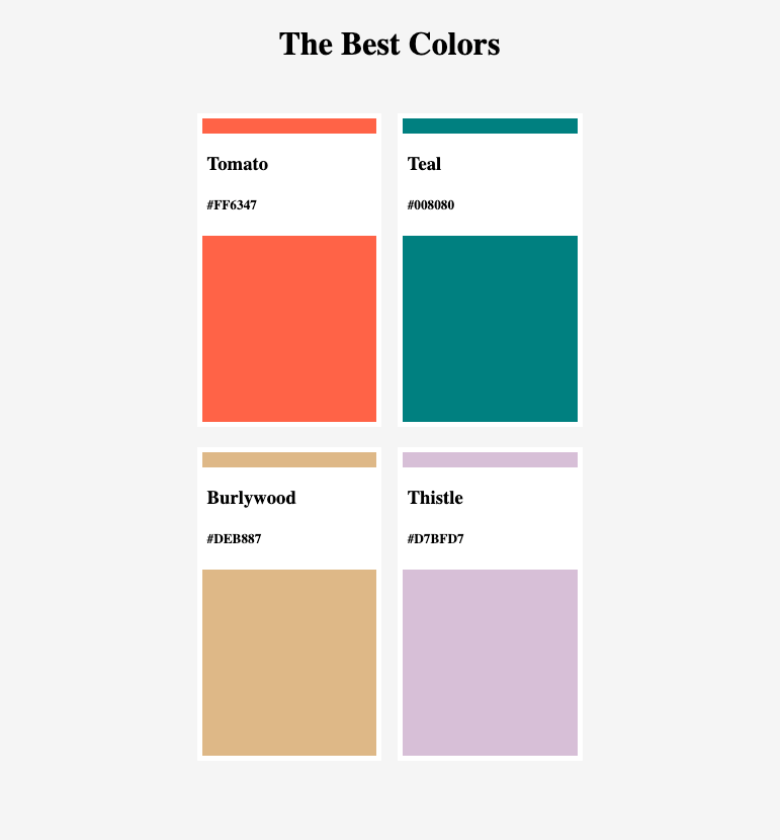
<h1>The Best Colors</h1>
<section>
<div>
<div class="color">
<h2>Tomato <br>#008080 </h2>
</div>
</div>
<div>
<div class="color">
<h2>Teal <br>#FF6347 </h2>
</div>
</div>
<div>
<div class="color">
<h2>Burlywood <br>#DEB887 </h2>
</div>
</div>
<div>
<div class="color">
<h2>Thistle <br>#D7BFD7 </h2>
</div>
</div>
</section>
</body>
</html>CSS
html, body{
    background-color: whitesmoke;
    height:100%;
    margin:0;
}

h1{
    text-align: center;
}

section{
    display:flex;
    flex-direction: row;
    justify-content: center;
    flex-wrap: wrap;
    position: relative;
}

div{
    width: 250px;
    height: 400px;
    border: 10px solid white;
    margin:20px;
    position: relative;
}

div:first-child{
    background-color: tomato;
}

div:nth-child(2){
    background-color: teal;
}

div:nth-child(3){
    background-color: burlywood;
}

div:nth-child(4){
    background-color: thistle;
}

div.color{
    background-color: white;
    position: absolute;
    width:240px;
    height: 100px;
    margin:0px;
    top:20px;
    left:0px;
    border: 10px solid white;
    text-align: left;
}
정답해설
HTML
<!DOCTYPE html>
<html>
  <head>
    <meta charset="utf-8">
    <meta name="viewport" content="width=device-width">
    <title>repl.it</title>
    <link rel="stylesheet" href="style.css">
  </head>
  <body>
    <h1>The Best Colors</h1>
    <section>
      <article class="color">
        <div class="color__bg"></div>
        <div class="color__info">
          <h3>Tomato</h3>
          <h5>#FF6347</h5>
        </div>
      </article>
       <article class="color">
        <div class="color__bg"></div>
        <div class="color__info">
          <h3>Teal</h3>
          <h5>#008080</h5>
        </div>
      </article>
       <article class="color">
        <div class="color__bg"></div>
        <div class="color__info">
          <h3>Burlywood</h3>
          <h5>#DEB887</h5>
        </div>
      </article>
       <article class="color">
        <div class="color__bg"></div>
        <div class="color__info">
          <h3>Thistle</h3>
          <h5>#D7BFD7</h5>
        </div>
      </article>
    </section>
  </body>
</html>
CSS
body {
height:100vh;
background-color: whitesmoke;
display: flex;
flex-direction: column;
align-items: center;
}
h1 {
margin-bottom: 50px;
}
section {
width:50%;
margin:0 auto;
display: flex;
justify-content: space-between;
flex-wrap: wrap;
}
.color {
width: 48%;
position: relative;
margin-bottom: 20px;
}
.color:first-child .color__bg {
background-color: tomato;
}
.color:nth-child(2) .color__bg {
background-color: teal;
}
.color:nth-child(3) .color__bg {
background-color: burlywood;
}
.color:last-child .color__bg {
background-color:thistle;
}
.color__bg {
height: 300px;
border:5px solid white;
}
.color__info {
position: absolute;
width:100%;
background-color:white;
top:20px;
padding:0px 10px;
box-sizing: border-box;
}
https://replit.com/@mimkong/ElasticLightblueMicroprogramming#style.css
- flex-wrap
- flex-wrap은 flex의 하위 요소들이 flex를 선언한 영역을 벗어날 경우, 강제로 한 줄로 배치할 지 행을 나눠서 배치할 지 결정하는 속성입니다.
flex-wrap: wrap을 선언한다면, flex를 선언한 영역을 벗어날 경우 행을 나눠서 배치하게 됩니다.- default값은 nowrap으로, 강제로 한 줄로 배치합니다.
wrap-reverse값은 행을 나눠서 배치하되, 위로 나뉩니다.- 일반적인
flex-wrap: wrap의 경우,1 2 3 4
의 순서로 행이 나뉘는 반면, flex-wrap: wrap-reverse의 경우,3 41 2의 순서로 행이 나뉩니다.
- nth-child
:nth-child(n)는 형제들 사이에서 n번째 요소를 선택할 수 있는 의사 선택자입니다.- 선택자 뒤에 추가되는 형식으로 작성됩니다. (ex.
div:nth-child(3), #text:nth-child(4)) - nth-child은 형제들의 타입은 신경쓰지 않습니다. 오로지 순서만 따집니다.
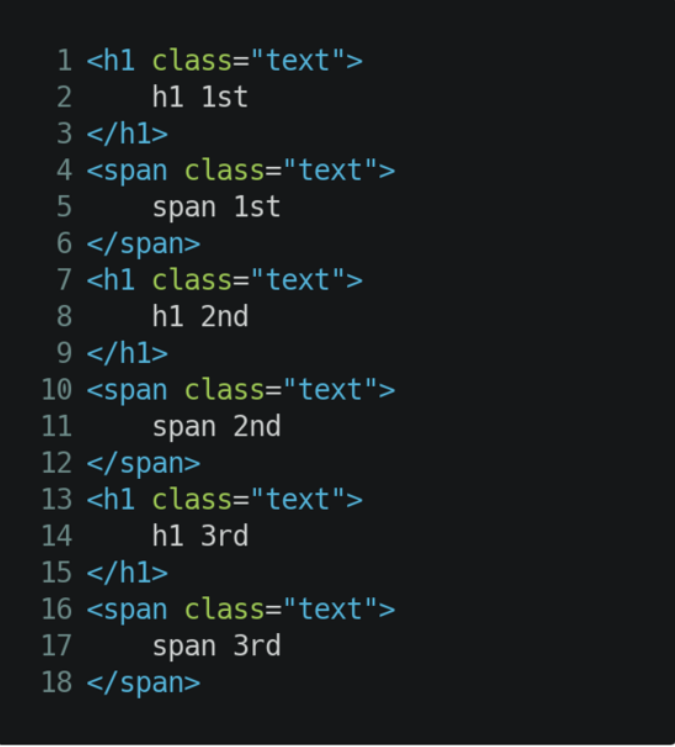
- 위의 html 코드에서
h1:nth-child(2) { color: red; }를 한다면, 어떠한 글자도 빨간색이 되지 않습니다. 왜냐하면 h1이면서 형제들 중 2번째인 요소는 없기 때문이죠. span:nth-child(1) { color: green; }도 마찬가지입니다.- 만약 h1 요소들 중에 2번째 h1을 선택하고 싶다면,
:nth-of-type(n)을 사용하면 됩니다. - nth-of-type은 동일한 타입들 안에서 순서를 따집니다.
- 위의 html 코드에서
h1:nth-type(2) { color: red; }를 한다면, 2번째 h1에 빨간색이 적용될 것입니다. - 첫 번째 혹은 마지막 번째의 요소를 선택하고 싶다면,
first-child,last-child,first-of-type,last-of-type을 사용하면 됩니다. - 또한 뒤에서 n번째 요소를 선택하고 싶다면, nth-last-child, nth-last-of-type 을 사용하면 됩니다.
- 짝수 혹은 홀수만 선택하거나, n의 배수 등을 선택하는 방법이 있습니다.
- nth-child(n) 의 n 자리에 odd(홀수), even(짝수), 3n, 4n-1 등을 넣어 다양한 선택자로 활용할 수 있습니다.
- Position 속성
- Position의 default 값은 static 입니다.
- 브라우저는 우리가 입력한 여러 요소에 대한 기본적인 크기와 위치 등을 가지고 있고, 이를 바탕으로 문서의 흐름에 따라 배치합니다.
- 이렇게 기본적인 흐름으로 배치하도록 두는 것이 static 속성입니다.
- 이때는 top, bottom, left, right 등 위치를 설정하는 속성값이 영향을 주지 않습니다.
- 이와 비슷한 속성으로 relative가 있습니다.
- 최초의 위치는 static과 동일하며, top, bottom, left, right 속성값의 영향을 받습니다.
- top, bottom, left, right 값은 현재 위치를 기준으로 합니다. (ex. top: 100px; 은 현재 위치에서 아래로 100px 옮깁니다.)
- absolute는 static, relative와 다르게 일반적인 문서 흐름에서 제외됩니다.
- 대신 부모 및 조상요소들 중 position: static이 아닌 가장 가까운 조상을 기준으로 잡습니다. (ex. top: 100px;은 static이 아닌 가장 가까운 조상을 기준으로, 상단에서 100px 만큼 떨어진 곳으로 옮깁니다.)
- 이러한 특성때문에 absolute를 사용할 때, 위치의 기준으로 삼을 부모에 position: relative를 선언합니다.
Section과 Article 차이
https://velog.io/@kansun12/HTML3
TA's의 정답해설을 무조건 다 적을필요는 없을 것 같다...
읽어보고 내가 필요한 정보, 적지 않았던 정보만 적으면 될 것 같구 내것과 해설의 HTML, CSS를 비교하여 부족한 부분은 공부하는 방향으로 잡아야겠다
오늘은 몸이 안좋아서 여기까지..
