1주일간 에어비앤비 클론 코딩을 진행했다.
혼자 힘으로 해내고 싶어 최대한 알고 있는 선에서 진행하며 코드를 넣었다.
그러다보니, css위주로 grid, flex 를 집중적으로 공부해야했다.
대부분 위 기능으로 모든 페이지를 구현했지만, 아직까지 많이 서투른 부분이 있다.
position을 활용해 z index로 사진위에 텍스트를 남기는 법을 공부하기도 했다.
그 중에서 기억에 남겨야할 스킬 몇가지를 기록해보고자 한다.
사진 텍스트 남기는 법
먼저 사진 콘테이너 위에 position:relative 를 적용해준다.
이후, 텍스트에는 absolute를 적용한다.
z-index를 적용한 후, 텍스트의 위치를 top과 left 비율로 조정해주면 끝이다.
여기서 z-index는 수직 레이어라고도 생각하면 된다.
0을 기준으로 음수로 갈수록 사용자와 멀어지고
양수로 갈 수록 사용자와 가까워진다.
텍스트에 사진보다 높은 수를 적용하면 위로 올라온다. 여기에
다음과 같은 코드를 기입해준다
Html

    <div class="container3">
        <h1 class="둘러보기">에어비앤비 체험 둘러보기</h1>
        <div class="container3Box">
            <img class="container3photo" src="img/7.jpg">
            <div class="container3photoCover">
                <div class="PhotoCoverText1">여행 중 만나는<br> 이색적인 즐길 거리</div>
                <button class="PhotoCoverButton1">체험</button>
            </div>
        </div>
        <div class="container3Box">
            <img class="container3photo" src="img/6.jpg">
            <div class="container3photoCover">
                <div class="PhotoCoverText1">집에서 만나는<br> 다양한 즐길 거리</div>
                <button class="PhotoCoverButton1">온라인 체험</button>
            </div>
        </div>
    </div>


   style

.container3{
    display: grid;
    grid-template-columns: 1fr 1fr;
}

.둘러보기{
    grid-column: 1 / 3;
    grid-gap: 10px;
}

.container3Box{
    position: relative;
    justify-self: center;
}

.container3photo{
    z-index: -2;
    width: 90%;
    margin: 5%;
    border-radius: 20px;
}

.container3photoCover{
    position: absolute;
    top: 10%;
    left: 10%;
}

.PhotoCoverText1{
    color: white;
    font-size: 2em;
    font-weight: bold;
}
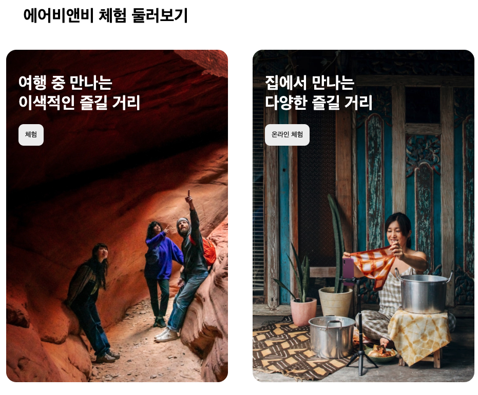
결과물은 다음과 같다.
물론 수정해야할 부분이 많지만, 다소 에어비앤비 느낌이 나기도 해서 기쁘다.
비슷한 느낌으로 이런 배치도 가능했다.
grid
다음은 배치에 사용되는 그리드다.
해당 방식은 css에서 흔히 사용되는 법으로,
display: grid;
grid-template-columns : fr
grid-gap: 숫자;
를 이용해 배치할 수 있다.
column은 열로 가로 선을 담당하고
row 는 행으로 세로 숫자를 뜻한다.
그리드로 배치하고, justify-items로 각각의 콘텐츠를 제어할 수 있다.
참고로 grid column : 1 / 4 은 1부터 4까지의 열을 차지하겠다는 뜻이다.
해당 방식을 이용해서 다음과 같은 코드를 짜서 그리드를 만들어보았다.
html

        <h1 class="설레는">설레는 다음 여행을 위한 아이디어</h1>
        <div id="섬">
            <img src="img/2.jpg" class="image">
            <img src="img/3.jpg" class="image">
            <img src="img/4.jpg" class="image">
            <img src="img/5.jpg" class="image">
            <div class="text">
                <div class="텍스트1">속초시</div>
                <div class="텍스트2">211kM 거리</div>
            </div>
            <div class="text">
                <div class="텍스트1">여수시</div>
                <div class="텍스트2">318kM 거리</div>
            </div>
            <div class="text">
                <div class="텍스트1">강릉시</div>
                <div class="텍스트2">231kM 거리</div>
            </div>
            <div class="text">
                <div class="텍스트1">제주도</div>
                <div class="텍스트2">455kM 거리</div>
            </div>
        </div>


        <style>
        #섬{
    display: grid;
    grid-template-columns: repeat(4, minmax(0, 1fr));
    justify-items: center;
    margin-left: 5%;
    margin-right: 5%;
}

/* .image:nth-child(1) */

.image{
    border-top-left-radius: 20px;
    border-top-right-radius: 20px;
    width: 95%;
}

.text{
    color: white;
    background-color: #bc196d;
    width: 95%;
    padding-bottom: 30%;
    border-bottom-left-radius: 20px;
    border-bottom-right-radius: 20px;
}

.text:nth-last-child(1){
    background-color: #d93a30;
}

.text:nth-last-child(3){
    background-color: #dd3150;
}

.텍스트1{
    margin-top: 20px;
    margin-left: 20px;
    font-size: 30px;
    font-weight: 500;
}

.텍스트2{
    font-size: 20px;
    font-weight: 200;
    margin-top: 10px;
    margin-left: 20px;
}
</style>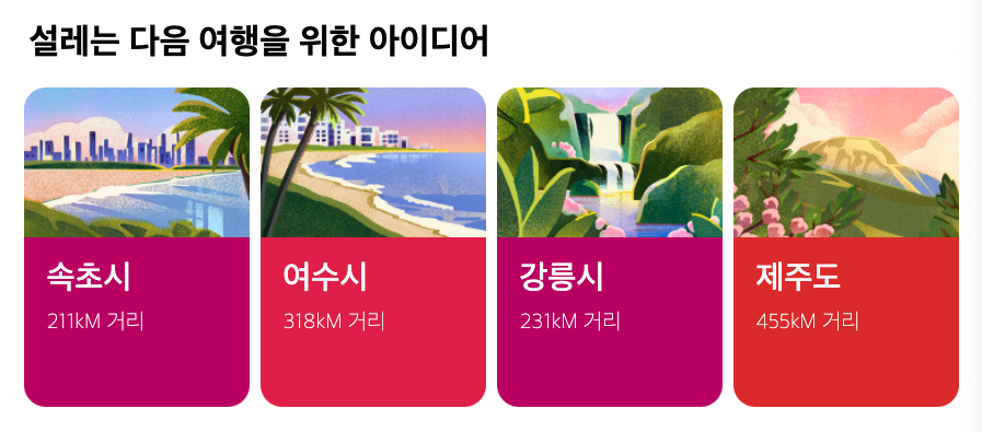
나름 귀엽게 나와서 이것도 뿌듯하다.