들어가면서 쓰는 글
- 회사를 이직하며 블로그를 쓸 시간이 생겨 이제 하나씩 써보려고 합니다.
- 현 회사의 디자인 시스템을 구축하며 작성한 과정 그립니다.
1. 디자인 시스템을 구축하며 가진 나의 목표
- 앱 기반 공통 디자인 시스템 구축한다.
- Storybook을 통한 디자인 시작화 한다.
- Web Storybook 이용
- React-native가 아닌 React Story board를 이용하여 패키지를 레포지토리 클론이 아니더라도 화면구성을 보기 용이하게 하기 위한다. - Github page를 통한 Web Storybook 공유
2. 디자인 시스템 라이브러리 초기 세팅 과정
-
React-Native 공식 홈페이지 참고하여 진행한다.
- 공식 홈페이지 Url : https://reactnative.dev/docs/native-modules-setup
- 위의 Url 에서 권장하는 react-native-builder-bob을 이용
-
다음의 명령어를 기입 후 react-native 프로젝트 생성
npx react-native@latest init mobileUi -
prettier 스타일 수정(스타일 추가 될 경우 마다 수정 및 repository 마다 수정)
"arrowParens": "avoid", "bracketSameLine": true, "bracketSpacing": false, "singleQuote": true, "trailingComma": "all" -
src 폴더 생성 후 index.ts 파일 생성
-
output 경로는 lib로 설정
-
react-native-builder-bob 설치 진행 : Url
-
package.json내 dependencies를 다음으로 수정
"peerDependencies": {
    "react": "*",
    "react-native": "*",
    "react-native-gesture-handler": "*",
    "react-native-svg": ">=12.3.0"
  }
3. Web Storybook 초기 세팅과정
-
다음의 깃헙 Repository 참고:
- https://github.com/storybookjs/addon-react-native-web
- 리액트임에 주의하여 다음을 설치 (webpack 5로 설정할것)
npx sb init --type react - 다음의 라이브러리를 설치
yarn yarn add react-dom react-native-web babel-plugin-react-native-web @storybook/addon-react-native-web metro-react-native-babel-preset --dev npm npm install react-dom react-native-web babel-plugin-react-native-web @storybook/addon-react-native-web metro-react-native-babel-preset --dev - 리액트 네이티브 웹 스토리북을 위한 라이브러리를 설치
yarn

yarn add react-dom react-native-web babel-plugin-react-native-web @storybook/addon-react-native-web metro-react-native-babel-preset --dev

npm

npm install react-dom react-native-web babel-plugin-react-native-web @storybook/addon-react-native-web metro-react-native-babel-preset --dev
-
storybook/main.ts 내에 코드를 다음과 같이 수정
import type {StorybookConfig} from '@storybook/react-webpack5';
const config: StorybookConfig = {
  stories: ['../src/**/*.mdx', '../src/**/*.stories.@(js|jsx|mjs|ts|tsx)'],
  addons: [
    '@storybook/addon-links',
    '@storybook/addon-essentials',
    '@storybook/addon-onboarding',
    '@storybook/addon-interactions',
    '@storybook/addon-react-native-web',
  ],
  framework: {
    name: '@storybook/react-webpack5',
    options: {},
  },
  docs: {
    autodocs: 'tag',
  },
};
export default config;
4. 필요한 라이브러리 설치
- 사용할 라이브러리를 설치
yarn

yarn add react-native-gesture-handler
yarn add react-native-svg

npm

npm install --save react-native-gesture-handler
npm install react-native-svg

cd ios && pod install
5. 테스트
- 테스트를 위해 다음과 같은 폴더구조를 사용한다. (구축과정 문서에서 수정)
src/ ├── components │ └── Button │ ├── index.tsx │ └── type.ts ├── index.ts └── stories └── Button └── index.stories.js- components/Button/index.tsx 코드
import React from 'react'; import {StyleSheet, Text, TouchableOpacity, View} from 'react-native'; import {ButtonProps} from './type'; const styles = StyleSheet.create({ button: { paddingVertical: 8, paddingHorizontal: 16, borderRadius: 4, alignSelf: 'flex-start', flexGrow: 0, backgroundColor: 'purple', }, buttonText: { color: 'white', fontSize: 16, fontWeight: 'bold', }, buttonContainer: { alignItems: 'flex-start', flex: 1, }, }); const Button = ({text, onPress, color, textColor}: ButtonProps) => ( <View style={styles.buttonContainer}> <TouchableOpacity style={[styles.button, !!color && {backgroundColor: color}]} onPress={onPress} activeOpacity={0.8}> <Text style={[styles.buttonText, !!textColor && {color: textColor}]}> {text} </Text> </TouchableOpacity> </View> ); export default Button; - components/Button/type.ts 코드
export type ButtonProps = { onPress: () => void; text: string; color?: string; textColor?: string; }; - stories/Button/index.stories.js 코드
import Button from '../../components/Button';

export default {
  component: Button,
  title: 'Button',
};

const ButtonTemplate = args => <Button {...args} />;

export const DefaultButton = ButtonTemplate.bind({});

DefaultButton.args = {
  text: 'button',
  color: 'red',
  textColor: 'white',
  onPress: () => alert('clicked'),
};
- components/Button/index.tsx 코드
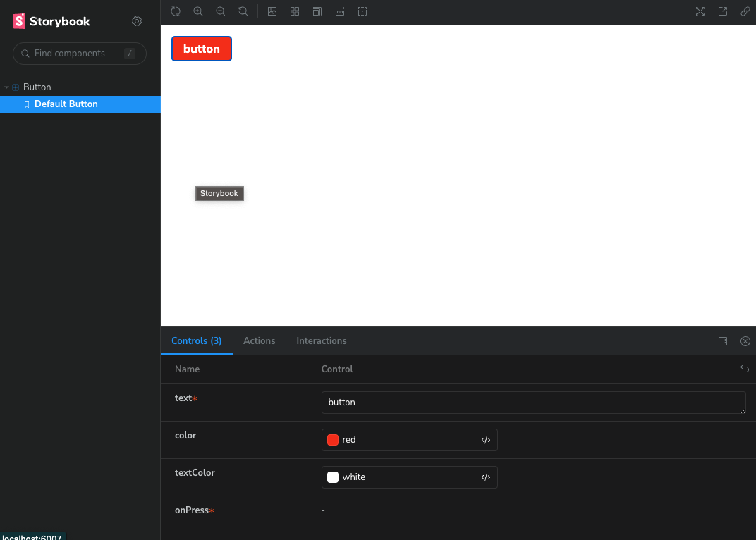
- Storybook 실행
yarn storybook - 실행되어 나타난 화면

Wooyo의 개발 블로그