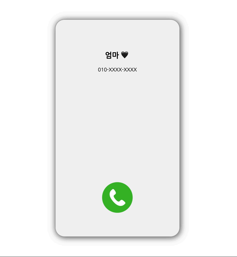
전화가 오면 핸드폰에 울리는 진동을 표현하고 싶었다.
css의 animation을 이용하면 된다.
animation의 하위 속성 (🔗 참고)
-
animation-delay : 언제 시작할지 정함
엘리먼트가 로드되고 나서 언제 애니메이션이 시작될지 지정합니다. -
animation-direction : 어떻게 반복할지 정함
애니메이션이 종료되고 다시 처음부터 시작할지 역방향으로 진행할지 지정합니다.
alternate로 지정하면 애니메이션이 종료된 뒤 역방향으로 진행됩니다.
-
animation-duration : 반복 텀을 정함
한 싸이클의 애니메이션이 얼마에 걸쳐 일어날지 지정합니다. -
animation-iteration-count (en-US) : 반복 횟수 정함
애니메이션이 몇 번 반복될지 지정합니다. infinite로 지정하여 무한히 반복할 수 있습니다. -
animation-name (en-US) : from, to로 중간 상태 지정함
이 애니메이션의 중간 상태를 지정합니다. 중간 상태는 @keyframes 규칙을 이용하여 기술합니다. -
animation-play-state (en-US) : 멈추고 시작을 정함
애니메이션을 멈추거나 다시 시작할 수 있습니다. -
animation-timing-function (en-US) : 중간 상태 반복 텀
중간 상태들의 전환을 어떤 시간간격으로 진행할지 지정합니다. -
animation-fill-mode
애니메이션이 시작되기 전이나 끝나고 난 후 어떤 값이 적용될지 지정합니다.
예시
p {
  animation-duration: 3s;
  animation-name: slidein;
}

@keyframes slidein {
  from {
    margin-left: 100%;
    width: 300%
  }

  to {
    margin-left: 0%;
    width: 100%;
  }
}
p 태그의 왼쪽 마진이 100% ⇢ 0%, 너비가 300% ⇢ 100%로 변화한다.
/* 효과 반복 */
animation-iteration-count: infinite;

/* 끝나면 역방향으로 진행*/
animation-direction: alternate;
작성한 코드
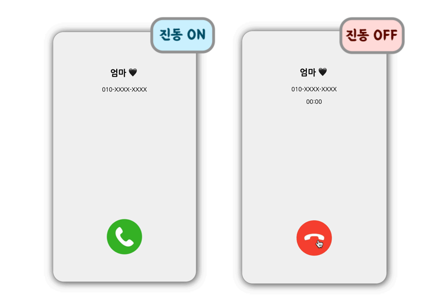
.phone{
    animation-duration: 0.5s;
    animation-name: slidein;
    animation-iteration-count: infinite;
    animation-direction: alternate;
}

@keyframes slidein {
    from {
        margin-left: 1%;
    }

    to {
        margin-left: -1%;
    }
}
0.5s 동안 좌우로 1%만큼 움직이도록 해주었다.


slow and steady wins the race 🐢